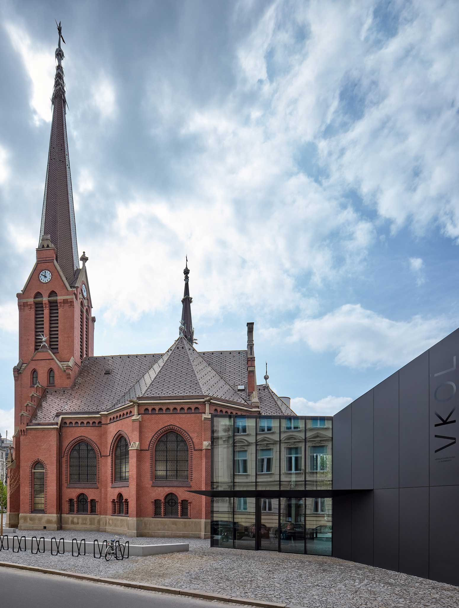
Olomouc Research Library has been using the Red Church as a book depository since 1959 and this beautiful Lutheran church has been completely closed to the public during all those years. The owner of this listed building, Olomouc Region, decided to construct a new library building to fulfill the storage needs and so free up the Red Church for cultural purposes such as smaller concerts, public readings, lectures, or art shows. Additionally, the Red Church is intended to be an information center for the Research Library and Olomouc Region.
Combining the overall reconstruction of the historical building with the new cultural and social functions was the main brief and focus of the design. The building was in a very poor condition. First, it was necessary to strengthen the foundations, mend the damp and salty masonry, repair the stucco and plaster, and tidy up and fill the gaps in the facade cladding. The floors were a complete redo including the layers all the way down to the terrain base. The reconstruction of the roof was one of the most critical updates. The trusses have been severely damaged by the rain, they could have collapsed at any point. The studio decided to do a complete makeover with maximum effort to retain the original elements. The new roof was made of copper squares that copy the same shape and format as the original roof. The authentic decorative elements did not stand the test of time sadly, so the studio worked together with renowned Olomouc sculptor Jan Dostal who created contemporary artifacts to be placed there instead.
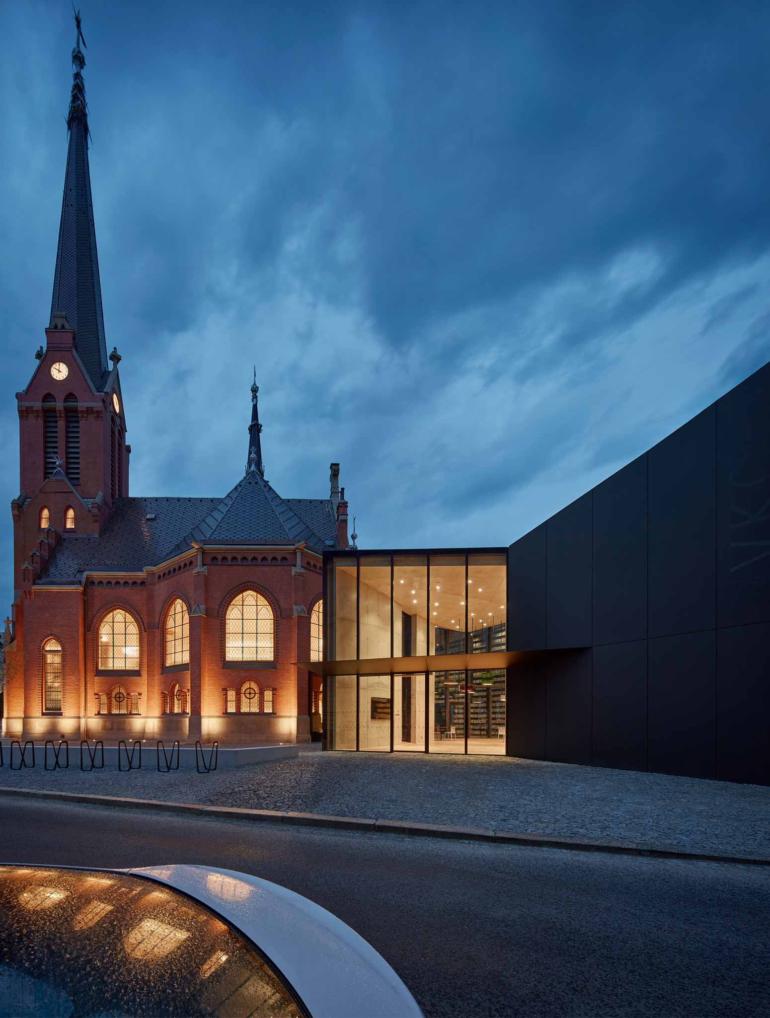
Extra space for operation and facilities was required for the new functionality of the building, but it did not fit in the main body of the church. To avoid significant construction changes to the existing heritage building, the studio decided to add on a new mass that would serve operational purposes. The new building is placed right in between the church and the library directorate, linking the two together. There is a common entrance hall with a reception and a café. The new construction respects the Bezrucova Street line and keeps enough indent from the existing buildings.
The crystal-like mass of the annex responds to the neo-Gothic form of the church; it derives from its geometric shape, volume, and layout. The floor plan is a cut-out of the part of the church floor plan, only moved outside of the original platform. The walls and the rooftop are made of matte black aluminum. The public space around the church is another compelling addition to the project. Where once there was a fence, there is a piazzeta with seating arrangements and suitable greenery now.

PHOTOS BY BoysPlayNice
PHOTOS BY BoysPlayNice

PHOTOS BY BoysPlayNice

PHOTOS BY BoysPlayNice
PHOTOS BY BoysPlayNice
Atelier-r designed the concept and philosophy of the interior spaces and asked for collaboration with Denisa Strmiskova Studio which stands behind the detailed interior design elements such as the choice of lighting, or ready and custom-made furniture. Both atelier-r and Denisa Strmiskova Studio closely collaborated on choosing the materials and surfaces.
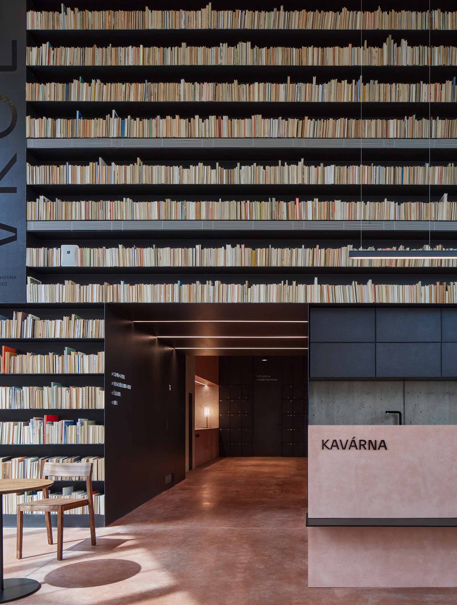
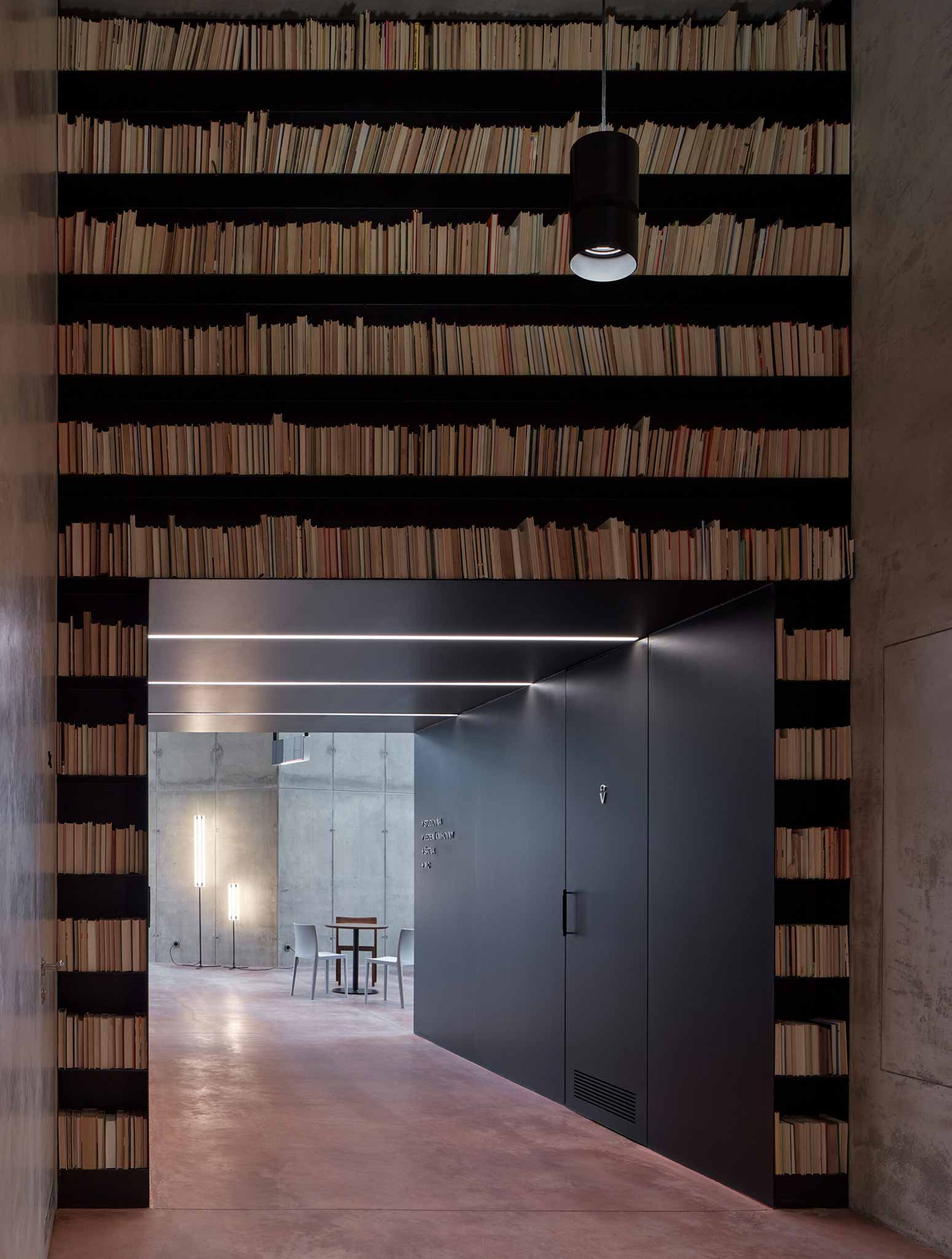
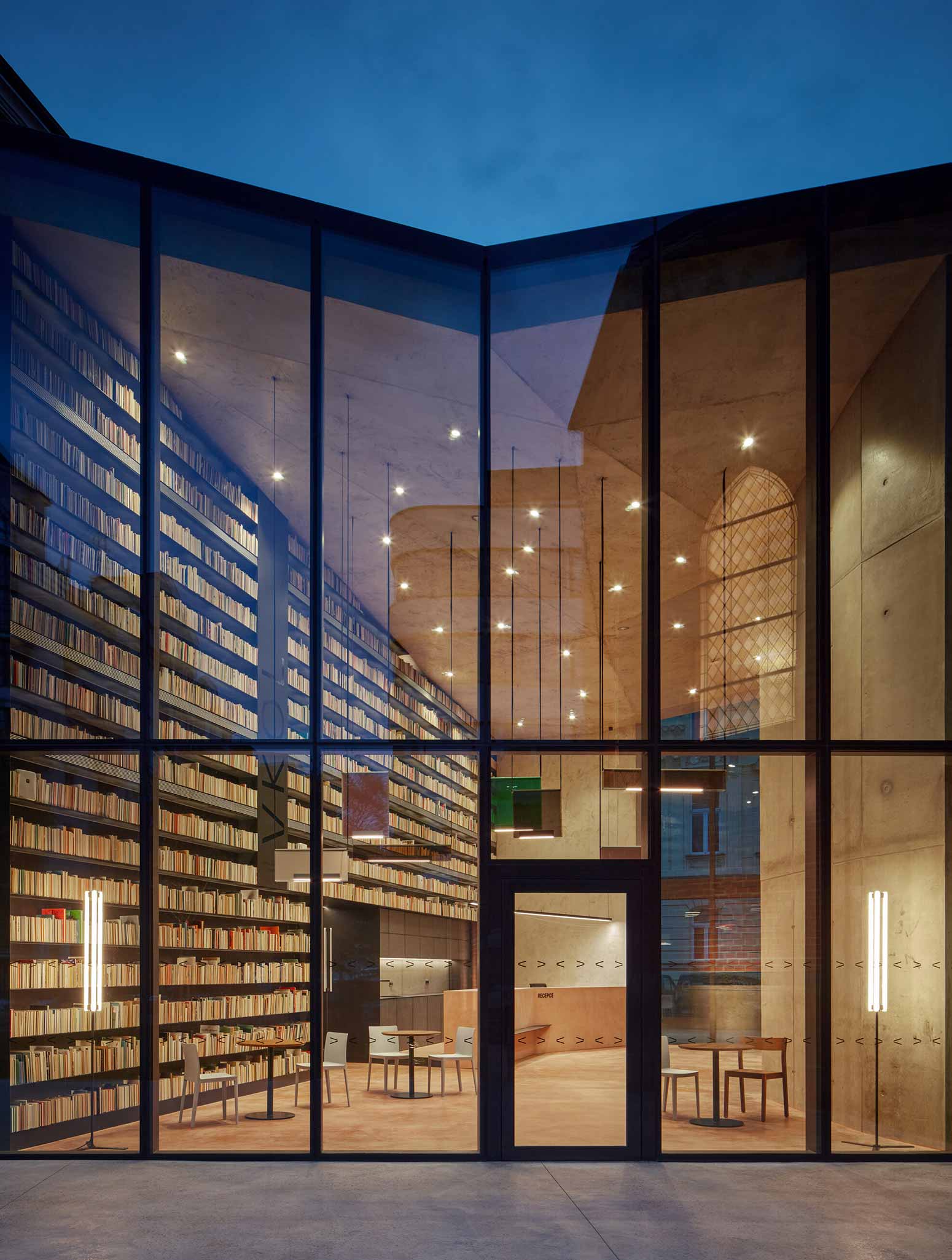
The reception and the café are taking up the main space in the modern annex. It is made of pastel pink concrete. The pink colour also matches other surfaces throughout the space such as floors, furniture, or walls. Massive accent book wall dominates the interior. It is a tall wall filled with old books that are backlit in the evening. There is a colourful glass Lambert & Fils light fixture hanging in front of the wall. The elegant and minimalist glass elements float in the air, suspended on the nylon ropes high above the visitors’ heads. If you look at them from specific angles, they reflect the houses in the street or the church. The lights are the defining connecting element in the room.
Sitting on the variety of comfortable chairs you will enjoy the meditative atmosphere of the space. Wooden Zeitraum chairs are made of walnut wood, and they are in both the church interior and the café in the annex. Plastic Hay chairs are a refreshing design by the Bouroullec brothers. There are also minimalist armchairs to rest on. The coffee tables were made to measure. The material and the details of the tables were inspired by the traditional elements of the church.
Floor lamps from Kaia remind us of a modern flambeau. They are placed in both the church and the café to set a pleasant vibe. Graphic studio KOSATKO collaborated on the project, designing a brand-new visual identity and the logo for the Olomouc Research Library.

PHOTOS BY BoysPlayNice

PHOTOS BY BoysPlayNice
PHOTOS BY BoysPlayNice
PHOTOS BY BoysPlayNice
Co-author: Daria Johanesová, architect, lead project manager
Collaborators:
Interior design: Denisa Strmisková Studio, www.denisastrmiskova.com
Graphic design: Studio KOSATKO, www.studiokosatko.cz
Steel artifacts: Jan Dostál, www.jandostal.com
General contractor: Company Červený kostel [associations of companies STRABAG and OHLA ŽS], www.strabag.cz, www.ohla-zs.cz
Interior furnishings contractor: Prosto Interiér, www.prosto.cz
Project information
- Architect:Atelier-R
- Location:Czech Republic,
- Project Year:2023
- Photographer:BoysPlayNice
- Categories:Church,Cultural,Cultural Center