PHOTOS BY Zheng Yan
The innovation of architecture is not only about the new form, but also bringing forth new ideas in internal logic and activities. This approach enables the creation of new aesthetic concepts and meanings, so that every building project may truly fulfill and exemplify their own unique cultural values.
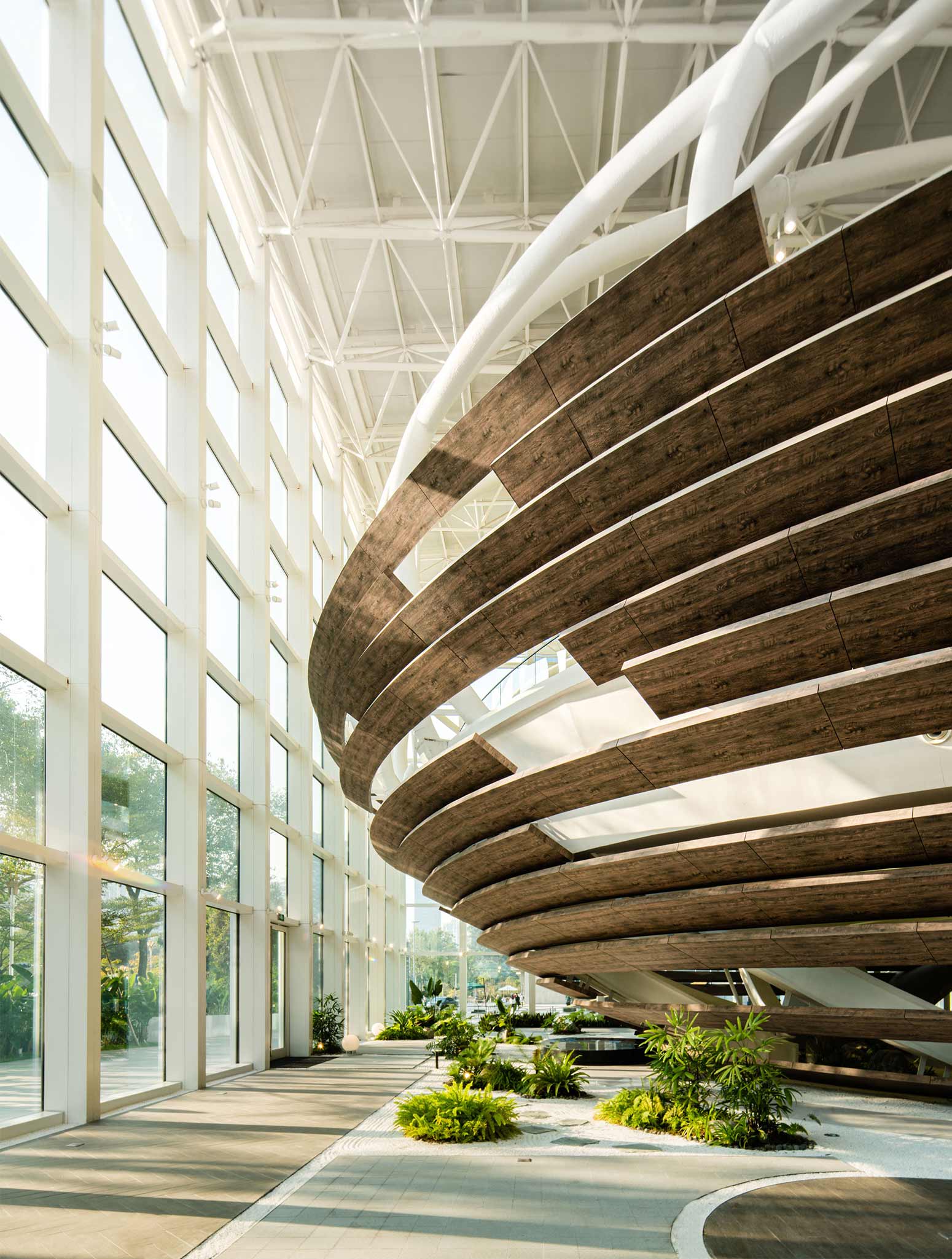
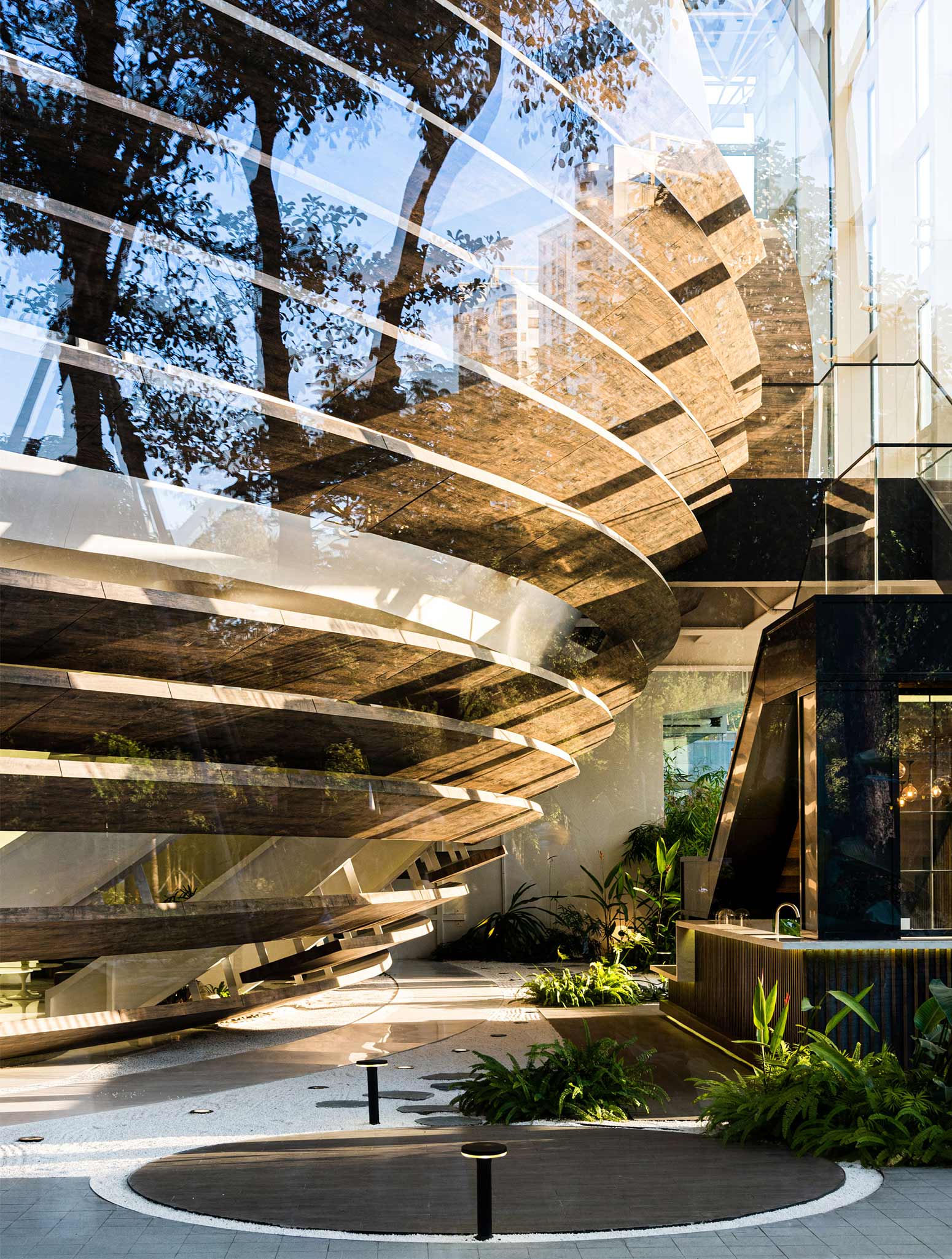
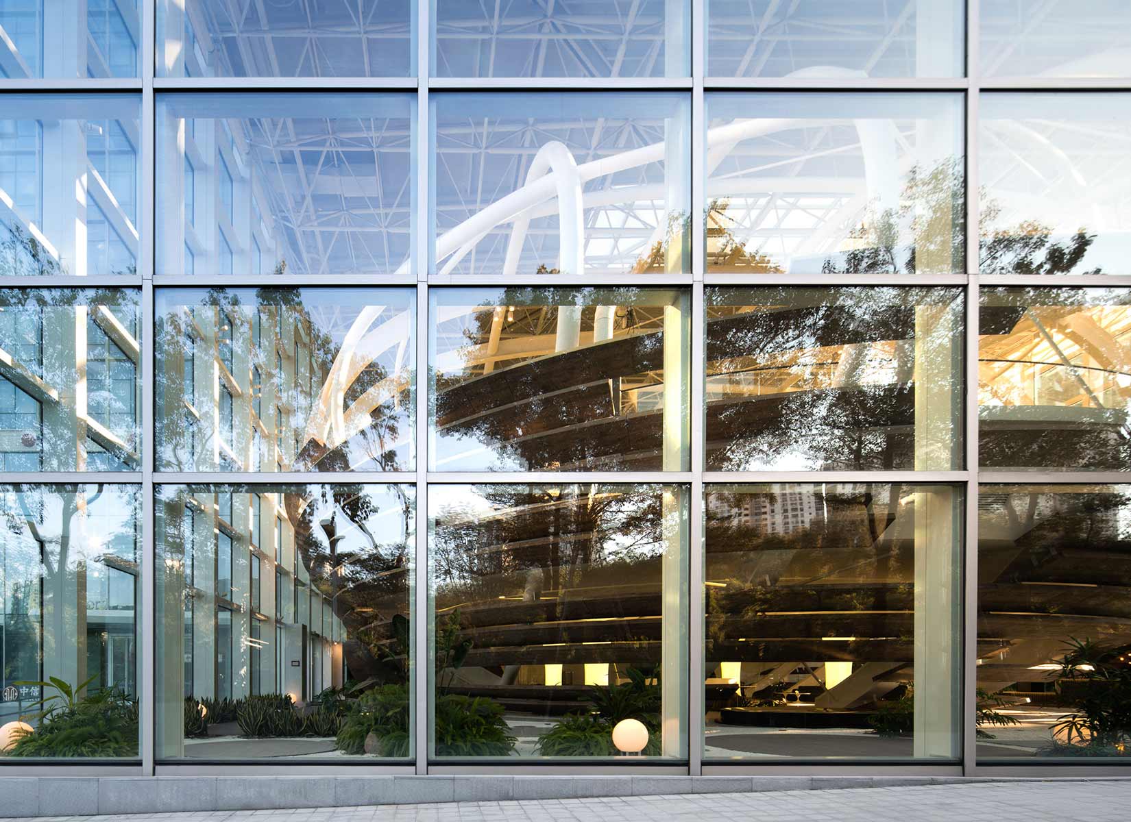
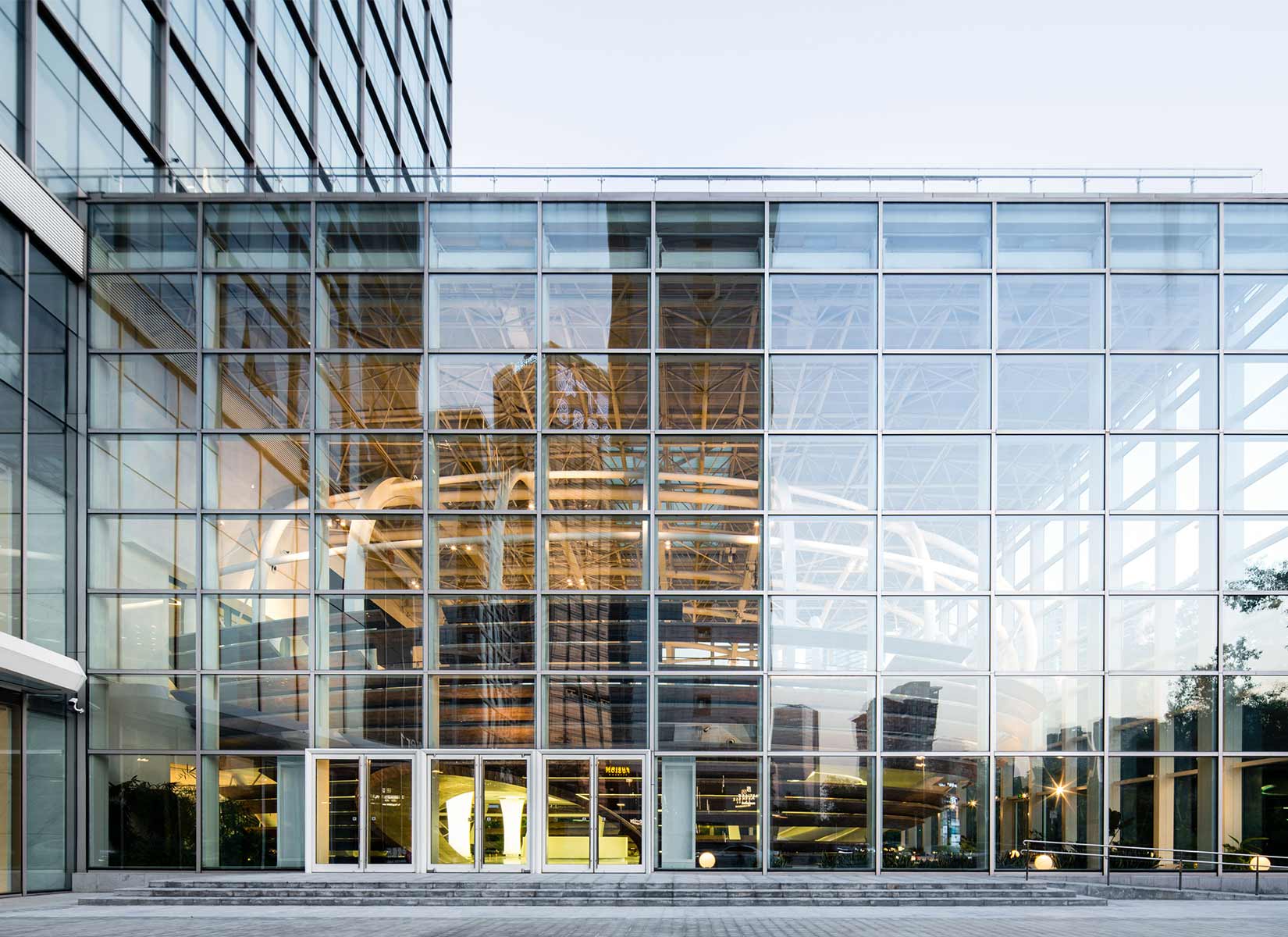
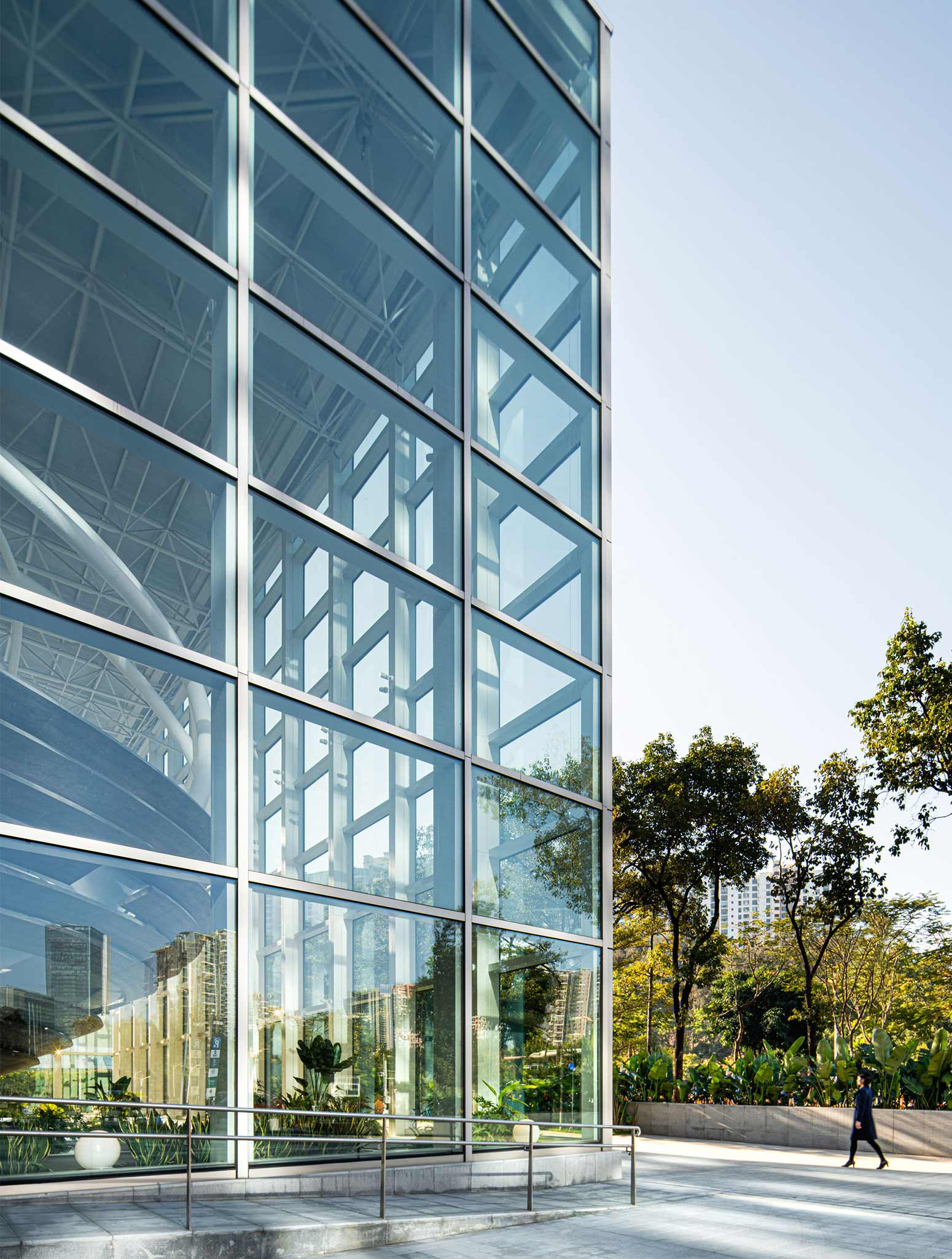
The architecture is easily recognized with its elliptical structure housed within a glazed frame facing the street, referred as “an egg emerging from a cocoon”, which forms an independent yet connected relationship with the surrounding area. It seeks to embody the ideals of innovation, freedom, and distinction, creating a unique, thoughtfully considered space. At the same time, the shape of the “egg” easily lends itself to the required function of the space. As a diversified building integrating corporate conferences, roadshows, cocktail parties, etc., the Center aims to be a true incubator for companies, and to provide an outstanding platform from which to announce themselves.
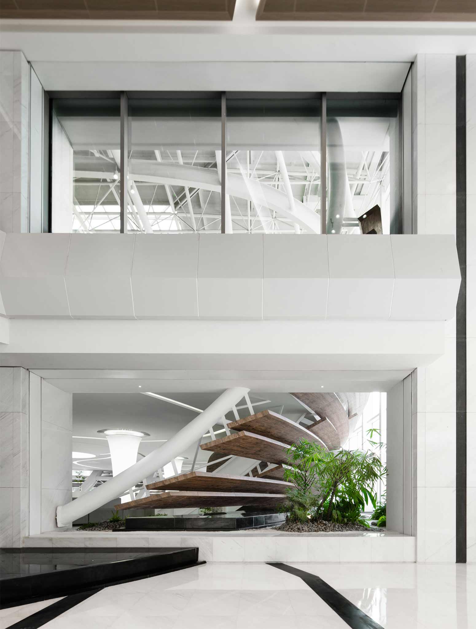
“Nest” implies a new life, hope, and vitality. In its combining of art, architecture and ecology, the project aims to echo the unique temperament of the new, vibrant city where it resides. The abundance of hi-tech and scientific research companies here has created a dynamic atmosphere, which provides a backdrop that contributes to Q-Plex’s attraction as an international-level space – an oasis of alternative arts and culture in Shenzhen. In addition, the white grid-like structure inside the building extends throughout the project, which gives a continuous and cohesive order to the architecture as one moves through the various spaces. This provides a visually striking effect, while simultaneously giving expressions to a rational and scientific spirit.
PHOTOS BY Zheng Yan
PHOTOS BY Zheng Yan
PHOTOS BY Zheng Yan
PHOTOS BY Zheng Yan
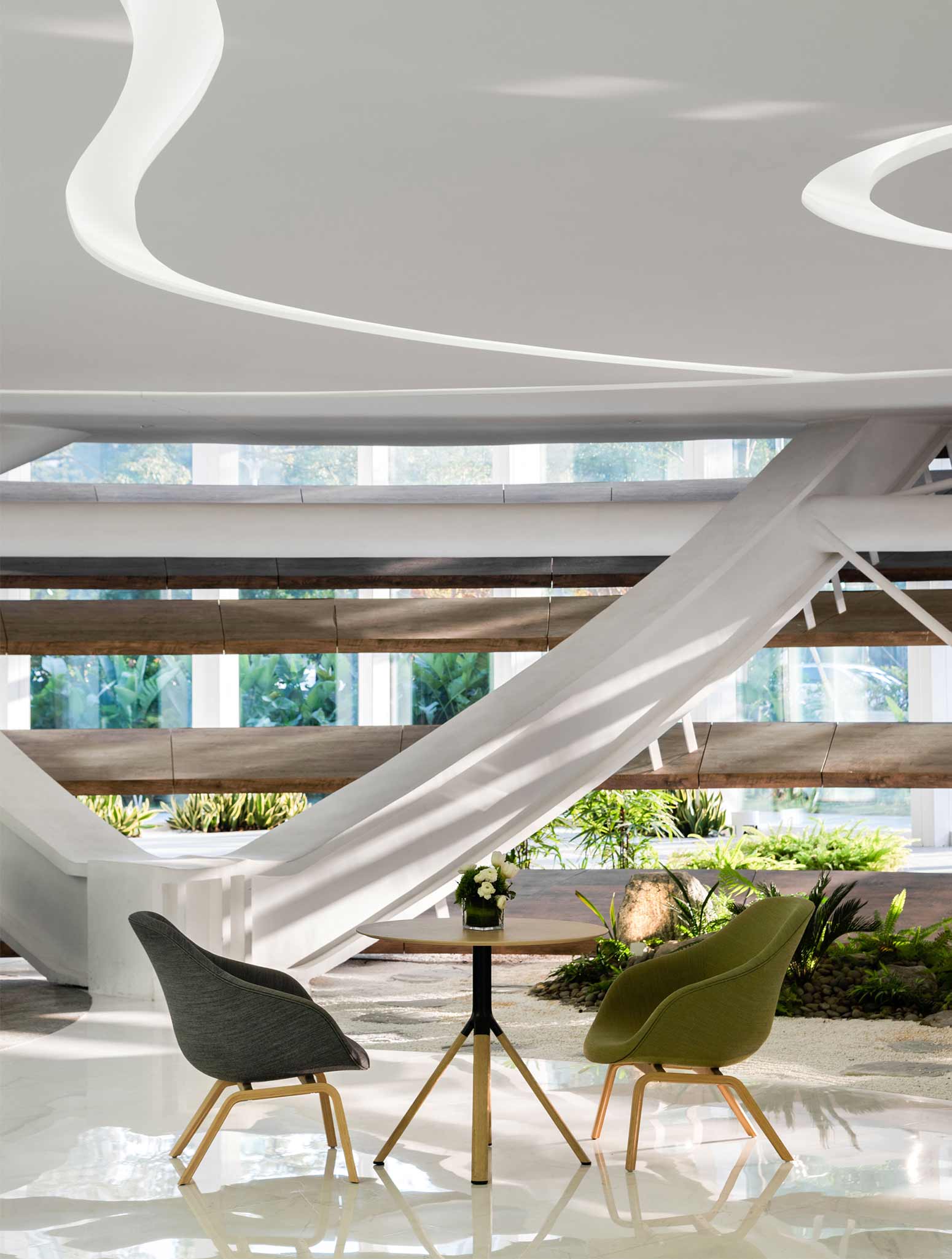
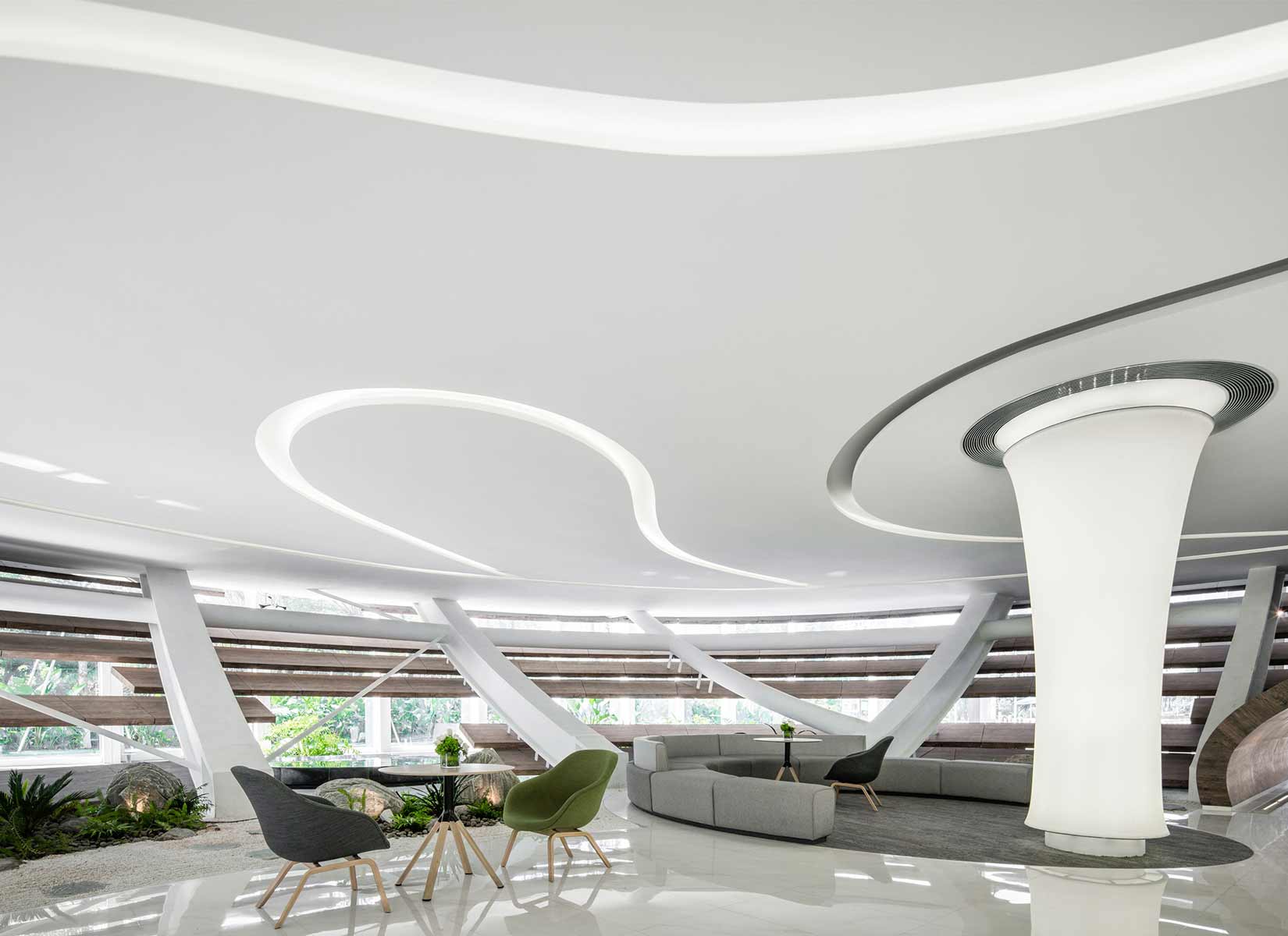
Within the building, the interior design has also incorporated white flowing lines to lead the eye throughout the space. Such creates an elegant contrast of rational straight edges and gentle contours, which illustrates the main characteristics of the Nest Art Center – a city icon with long-term vitality, and possessed of both inner and outer refinements.
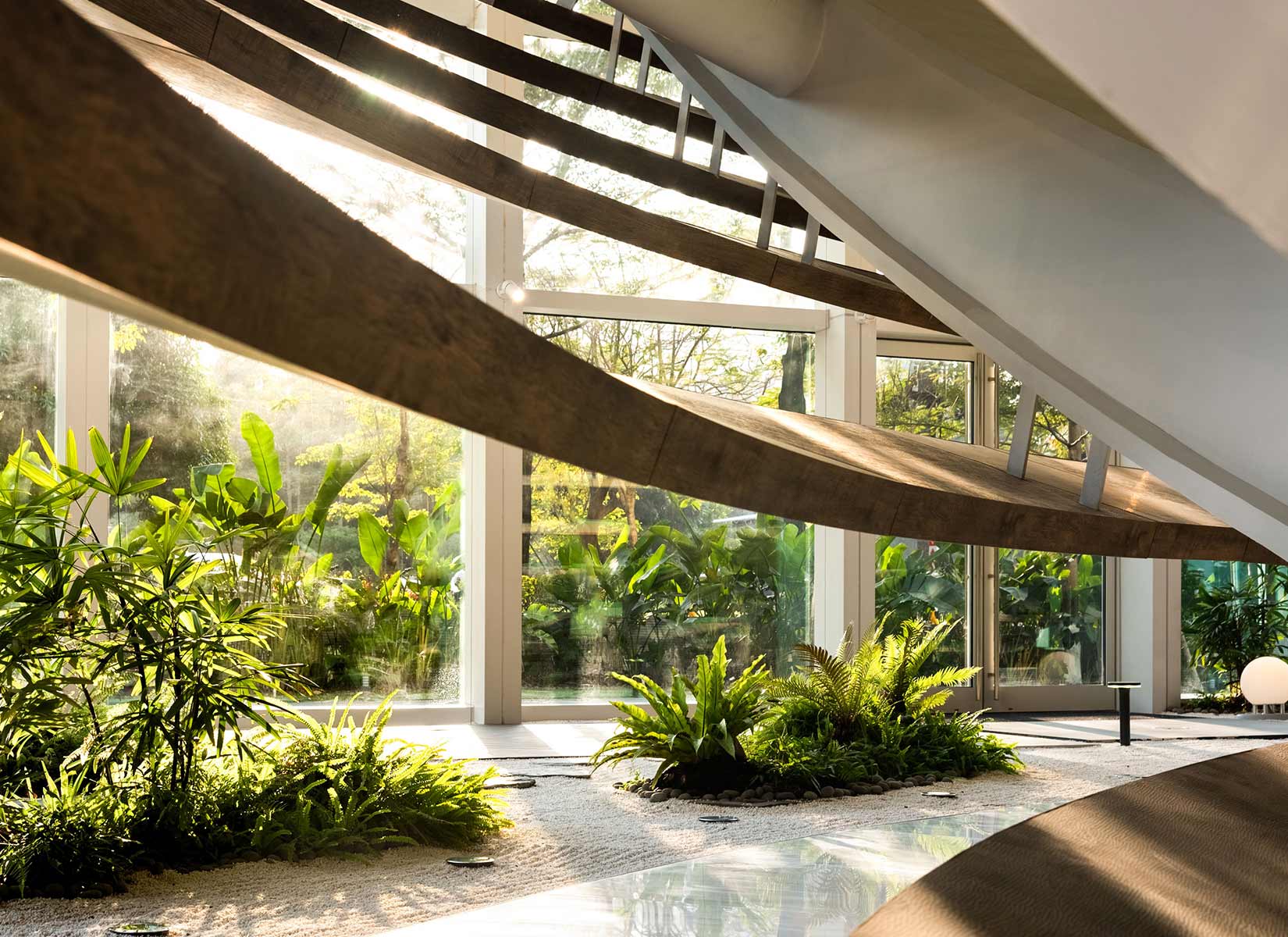
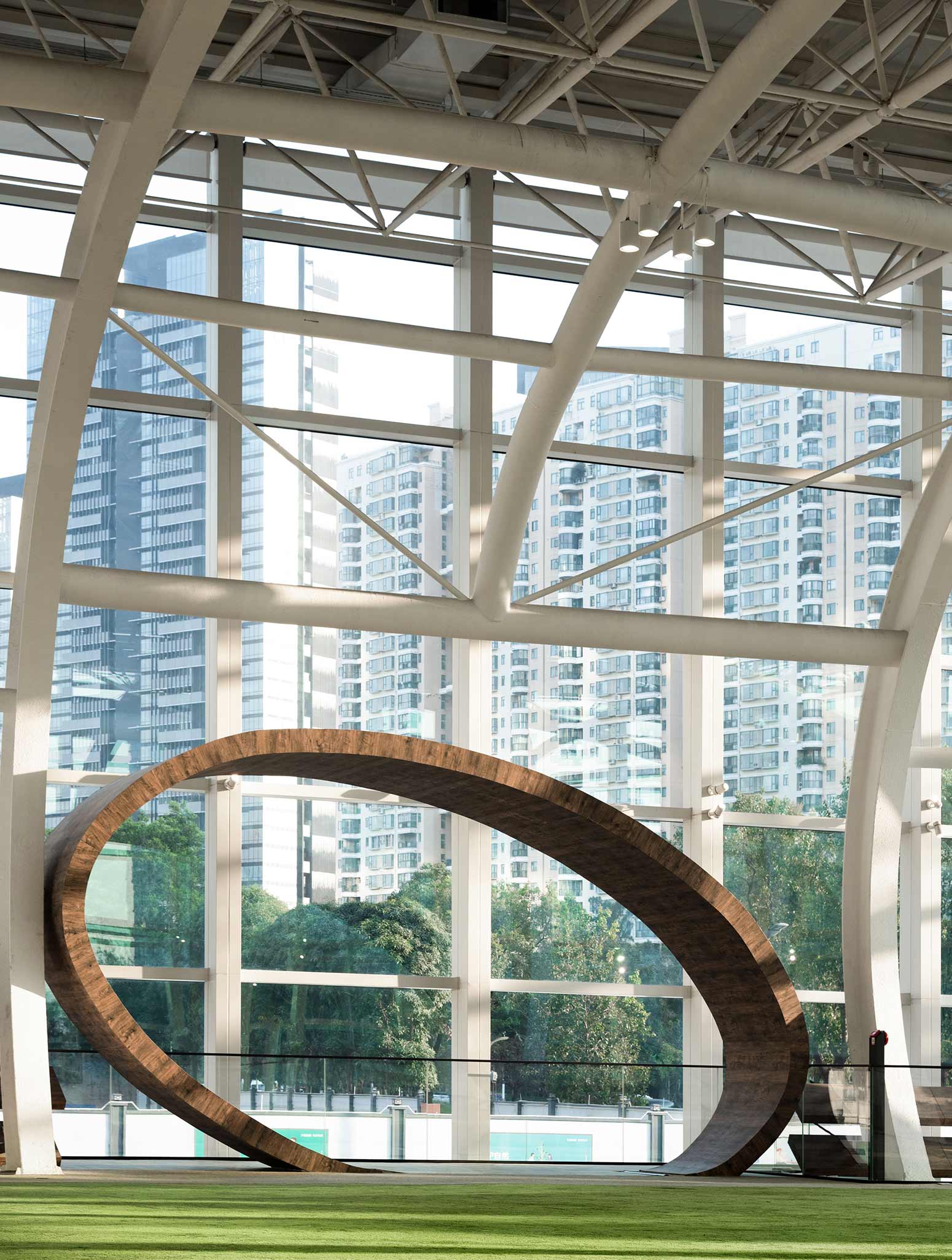
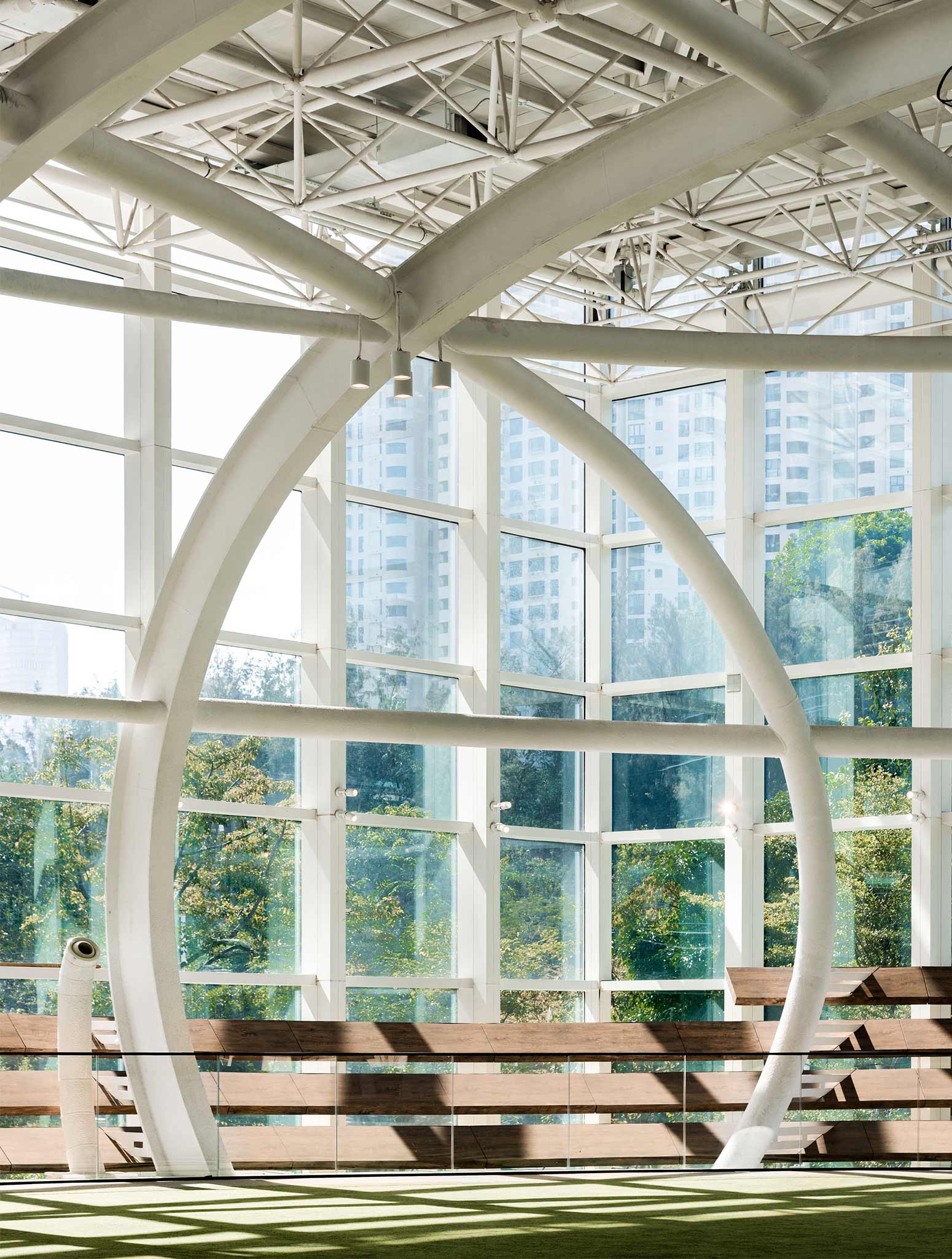
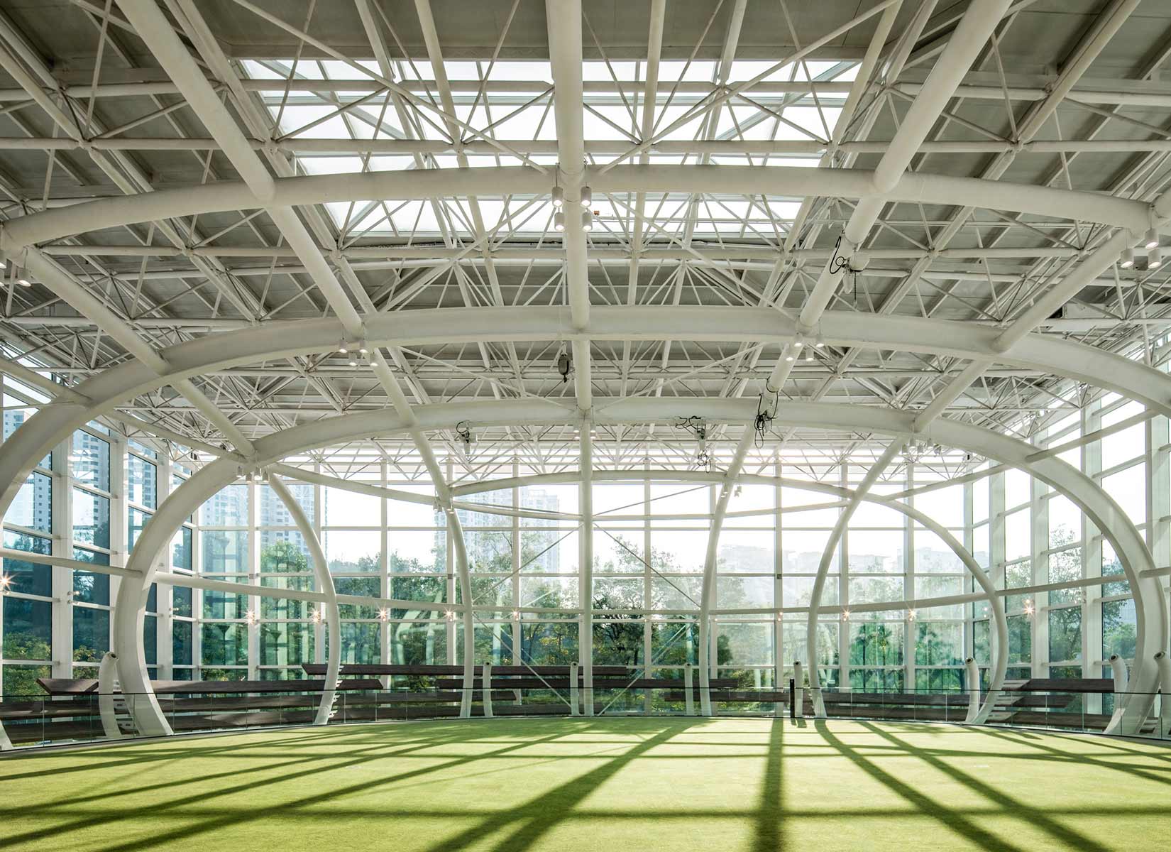
If architecture is to reach the level of art, then light must have an intrinsic role in the defining of space. It runs through the shape of the building and changes its rhythm. Here, the circular glass curtain wall and pure white steel frame structure increase the sense of transparency within the space as light passes through it. As the architecture is sculpted by illumination, its nature-inspired flowing forms are accentuated, creating the defining aesthetic qualities of the Nest Art Center, now a well-known and outstanding landmark in Shenzhen.
PHOTOS BY Zheng Yan
PHOTOS BY Zheng Yan
PHOTOS BY Zheng Yan 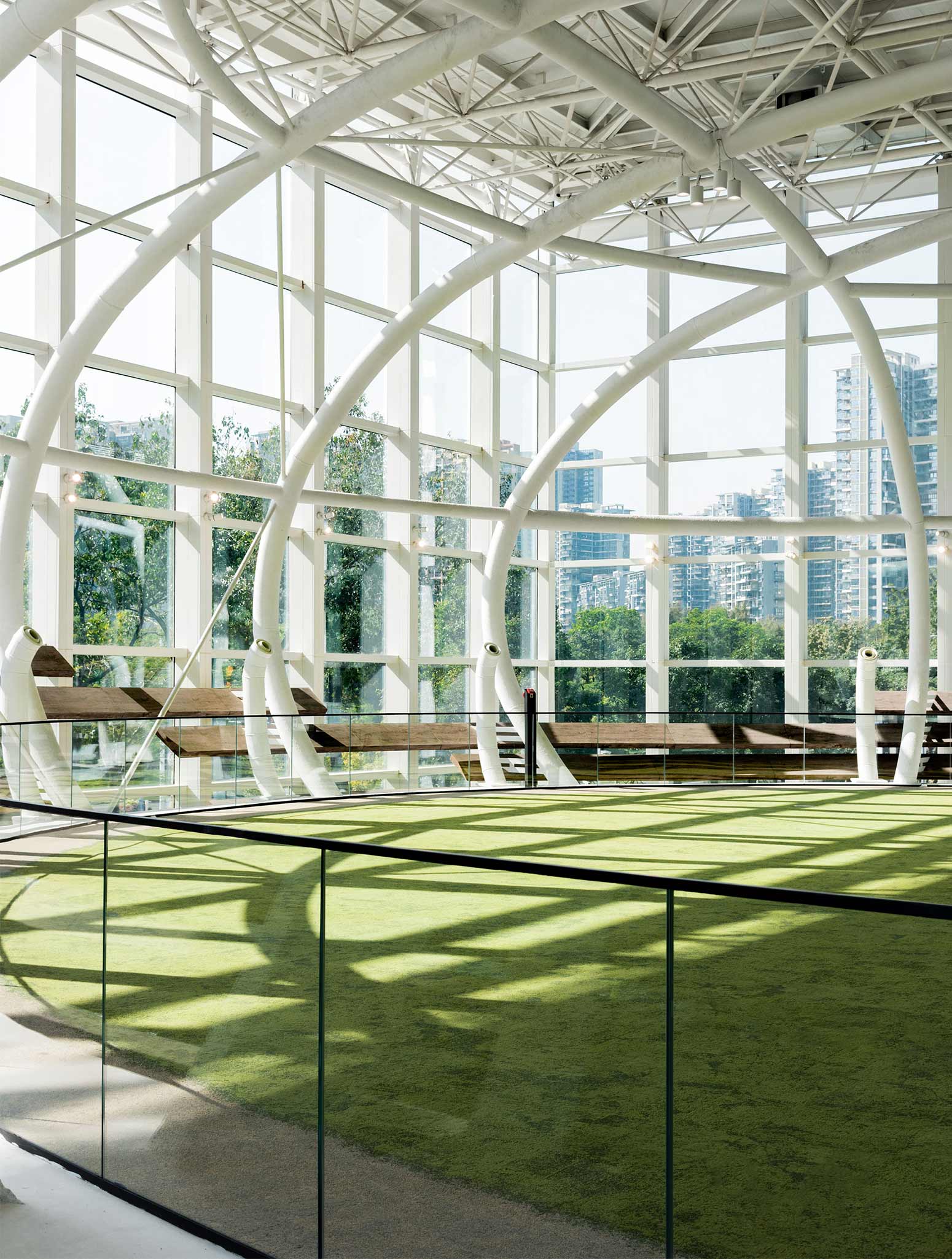
PHOTOS BY Zheng Yan
Other than the wooden and ceramic floors used in traditional art spaces and laying artificial turf to introduce nature into the interior, the concept of urban green parks is echoed here, and raises the aesthetic quality: the fusion of natural landscape and artistic elements is a compelling match and sets a new standard for this type of space.
The indoor greenery is a prominent symbol of a larger landscape beyond, with layers of daylight filtered through the white frame, flowing onto and through the building – the total effect recalls the phrase, “Although made by humans, it seems to have come from the sky above”. This “inner garden” creates a dignified air of culture, with its green plants casting shadows on the Zen-like white sand, eloquently bearing witness to the gentle passing of time. The famed Spanish architect Antoni Gaudí once said, “The straight line belongs to man, the curve to God.” The beauty of non-linear contours lies in their similarity to the ones found in nature, fascinating in their uniqueness and unexpectedness.
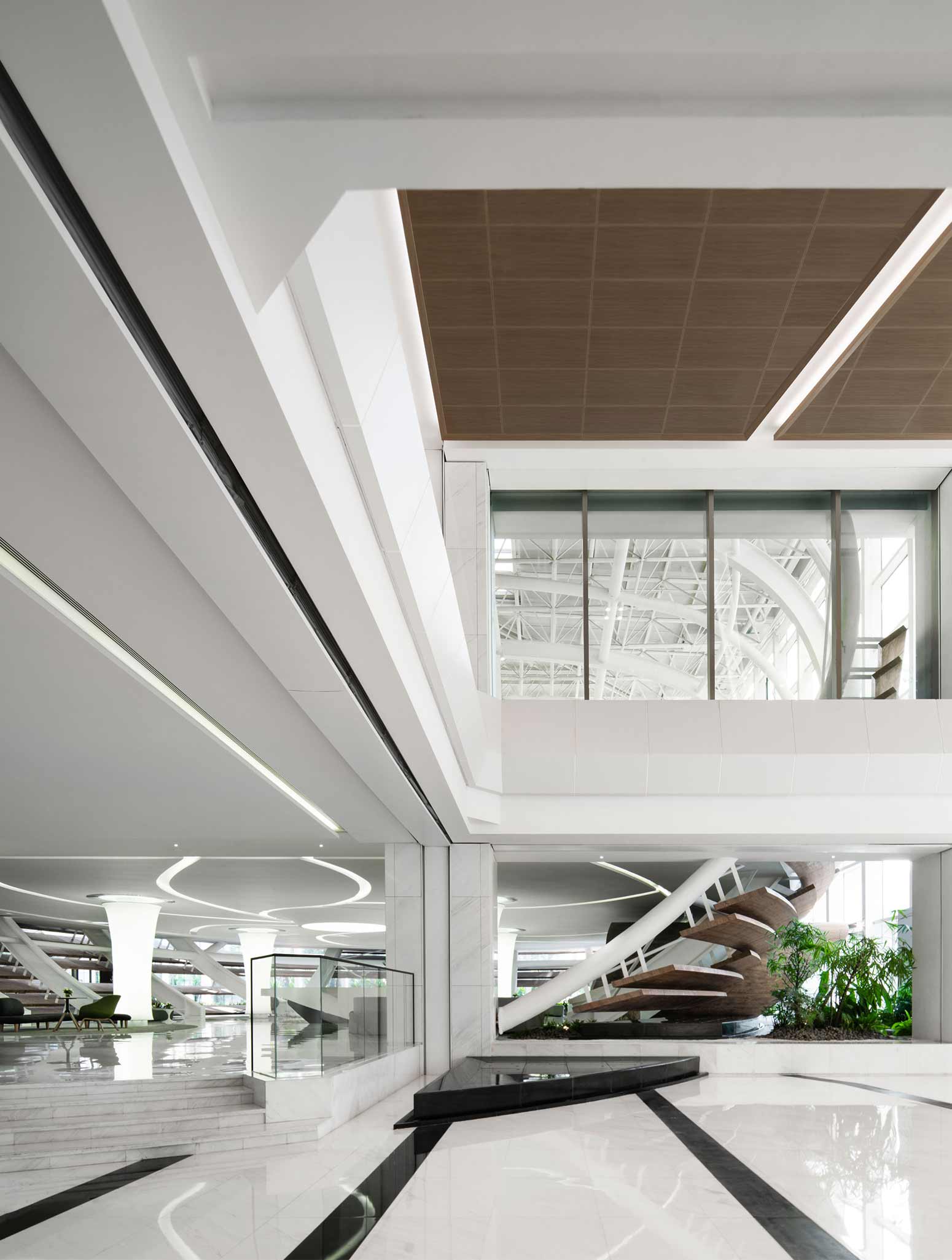
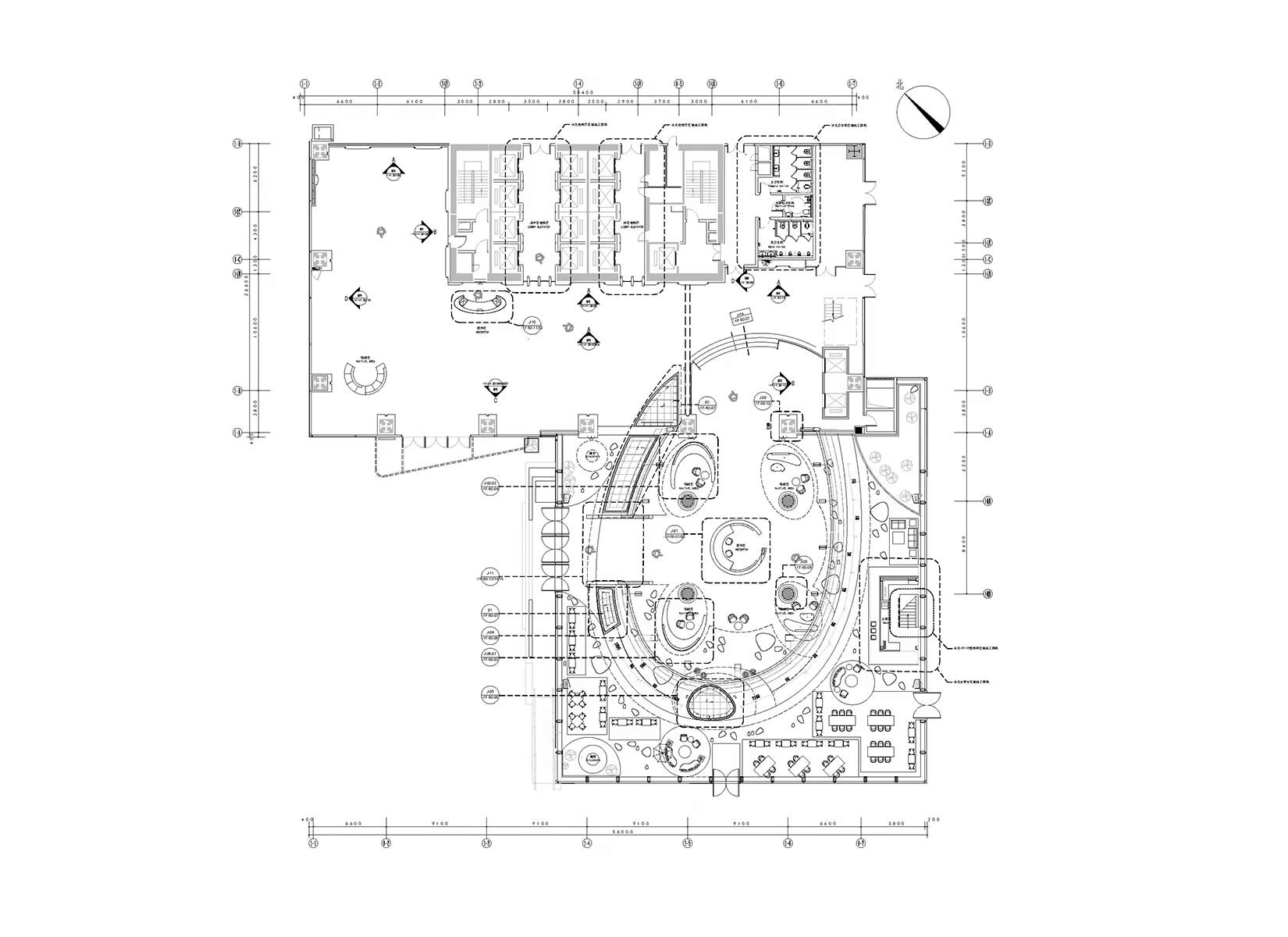
The various interiors of the building are connected through a series of curves, with each one performing the task of creating a degree of spatial tension. The reception desk is the center of the main lower area, focusing on visitors’ sights with a cylindrical shape which narrows at the location of the desk.
A system of pillars arranged around it are utilized by the designer as light-emitting membrane lamps. The ceiling is embedded with a ribbon-shaped fluorescent lamp slot which playfully winds its way between the pillars, leading the eye through the space. Wooden shutters form a connection with the external courtyard, introducing warm natural light. Moving to the second level, the glazed stairwell has a flooring of wooden steps that echo the wood oval at the entrance area, which boasts a main venue with a platform of 1200 sqm free of beams and columns, with accommodation of up to 500 people.
PHOTOS BY Zheng Yan
PHOTOS BY Zheng Yan
PHOTOS BY Zheng Yan
PHOTOS BY Zheng Yan
Project information
- Architect:M Moser Associates
- Location:China,
- Project Year:
- Photographer:Zheng Yan
- Categories:Cultural,Cultural Center,Exhibition Center