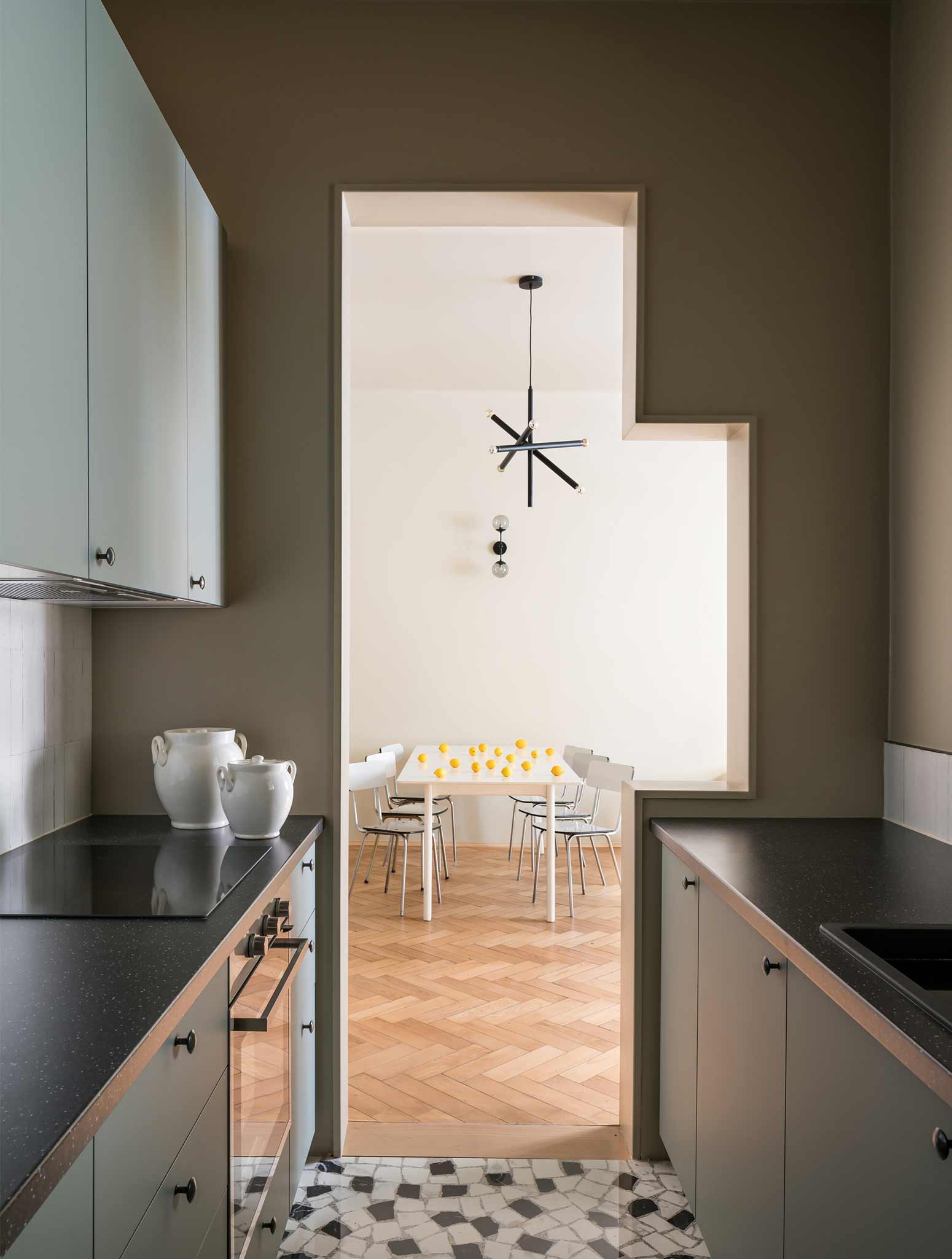
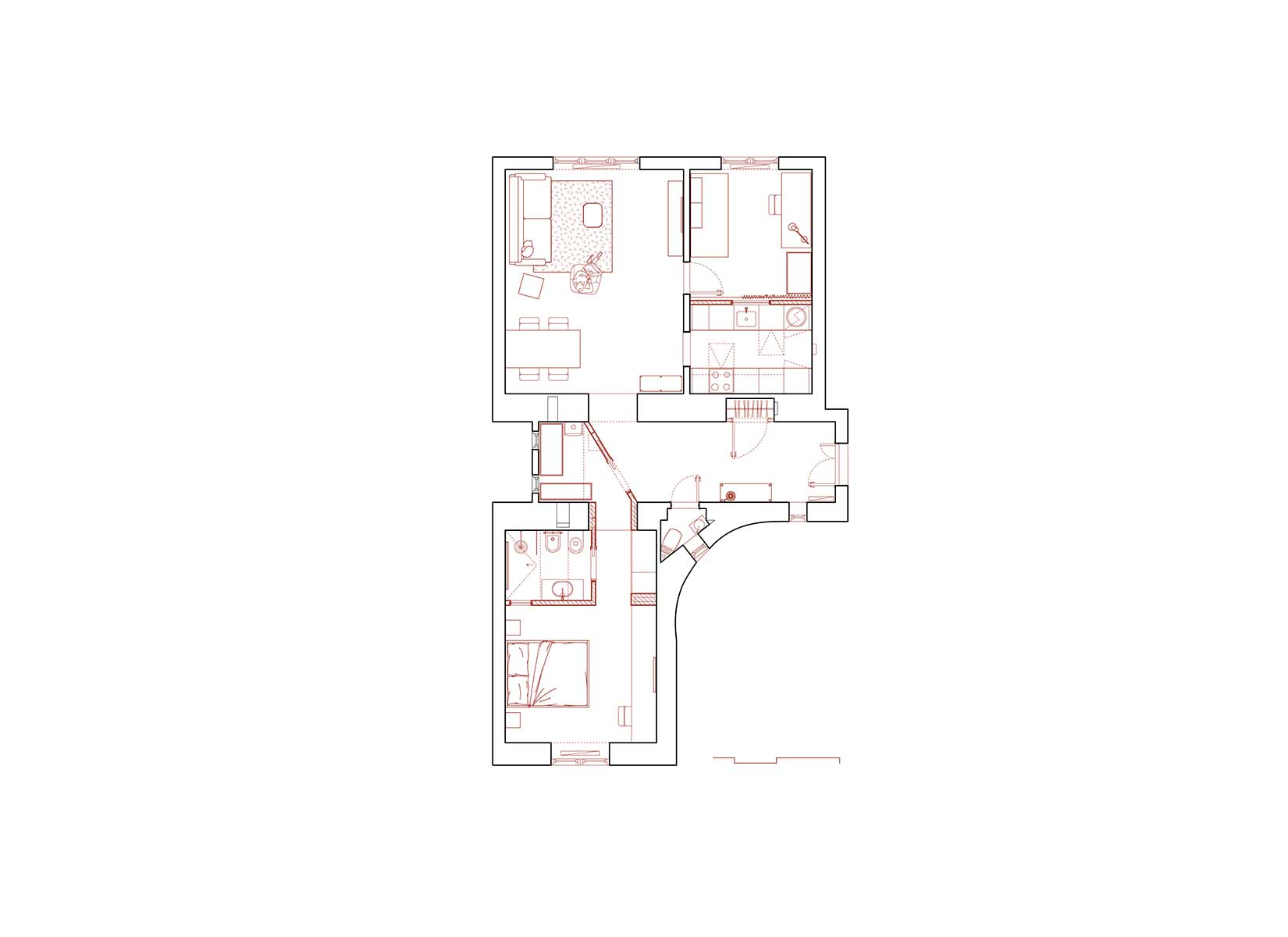
The stepped-volumes apartment is a gut renovation of a unit in Prague, Czech Republic. The design process and construction took place during the Pandemic, and, as a result, the design team was never able to visit and experience the site physically. The entire process, from ideation to final completion, was managed remotely.The brief required recalibrating the spaces within the 80 square meters apartment. The original floor plan had only one bedroom, and two bathrooms were awkwardly opening into a large foyer. The unit was in complete disrepair and lacked modern systems and fixtures, requiring a gut renovation. Moreover, the client wanted to add a study/guest bedroom for remote work and had a shoestring budget.
Our solution developed a playful, site-specific architecture deploying “inserted elements” to house new programs, modified the circulation, reused existing elements (e.g. doors and flooring) wherever possible, and introduced interior openings to bring light into darker spaces. All solutions needed to be simple, functional, and budget-conscious. Firstly we reorganized the program by shifting the kitchen shifted South to free up the windows for the new study.
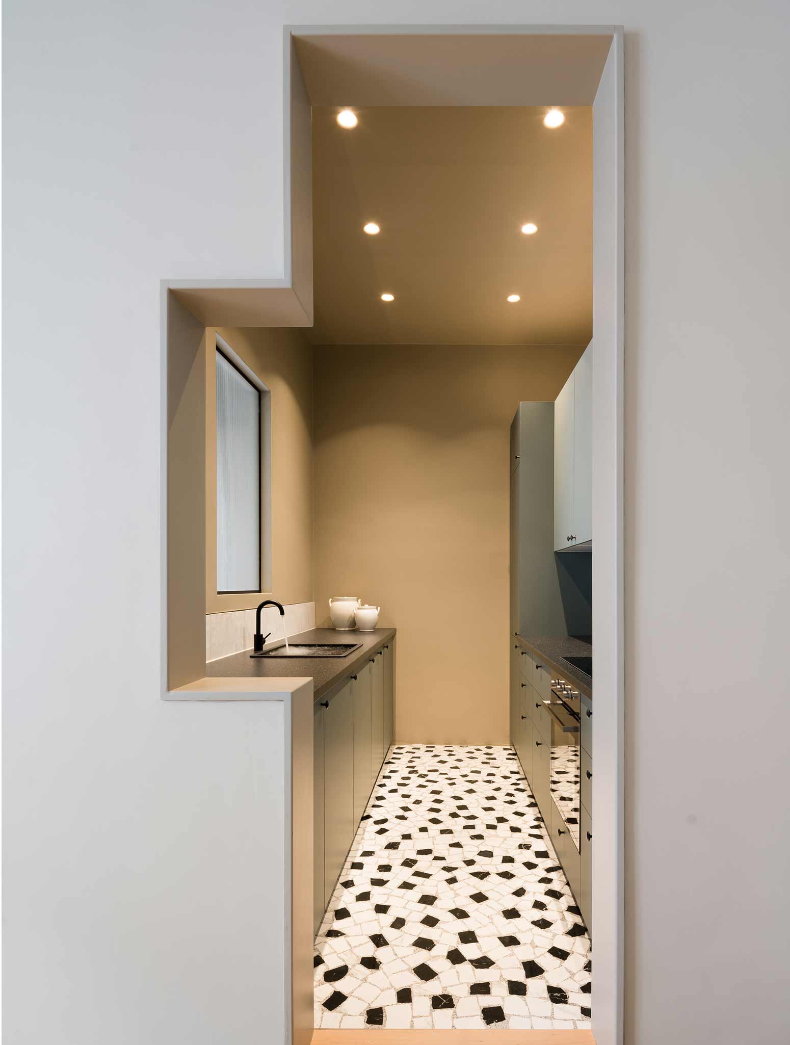
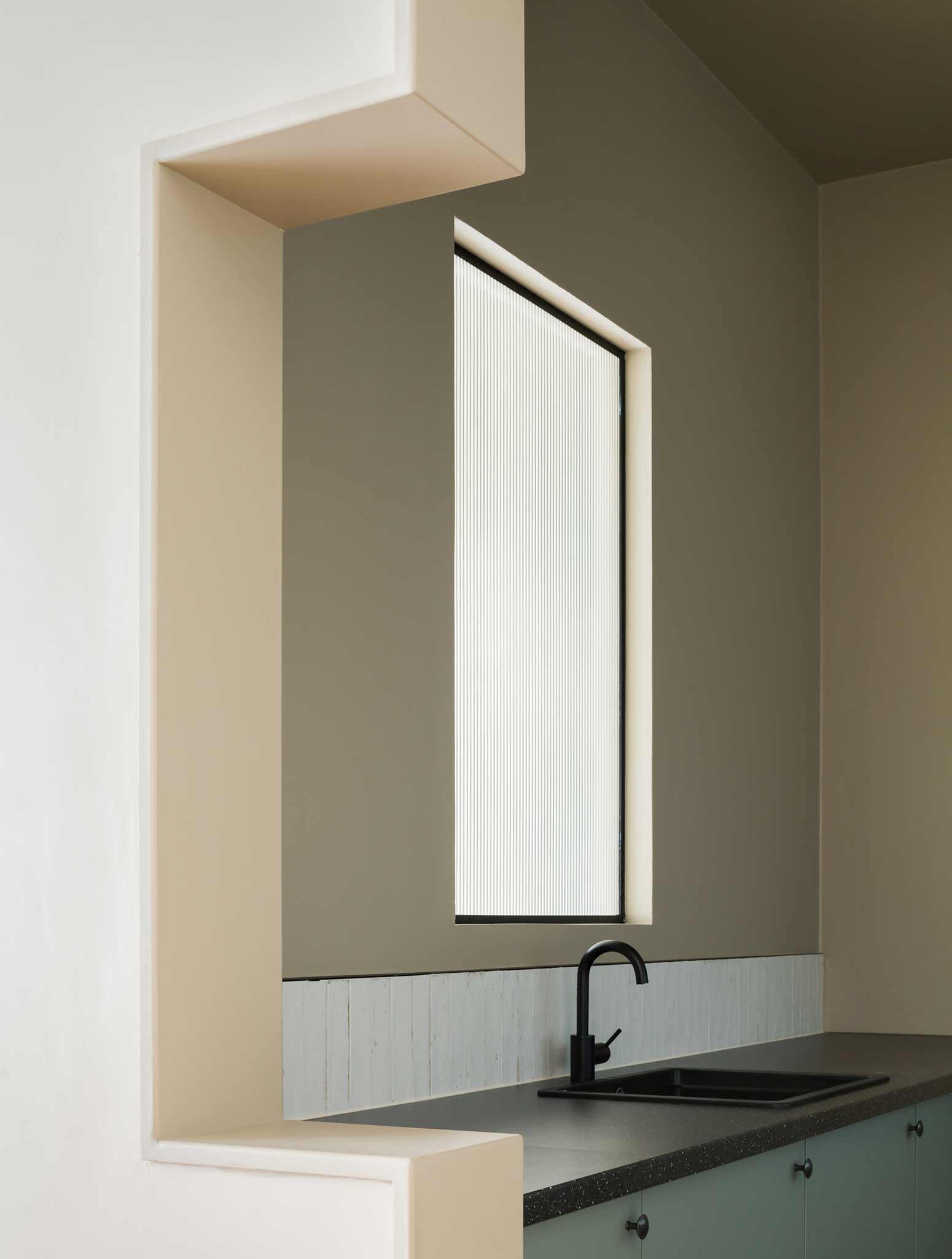
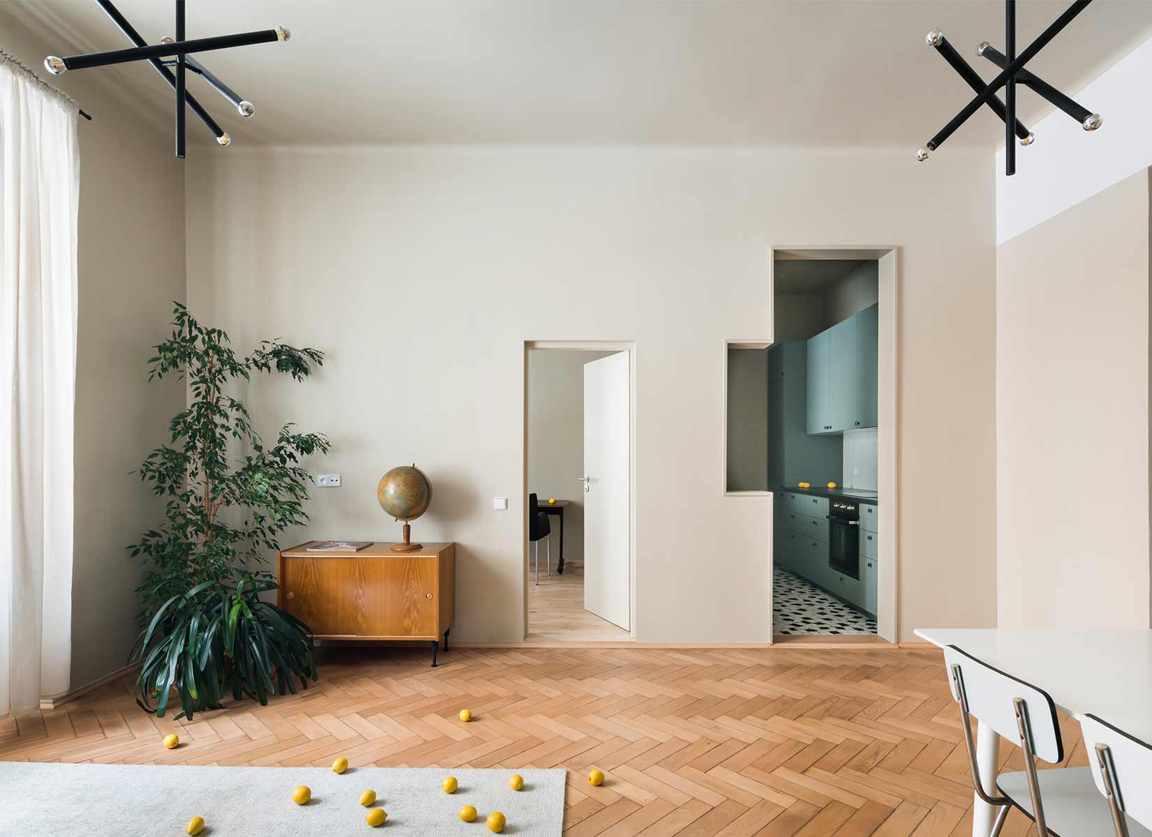
The new galley kitchen is compact but functional and receives natural light from an interior window overlooking the new study/guest bedroom. A stepped tall cased-opening links the living room to the kitchen, further bringing in light. The step reconciles the lower datum of the study door with the taller opening that leads into the foyer. Simple cabinetry from Ikea is elevated by a handmade backsplash subway tile and palladiana floor–a hint to the Italian heritage of the architecture studio.
PHOTOS BY Studio Flusser
PHOTOS BY Studio Flusser
PHOTOS BY Studio Flusser
PHOTOS BY Studio Flusser
PHOTOS BY Studio Flusser
PHOTOS BY Studio Flusser
PHOTOS BY Studio Flusser
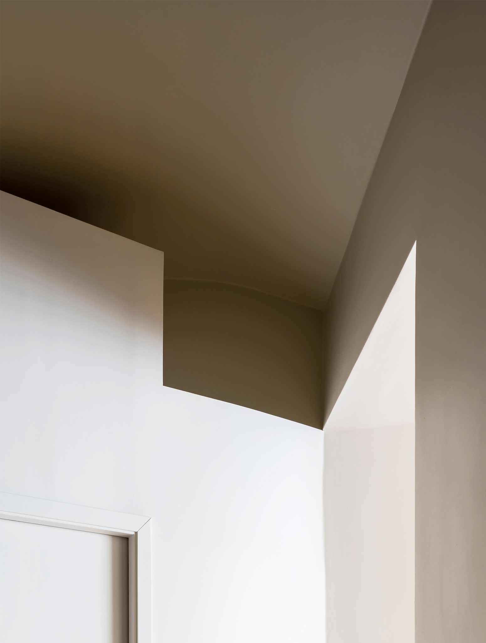
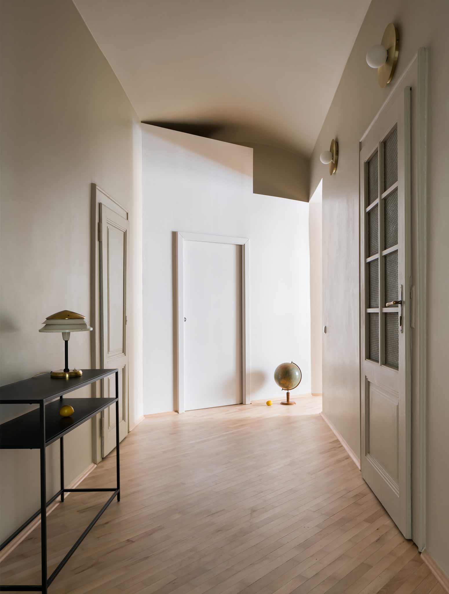
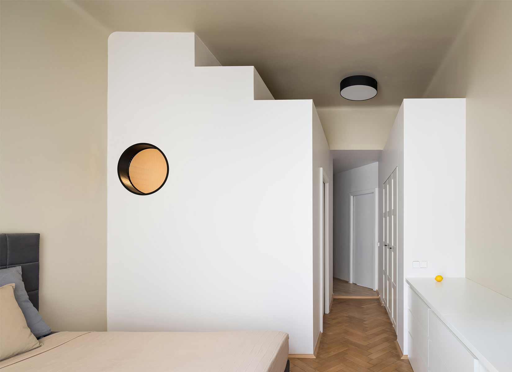
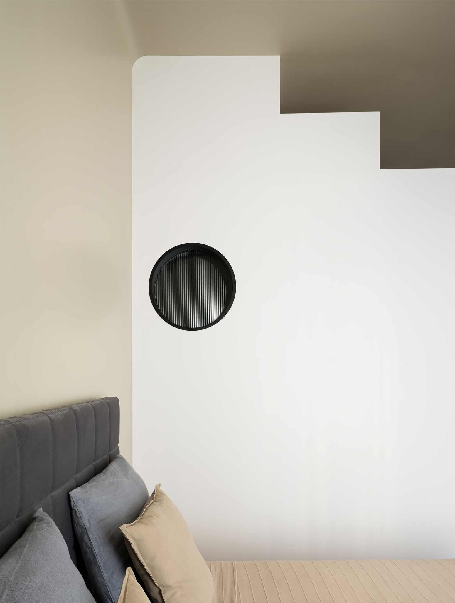
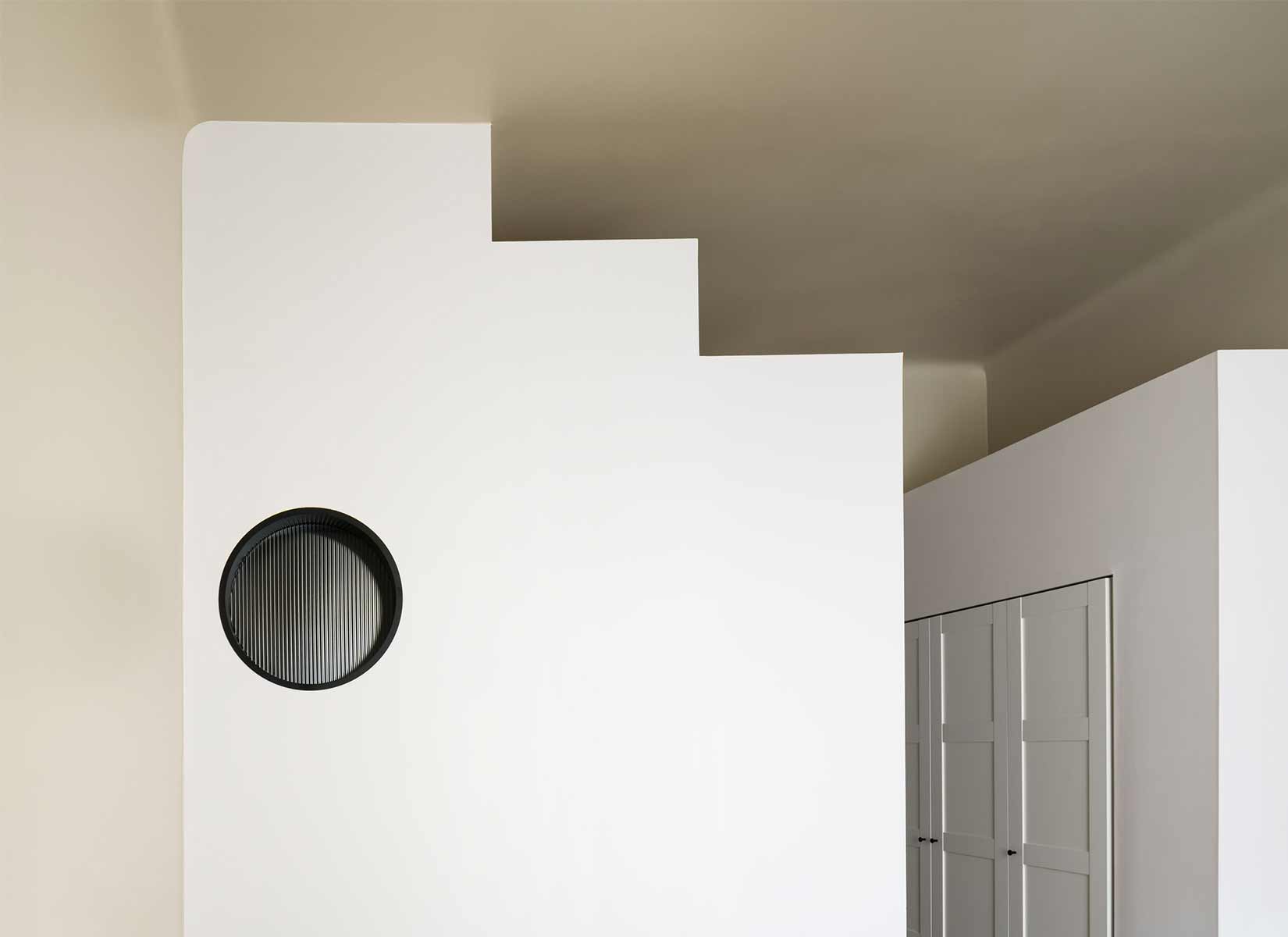
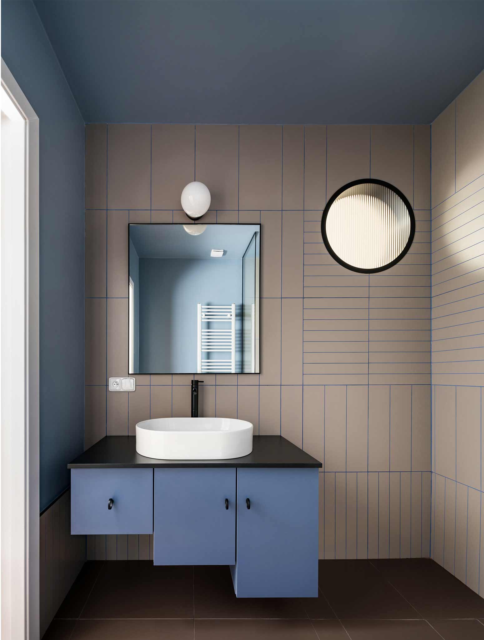
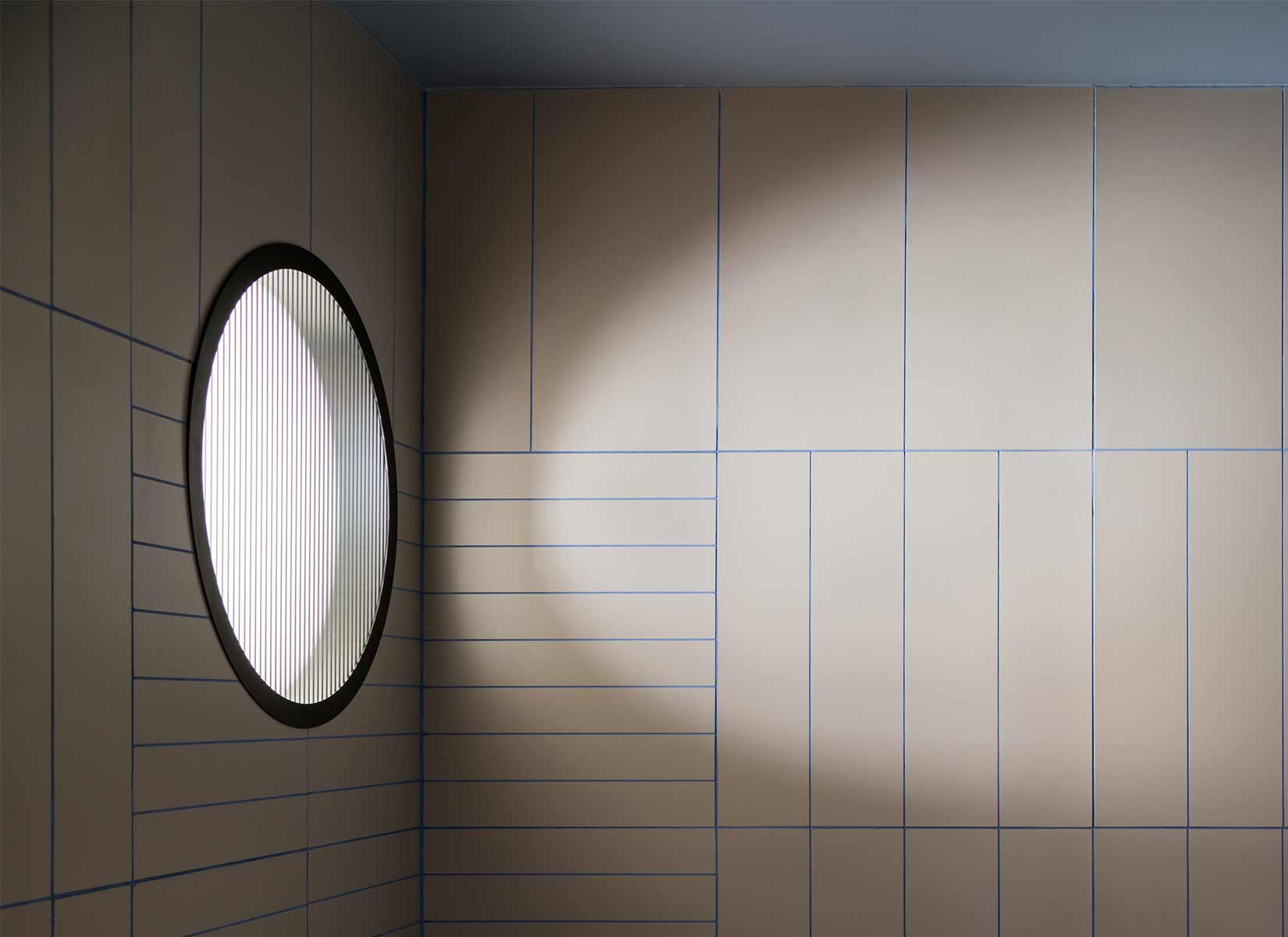
The oversized foyer was reduced with the introduction of a sculptural stepped volume that houses a walk-in closet and creates a threshold to the main bedroom. Here, another stepped volume houses an en-suite bathroom that receives natural light from a round window, whose height is set to align with the head of a person taking a shower. The reason for using a stepped geometry for these “inserted elements” is two-fold. Visually, the steps differentiate the new volumes from the existing fabric. Pragmatically, the formed shelves provide space to showcase objects or for additional storage. The use of color reinforces the distinction between existing and inserted geometries, which are left white.
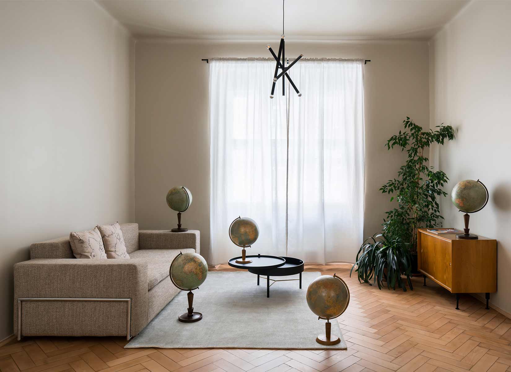
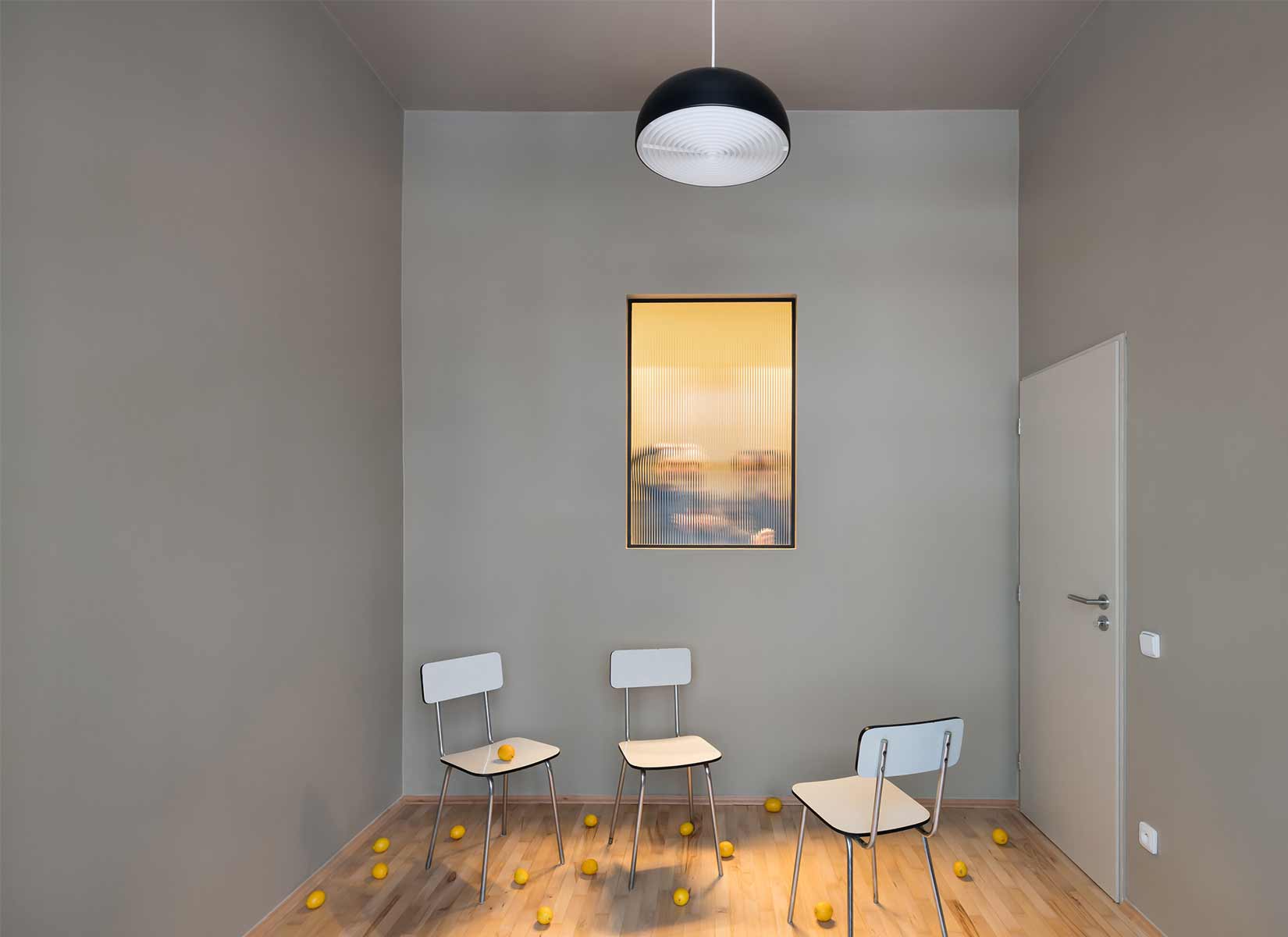
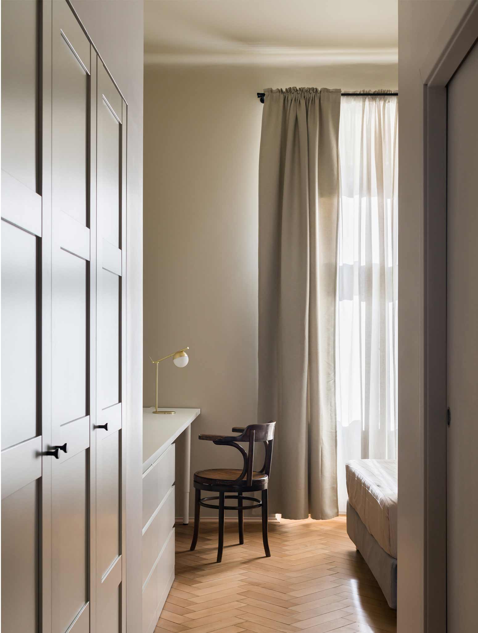
The material palette for the main spaces is purposely neutral. The existing oak wood floor was sanded and refinished wherever possible. The foyer required a new wood floor, which was installed at an angle to differentiate it from the historic herringbone parquet. The interior of smaller spaces, such as the powder room, the bathroom, and the kitchen, is more playful and uses colorful cabinetry, tiles, grout, and paint to provide each small space with its own character. The apartment is sparsely furnished meeting the minimalist sensibility of the client. Several of the furniture are traditional Czech pieces. The media console is a vintage Czech design with new metal legs. The metal and bent plywood chairs around the dining table are a conventional Czech design found in schools throughout the country. Most millwork is off-the-shelf but integrated into niches to look built-in.
PHOTOS BY Studio Flusser
PHOTOS BY Studio Flusser
PHOTOS BY Studio Flusser
PHOTOS BY Studio Flusser
PHOTOS BY Studio Flusser
PHOTOS BY Studio Flusser
Project information
- Architect:Alepreda Architecture
- Location:Czech Republic,
- Project Year:2021
- Photographer:Studio Flusser
- Categories:Apartment