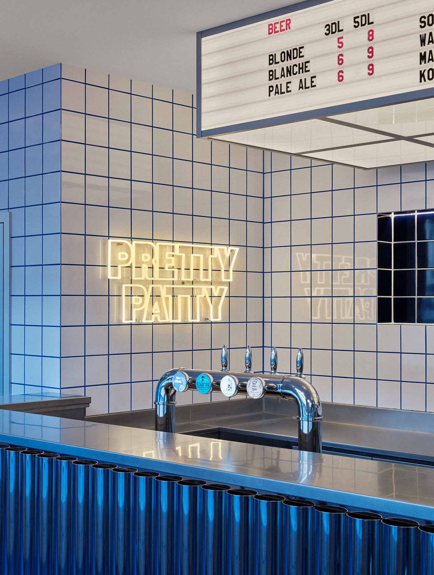
Pretty Patty is a neighborhood burger joint located in the heart of Geneva, designed by Sapid Studio in collaboration with YKRA. An homage to burger restaurants both past and present, the design incorporates nostalgic and contemporary elements within the space to create an environment that is simultaneously new yet familiar.
The project responds to the growing need for fast food restaurants to be versatile, providing memorable dining experiences for clients while adapting to quickly changing takeout and delivery needs. Through extensive research into fast food logistics and aesthetics, the design language aims to elevate materials typically associated with American diners and commercial kitchens, to convey the idea that this is both a space of consumption and production.
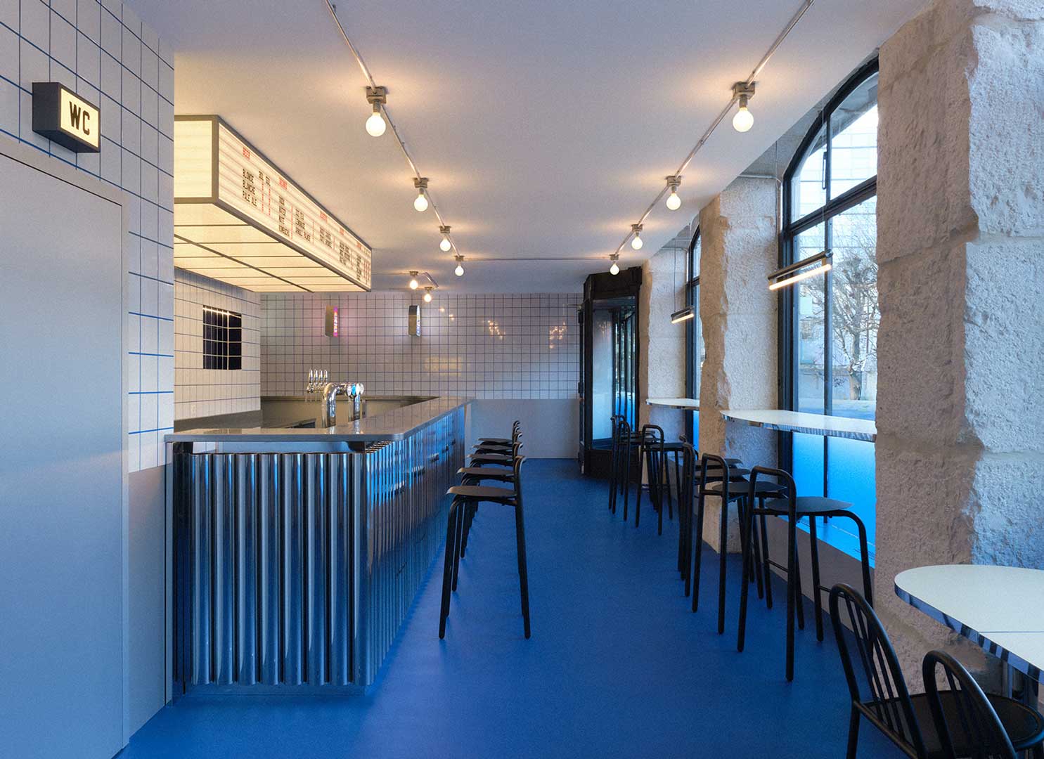
Seating up to 70 people indoors with an additional capacity for 20 outdoors, the restaurant contains three main rooms; a front room with bar counter, rear dining room and commercial kitchen.
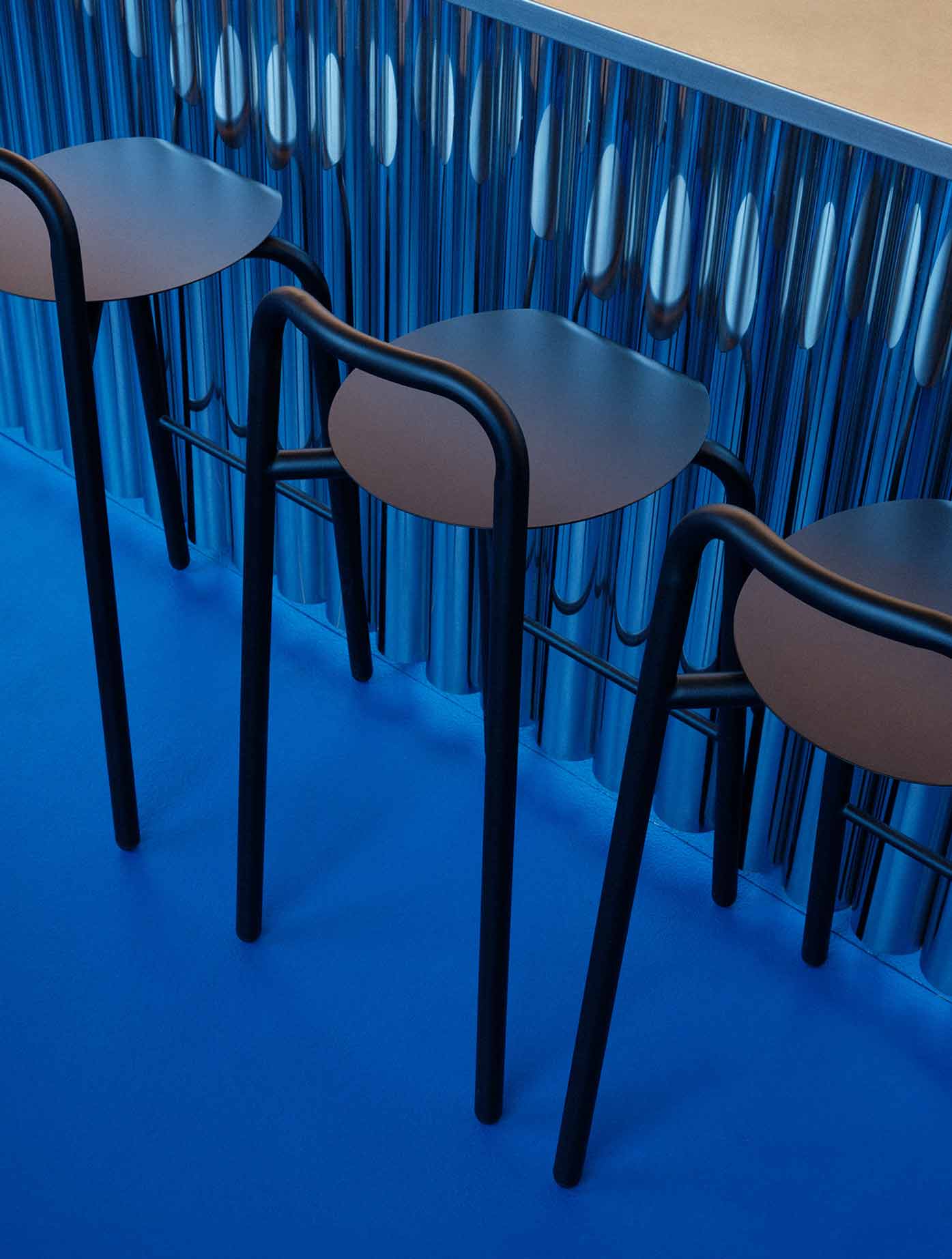
Upon entering the space, visitors are confronted by a custom-made, curved bar built out of chrome-plated metal tubing, with a marquee style light displaying Pretty Patty’s menu overhead. The counter doubles as both a place to line up and order, as well as a full-service bar.
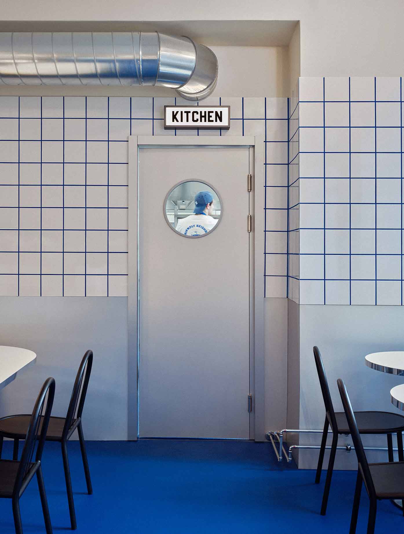
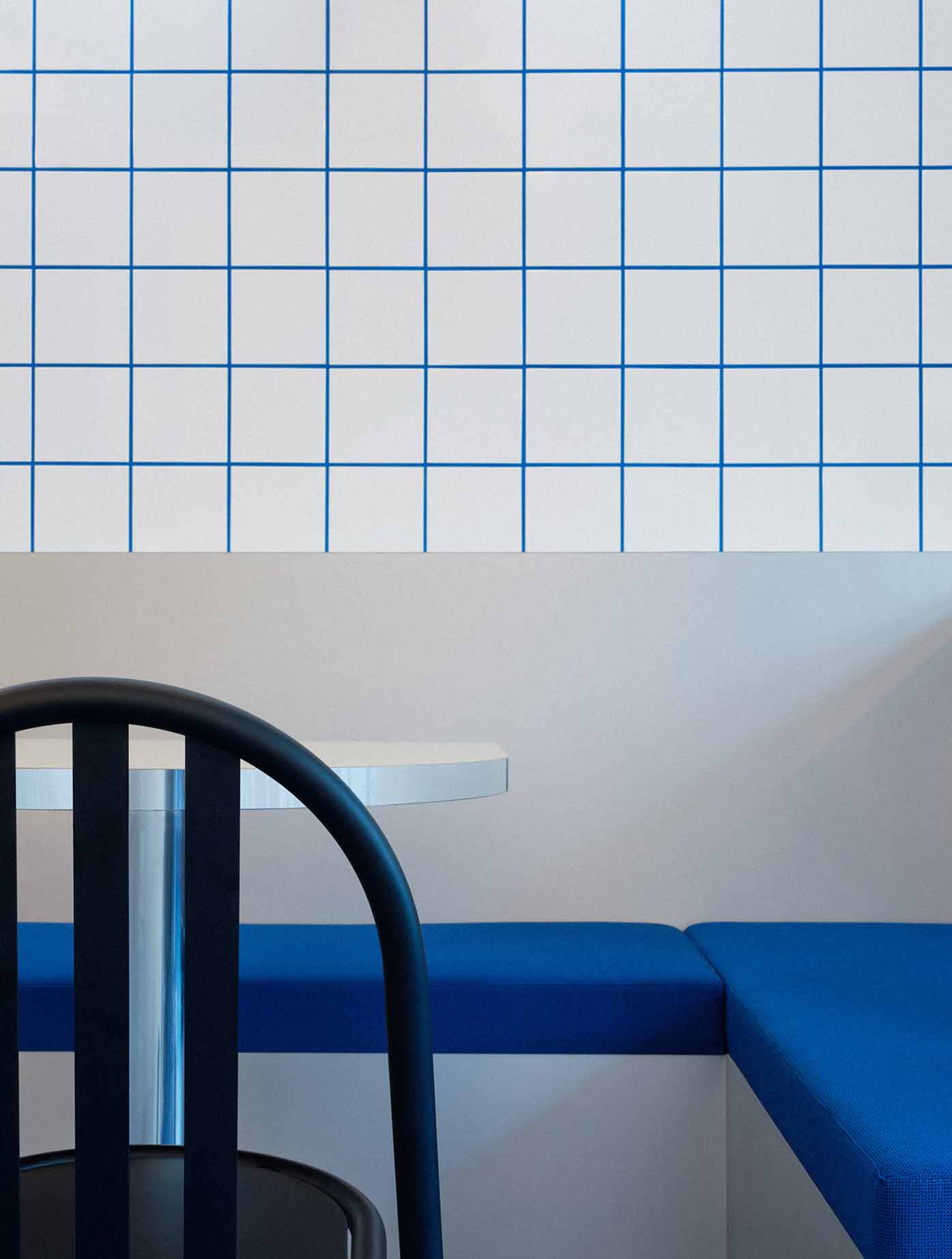
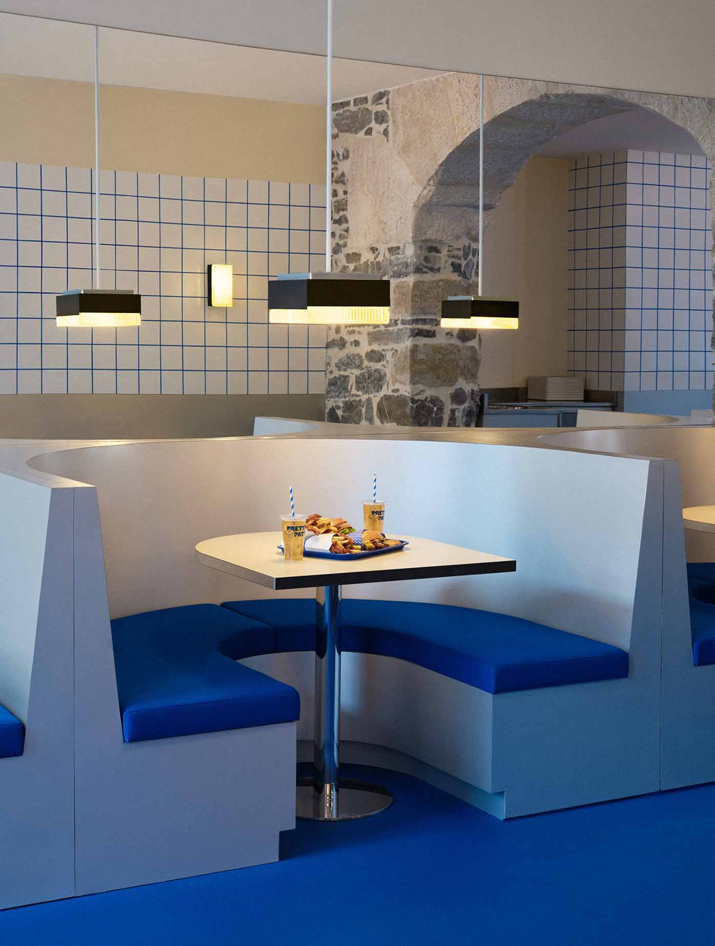
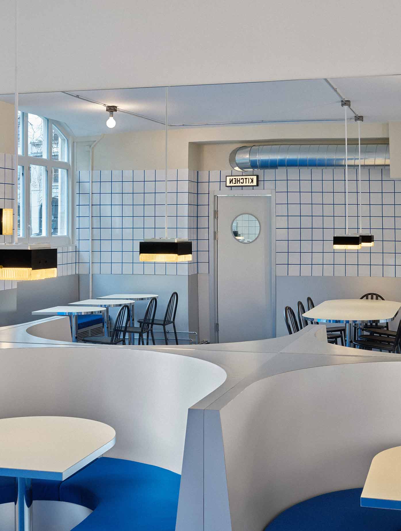
In the back room, custom seating includes 4 U-shaped booths and a large communal table seating up to 8, creating a range of seating that affords for different lengths of dining. Metal tones including chrome and aluminum veneer are used throughout the space in different millwork and lighting elements. White tiles typically used in commercial kitchens are finished with contrasting blue grout to reinforce Pretty Patty’s identity, in an effort to combine the material identities associated with American diners and commercial fast food kitchens.
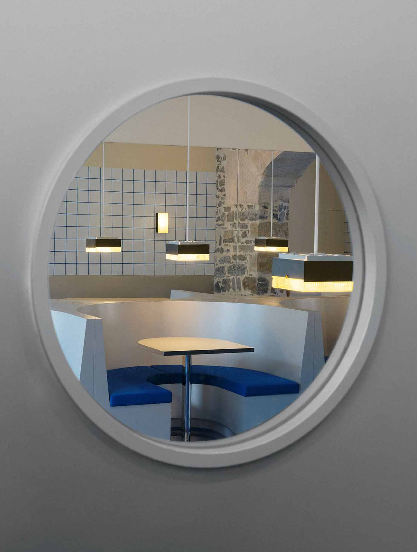
The spatial layout of the kitchen responds to the dual needs of the restaurant; to provide food to customers efficiently while simultaneously handling high delivery order demand. In response, the main kitchen door serves the restaurant while the other acts as a delivery door that opens out onto an adjacent passageway. A sliding window integrated into the delivery door allows orders to be efficiently handed out to the drivers, minimizing wait time and their need to find parking for their respective vehicles.
The project merges the front and back of house spaces through a shared, elevated material language that creates a cohesive restaurant experience for diners, workers and delivery drivers alike.
PHOTOS BY Alicia Dubuis
PHOTOS BY Alicia Dubuis
PHOTOS BY Alicia Dubuis
PHOTOS BY Alicia Dubuis
PHOTOS BY Alicia Dubuis
PHOTOS BY Alicia Dubuis
PHOTOS BY Alicia Dubuis
Project information
- Architect:Sapid Studio
- Location:Switzerland,
- Project Year:2024
- Photographer:Alicia Dubuis
- Categories:Commercial,Shop,Tiles