
Studio Bloomscape Architecture and Francesca Perani Enterprise teamed up to create the new store for the multi-brand retailer ON-OFF in Milan, experimenting with flexible and scalable display solutions borrowed from the construction industry for a circular future.
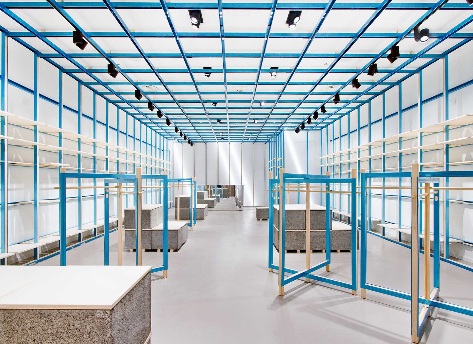
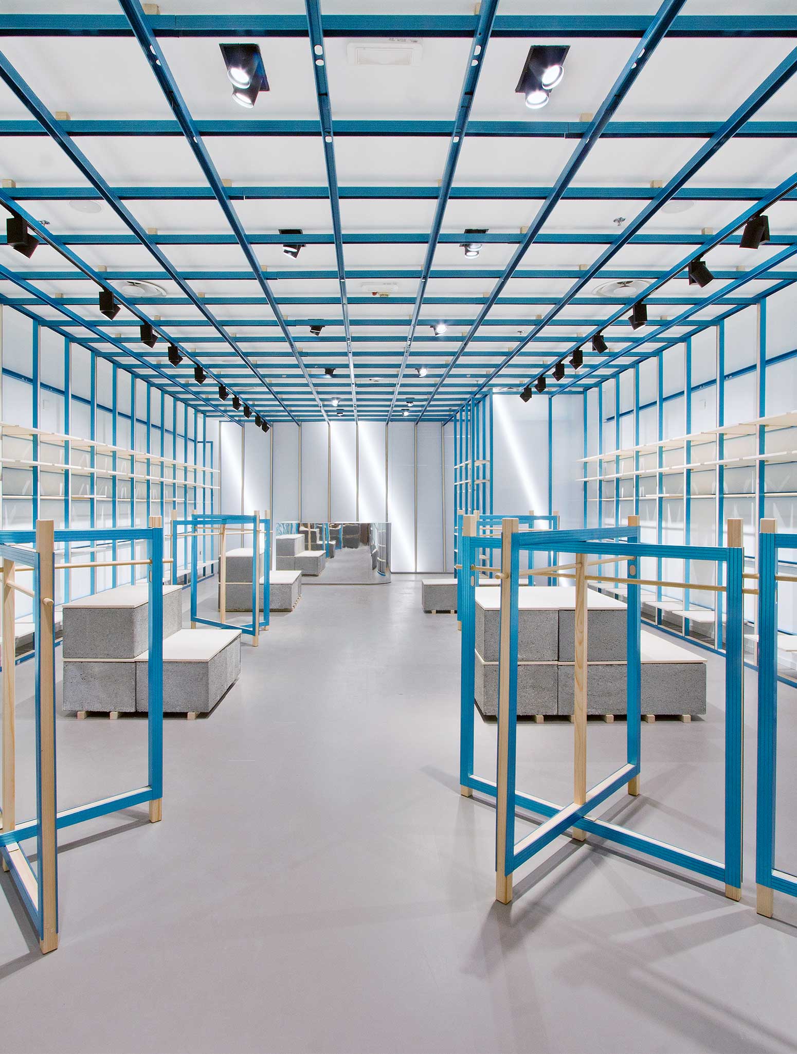
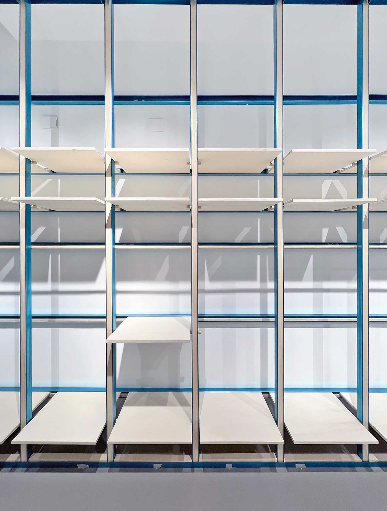
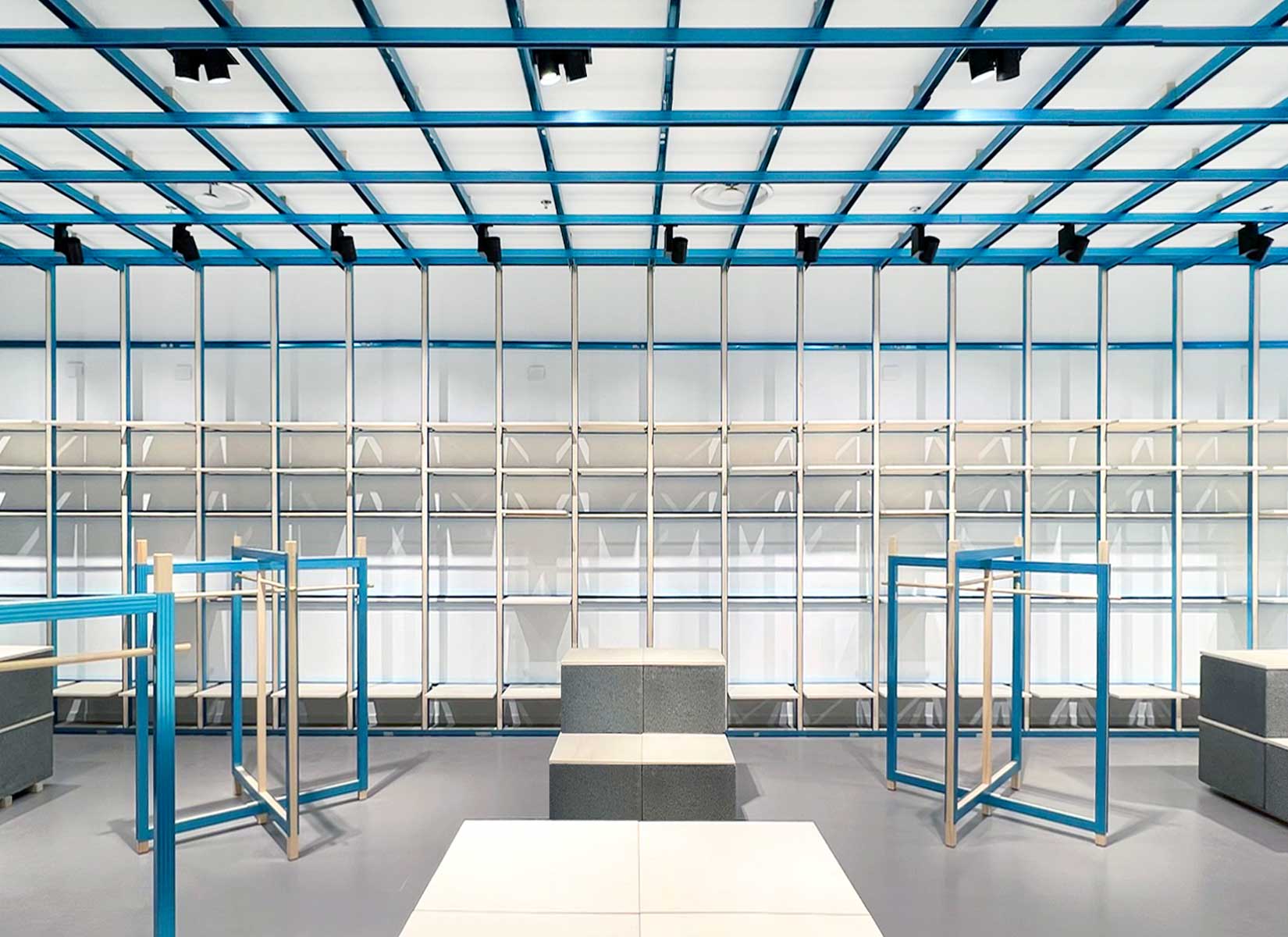
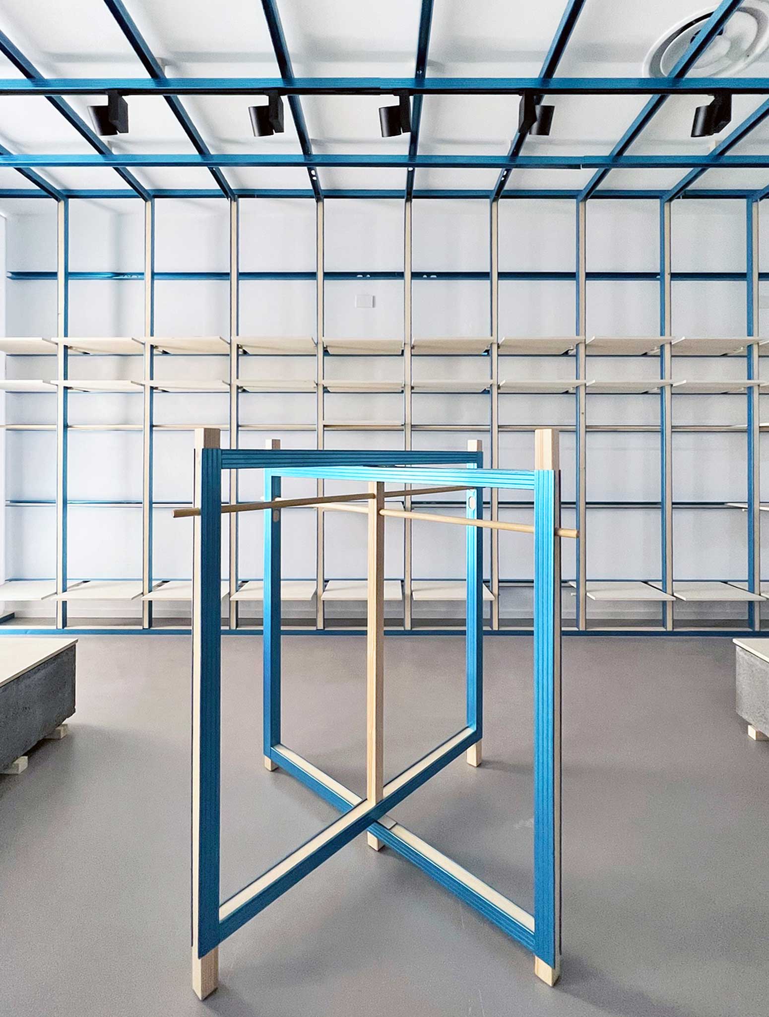
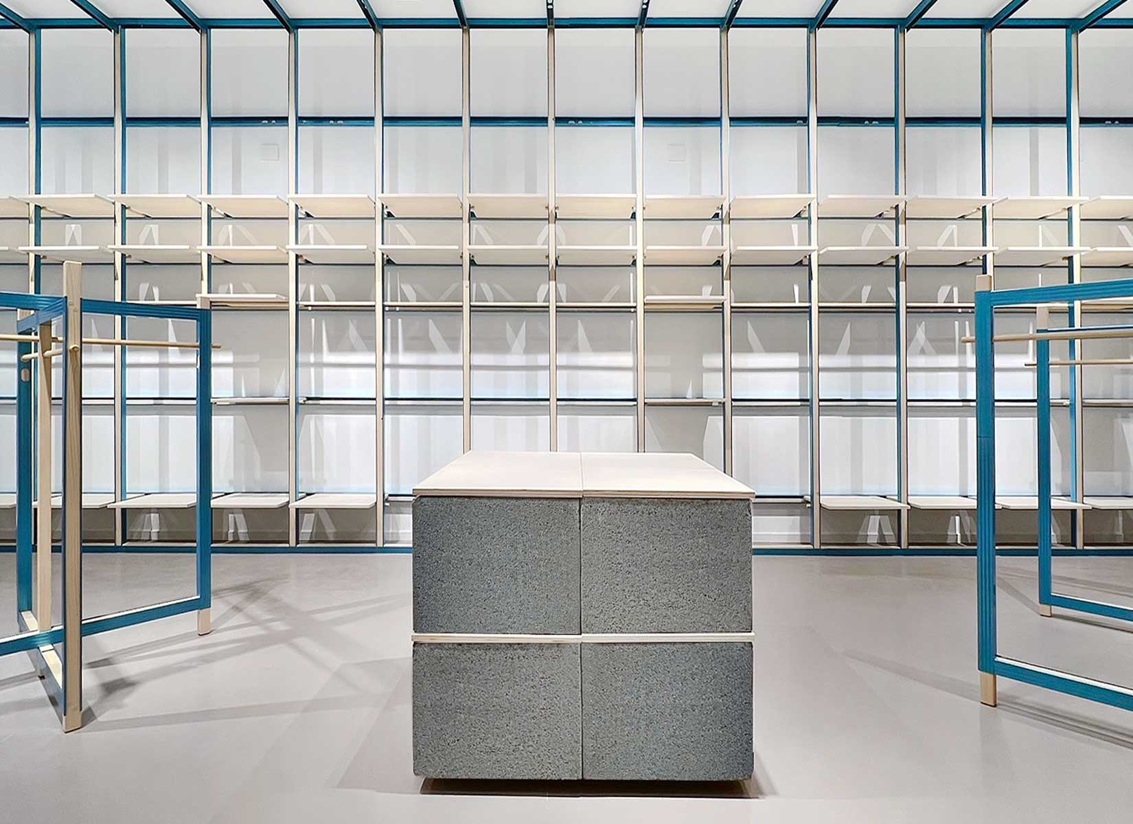
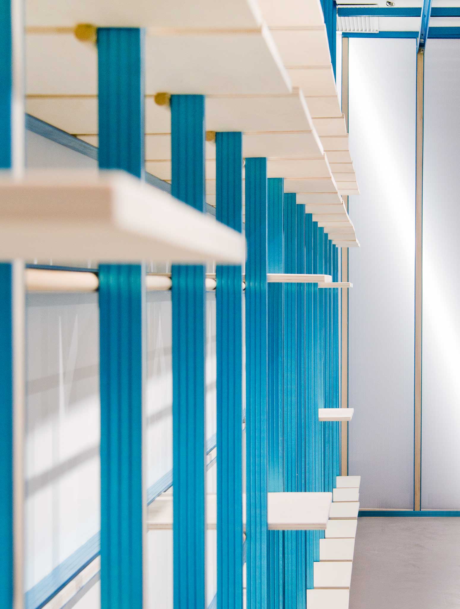
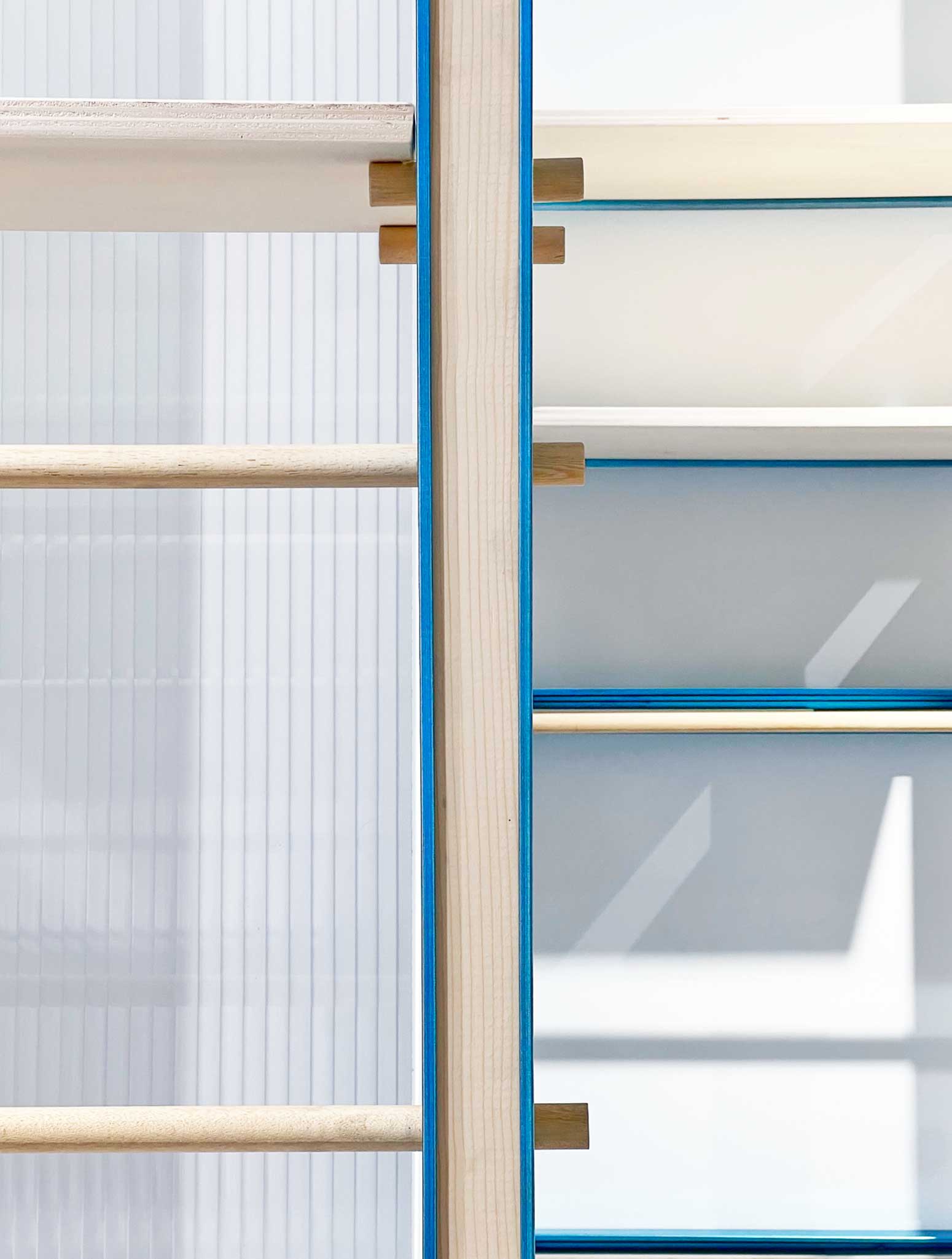
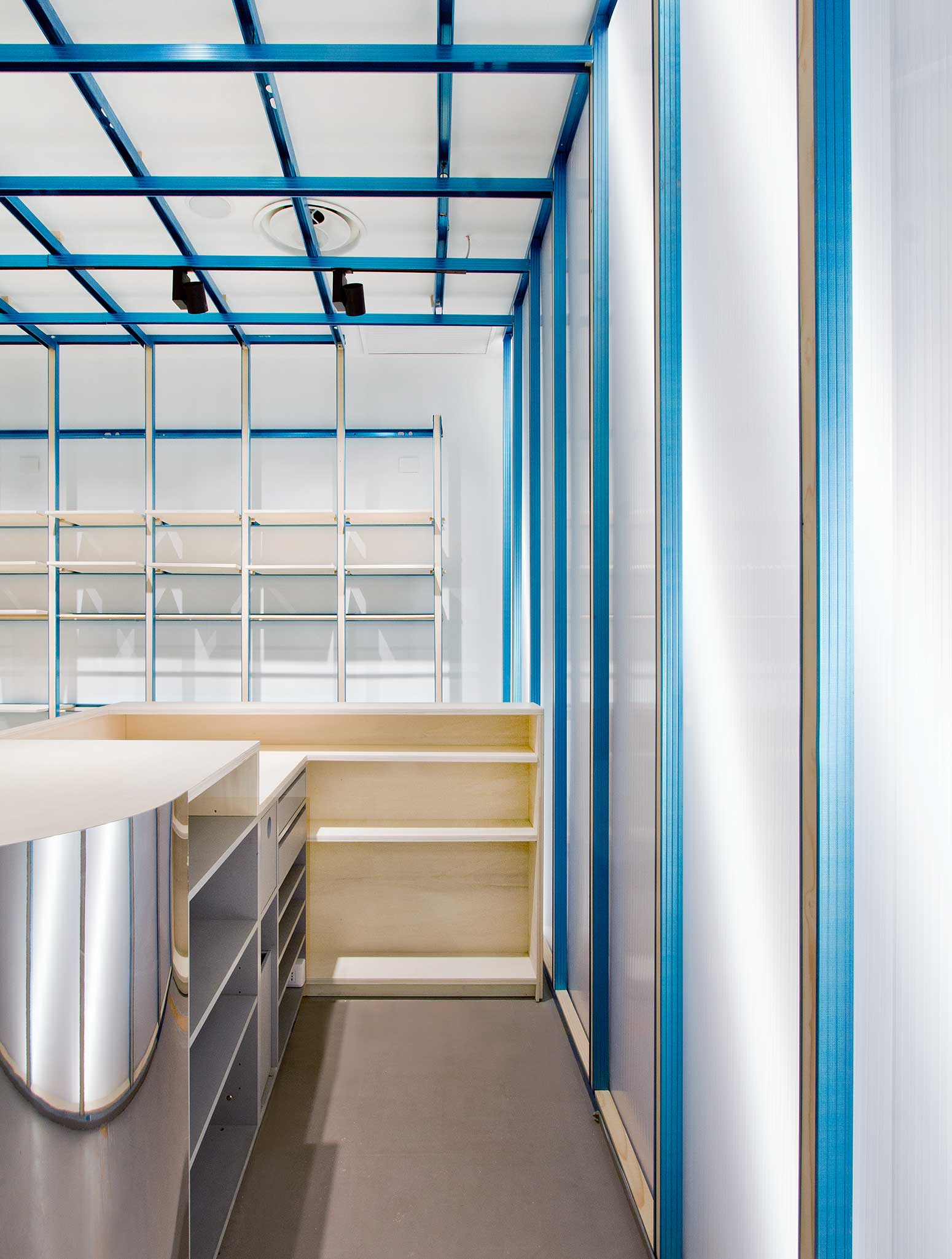
The 100sqm space is defined by an exposed structure in bright blue, anodised steel drywall framing combined with inserts and shelving in poplar wood. A playful reinterpretation of industrial and natural materials combined in their essential form to characterise the identity of the space. The designers dealt with the time limits for execution by identifying easily available construction solutions, with the intent of creating a new fit-out prototype inspired by the building world, mindful of waste and enhancing existing materials.
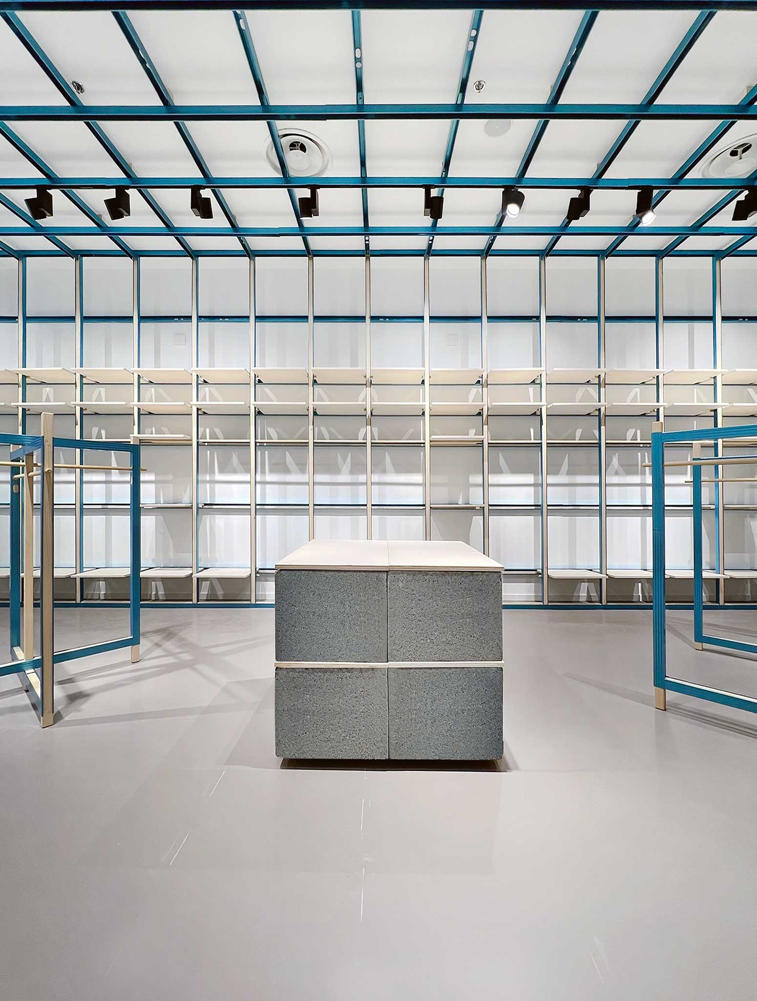
The brief from the owner was to create a new brand identity despite a limited budget; provide high- flexibility displays so that the store rollout could be faster and replicated in diverse contexts. The design develops through a coloured metal grid descending from the ceiling and covering all the walls. A series of adjustable shelves and a single wood rail for hanging are placed on it. Prefabricated concrete blocks, mirror features, and methacrylate surface complete the material mood board with the characterising blue protective treatment as the absolute protagonist.
PHOTOS BY Francesca Perani
PHOTOS BY Francesca Perani
PHOTOS BY Francesca Perani
PHOTOS BY Francesca Perani
PHOTOS BY Francesca Perani
PHOTOS BY Francesca Perani
PHOTOS BY Francesca Perani
PHOTOS BY Francesca Perani
PHOTOS BY Francesca Perani
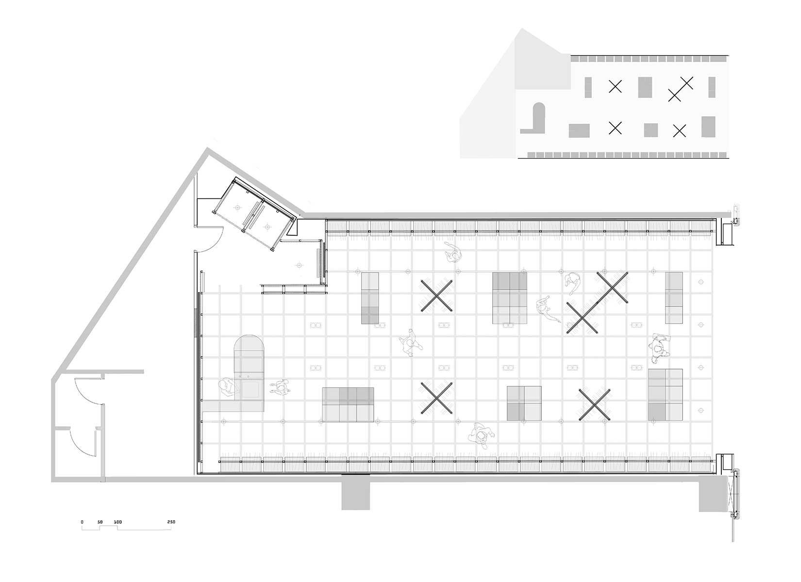
The internal layout envisages an open distribution of the sales area. Hangable and folded items for sale are distributed along the perimeter of the walls, making the product itself become an architectural part of the design. The back wall is dedicated to corporate communication. The central area is arranged in an alternation of free-standing displays for hanging items and focus islands for folded goods. The customised clothes rails are made of the same structural steel paired with wood used on the perimeter walls. The display islands, focus point for the brands, are instead created using prefab chimney cement blocks that can be repositioned to suit commercial needs.
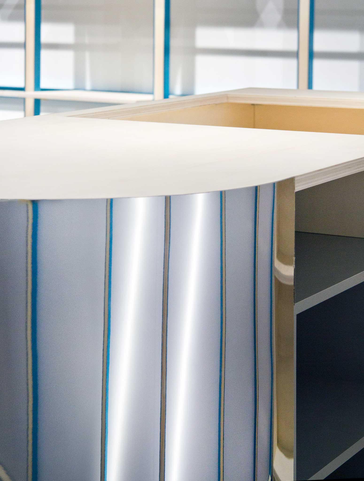
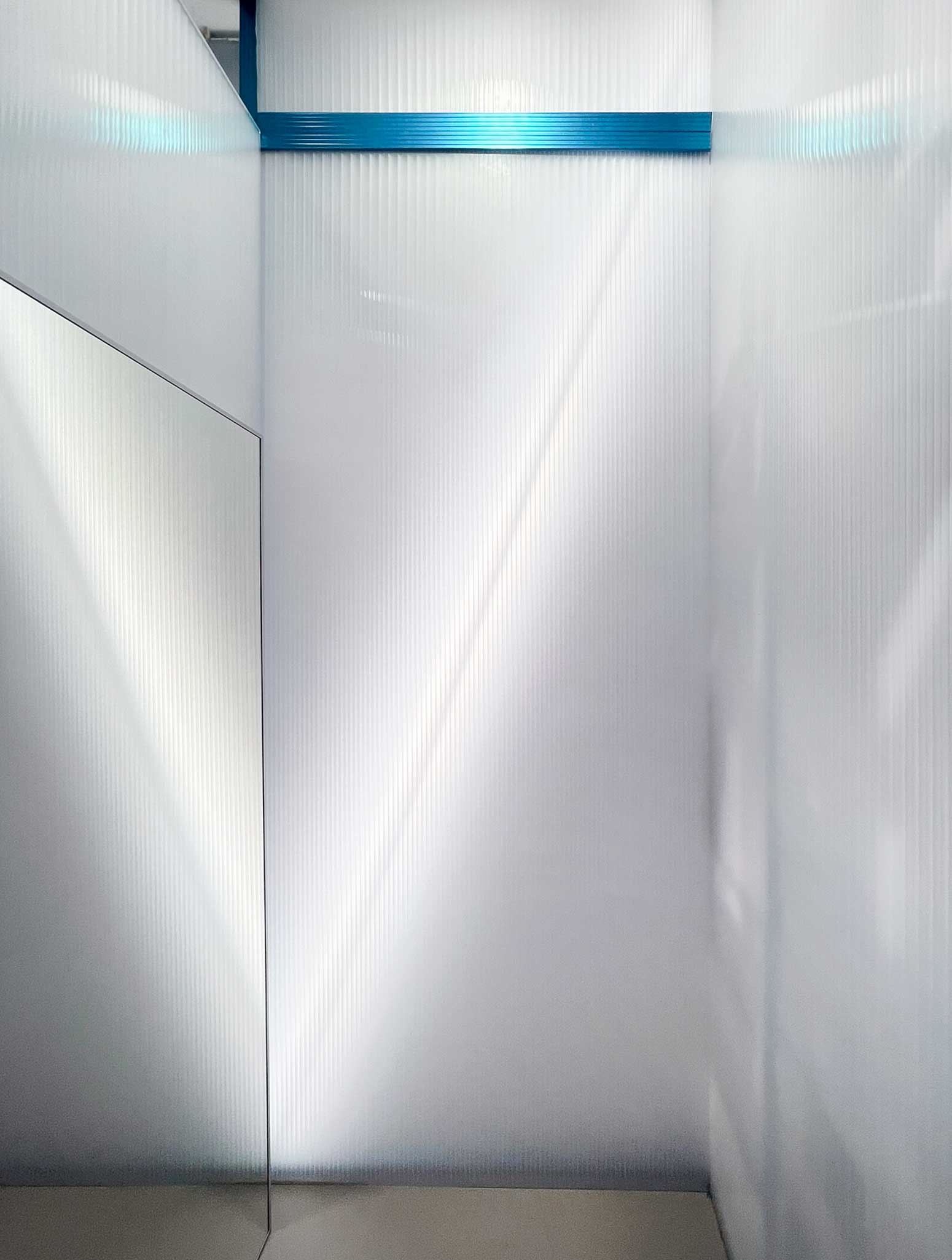
The cash register unit, designed with mirror finishes, is integrated by camouflage within the shop, becoming light and purposely disguised from its context. The sales counter is centred on the backlight end wall with the alternation of polycarbonate and metal uprights. The dressing rooms near the cash register are also built using light polycarbonate partitions with structural metal and wood frames. This intimate and reserved space converses with the sales floor thanks to the continuity in materials that connects it to the cash register area.
Internal circulation, aimed at guaranteeing a complete depth of vision, has a clear central path around which the communication panels hanging from the ceiling accompany the user to identify and choose the brands available.
PHOTOS BY Francesca Perani
PHOTOS BY Francesca Perani
PHOTOS BY Francesca Perani
The existing architectural space remains unchanged: a second skin, created using an essential skeleton structure, defines the area and the new ON-OFF corporate image. The original floor is treated with a neutral colour, and the walls are painted white, “freezing” the pre-existing. The metal-cyan structures, the wood, the polycarbonate and the mirrors complete the space.
The shop is conceived as reversible in two ways: firstly, it offers the opportunity to develop any commercial premises limiting demolition and reconstruction costs; it also creates the possibility of repositioning the display elements or recycling them back to the world of construction.
The project designers’ intent was to identify a single language, strongly connected to the materials used, to express the contemporary dynamics any project faces today; a creative vision answering the need for waste limitation and reduced access to refined materials.
Collaborators: Claudia Martinelli
Project information
- Architect:Bloomscape,Francesca Perani
- Location:Italy,
- Project Year:2023
- Photographer:Francesca Perani
- Categories:Shop,Showroom