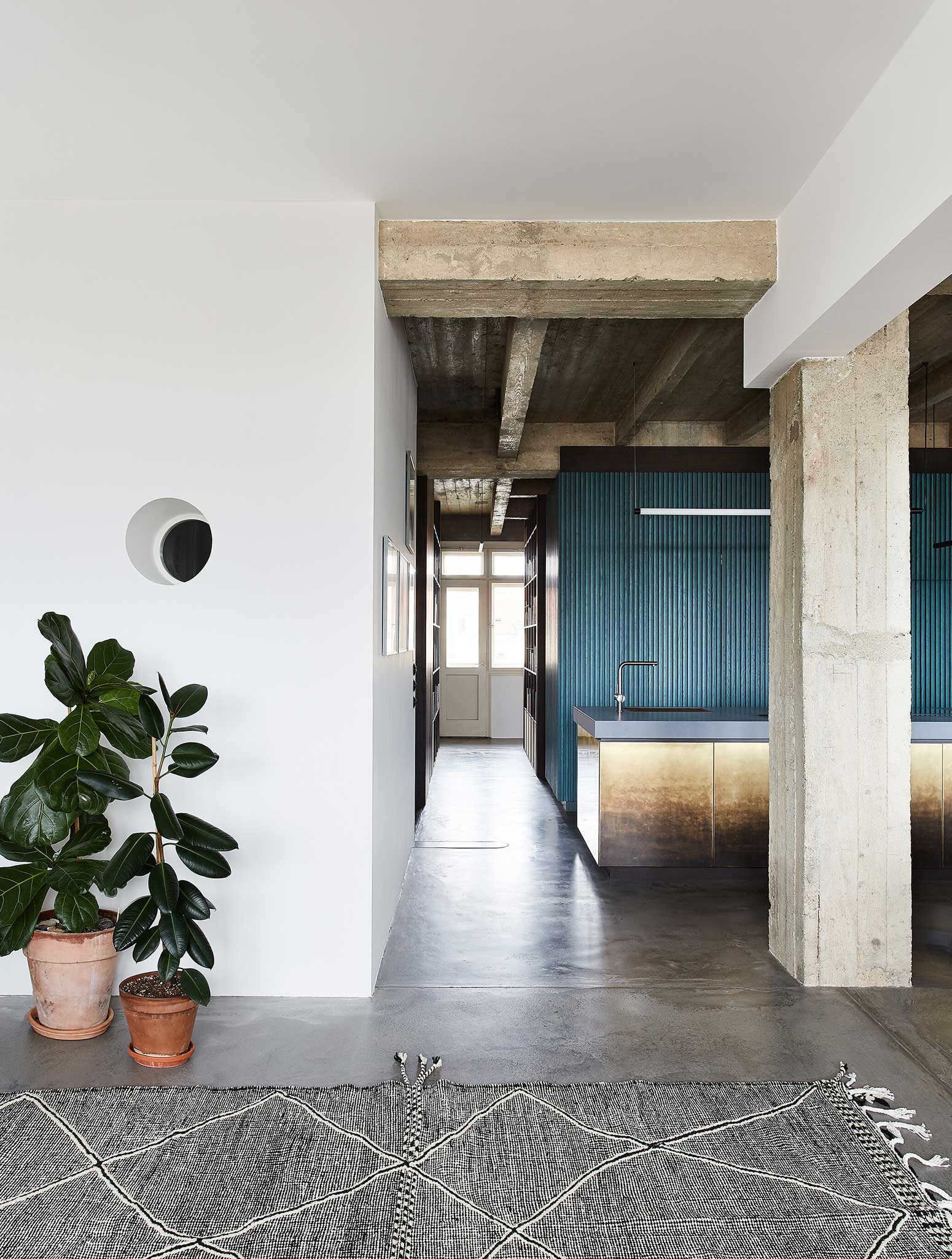
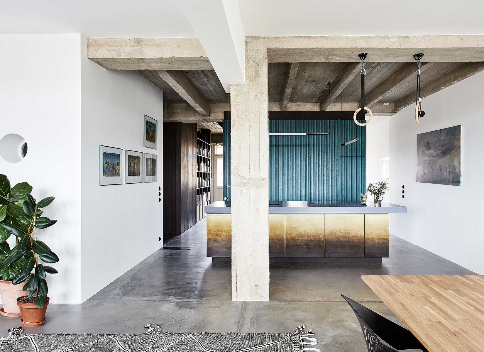
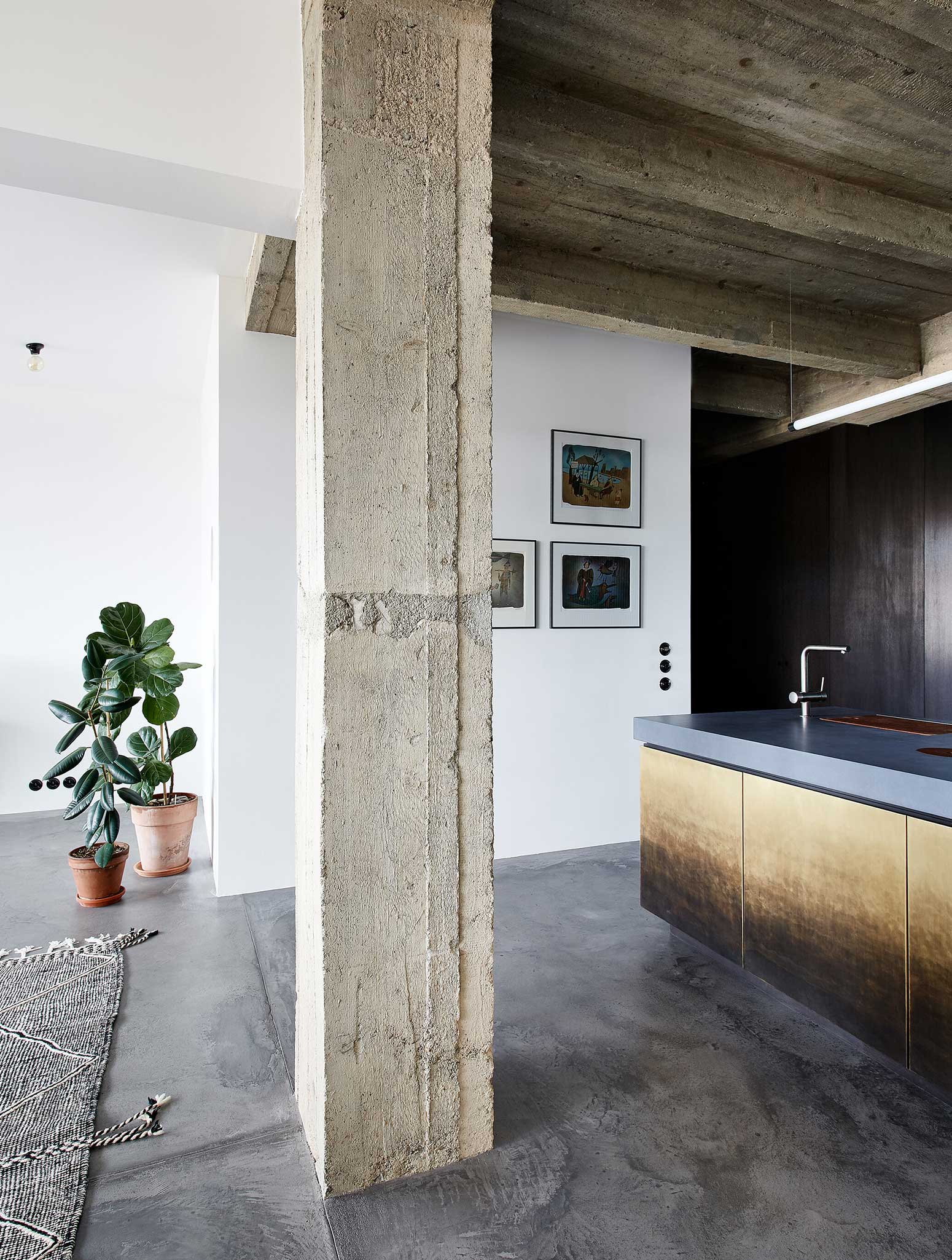
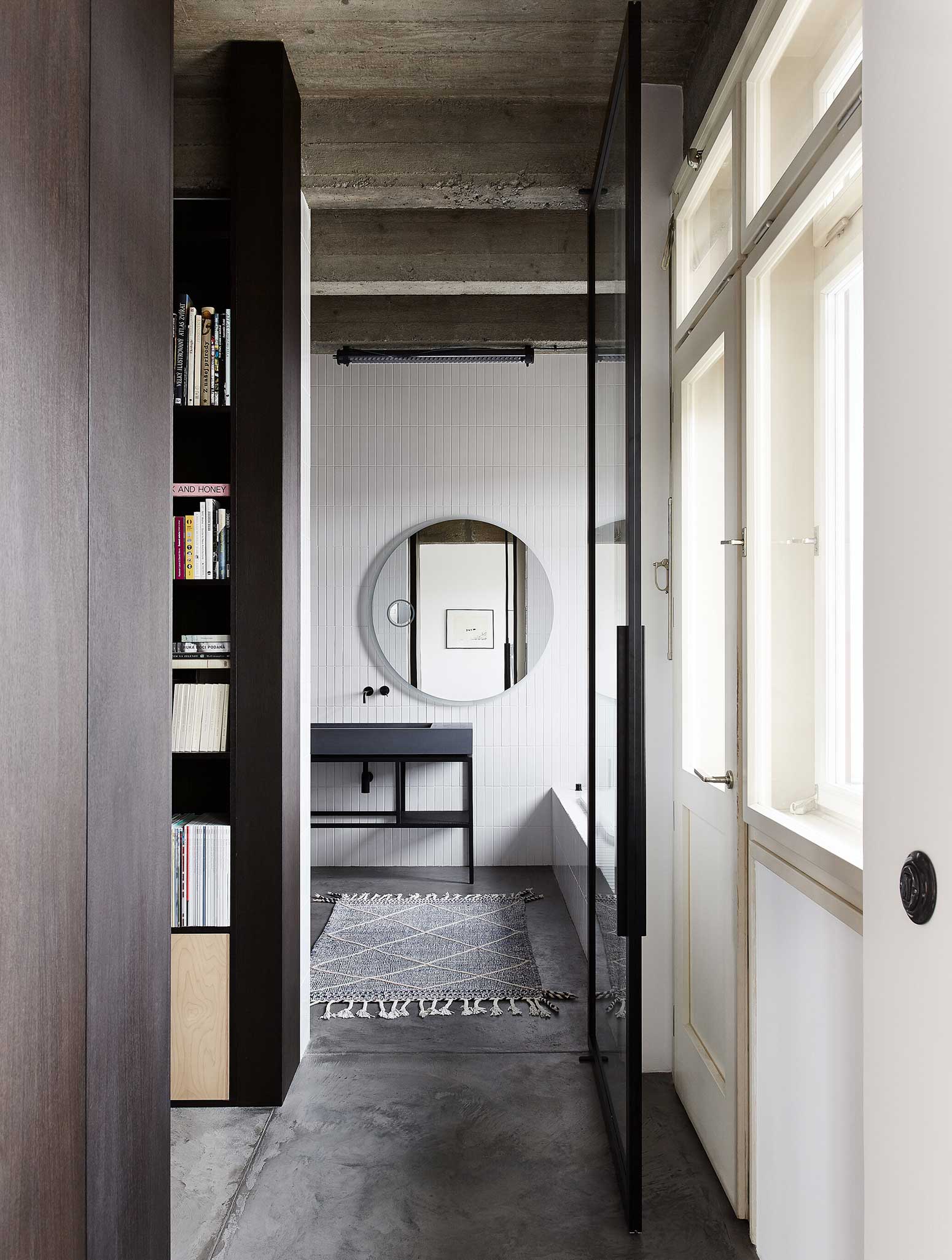
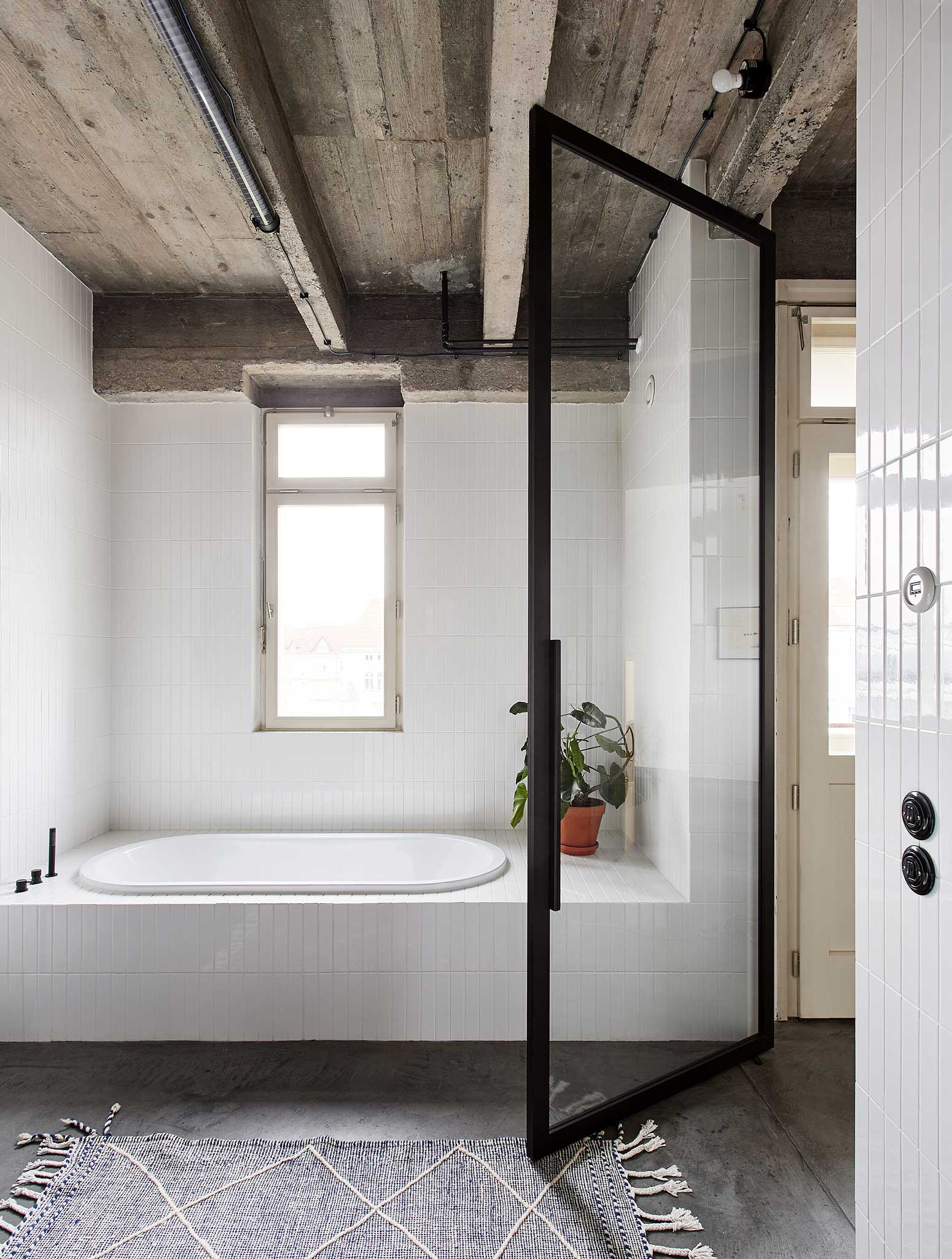
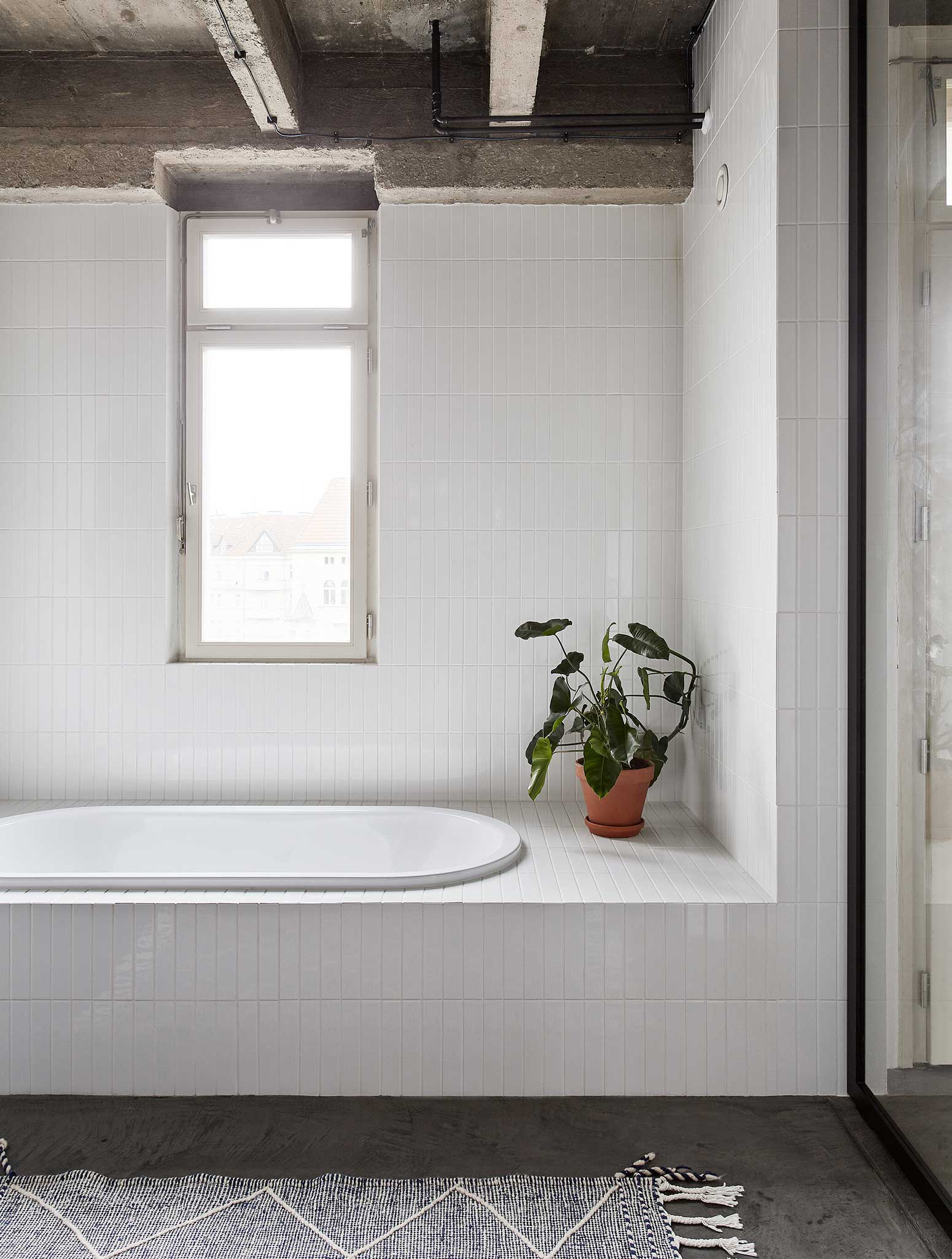
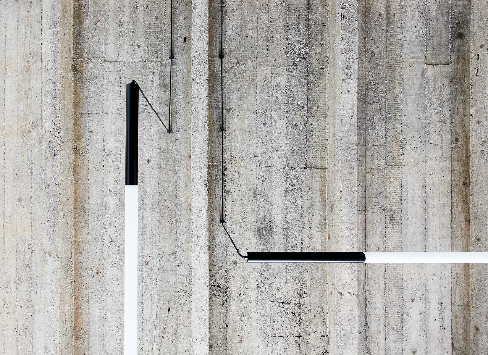
How do you create one open space out of a large multi-room apartment so that there doesn’t have to be a door between rooms because the client wanted as few as possible, but you still felt like the rooms were separated? We tried to clean the whole space, to use the existing structural and technical parameters of the apartment. The reinforced concrete ceiling structure with ribs was also exposed. This gave the apartment a rawer character.
The supporting theme of the concept was the choice of flooring, which was supposed to be uniform throughout the apartment, including in the bathrooms and shower spaces. One of the options was a terrazzo floor but after a static analysis, the client and I decided on a brushed concrete screed.
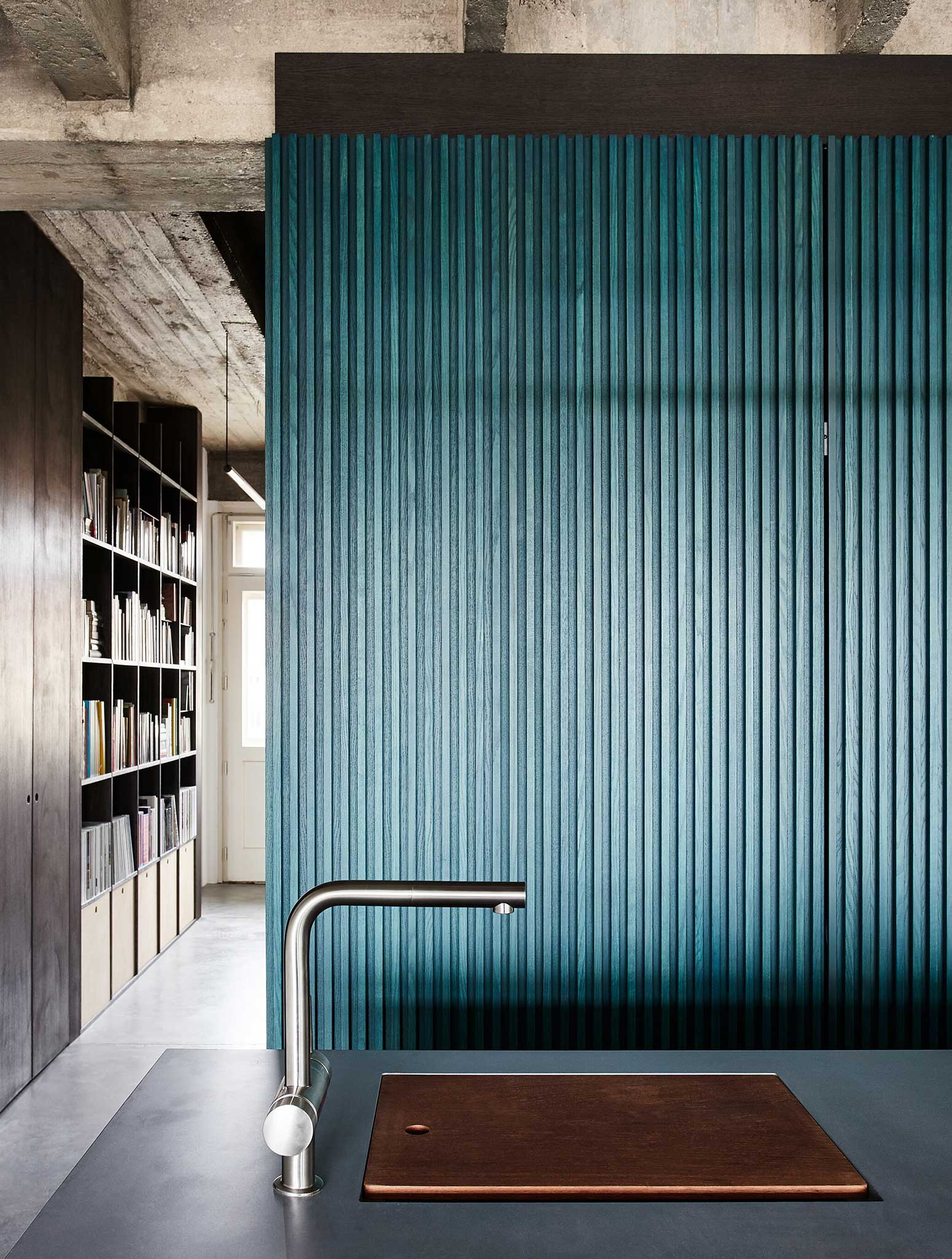
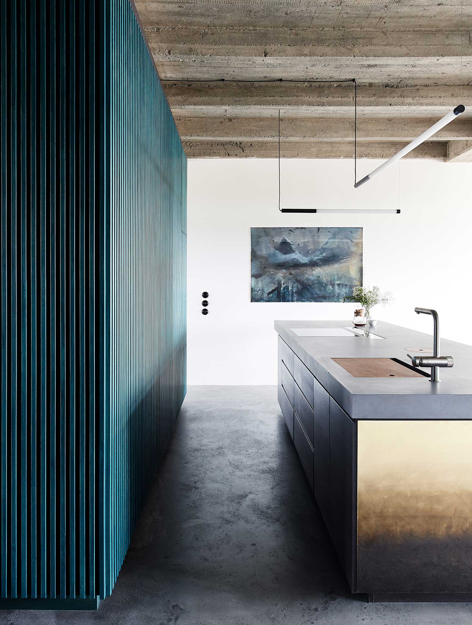
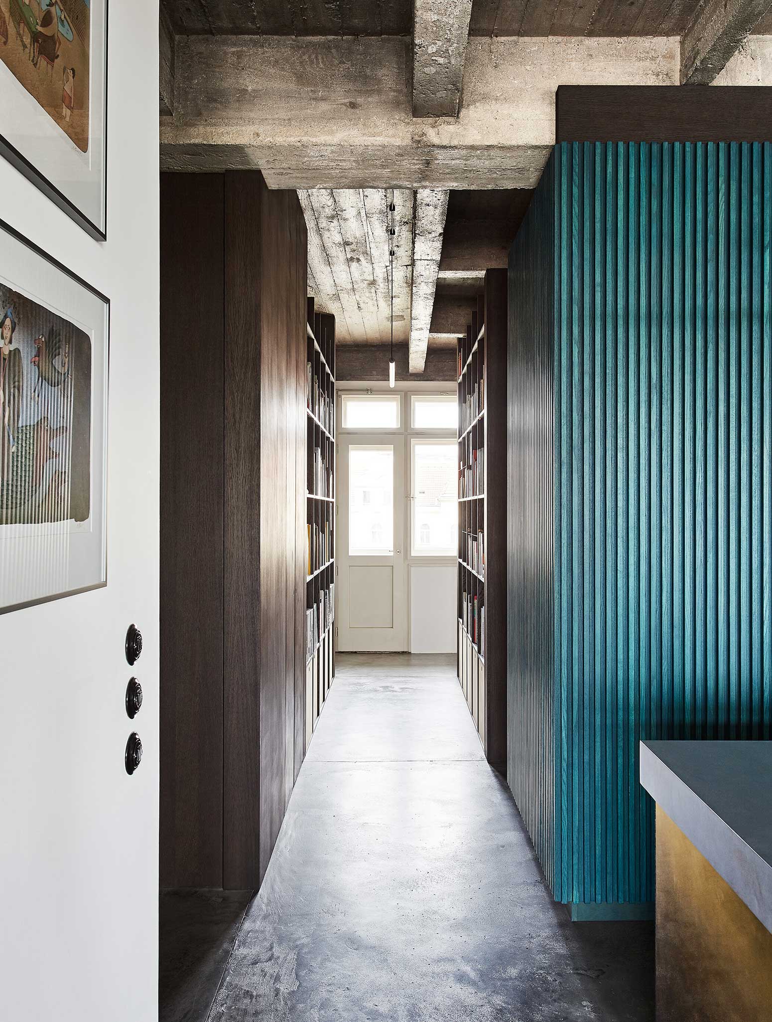
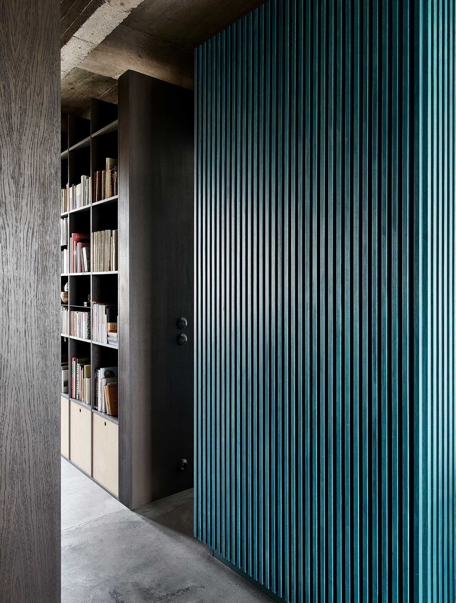
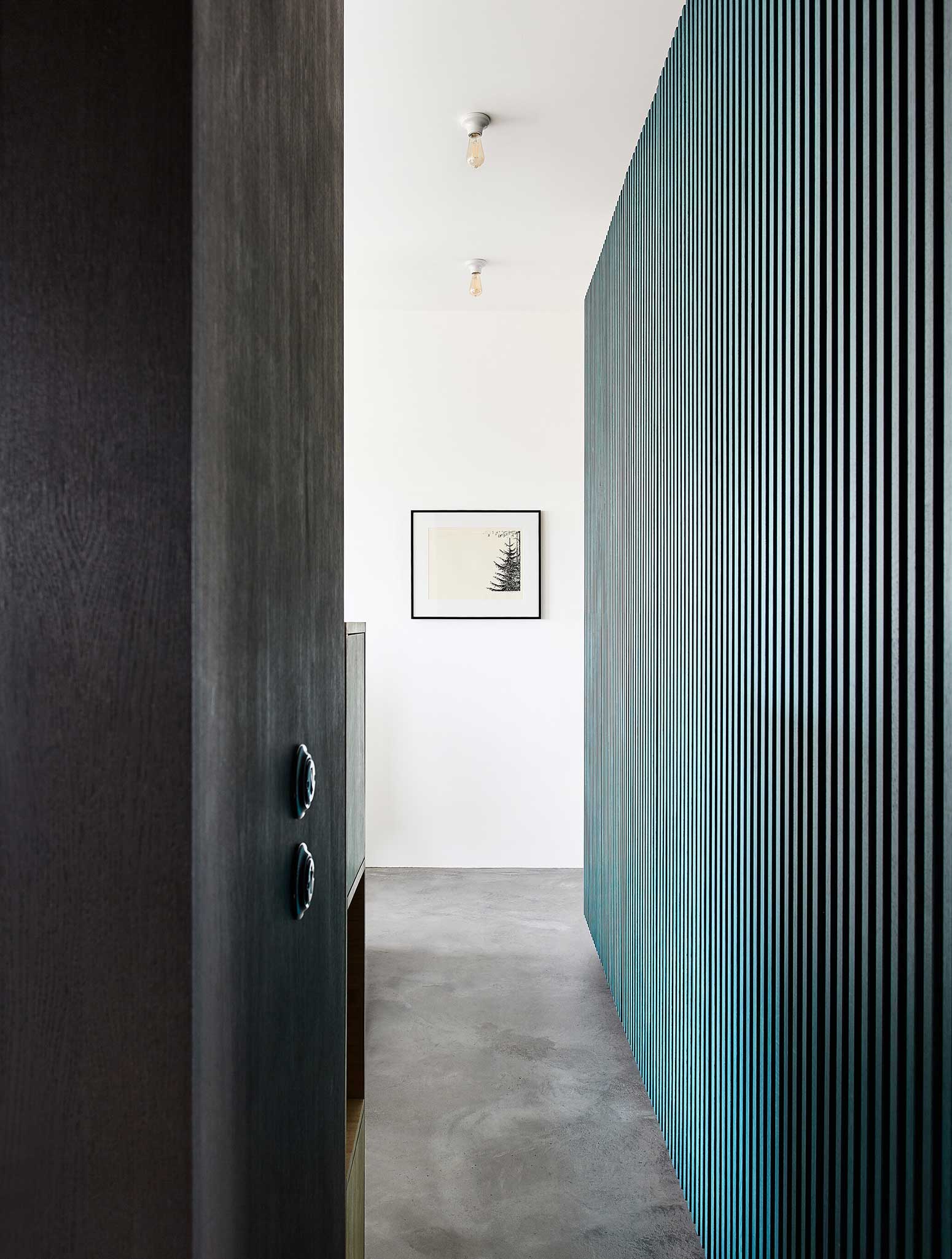
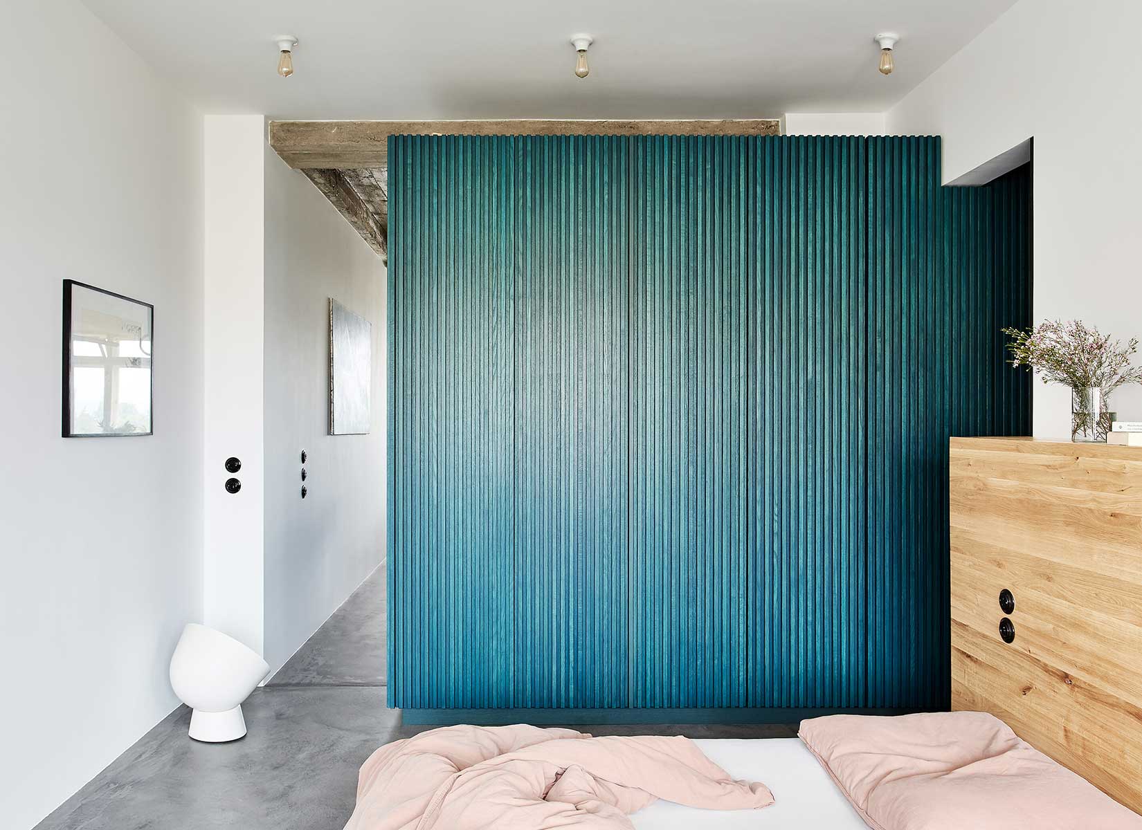
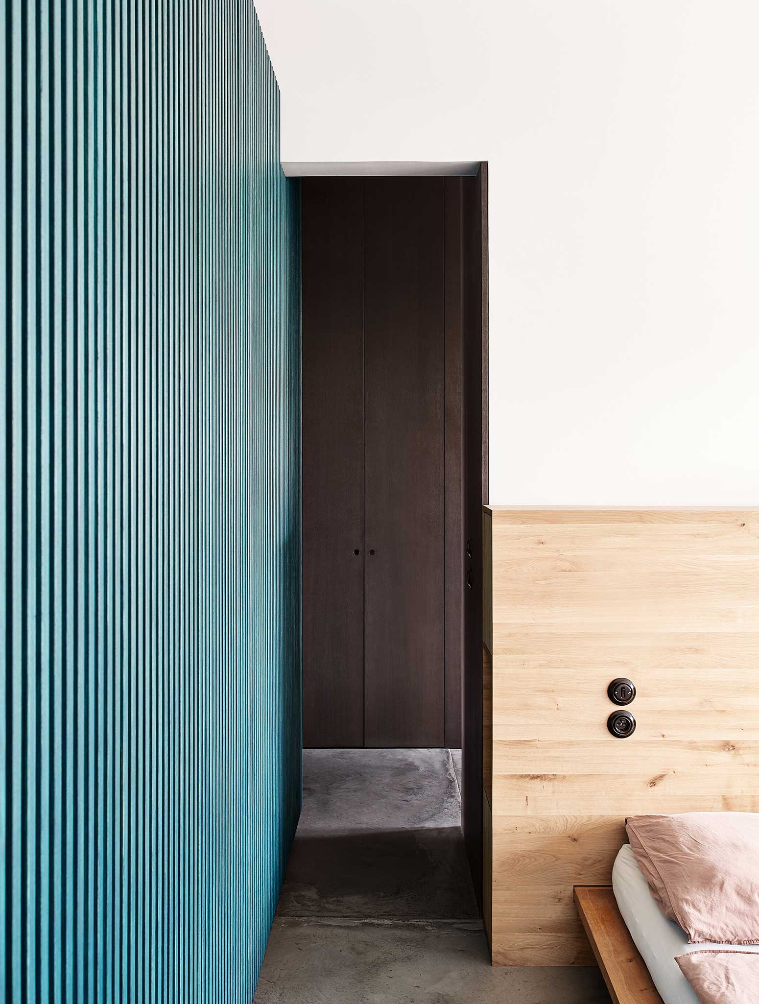
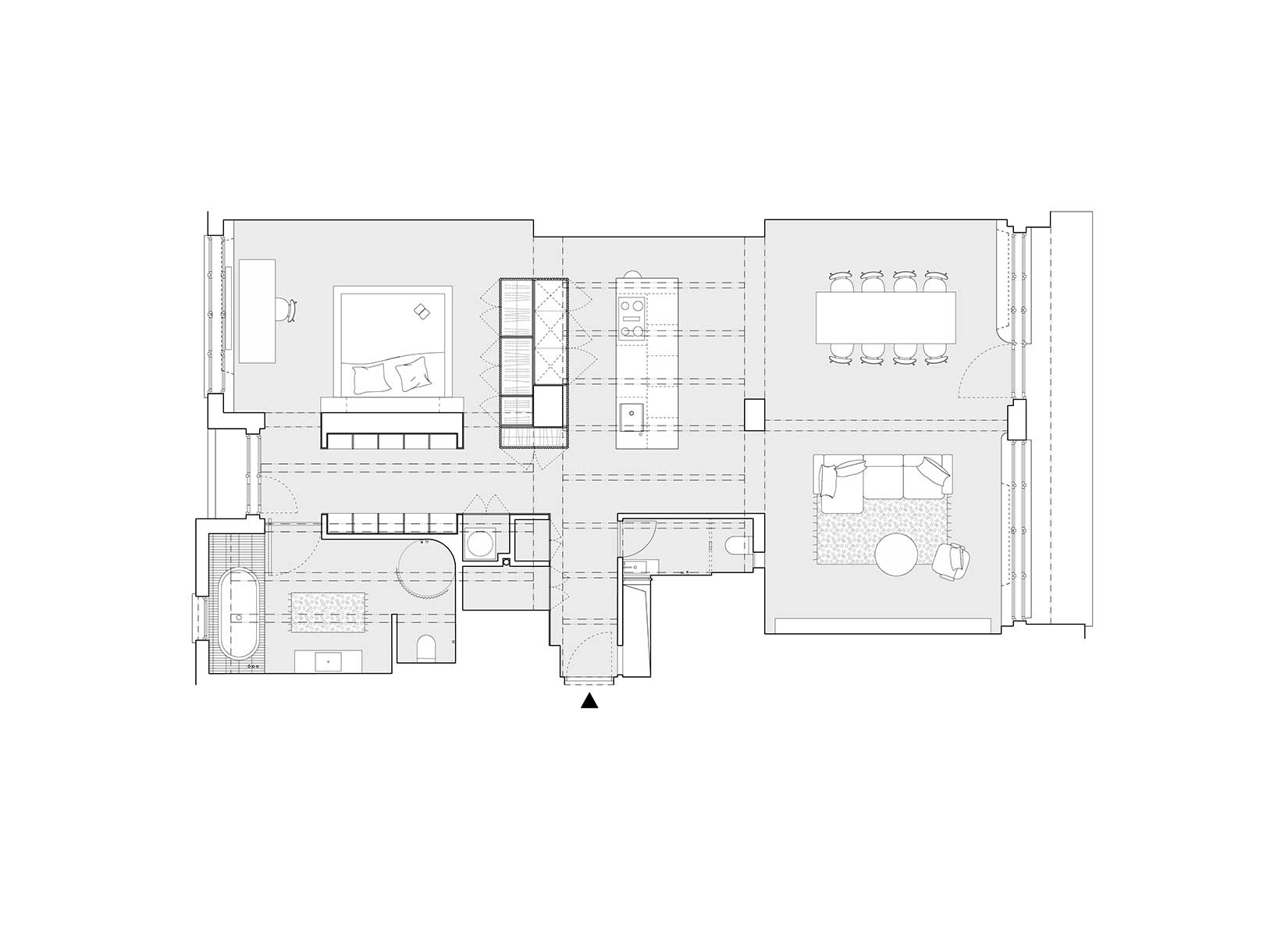
The second theme of the concept is the insertion of “boxes” into the open space, so that the rooms are separated from each other, and also in this way the private part of the apartment is separated from the residential part. The inserted boxes are made of different materials and structures. The main dividing element of the space is a green scalloped box that hides a part of the kitchen with a fridge, dishwasher or built-in oven, wardrobes in the bedroom or also a closet that serves at the entrance. The client wanted as few doors as possible.
PHOTOS BY Veronika Raffajová
PHOTOS BY Veronika Raffajová
PHOTOS BY Veronika Raffajová
PHOTOS BY Veronika Raffajová
PHOTOS BY Veronika Raffajová
PHOTOS BY Veronika Raffajová
PHOTOS BY Veronika Raffajová
PHOTOS BY Veronika Raffajová
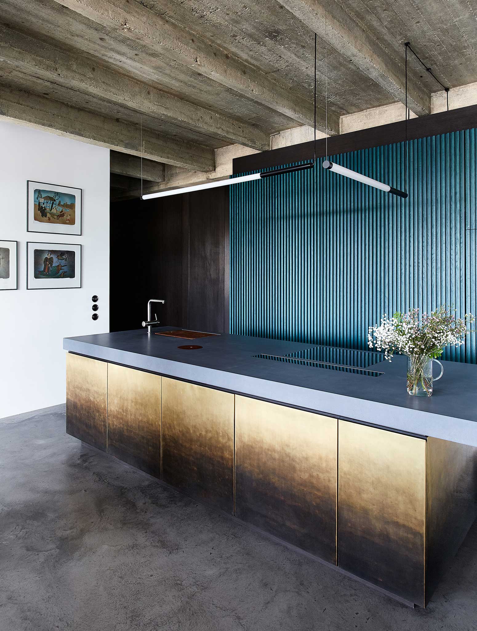
At the entrance there is a small utility room and two built-in wardrobes. One is recessed in a dark panelling that goes around the corner into a library. The other is located in a green box. The central space is the kitchen with an island lined with patinated brass panels. This has a solid concrete countertop. The island’s countertop surface has cleverly hidden openings for things like bio-waste sorter. The bedroom is located behind the green box. It has three entrances. The headboard uses the existing massive chimney as a divider. There is a pass-through library between the master bathroom and the bedroom.
The other half of the apartment is without any divisions or partitions. There is space for a dining room with a living area. In this half of the apartment is also a small bathroom where is a toilet for visitors. The entrance to the bathroom is at the vestibule of the apartment.
The views that were created after most of the partitions were removed are sometimes surprising, due to the interconnection of so many materials used in the apartment.
PHOTOS BY Veronika Raffajová
PHOTOS BY Veronika Raffajová
PHOTOS BY Veronika Raffajová
PHOTOS BY Veronika Raffajová
PHOTOS BY Veronika Raffajová
PHOTOS BY Veronika Raffajová
PHOTOS BY Veronika Raffajová
Collaborators:
Custom made concrete kitchen countertop and sinks: Burning Vibe, www.burningvibe.cz
Concrete floor screed surface: Concrete Group, www.concretegroup.eu
Metalsmith works: DEMO Works, www.demoworks.cz
Carpenter works: Lemberk, www.lemberk.cz
Pivot doors: Dorsis, www.dorsis.cz
Project information
- Architect:Markéta Bromová Architekti
- Location:Czech Republic,
- Project Year:2022
- Photographer:Veronika Raffajová
- Categories:Apartment,Column,Concrete,Residential