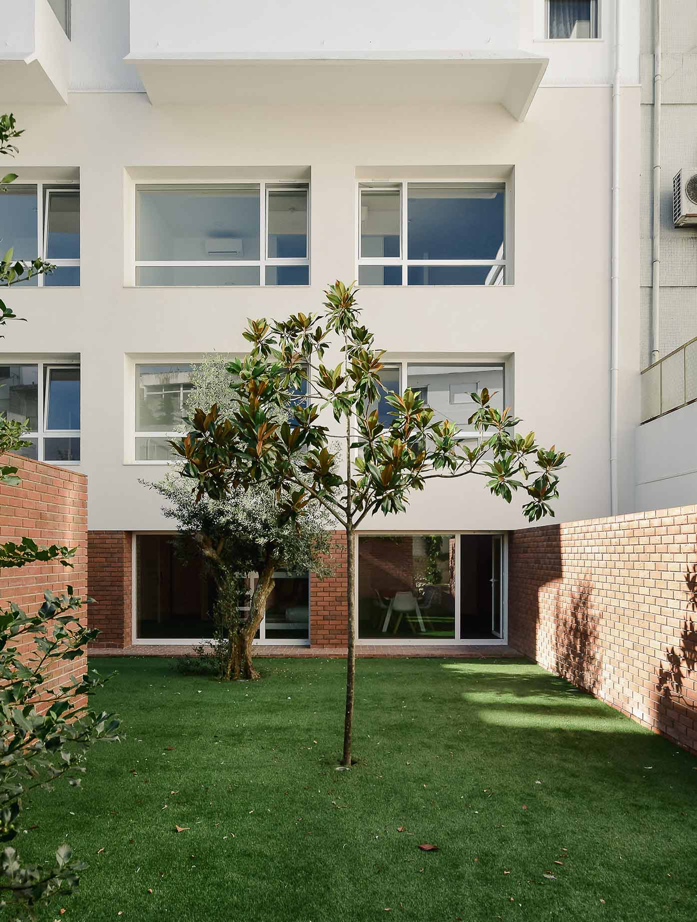
The intervention takes place on the ground floor, basement, sub-basement, and courtyard of a multi-family residential building. The pre-existing building conditions were maintained, including alignments, layout, and height. However, all interior compartmentation was altered to create conditions for the establishment of a hospitality establishment. The intervention area, included in a plot with 374 m², total area 787 m², of which 662 m² corresponds to the gross construction area of the three floors and 125 m² corresponds to the courtyard. It consists of 9 rooms – 8 double rooms and 1 dormitory with 6 bunk beds. The ground floor is the only entrance available to the site. Facing directly onto the street, it has a self-service laundry and the reception of the hospitality establishment, whose interior design projects are not authored by COMBO. On this floor, there are 4 double rooms oriented to the north, towards the rear facade of the building. The -1 floor has a similar organization to the ground floor, with 4 double rooms also oriented to the north, and two compartments intended for technical areas and storage, as well as sanitary facilities. On the -2 floor is the dormitory, with access to the baths, and a pantry to support the hospitality guests.
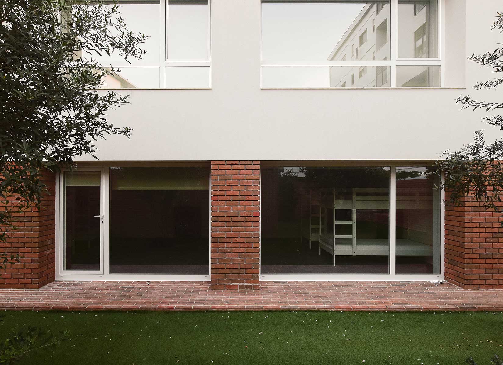
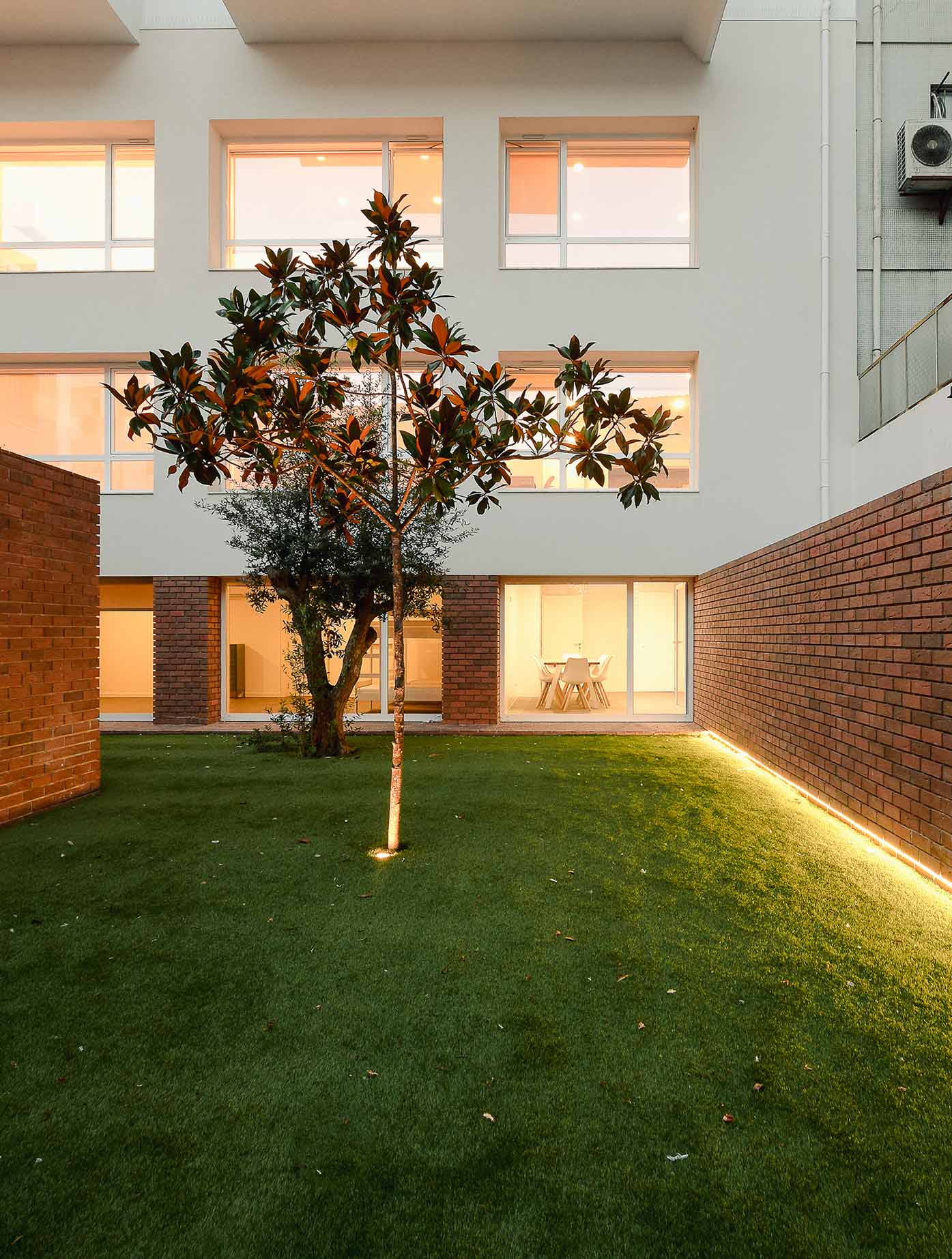
The dormitory and pantry have direct access to the courtyard. Vertical circulation is carried out through the central staircase shaft (pre-existing, rehabilitated) and complemented by a new elevator that operates exclusively on the floors of the intervention. The focus of the project was on changing the composition of the rear facade and the courtyard. Since the rooms could only be located on the rear facade, and this facade faces north, it was important to flood the spaces with light and gain amplitude indoors, without losing all the necessary thermal comfort. For this purpose, a new facade composition was studied, which also reflects the interior organization of the compartments. All rooms have a view of the courtyard, a fact that reinforced the special care in creating a more welcoming and pleasant environment, which was also inviting. The courtyard, which was once an abandoned place where only garbage was deposited, was thus transformed into a support and leisure area for all guests to use. It consists of a large green space, which includes some trees (including two olive trees and a magnolia) and ground vegetation, surrounded by a large continuous wall that surrounds and delimits it.
PHOTOS BY Fábio Peixoto
PHOTOS BY Fábio Peixoto

PHOTOS BY Fábio Peixoto
PHOTOS BY Fábio Peixoto
PHOTOS BY Fábio Peixoto

PHOTOS BY Fábio Peixoto
PHOTOS BY Fábio Peixoto
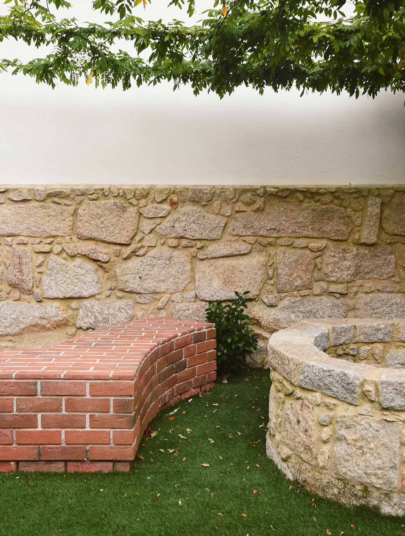
To conceal the technical area (where the AC machines and other large equipment are located), another wall was added, which serves as an extension of the others, and at its top, a continuous bench is formed. During the construction, a stone well for rainwater was found, which was left uncovered, leading to the alteration of part of the continuous bench, which now follows a circular shape. A pergola was placed over the bench and well, composed of thin metal profiles and stainless steel wires, covered with climbing plants (bougainvilleas).
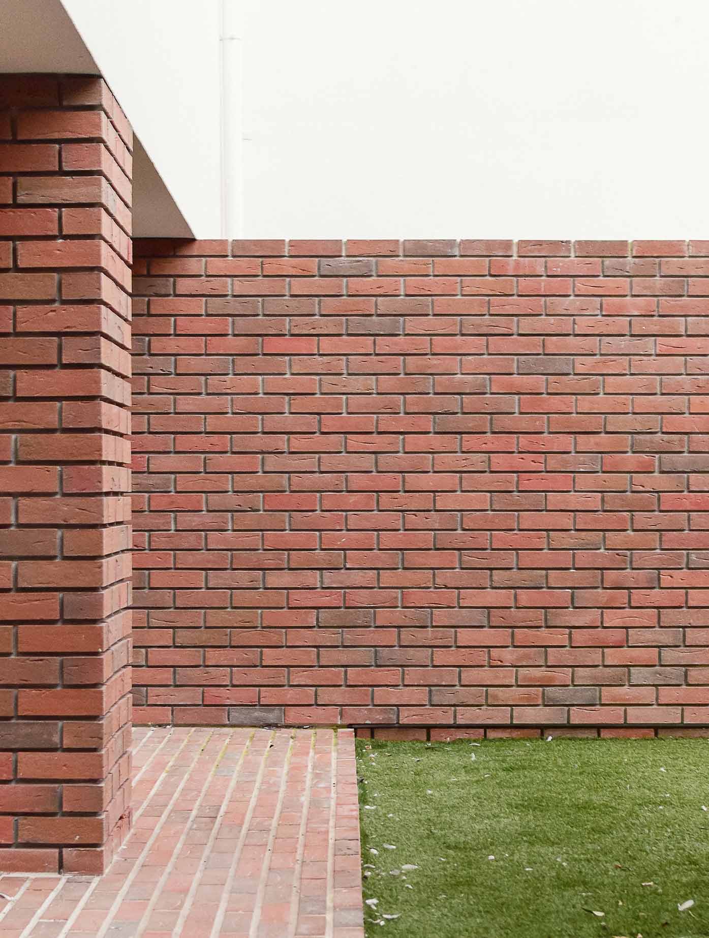
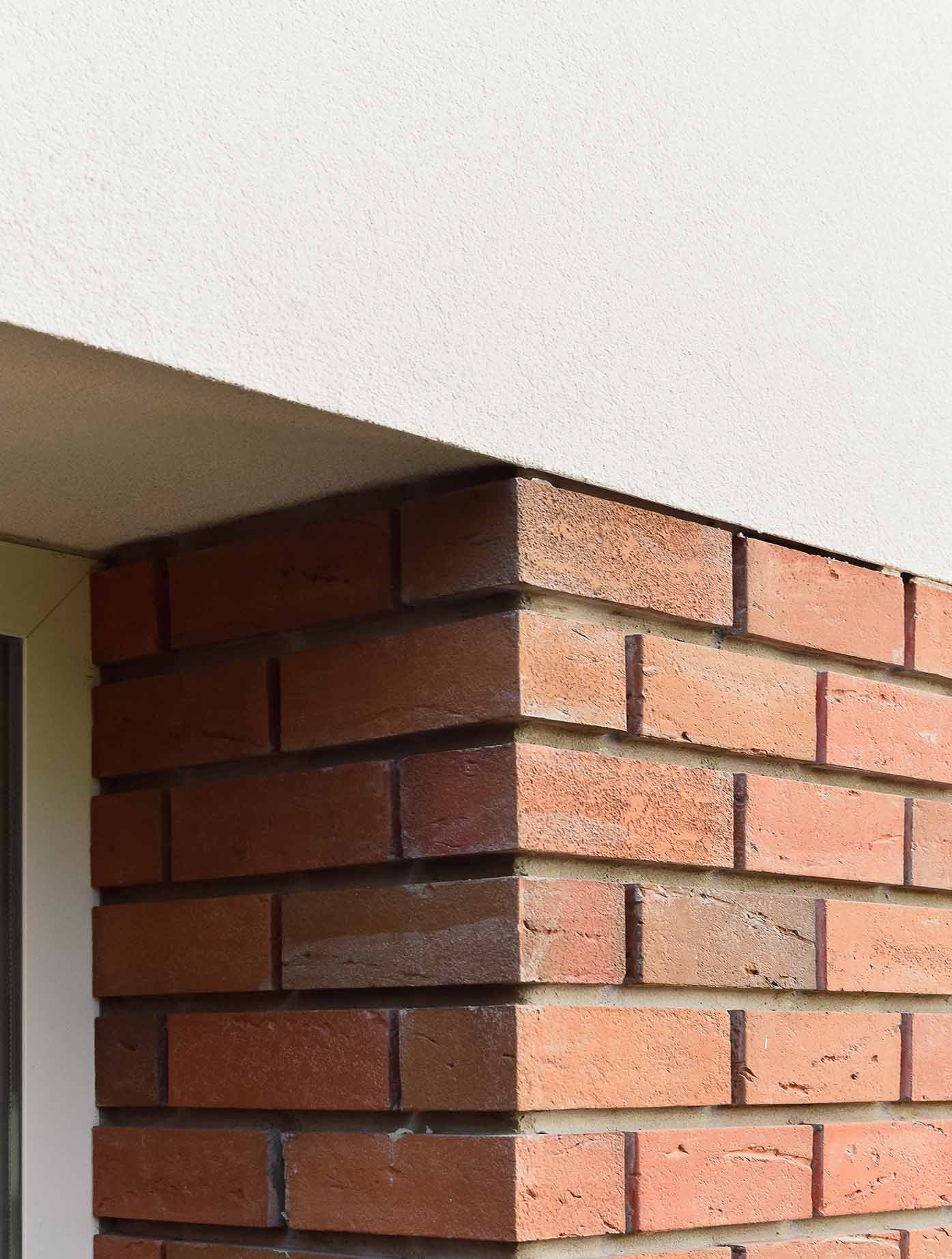
The intention was to distinguish the courtyard space from the rest of the building and clearly define an area for all guests separate from the private areas. At the same time, as it is an area exposed to the elements and prone to damage, a resistant material was sought, one that would conceal dirt and require minimal maintenance over time. Thus, giving it a character of foundation, the rear facade at the -2 floor level, as well as all the surrounding walls of the yard, were covered with brick, with spaced and deep joints. This specific model and color were chosen for their rough and artisanal appearance, where the variation in tones and textures also plays an important role. Thus, the desired contrast with the rest of the building was achieved, transforming the yard into a more welcoming and timeless place. The floors of levels 0 and -1 are coated with a painted capotto system in white, and all frames are in lacquered aluminum in white. Regarding furniture, special attention was given to the kitchenettes.
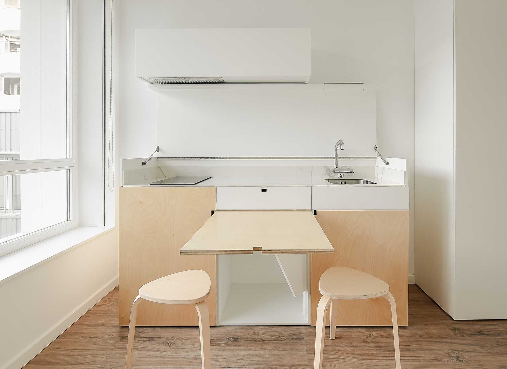
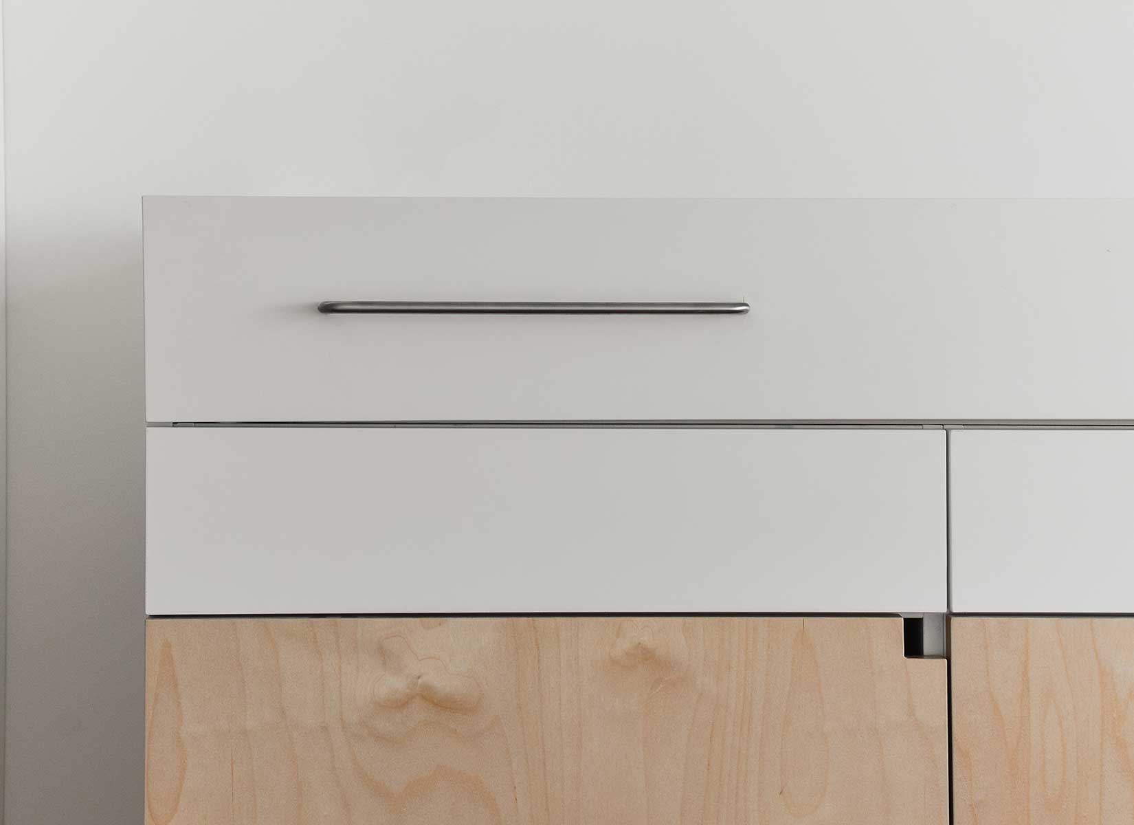
One of the main concerns of the Owner was to have flexibility in the use of the rooms, regarding short or long-term rentals. For this, it was necessary to foresee the possibility of the rooms being transformed into studios (with a place for meal preparation). The challenge was to add a kitchenette and a dining table to such small compartments. In the larger rooms, the kitchenettes would be hidden within sliding doors, as if it were a wardrobe. In the smaller rooms (the middle ones), a piece of furniture was created that transforms: when closed, it is a chest of drawers/sideboard, and when opened, it is a kitchenette with an integrated table.

PHOTOS BY Fábio Peixoto
PHOTOS BY Fábio Peixoto

PHOTOS BY Fábio Peixoto
PHOTOS BY Fábio Peixoto
Project information
- Architect:Combo Architecture Studio
- Location:Portugal,
- Project Year:2022
- Photographer:Fábio Peixoto
- Categories:Apartment,Bricks,Patio,Residential