PHOTOS BY French + Tye
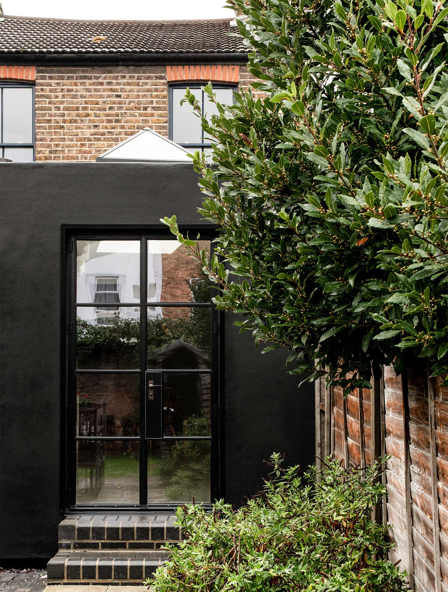
The clients, Janice Turner, who leads the uniform design studio Field Grey, Mike Blackwell, and their dog Queenie, approached Office S&M to replace a poorly built lean-to behind their terraced house in Walthamstow. They wanted the new extension to be clearly different from the late 1800’s property, while still being related in scale to it. They challenged Office S&M to design an extension that contained both a bathroom and a kitchen that each looked over the garden.
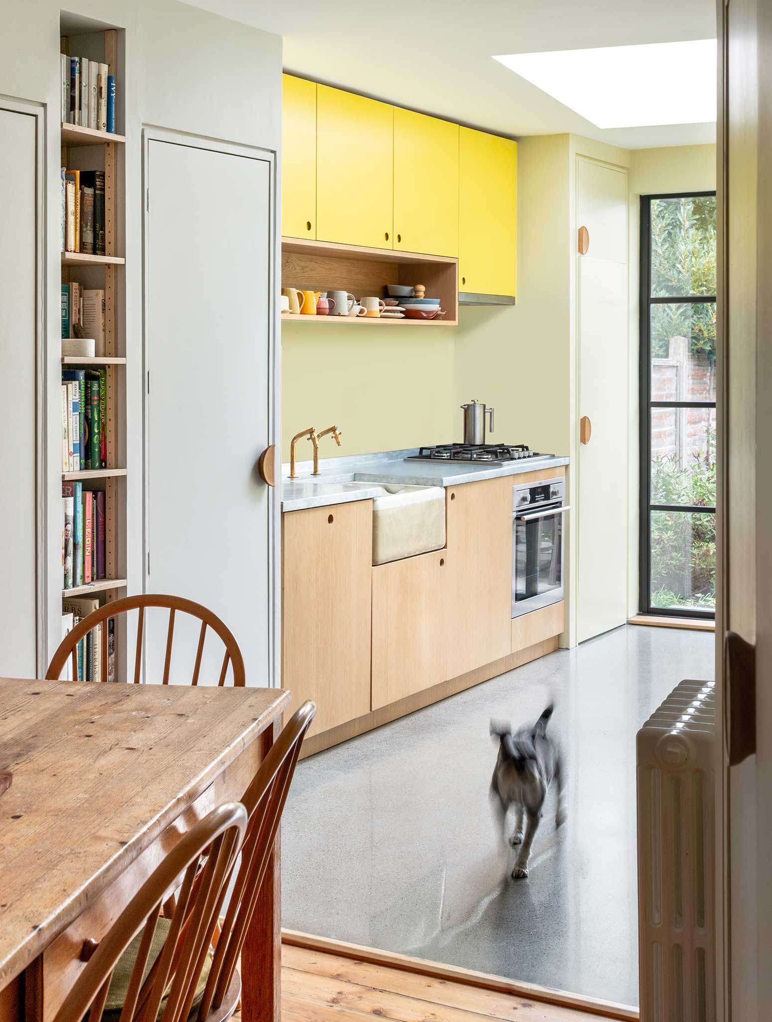
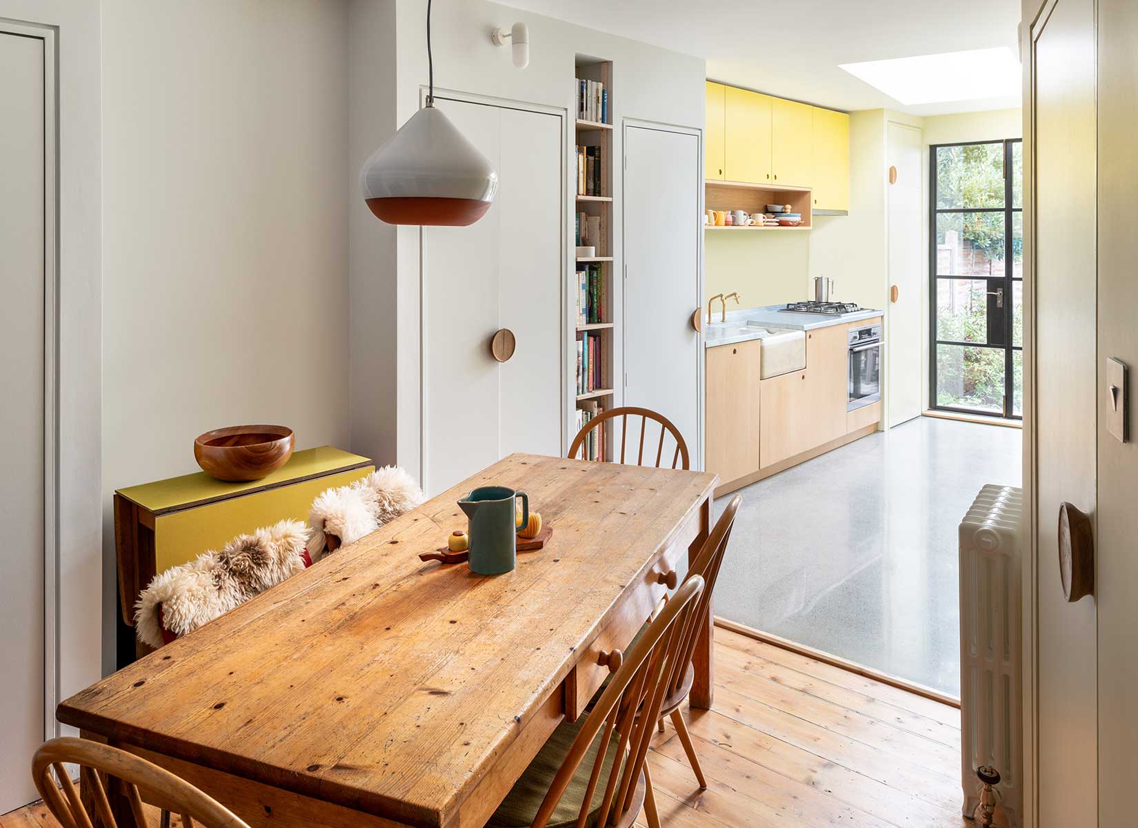
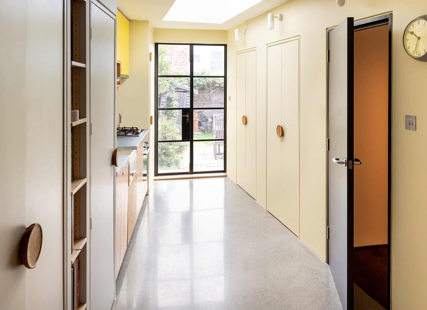
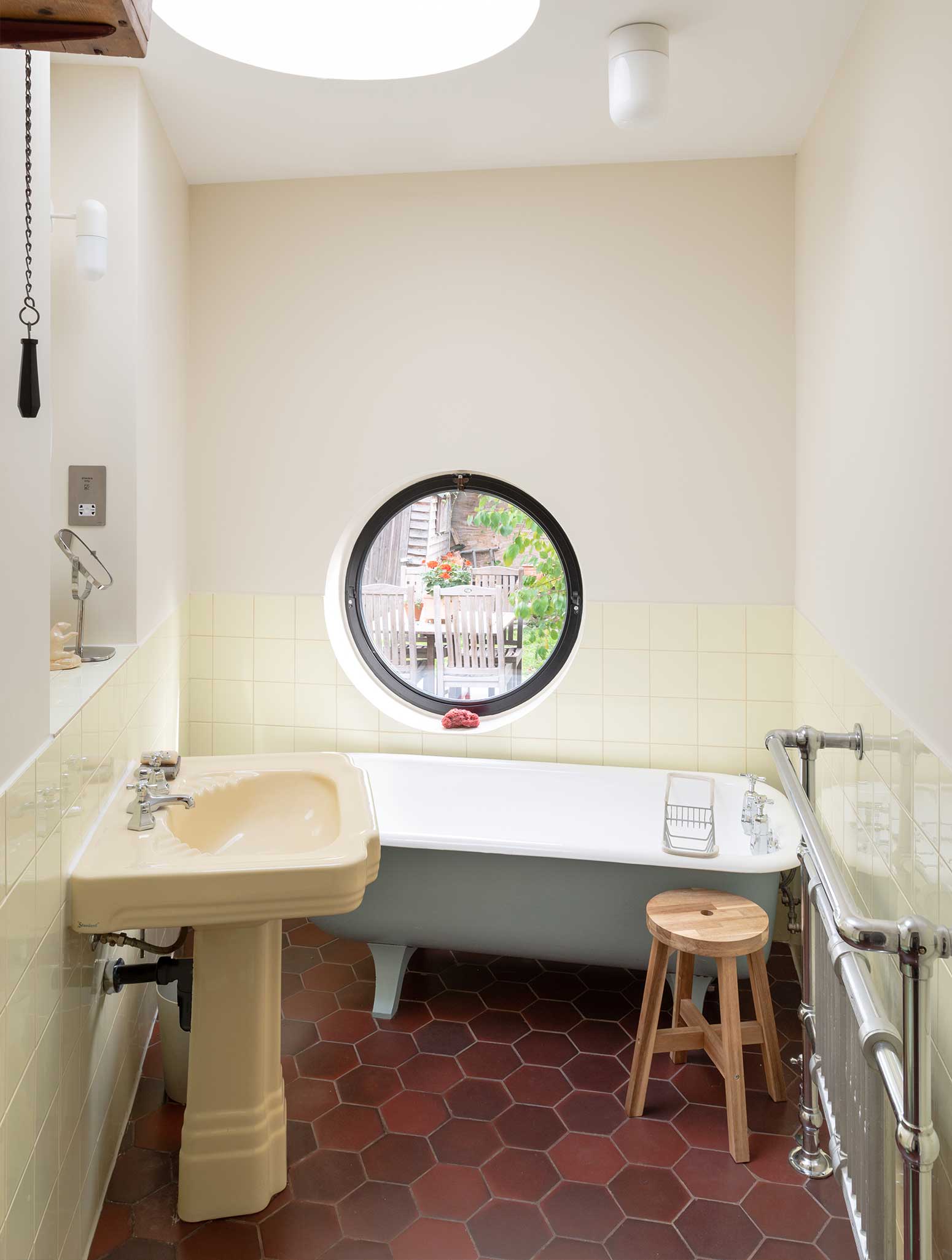
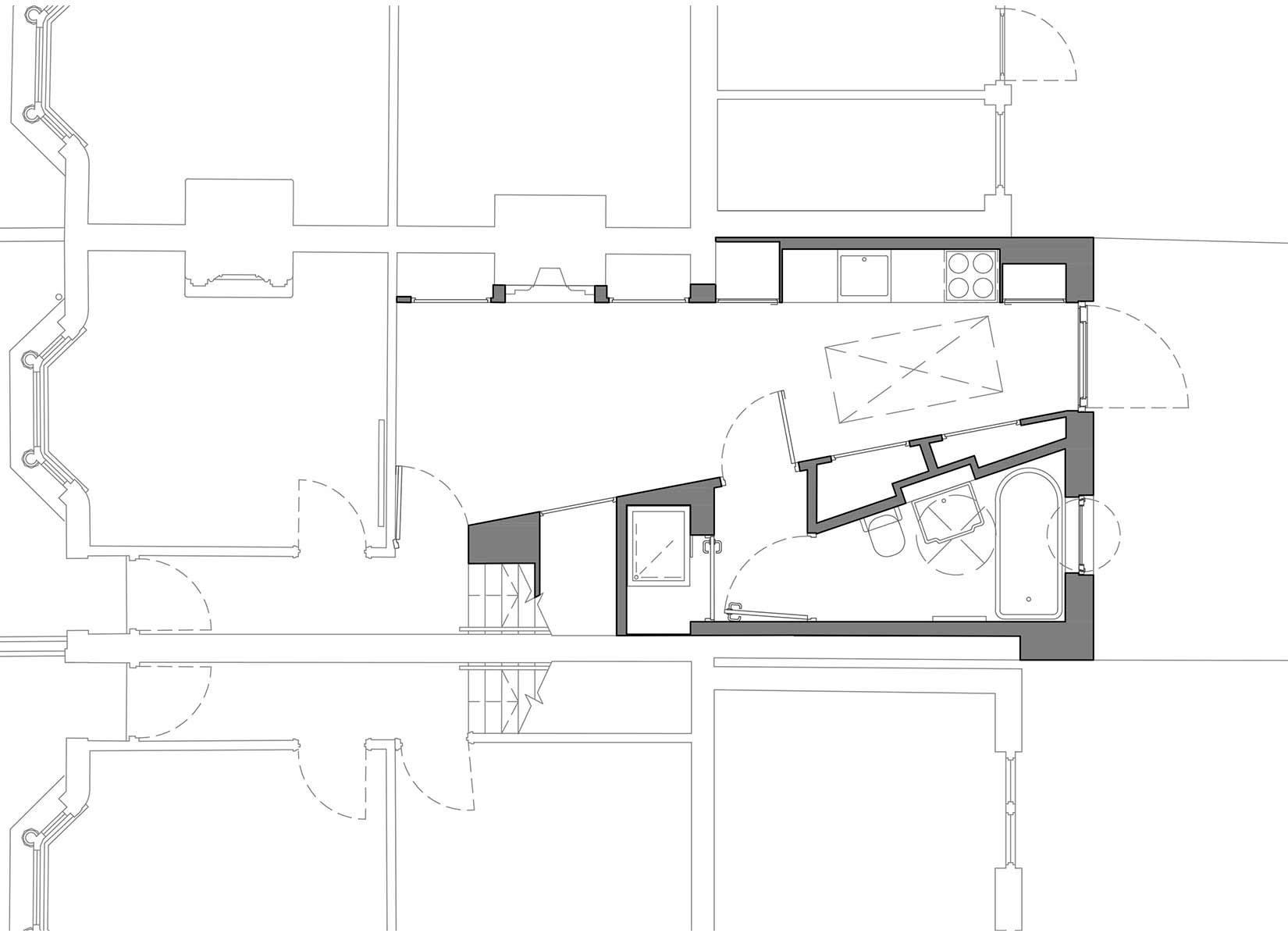
Office S&M’s design made best use of the restricted space by splitting the extension diagonally with a storage wall. This wall removed the need for separate circulation space by hiding the bathroom, shower and storage while also directing and framing views of the garden. In the kitchen, this gives a fantastic daylit space, while the bathroom has a view over the garden from the tub.
PHOTOS BY French + Tye
PHOTOS BY French + Tye
PHOTOS BY French + Tye
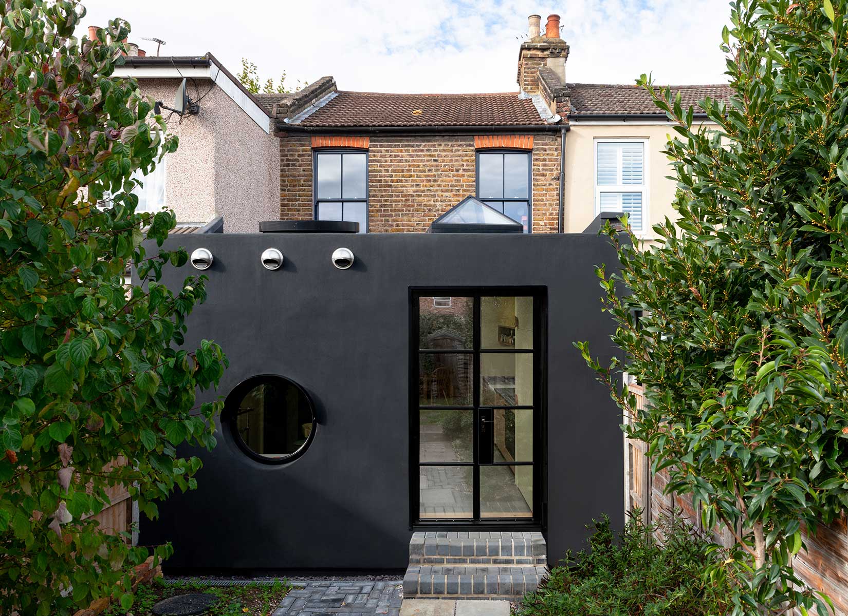
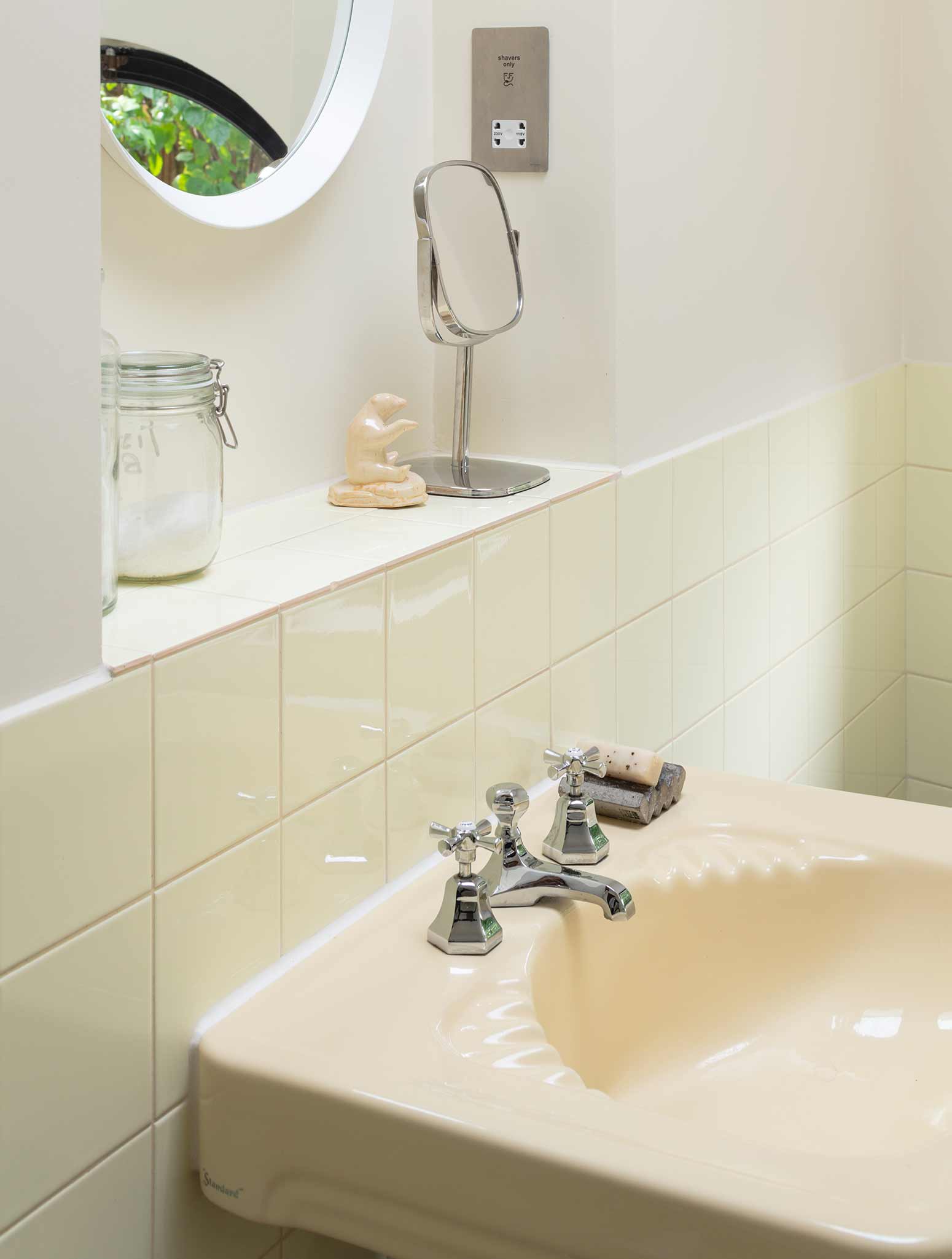
The “two faced” nature of the design is exhibited externally by the shape of the window, door and rooflights. The side with circular openings contains the bathroom, while the rectangular side is the kitchen. These motifs responded to fixtures and fittings that Janice and Mike had already bought for the extension, such as the kitchen table, terracotta pendant light, and pastel 1930’s bathroom suite.
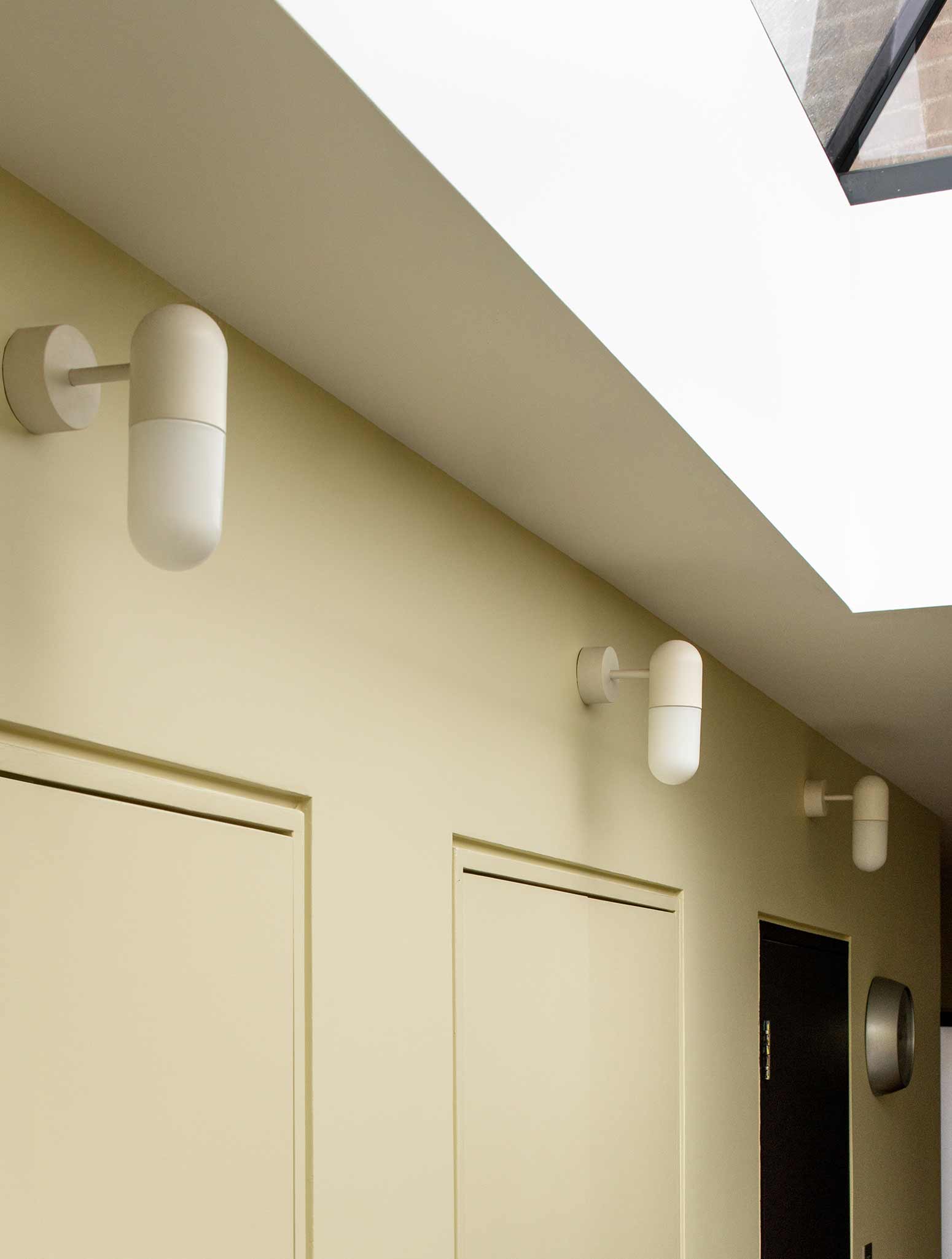
The contrasting circle and square geometry of the windows was developed from these existing pieces to link the exterior of the extension to the interior, and these motifs continue throughout details of the project from rectangular light switches to circular door pulls.
The sprayed on rubber exterior creates a monolithic background which wraps the two halves of the extension together. This unusual industrial material, Prokol polyurea, was chosen because of its low cost, seamless finish, and contrast with the existing brickwork of the terraced house.
PHOTOS BY French + Tye
PHOTOS BY French + Tye
PHOTOS BY French + Tye
Project information
- Architect:Office S&M
- Location:United Kingdom,
- Project Year:2018
- Photographer:French + Tye
- Categories:House