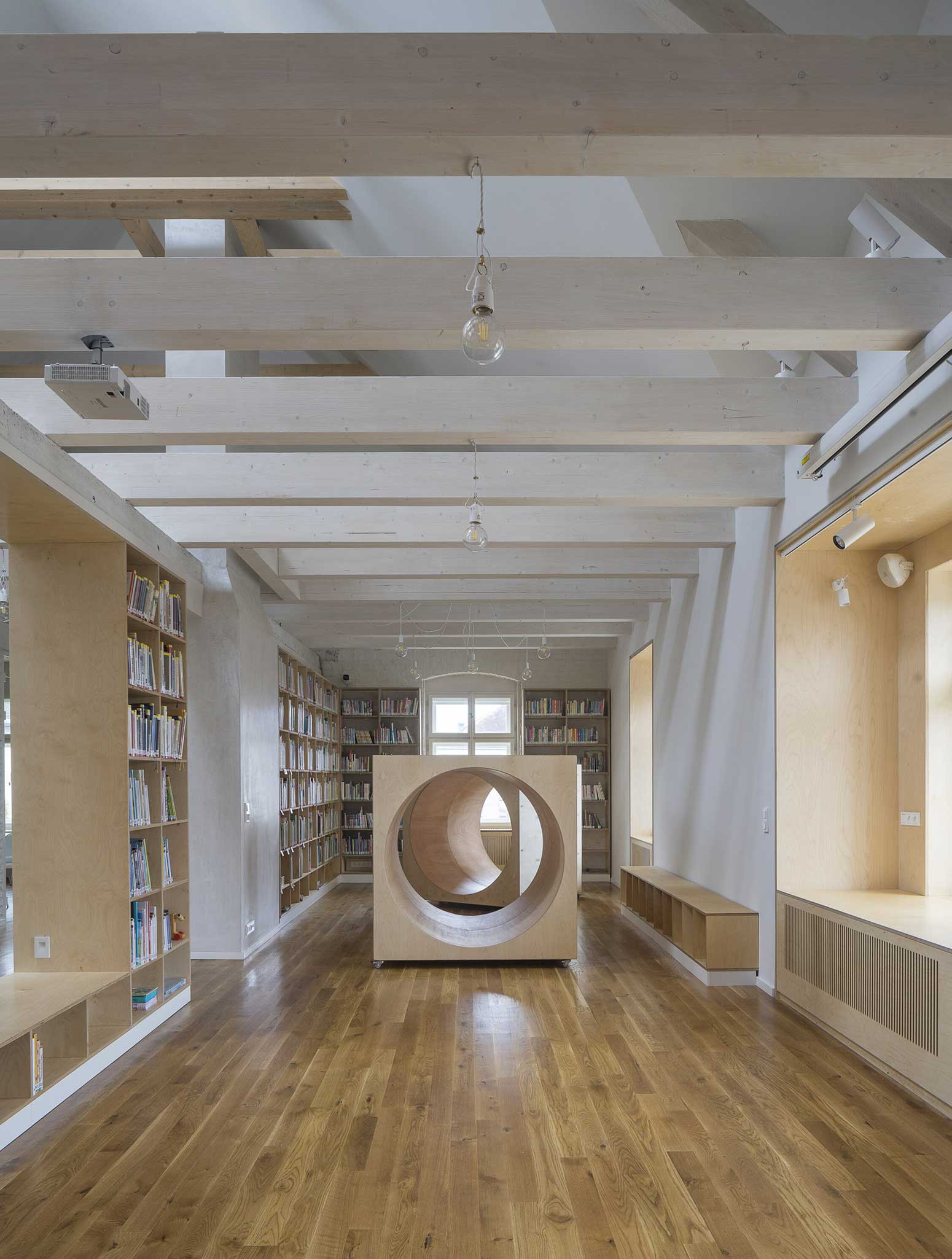
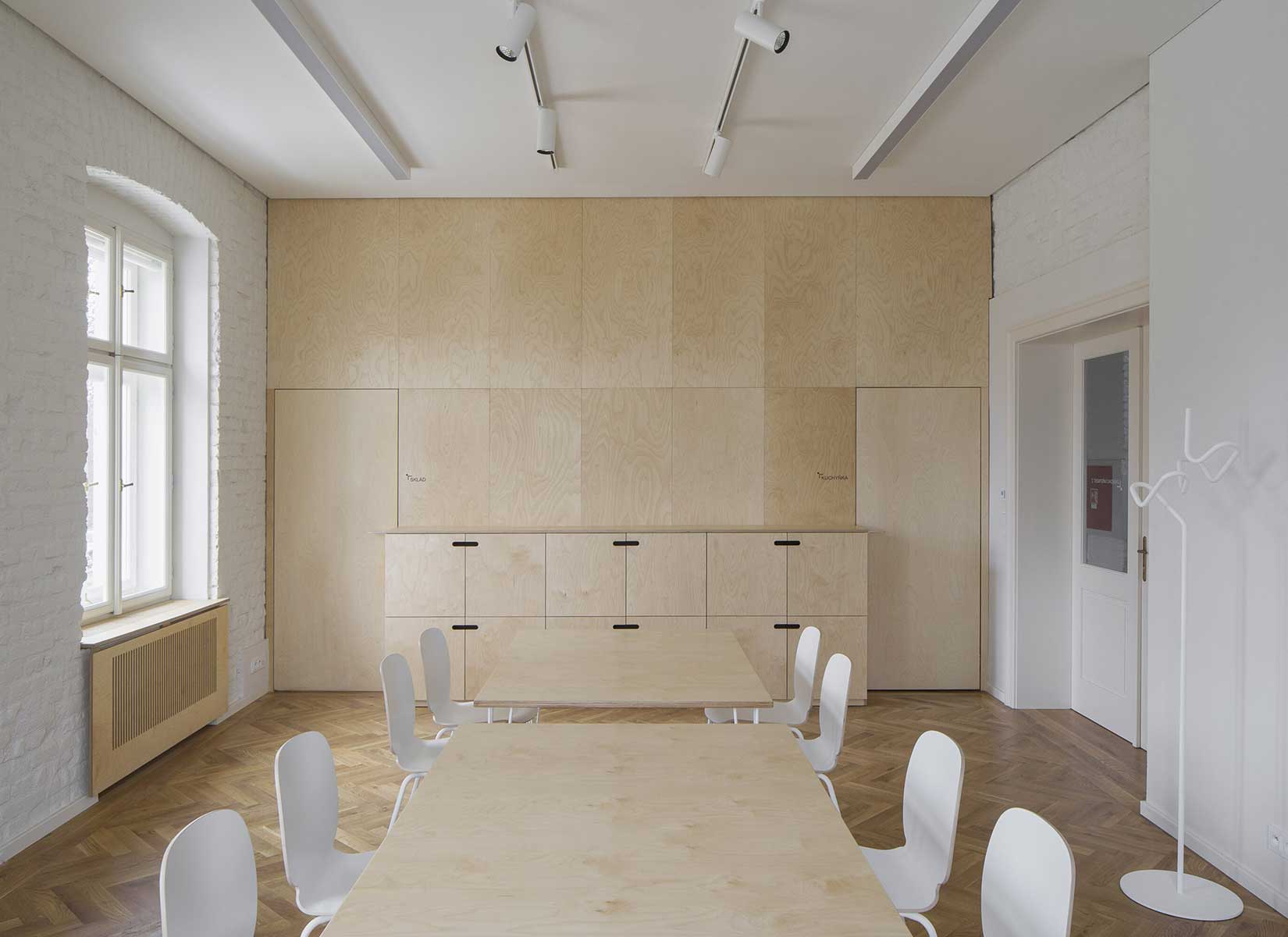
A suitable place for the new town library was the unused house of the Roman Catholic rectory, in the past also used as an orphanage, kindergarten and vocation school. In addition to the library, the municipality intended to place a multifunctional hall, facilities for clubs and a maternity centre in the house. The former rectory could not accommodate all the functions, so it was decided to extend the building with an extension. The idea of the design is to create a new public place that will connect to the existing vibrant center of Vratislavice, defined by public buildings and the château garden.
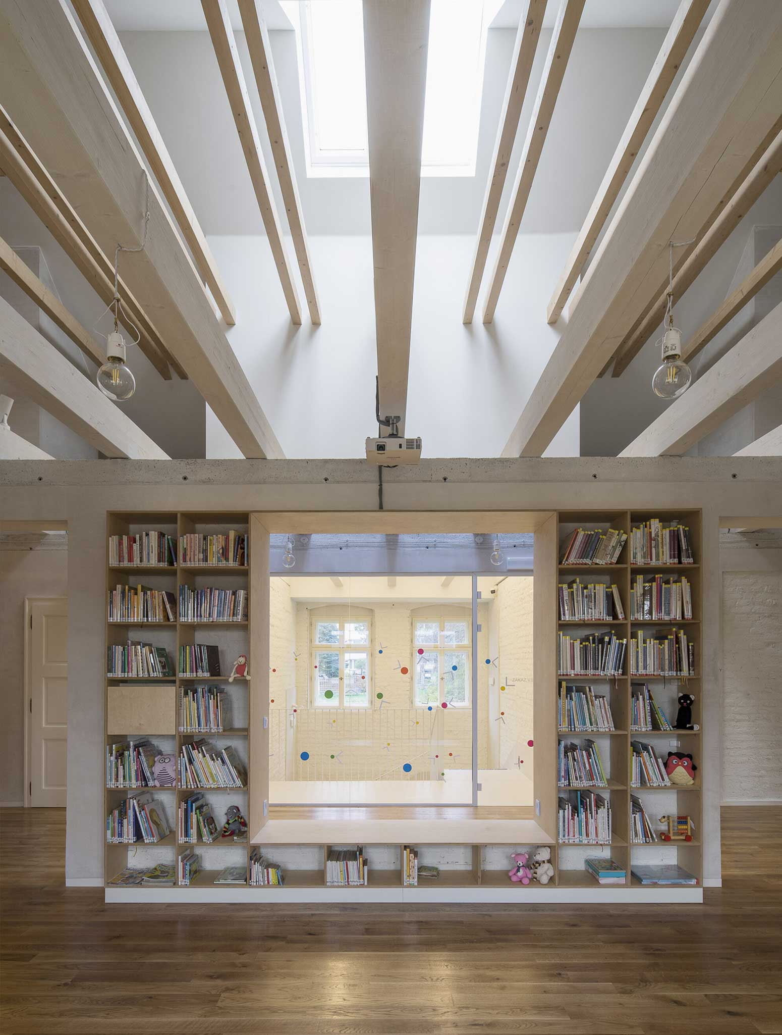
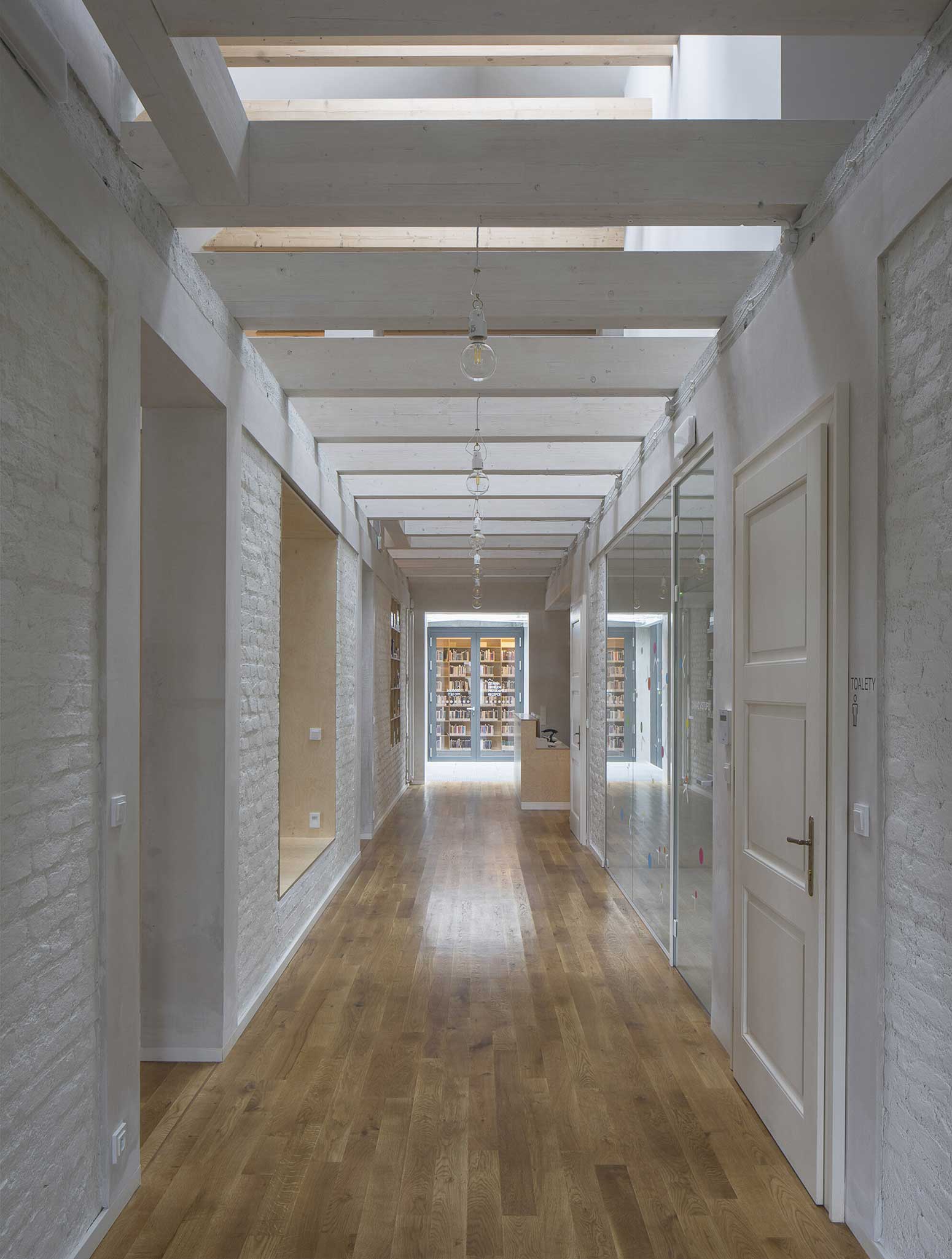
A new piazzetta is being created, inspired by the rhythm of small squares in the vicinity of the public buildings. The original character of the old house has been retained – its deep foundations have allowed for a semi-recessed floor to be created by weighing off the ground. The excavation allowed daylight in through generous portals and the excavated pit formed the base of the new plaza. The ground floor has been given over to clubs and the upper floor to the children’s library.
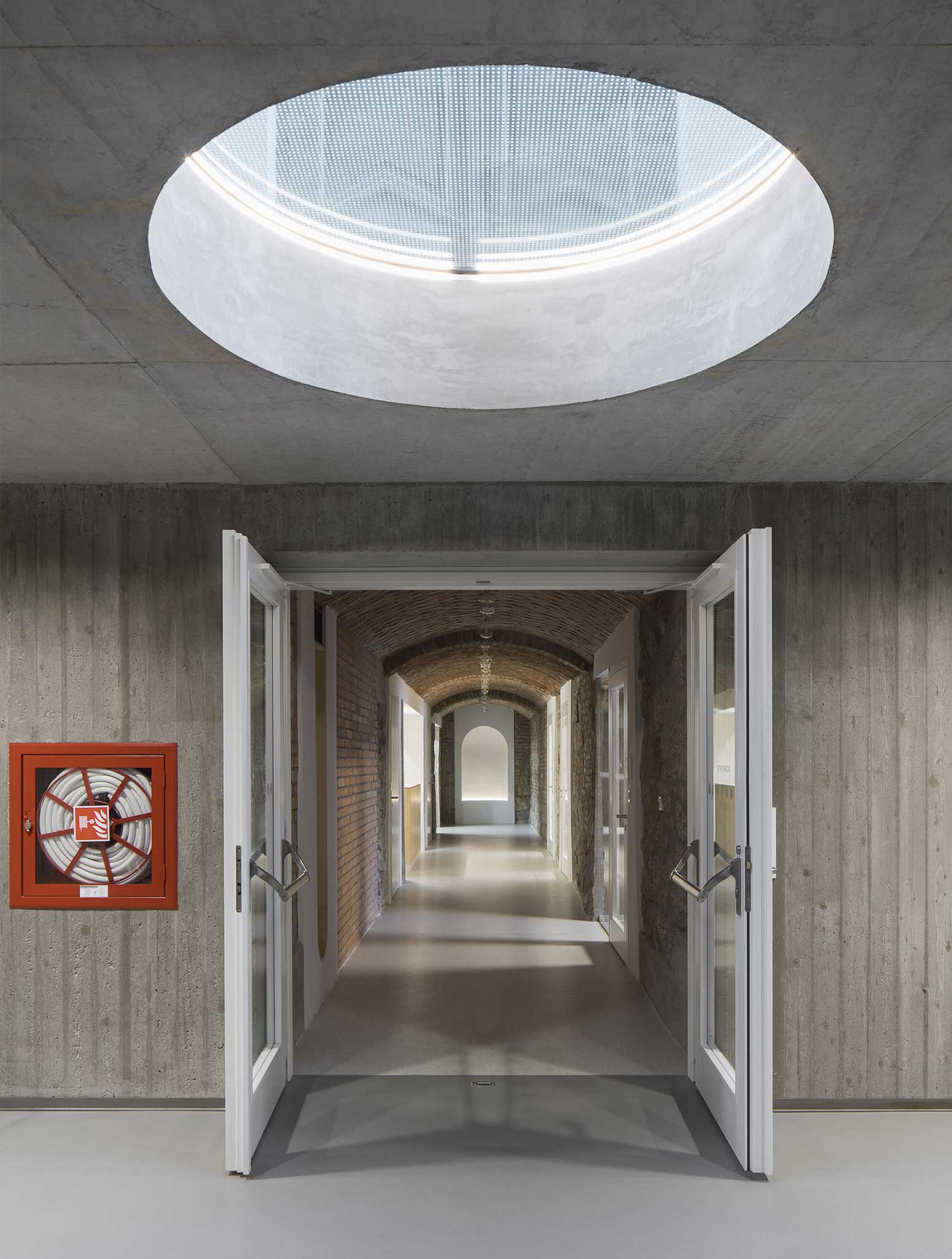
On the west side, the rectory is complemented by the contemporary-styled library structure. Both buildings are connected in the basement and also by a bridge on the first floor. Its size, shape and location are based on the context of the château garden and the rectory, as well as the tree protection zones and infrastructure network lines.
PHOTOS BY Tomáš Souček
PHOTOS BY Tomáš Souček
PHOTOS BY Tomáš Souček
PHOTOS BY Tomáš Souček
PHOTOS BY Tomáš Souček
PHOTOS BY Tomáš Souček
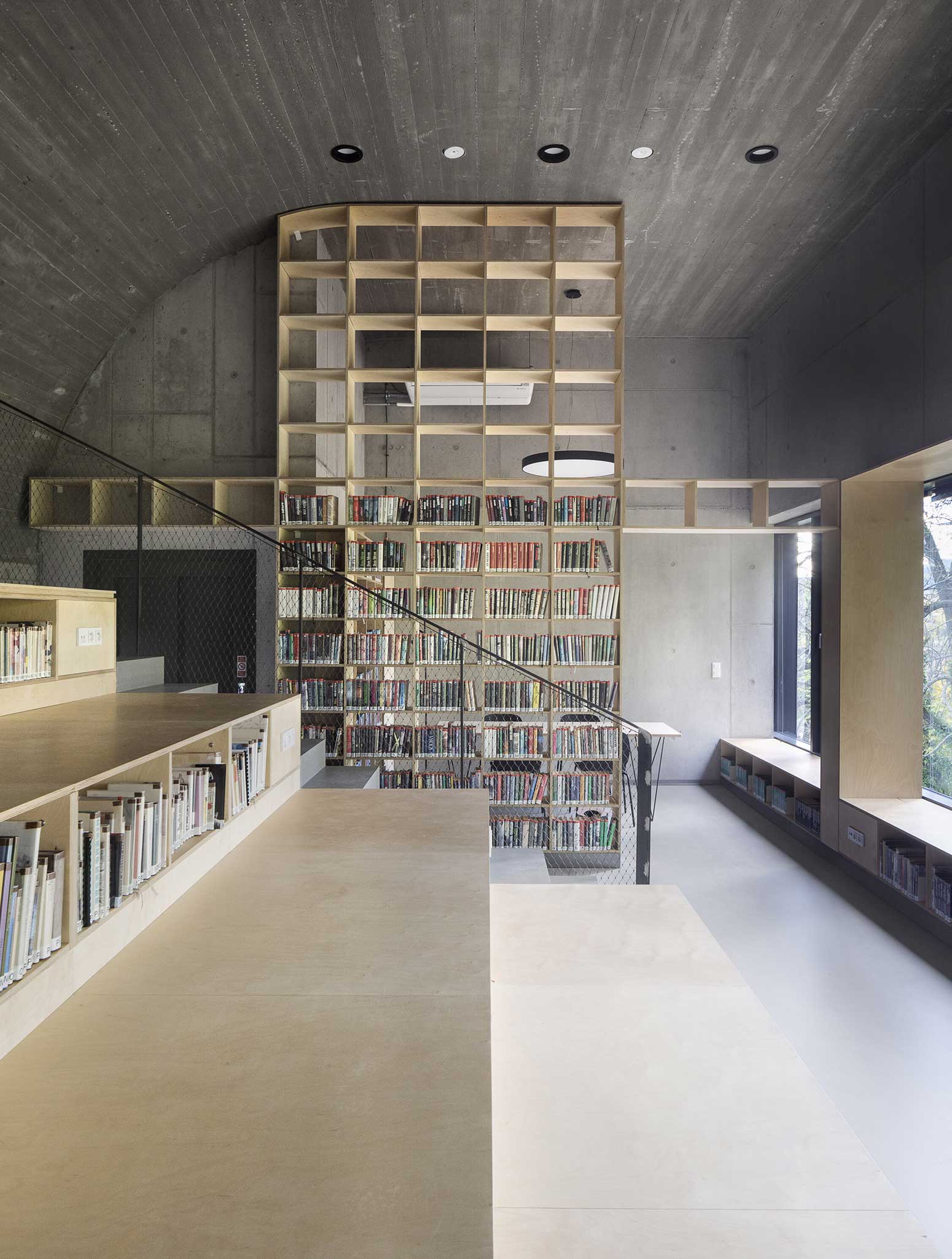
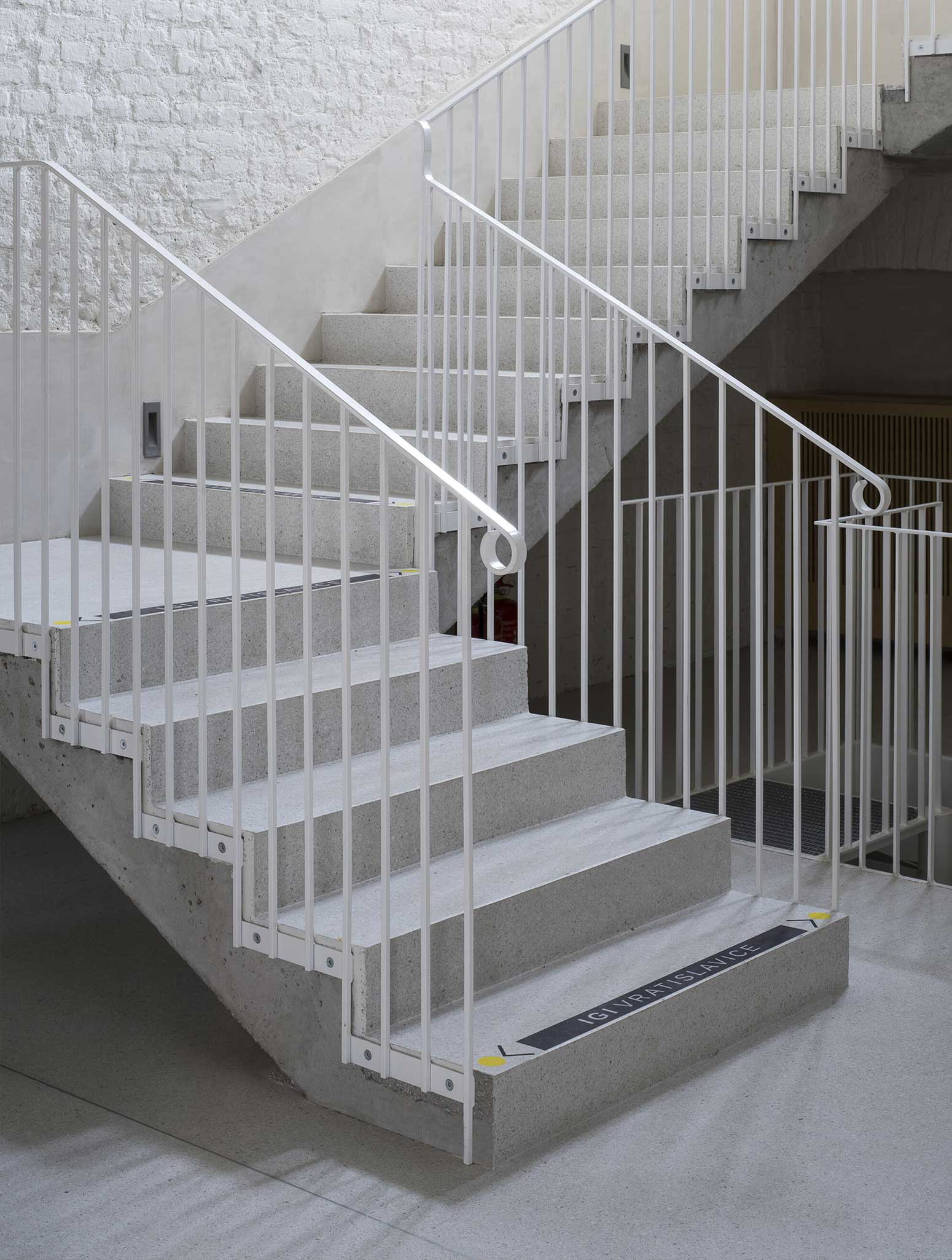
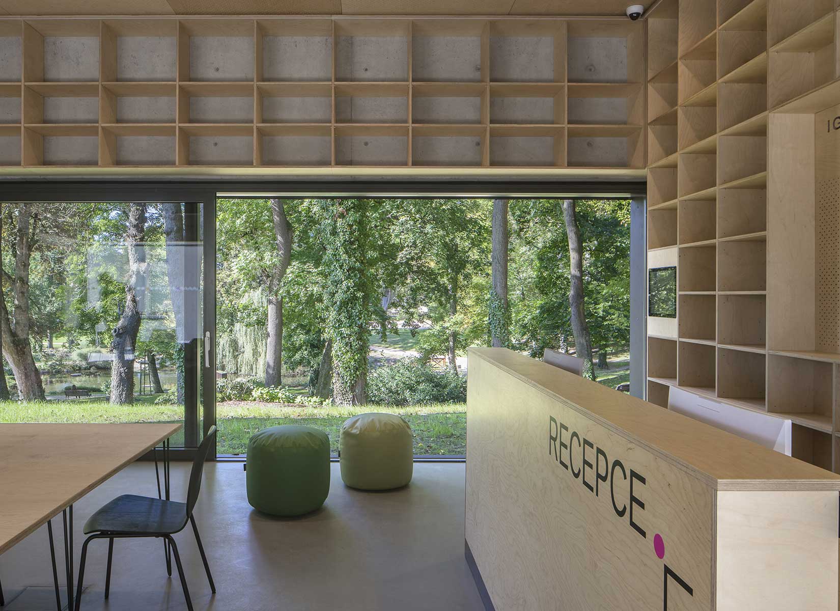
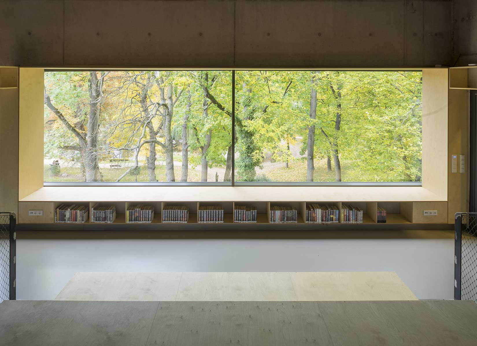
The result is a building with a narrow, compact three-story upper part and a two-story basement. The library is integrated into the above-ground floors of the extension, whose open space principle accommodates a reception area with a terrace on the ground floor, a first-floor gallery and a reading room under an arched roof. The underground floors house a multifunctional hall with a small lobby and a cloakroom in a vestibule linking the two buildings, creating a common entrance area.
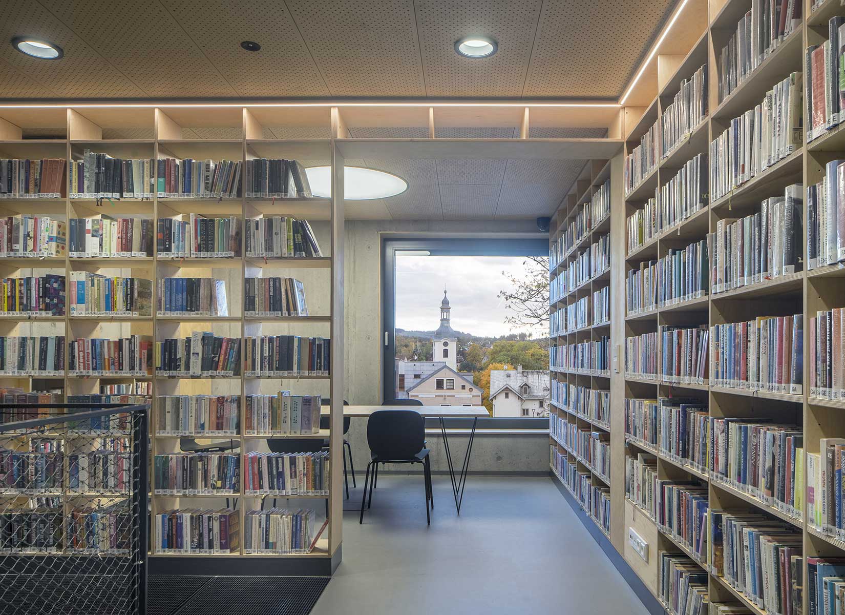
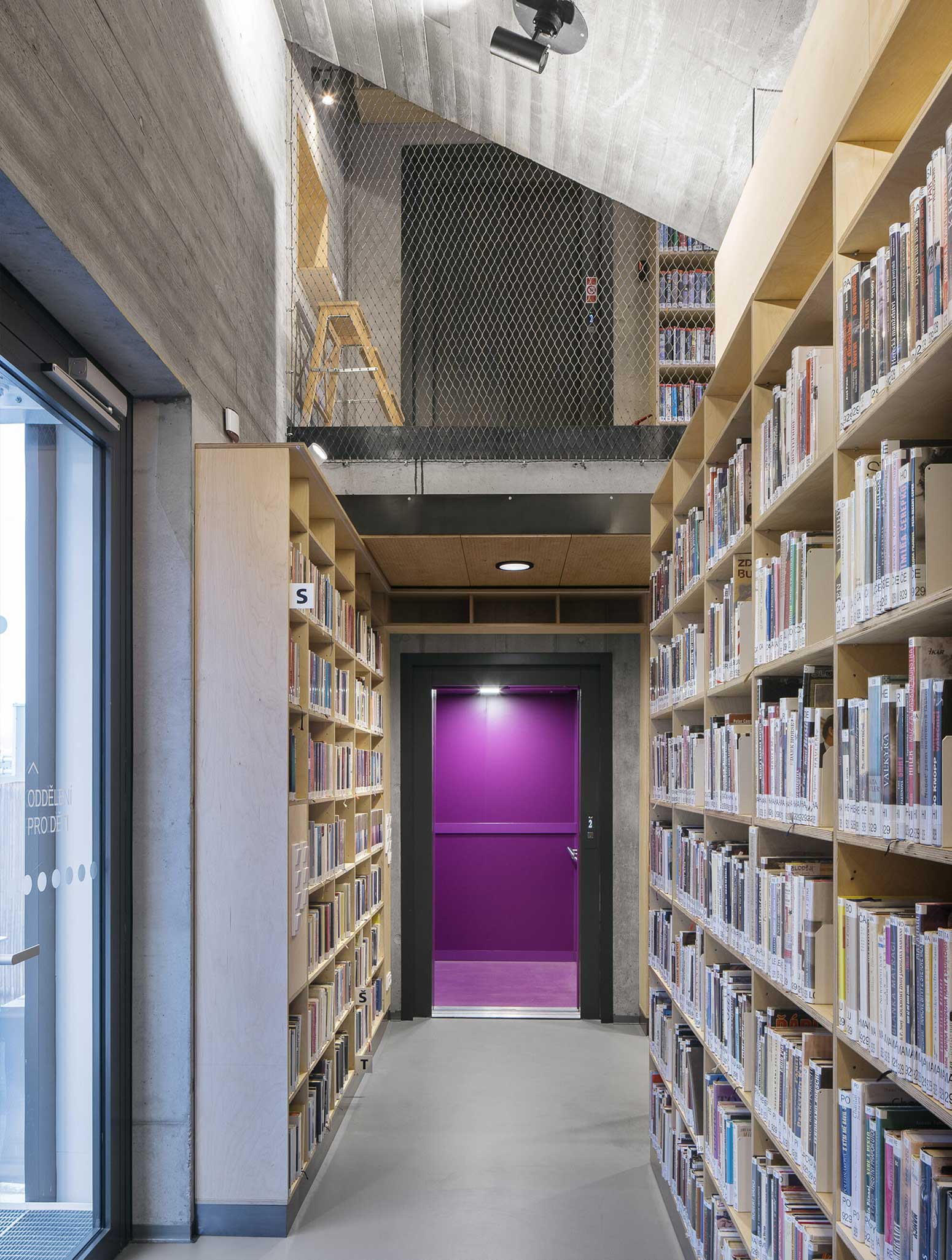
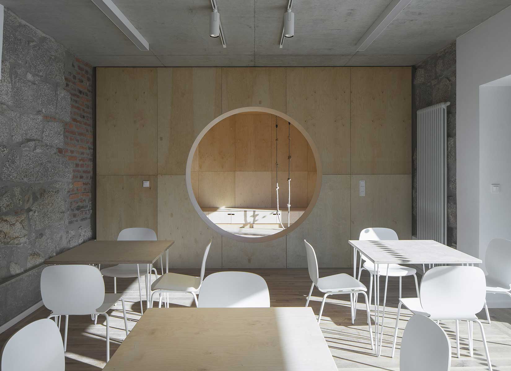
Through the large glass walls on the ground and upper floors, the library makes the most out of the views of the château garden. In the reading room, the contact with trees through the panoramic window is so close that readers feel like they are sitting inside the tree crowns. The exposed concrete and the brick and stone masonry of the interior are softly lined with wooden sedilia and bookshelves. These create all sorts of hiding places and nooks where the visitor can constantly discover something new.
PHOTOS BY Tomáš Souček
PHOTOS BY Tomáš Souček
PHOTOS BY Tomáš Souček
PHOTOS BY Tomáš Souček
PHOTOS BY Tomáš Souček
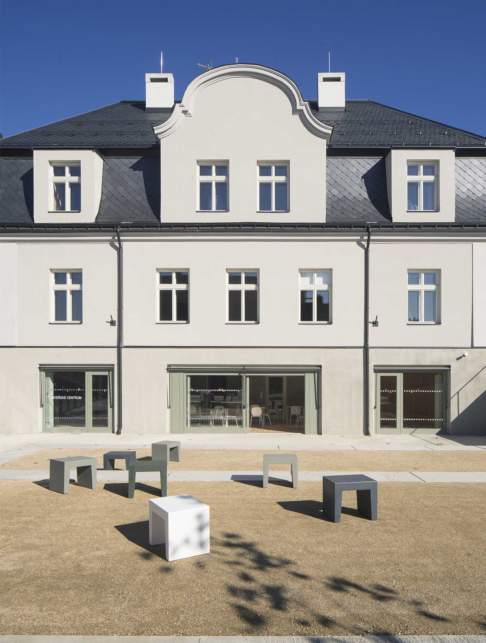
PHOTOS BY Tomáš Souček
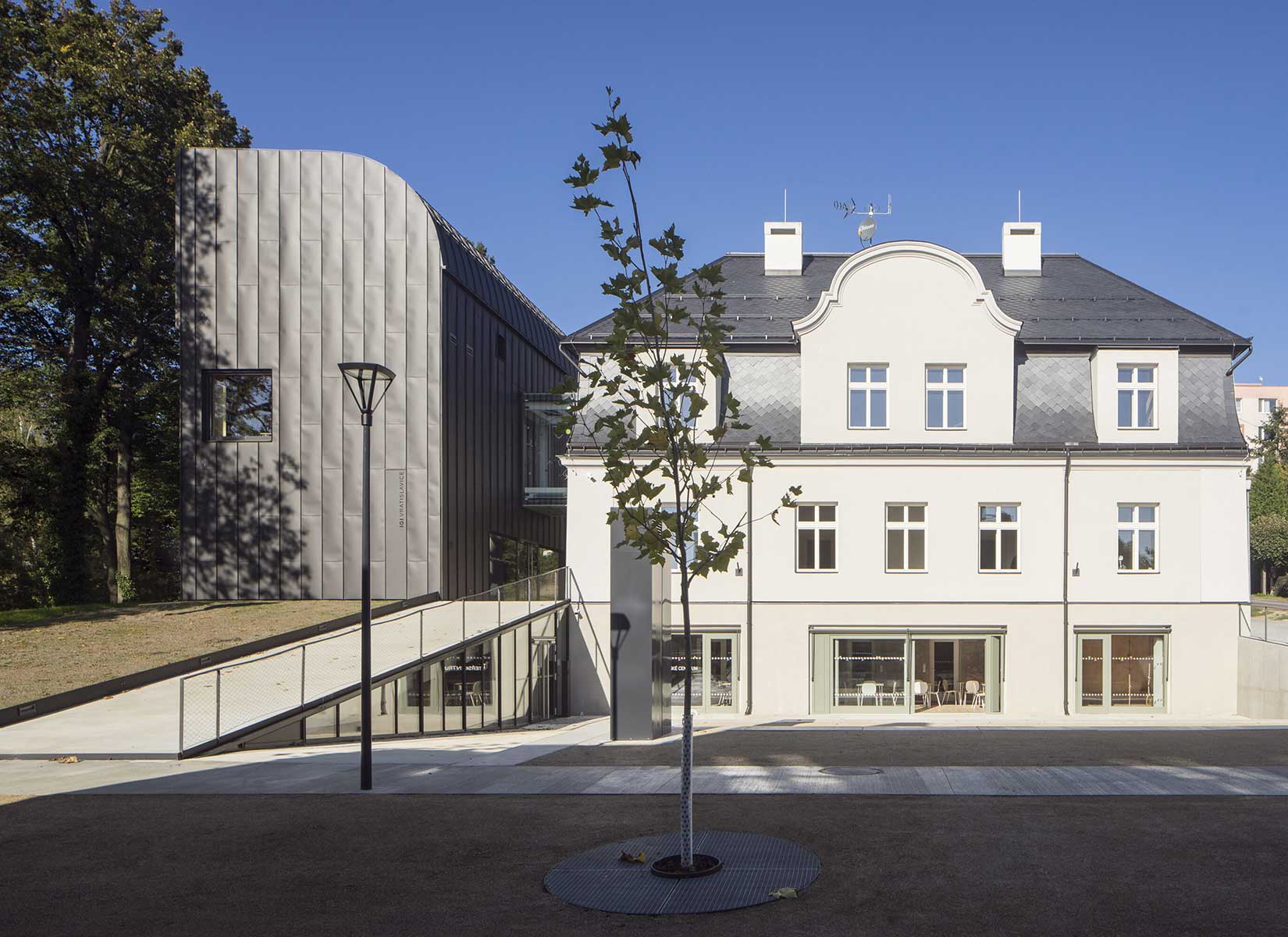
PHOTOS BY Tomáš Souček
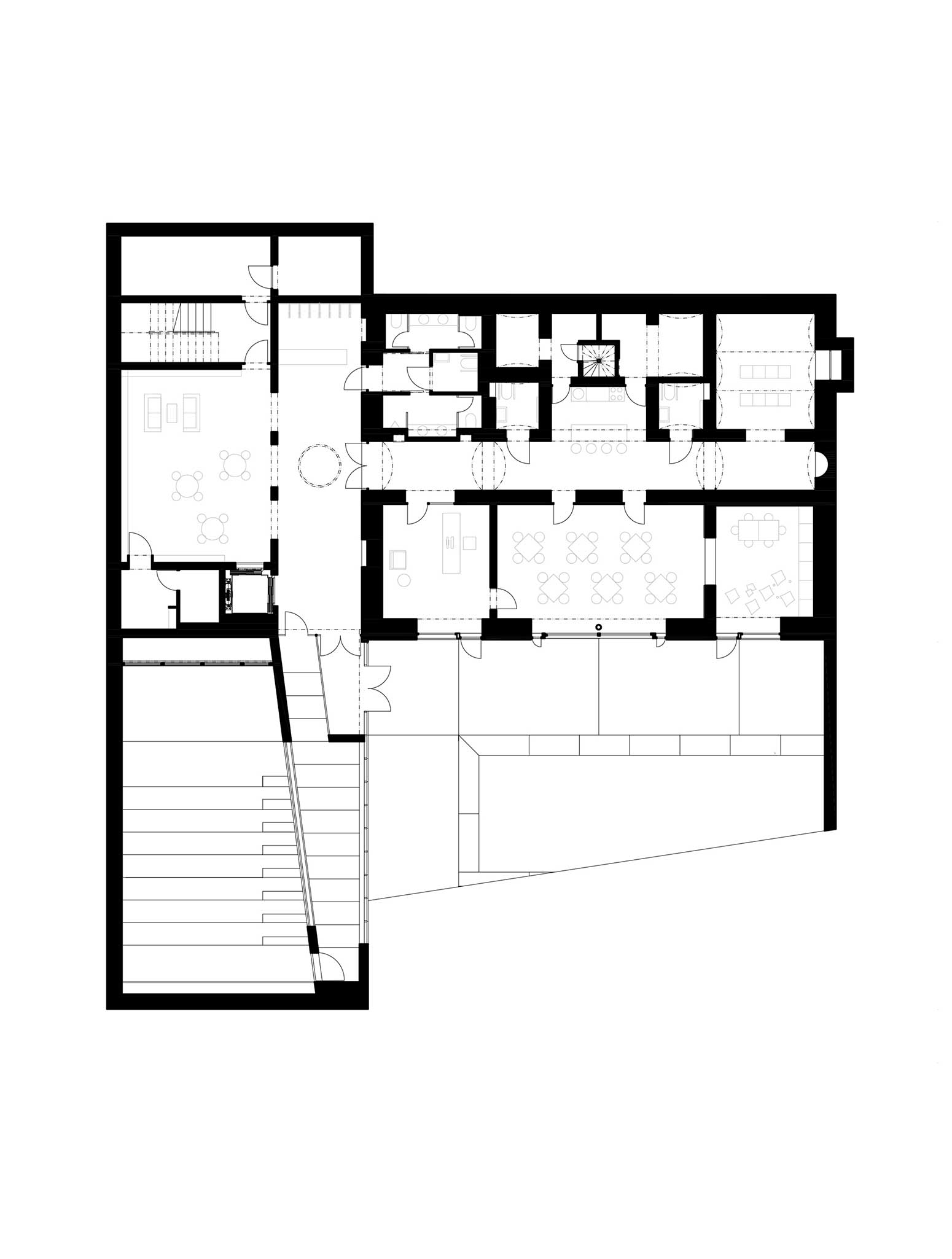
Co-author: Jana Janďourková Medlíková
Collaborators: Construction engineer: David Mareček; Graphic design: Jan Stolín
Project information
- Architect:Atak Architekti
- Location:Czech Republic,
- Project Year:2021
- Photographer:Tomáš Souček
- Categories:Library,Public Building