We tailored this renovation of an apartment from the turn of the 19th century in Prague’s Bubeneč district to young clients with two, perhaps three little creatures. The clients, together with the space and place as such, were the primary source of inspiration – their requirements, lifestyle, and the feeling they evoke.
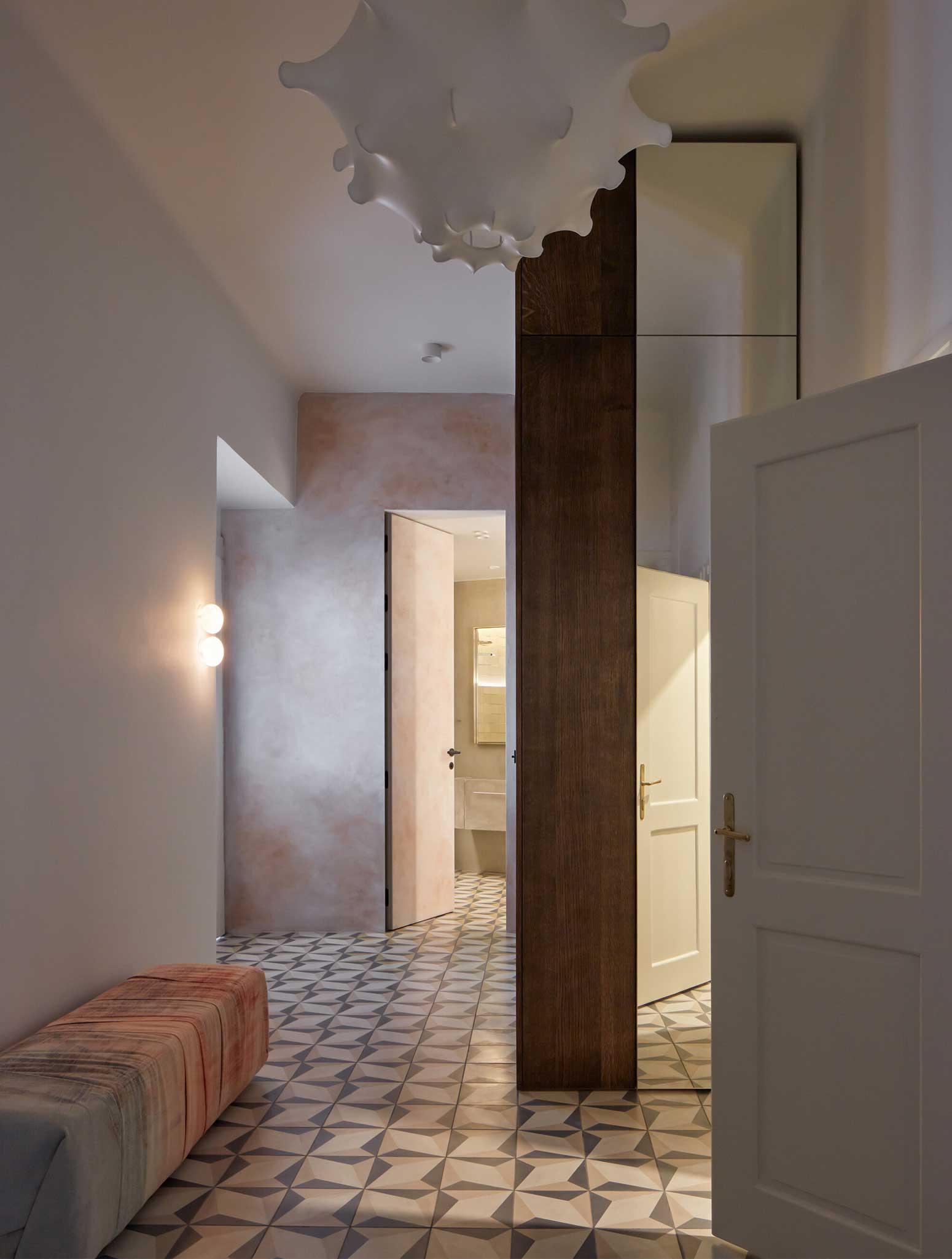
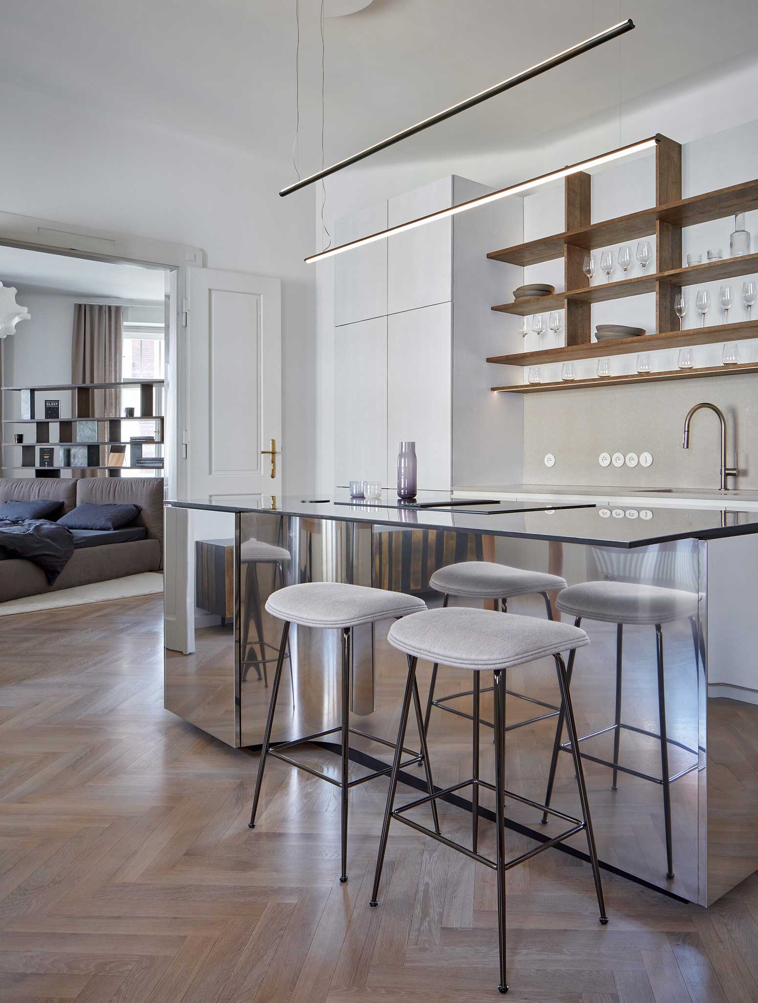
The brief was, in many ways, very concrete – the clients wanted a cement floor tiling with a distinct four-pointed star pattern, a supermirror kitchen island, or several pieces of furniture (bed, atypical drawer), which were moved in from another place.
In developing the design, we had to deal with a couple of contradictory requirements in a relatively small area. Interconnection and compactness of the whole manifesting its current functional purpose were our key concepts.
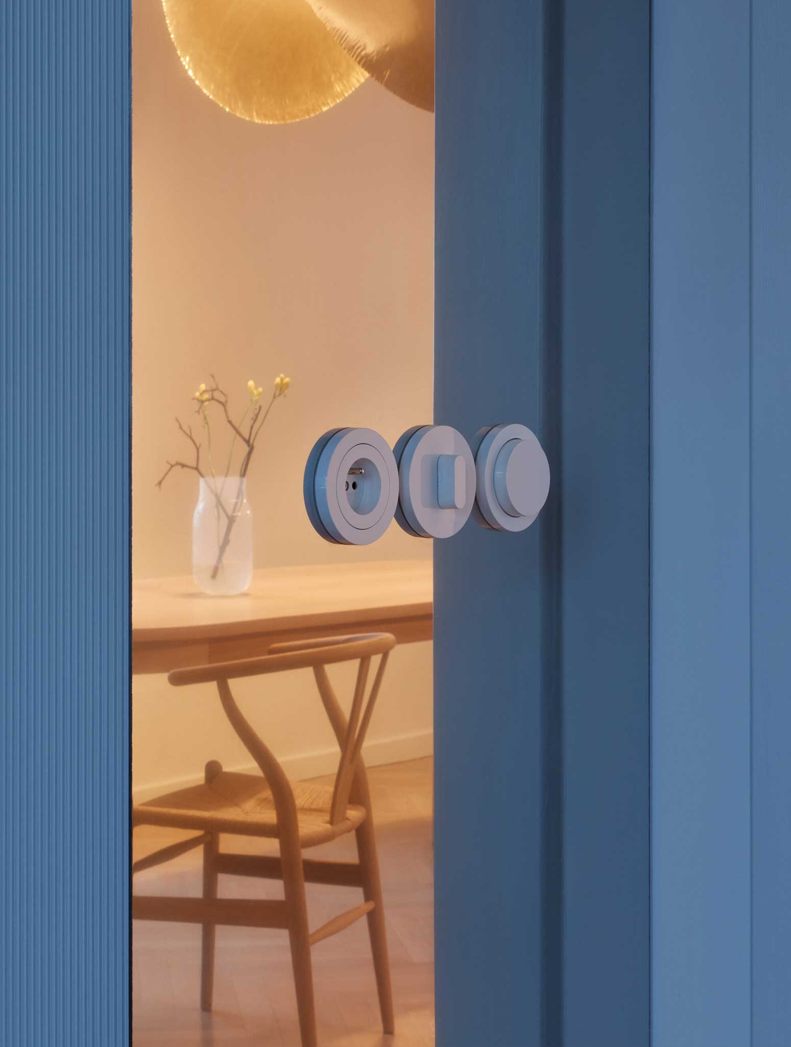
In this metamorphosis of tiny details, the materials, colours and textures played a crucial role. They are playfully featured on individual parts of the apartment and interconnected more than just in the openings.
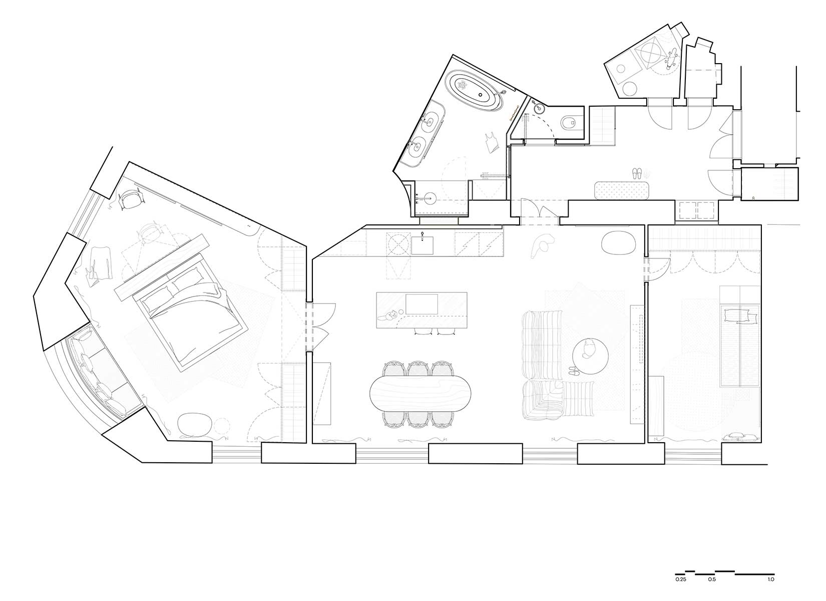
The apartment, which originally consisted of smaller rooms, as was common in this period, saw several adjustments in its floor plan. First, by removing a wall, we created a central space – the heart of the apartment. This way, we altered the overall movement patterns in the apartment. This adjustment also made way for enlarging the bathroom.

PHOTOS BY BoysPlayNice

PHOTOS BY BoysPlayNice

PHOTOS BY BoysPlayNice

PHOTOS BY BoysPlayNice
PHOTOS BY BoysPlayNice

PHOTOS BY BoysPlayNice

PHOTOS BY BoysPlayNice
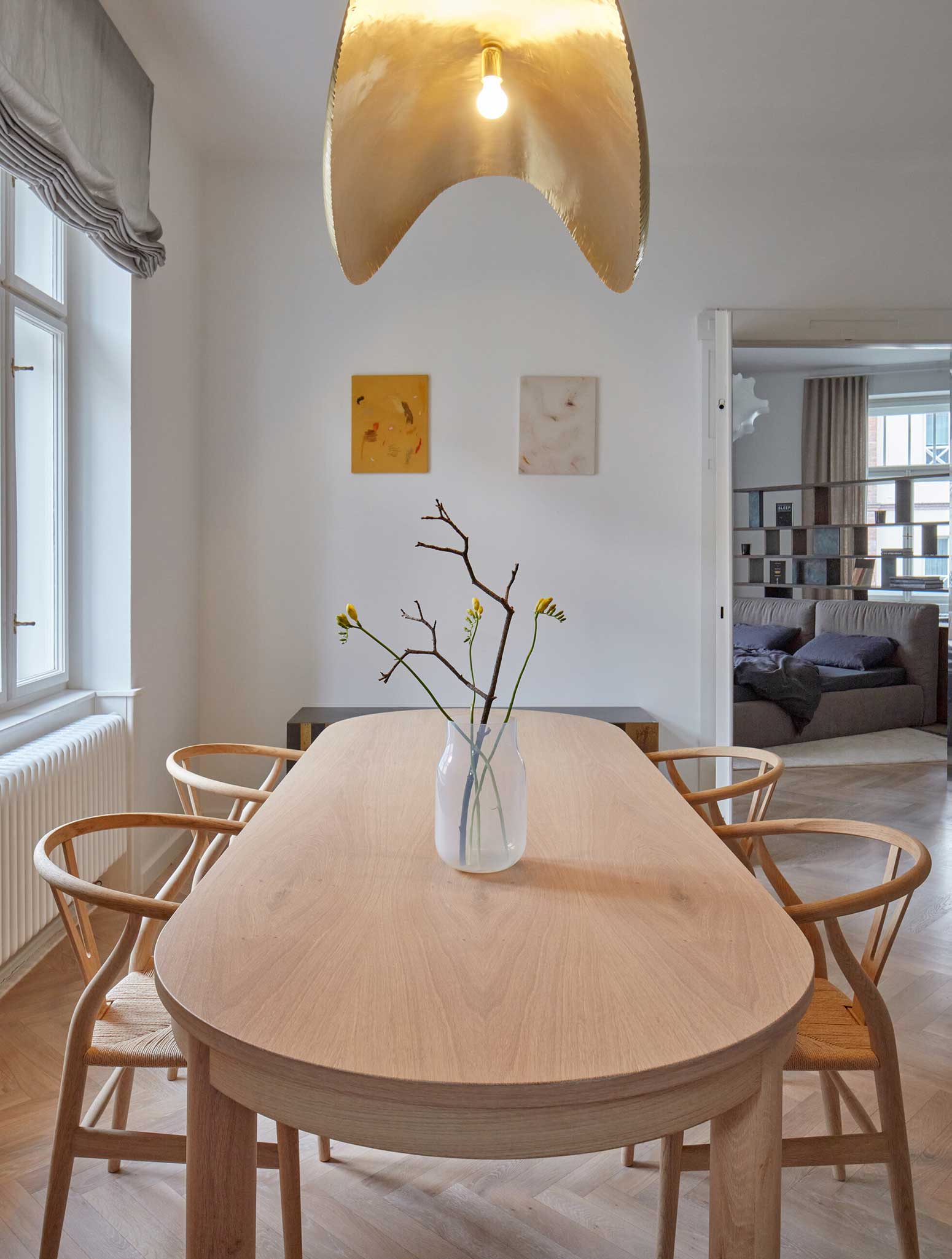
The central room opens to the children’s room with Montessori elements on one side and the bedroom with a workstation on the other. Overarching elements in the living spaces are subtle colours and clean, regular lines of the atypical furniture.
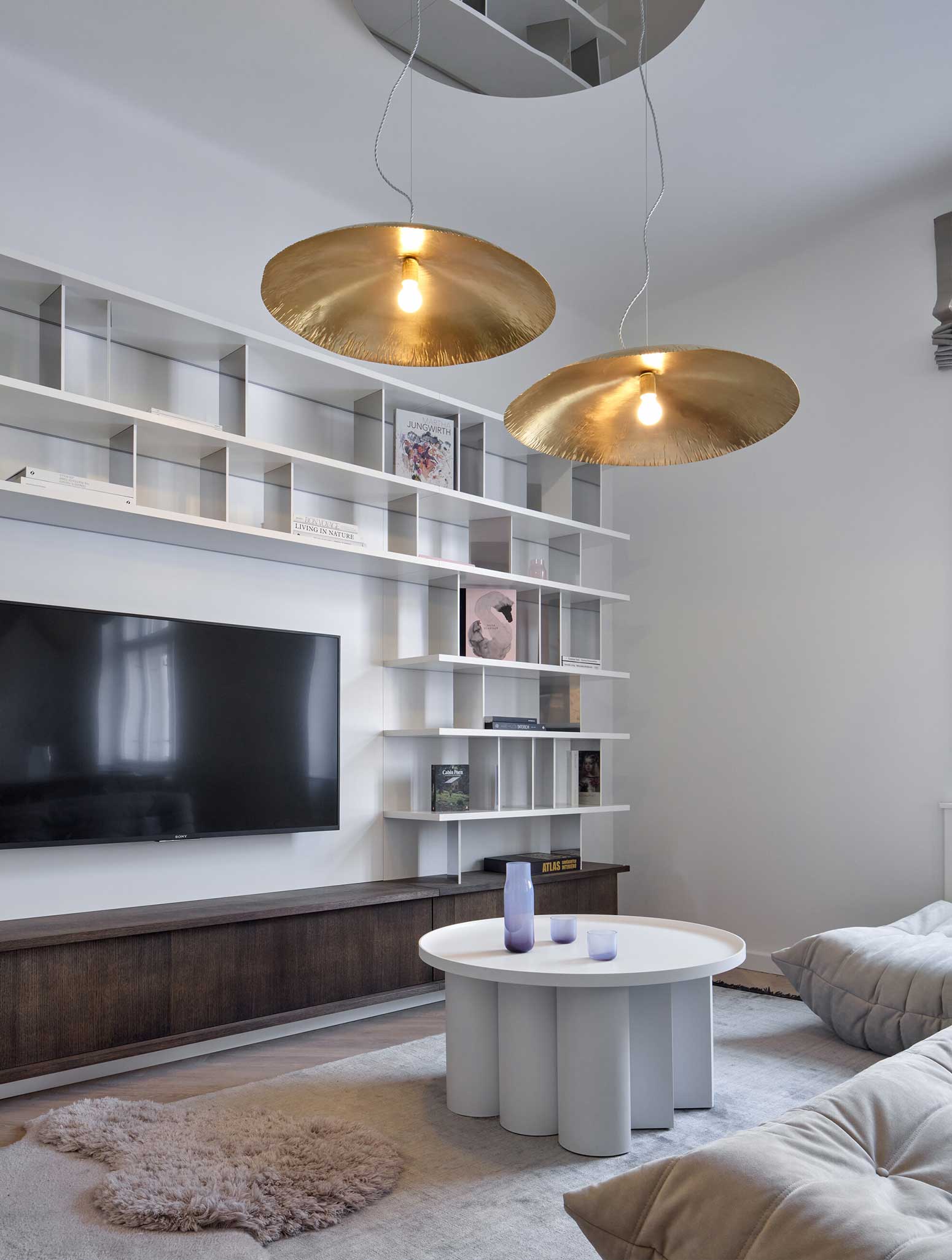
The apartment has an array of lighting (from standard interior lighting to furniture lighting), which facilitate particular atmospheres while also making the outstanding pieces of furniture come to the fore. Amongst them, the Stella coffee table by Jiří Krejčík, the Roly Poly armchair and the legendary Togo Sofa are worth mentioning.
Upon entering the apartment, the whole design has a playful clear-cut. The hallway allowed us to employ a wilder look. In its more tender layer, we complemented this space with a mirror play and a flow created by the colours changing on its distinct-patterned floor tiling (shading from medium grey to mustard ochre and powder pink). From the hallway, there are doors leading to a separate, hidden toilet or to a generous bathroom.
The whole apartment features remarkable pieces of author textiles from the Geometr Studio.

PHOTOS BY BoysPlayNice

PHOTOS BY BoysPlayNice
PHOTOS BY BoysPlayNice
PHOTOS BY BoysPlayNice
PHOTOS BY BoysPlayNice

PHOTOS BY BoysPlayNice
Collaborator: Petr Klapka – Technical supervisor of the investor
Project information
- Architect:Malfinio
- Location:Czech Republic,
- Project Year:2022
- Photographer:BoysPlayNice
- Categories:Apartment