PHOTOS BY David Zarzoso
PHOTOS BY David Zarzoso
The beginnings of this project are quite clear, it means taking a step forward and thinking about the future, initially it will be for a single person, with prospects that with the passage of time may increase the
number of occupants, as well as the use of the living place.
PHOTOS BY David Zarzoso
PHOTOS BY David Zarzoso
PHOTOS BY David Zarzoso
PHOTOS BY David Zarzoso
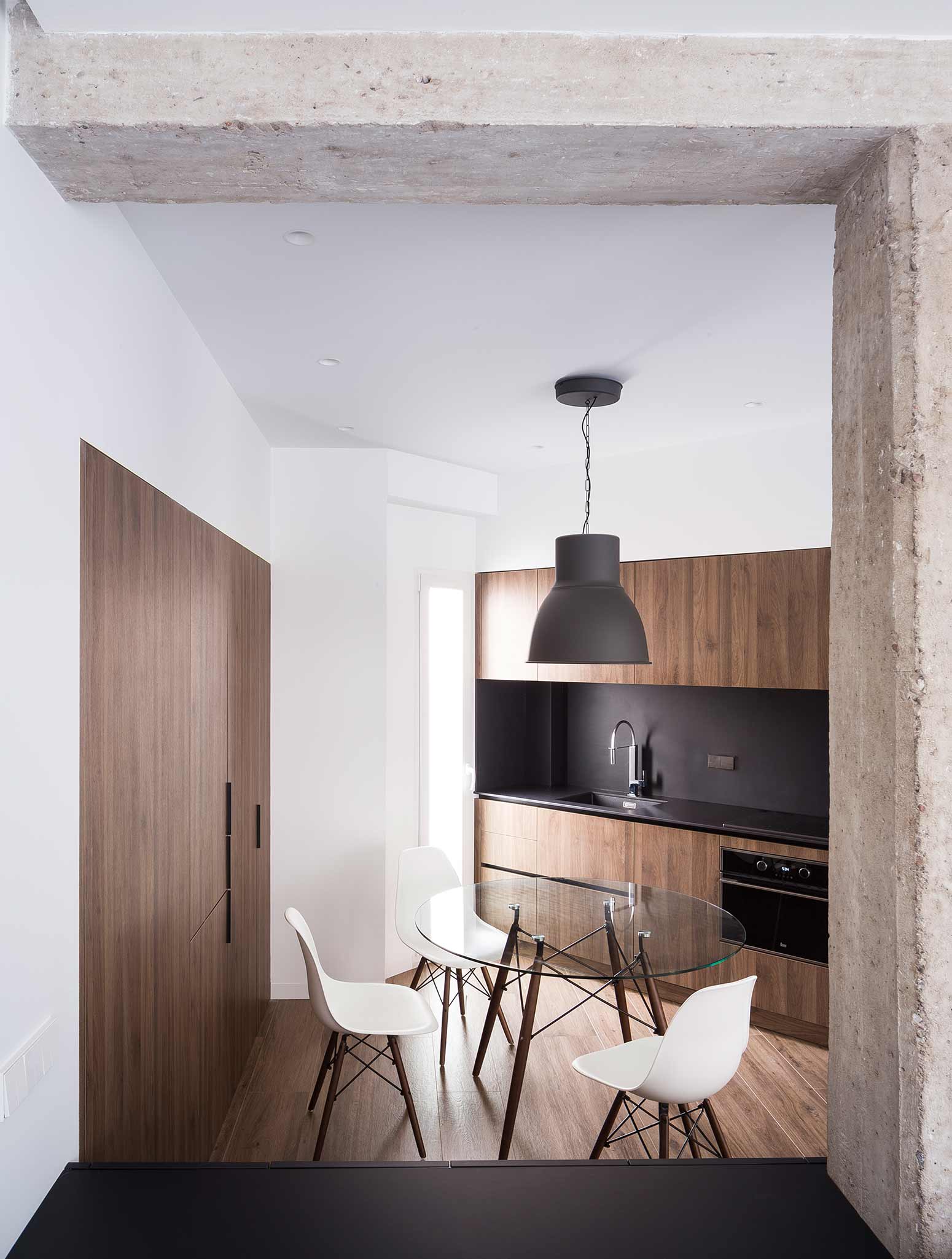
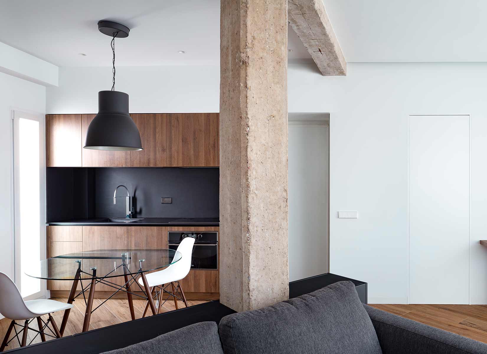
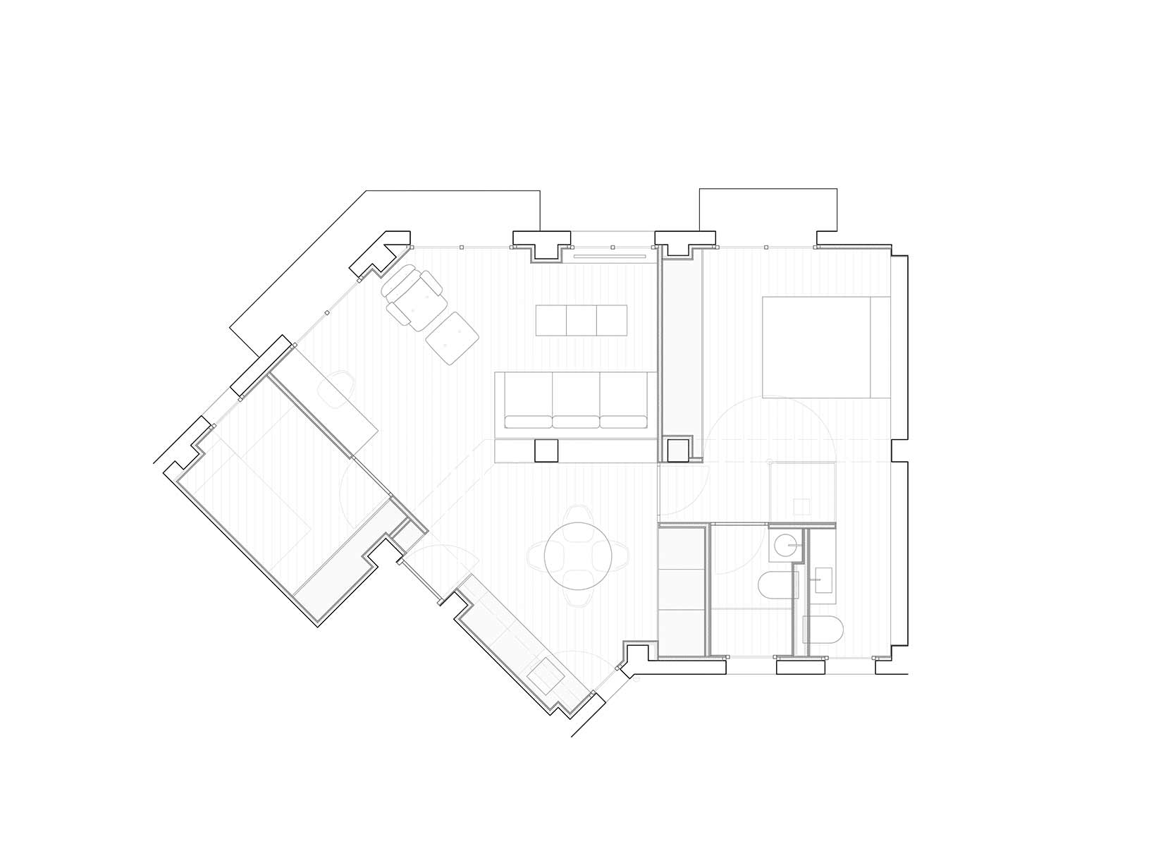
The premise and complexity when we started to distribute the spaces was to fit the program in 56m2, maintaining the sense of spaciousness. Therefore, we came to the conclusion that the most logical option was to let ourselves be guided by the chamfered geometry of the plant and by the structural lines of the building, following this thoughts, the final solution was simple and appropriate way to the building, where everything was going to it ́s place in a natural way.
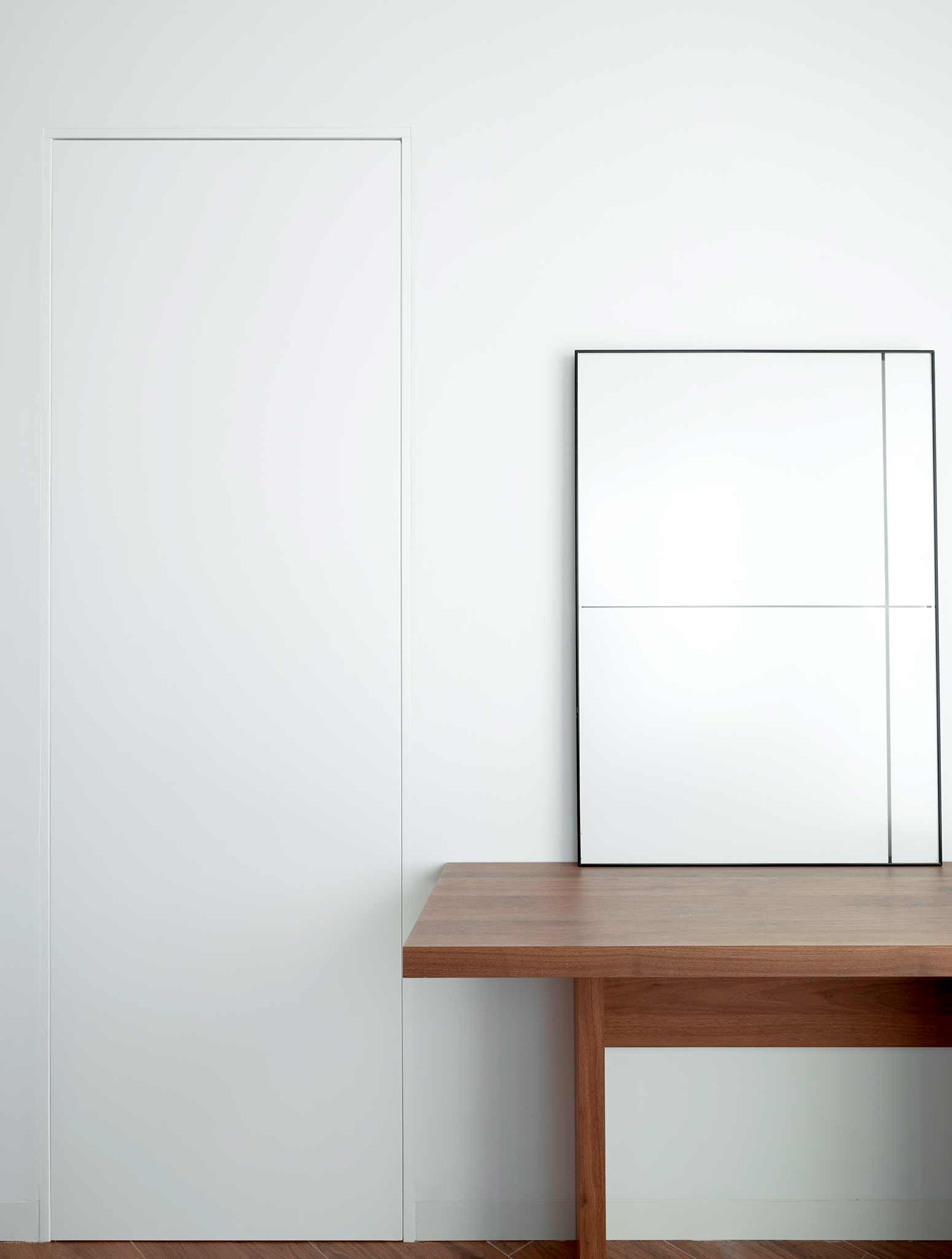
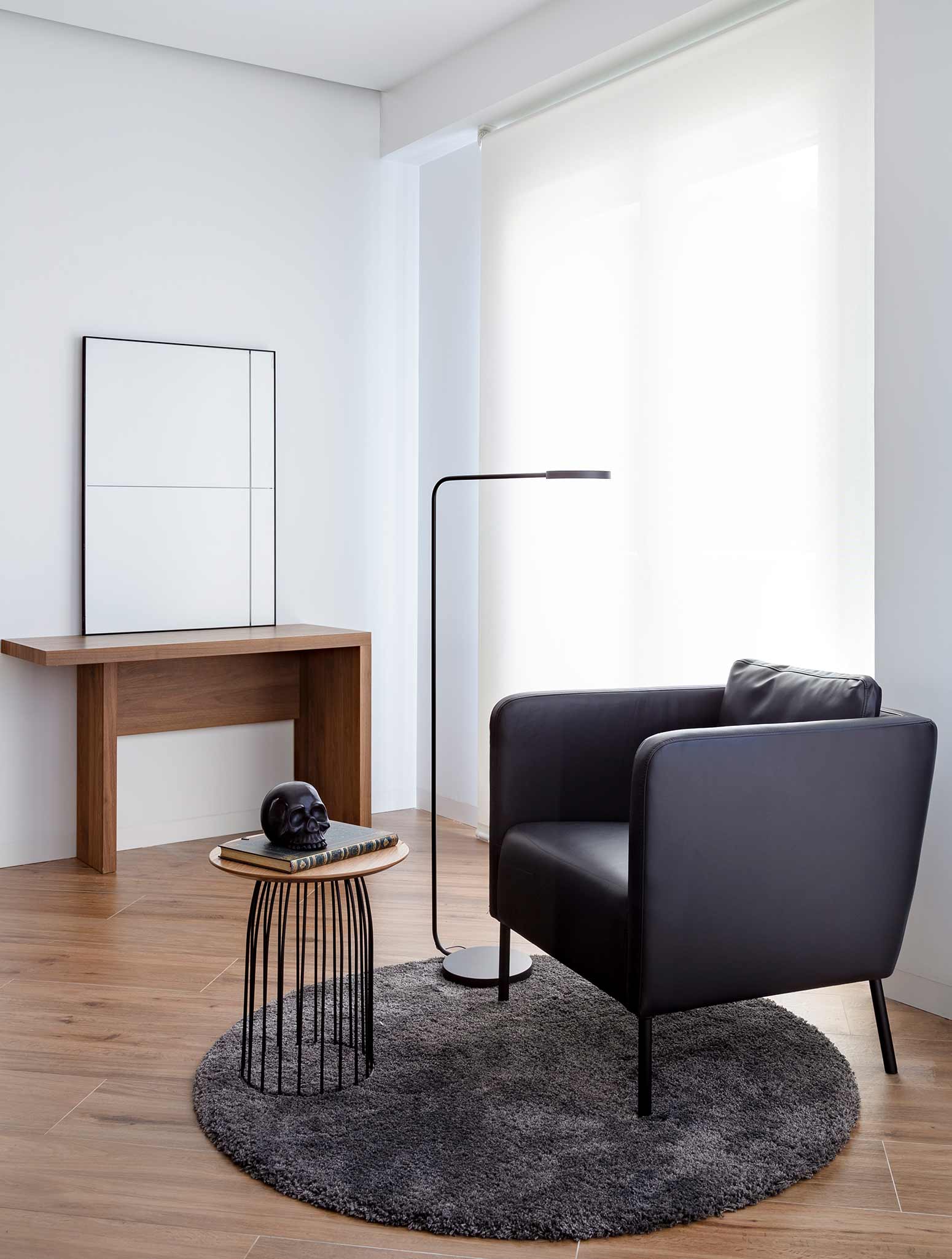
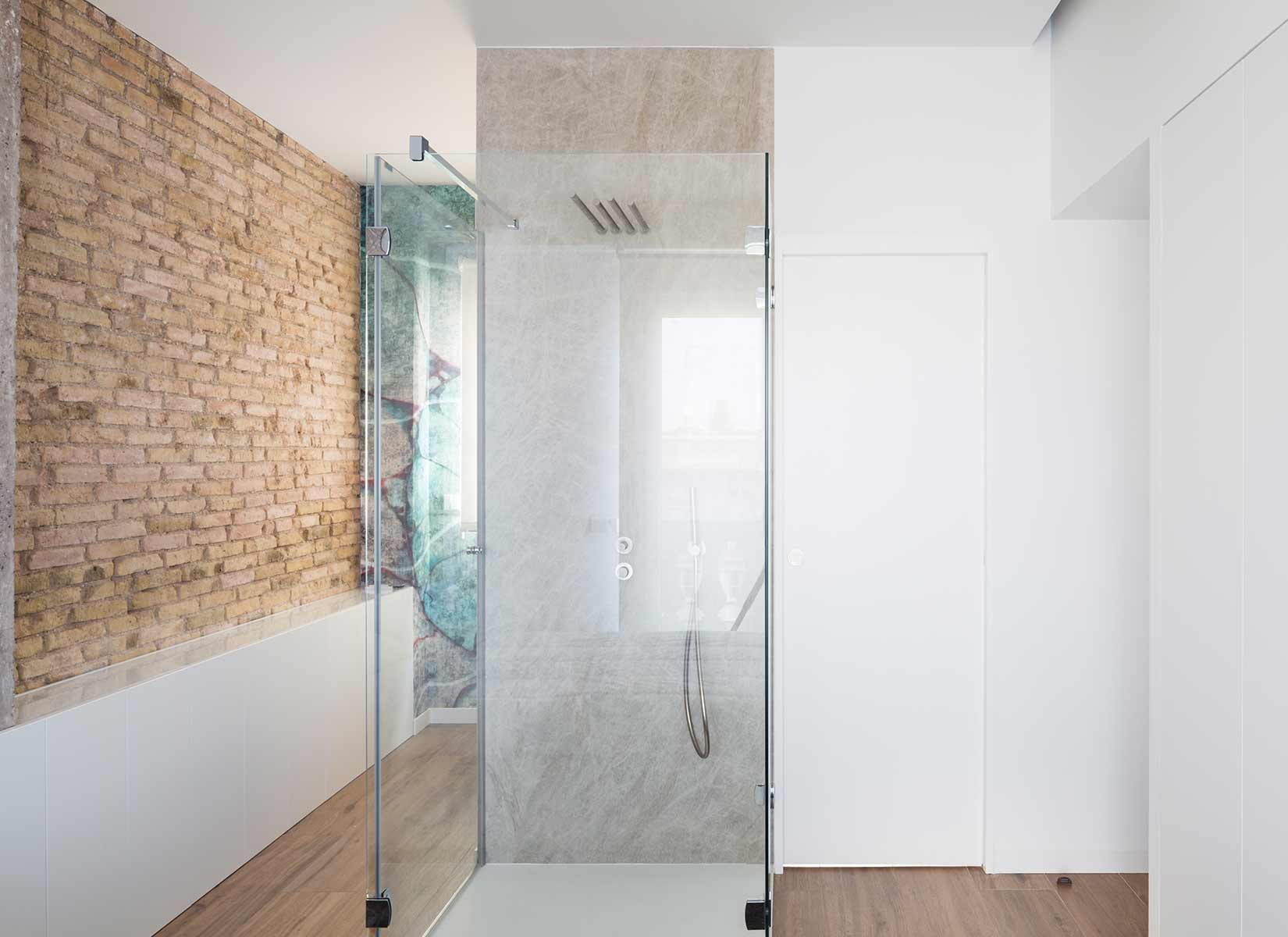
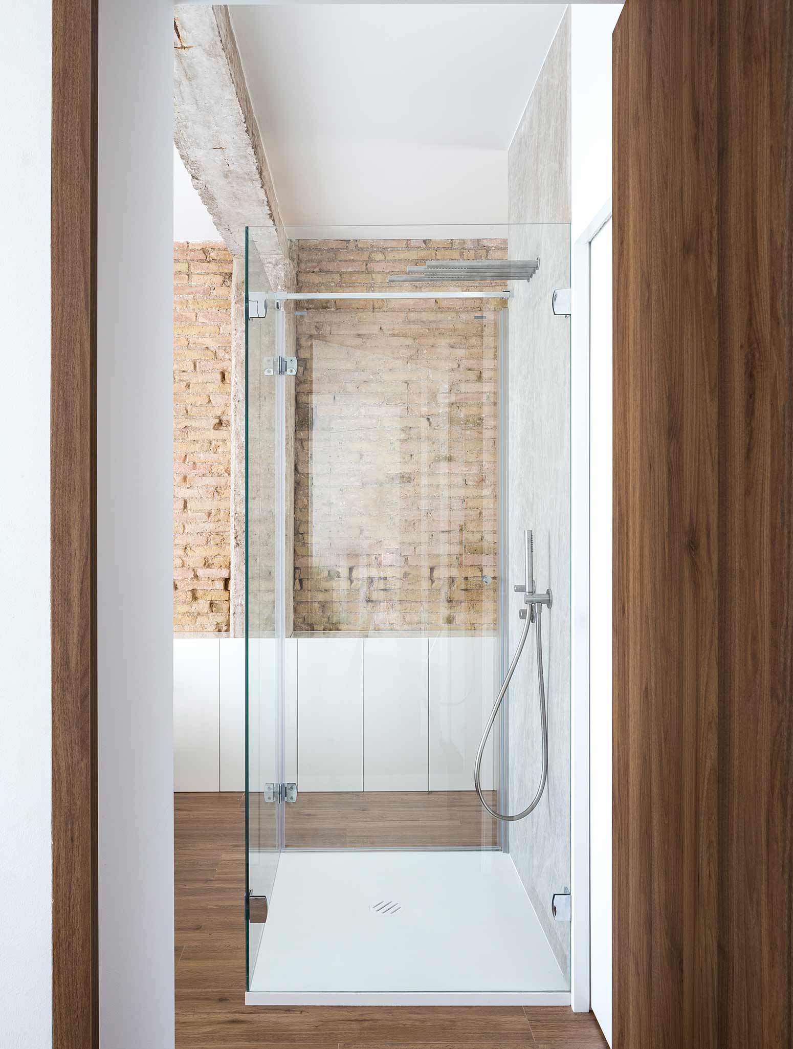
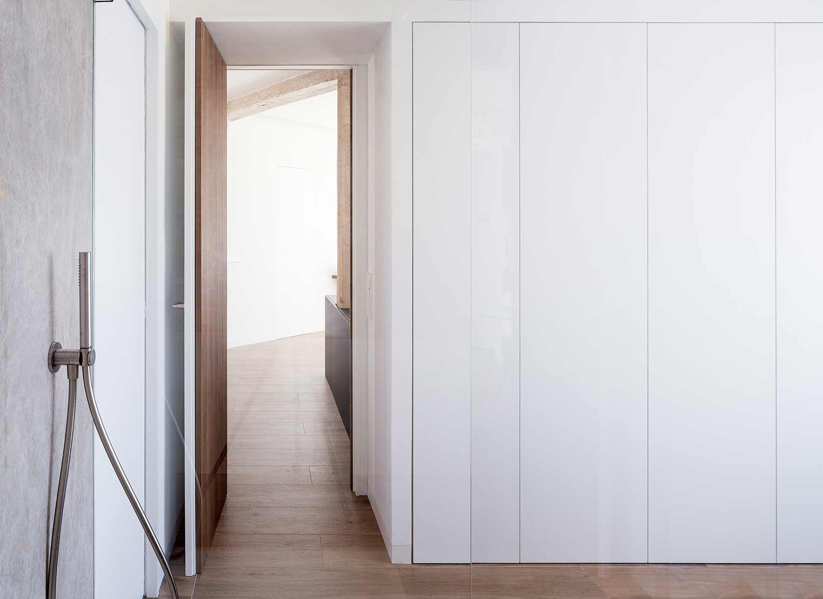
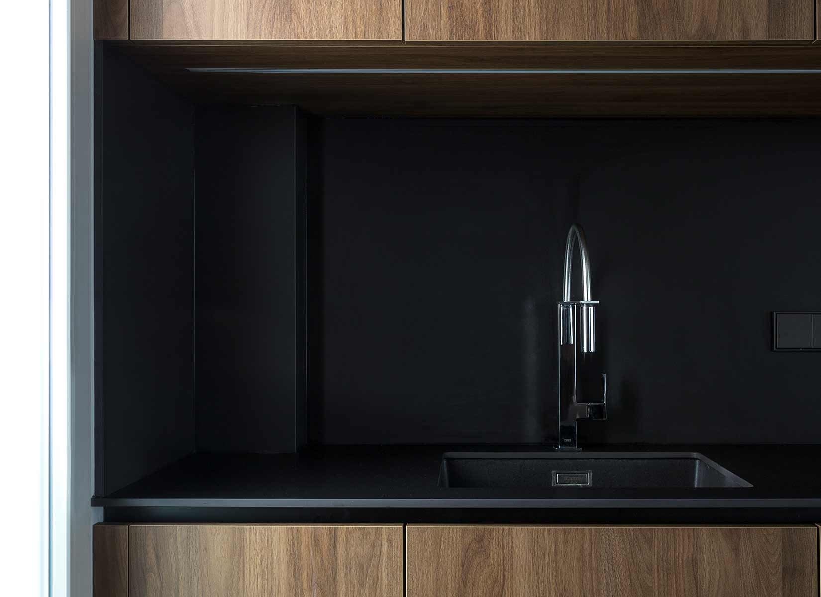
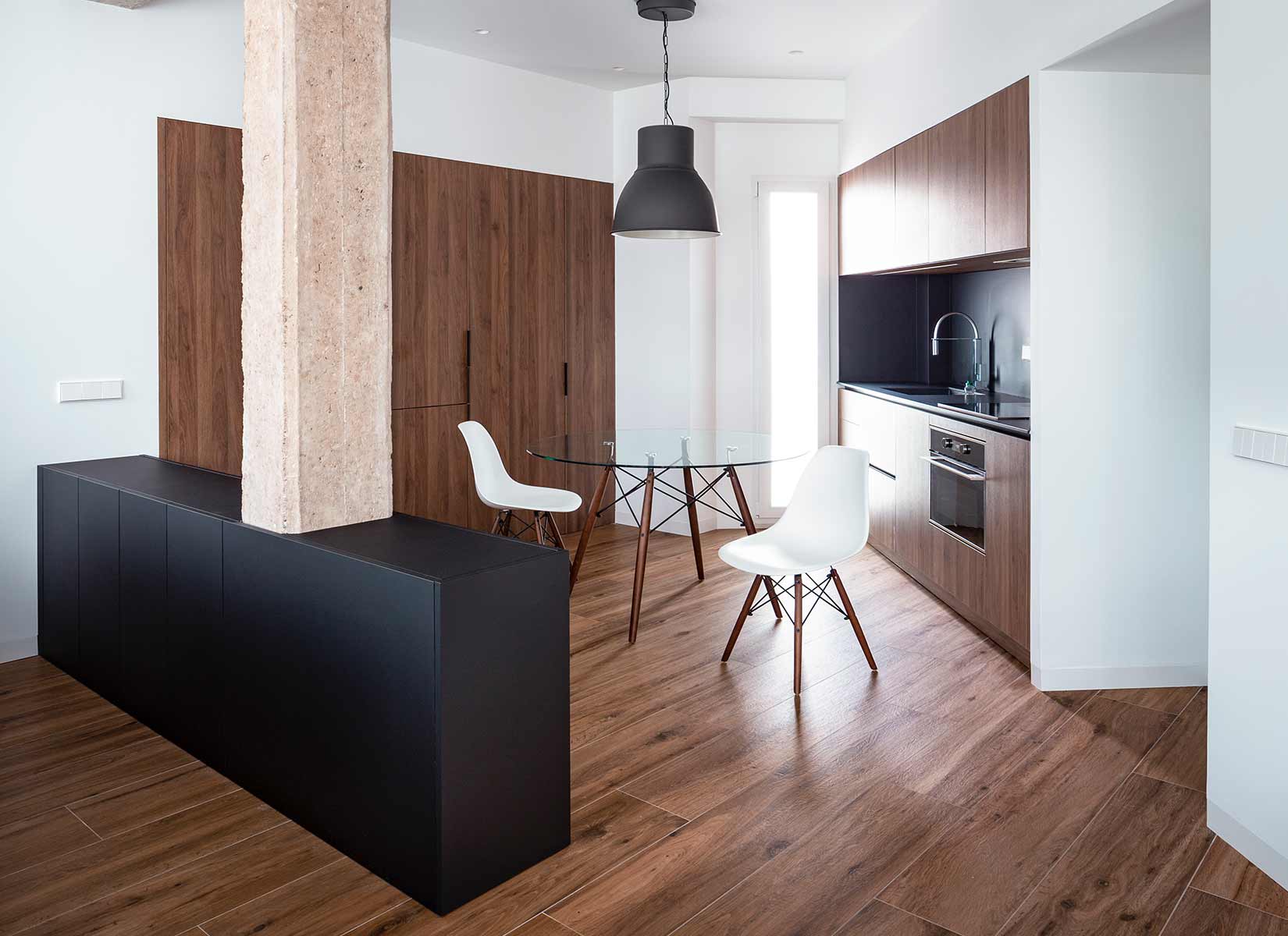
Working together with the client, we decided to give a sober and elegant character to the home, we chose to combine the noble finish that gives the walnut, in balance with some pre-existing elements that we decided to rescue and put in the foreground, while everything is related with white color as the dominant background. At the same time we play with the black color in a timely manner, using it in the furniture to differentiate spaces in the diaphanous area of the house.
PHOTOS BY David Zarzoso
PHOTOS BY David Zarzoso
Project information
- Architect:Carlos Segarra Arquitectos
- Location:Spain,
- Project Year:2018
- Photographer:David Zarzoso
- Categories:Apartment