PHOTOS BY FG+SG Fotografia de Arquitectura
PHOTOS BY FG+SG Fotografia de Arquitectura
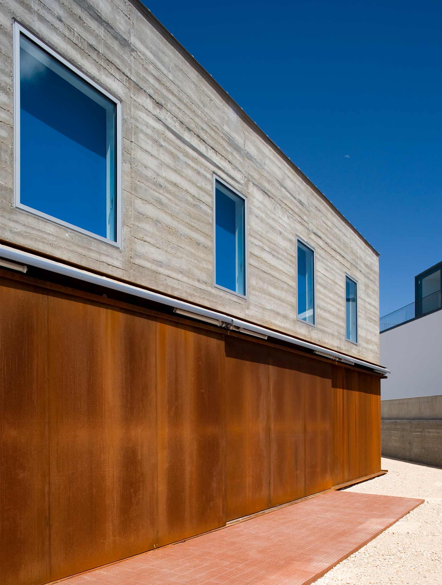
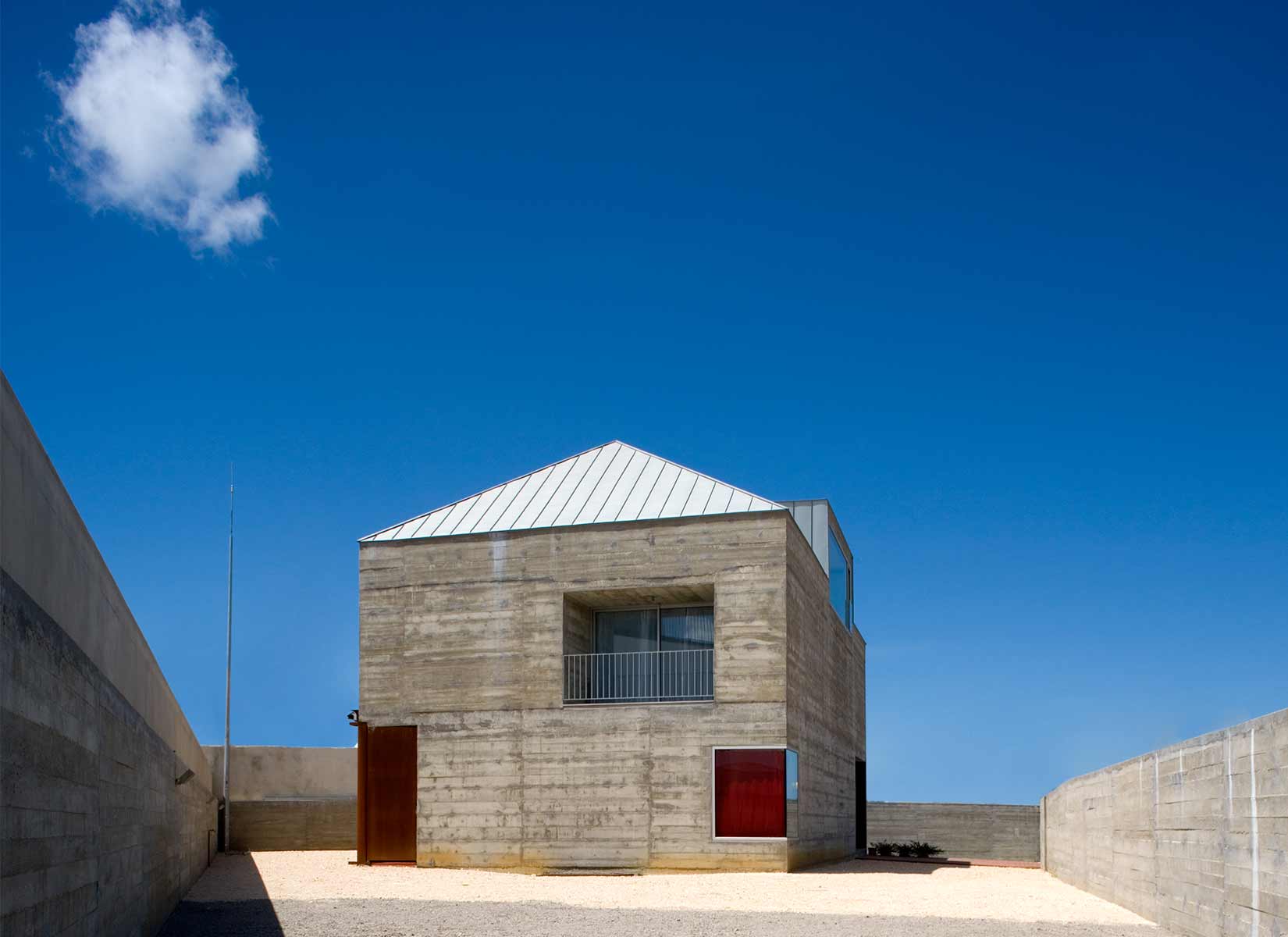
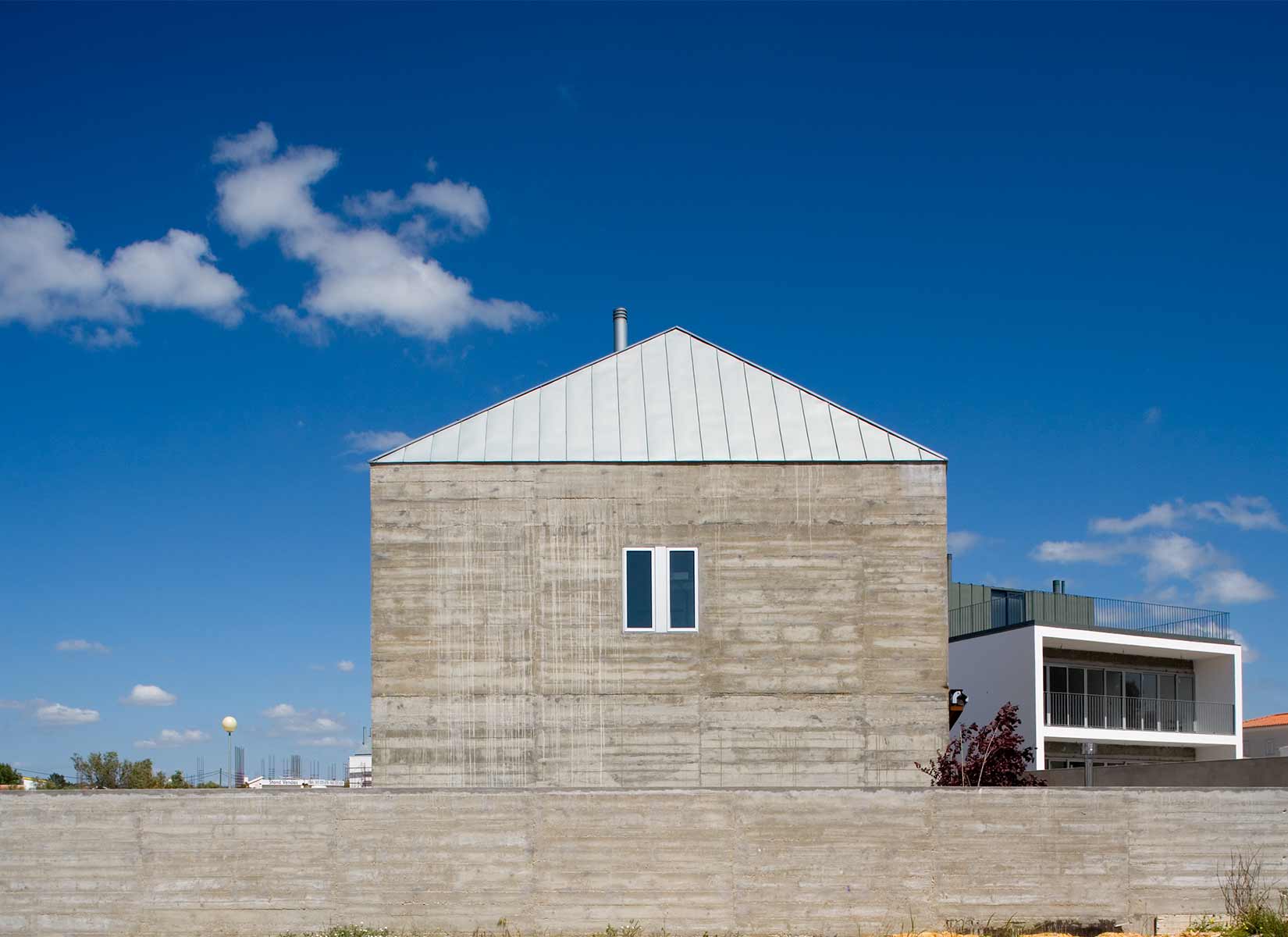
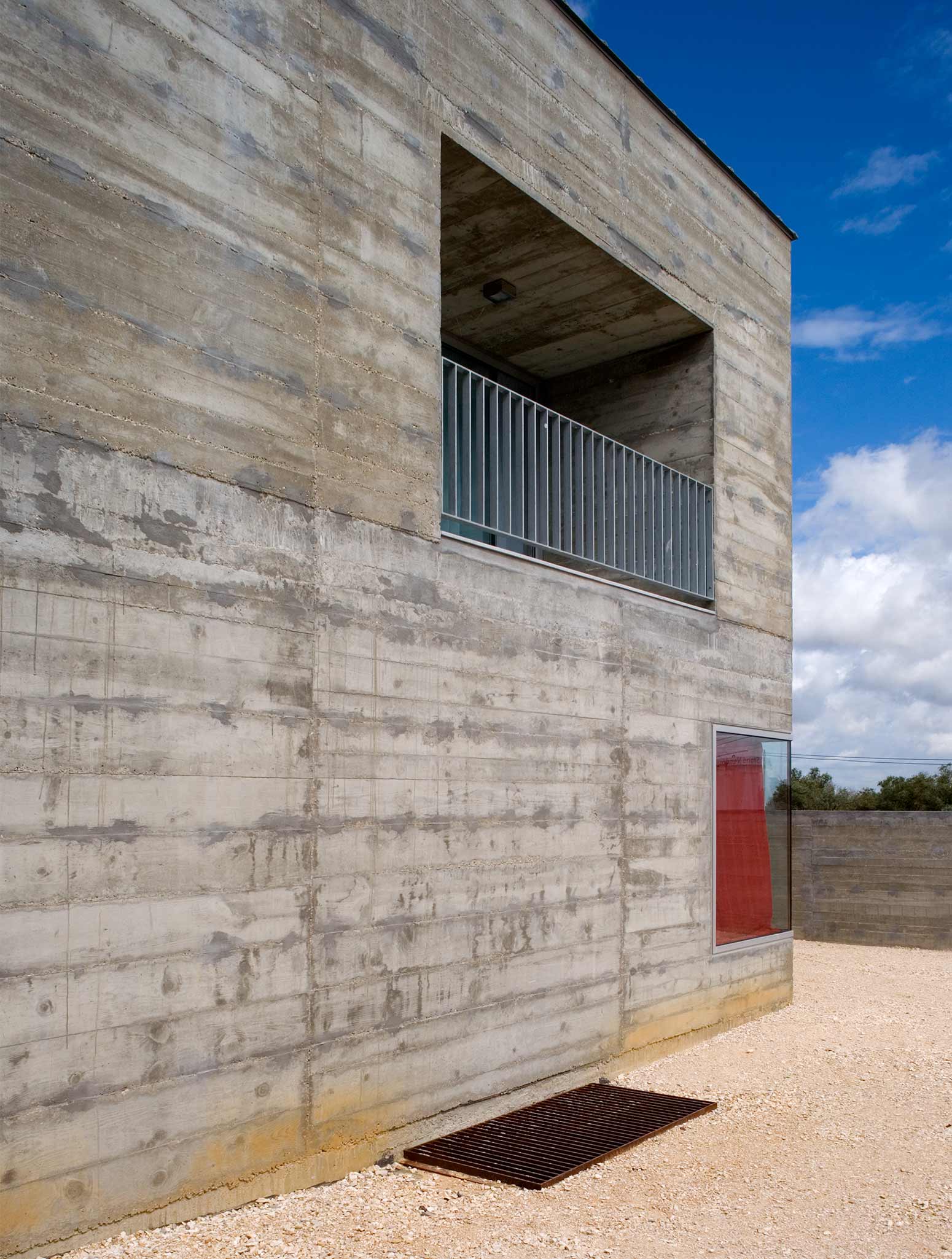
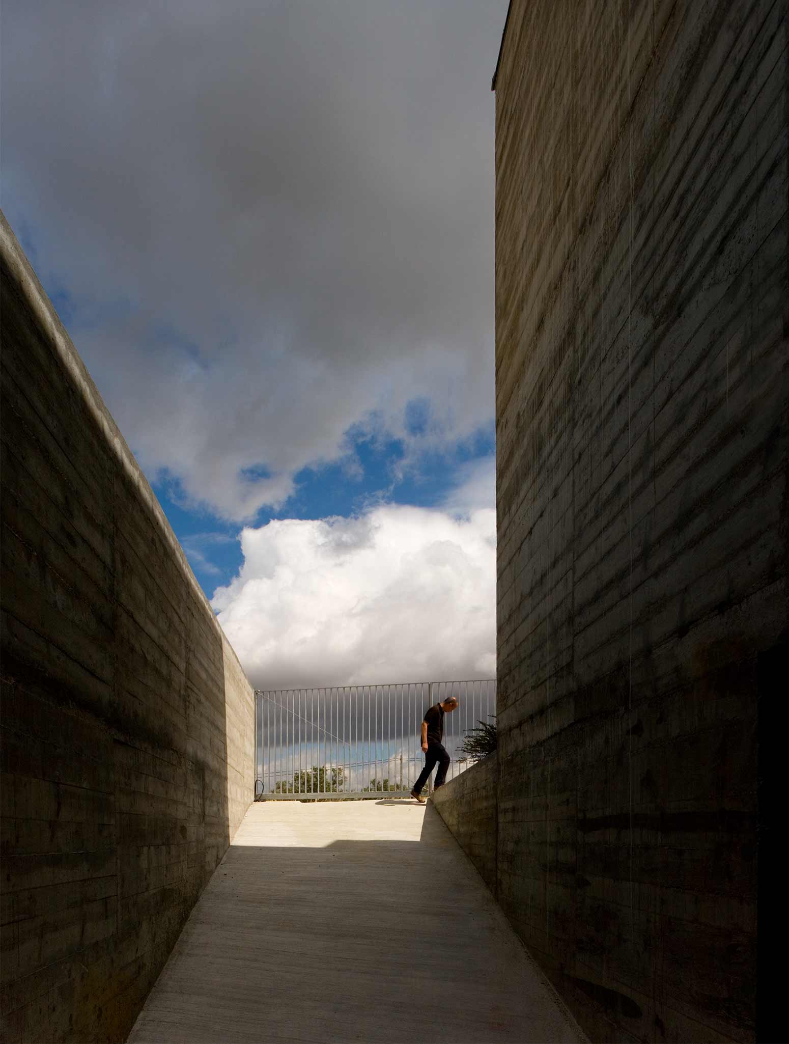
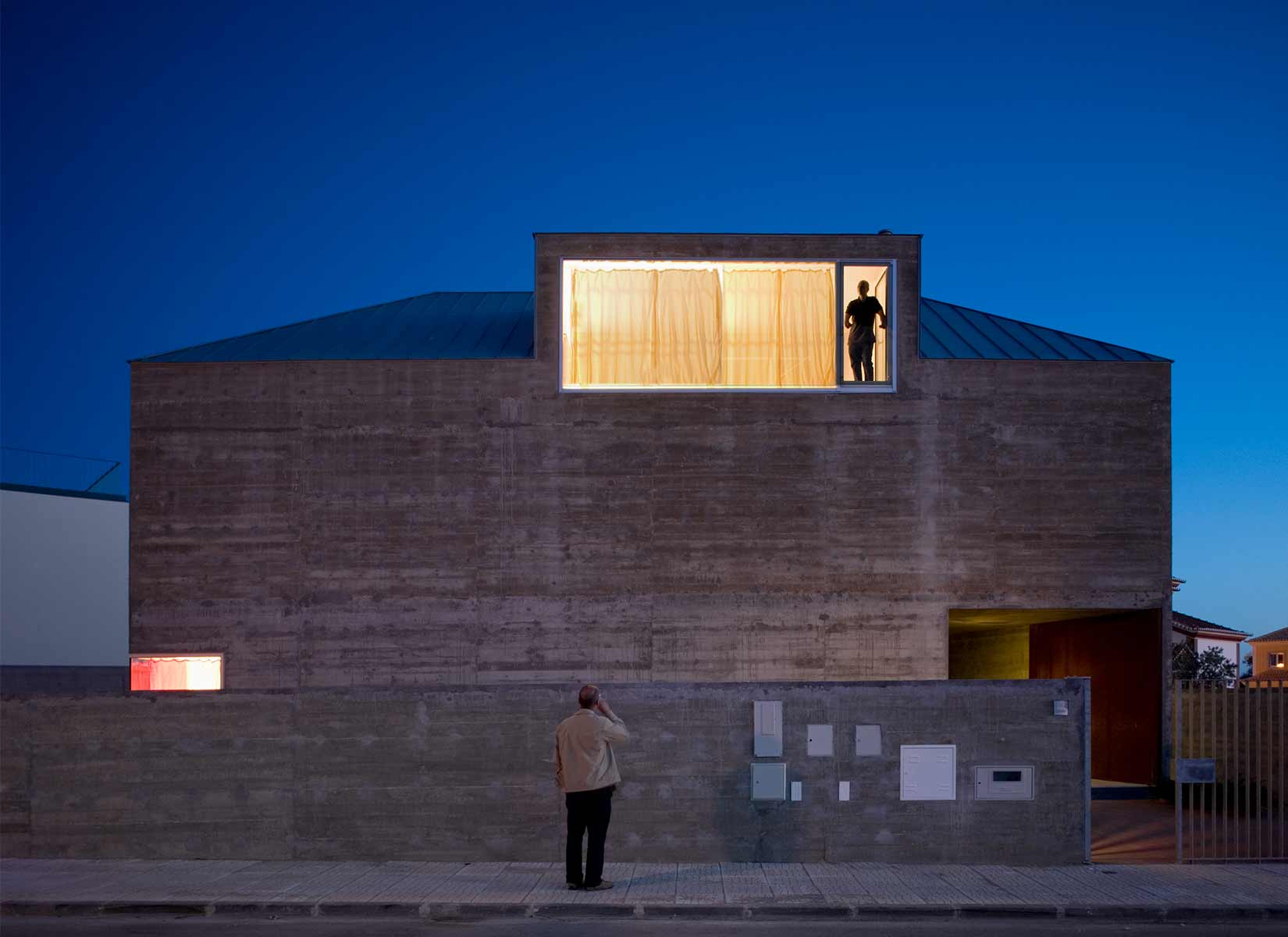
The starting point was a simple consideration: to make it look like a house. Its shape should be basic. Its material is concrete. Have time as an ally. Its elements emerge through analogy, emulation and selection. They include roof, windows, chimney, porch, veranda, and ironworks. It is seemingly opaque. It displays strong and unexpected contrast between interior and exterior. Consider the effects of exposure of the materials chosen. Take into account oxidation, erosion, wet and dry conditions.The project ‘migrates’ to a lot in Vila Nogueira de Azeitão. The family wanted a house that would face the mountain and close itself to the surroundings. The house takes up all the available space and the triangular shape of the lot allows for a floor area away from the property line, enhancing the detachment from the closest surrounding.
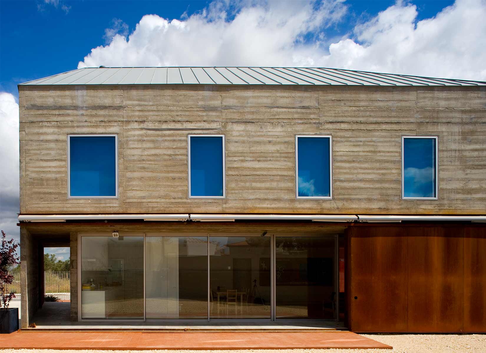
This monolithic structure of expose concrete is accentuated by openings (doors and windows) that appear as the result of the rigor of the interior space and it is covered by a zinc roof.
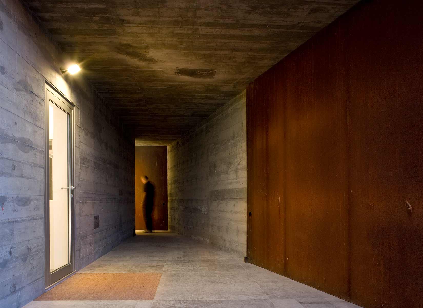
On the ground floor the south and west facades are held back some to create a transitional space between the inside and the outside. The receding glass panes are protected by huge stainless steel panels.
PHOTOS BY FG+SG Fotografia de Arquitectura
PHOTOS BY FG+SG Fotografia de Arquitectura
PHOTOS BY FG+SG Fotografia de Arquitectura
PHOTOS BY FG+SG Fotografia de Arquitectura

PHOTOS BY FG+SG Fotografia de Arquitectura

PHOTOS BY FG+SG Fotografia de Arquitectura
PHOTOS BY FG+SG Fotografia de Arquitectura
PHOTOS BY FG+SG Fotografia de Arquitectura
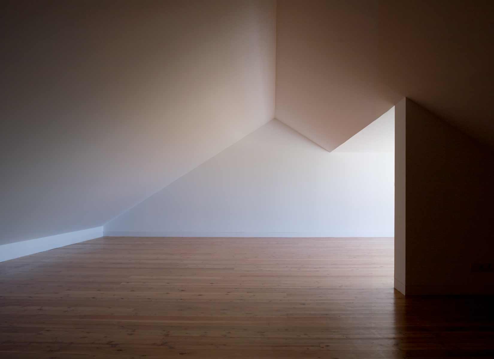
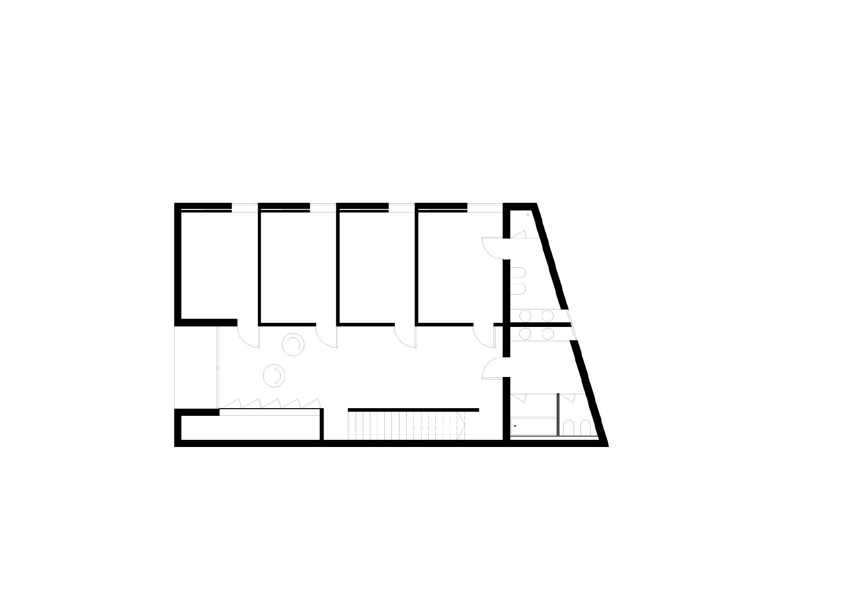
The stairs of access to the different levels are an element of distribution and take up the entire north façade. The house is organized into four levels: underground level for garage and atelier; ground floor with kitchen and living room; first floor with four bedrooms, large access area for study and relaxation, and bathroom; and an attic used as library and music room. Inside, the white color, the wood, the ceramic tiles and the soft stone establish a contrast with the concrete, iron, and cut stone of the exterior.
Collaborators: José Martinez Silva, Miguel Beleza, João Graça, Sandra Pereira
Project information
- Architect:Atelier Central Arquitectos
- Location:Portugal,
- Project Year:2005
- Photographer:FG+SG Fotografia de Arquitectura
- Categories:House