The creator of Artchimboldi, Anna Truyol, stands out for her restlessness and her tireless quest to transform people and humanise the business environment through spaces. After almost a decade working as an engineer in a multinational without finding meaning in her work and looking for a way to transform the business world, she decided to turn her career around. She clearly remembers how meetings in the multinational used to take place in impersonal hotels, in cold rooms with unwelcoming lighting.
At that time, more than 20 years ago, not much attention was paid to the care of workspaces and the well-being of the people who frequented them. It was then that he decided to found Artchimboldi. Thus, almost two decades ago, he created a new concept of conceiving business dynamics: a working environment with the warmth and spirit of a home.
During these years, companies from all over the world such as Nestlé, Ikea, Novartis, Puig, Nike, Bimbo, etc. have passed through Artchimboldi.
When Anna created Artchimboldi in 2005, she designed and decorated it herself and has been constantly transforming it. Now, together with her architect friend and collaborator in other projects such as Artchimboldi Menorca, Emma Martí, they have renovated the original Artchimboldi headquarters in Barcelona’s Dreta de l’Eixample with the aim of flooding the space with light and introducing the warmth of wood to achieve an atmosphere full of creativity as well as cosiness.
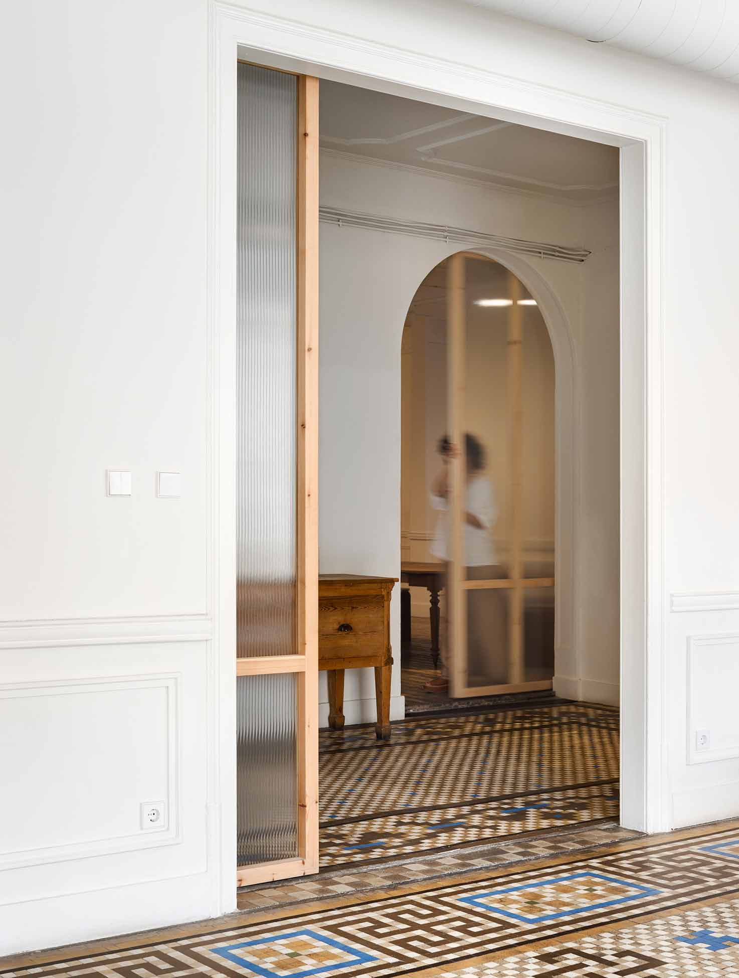
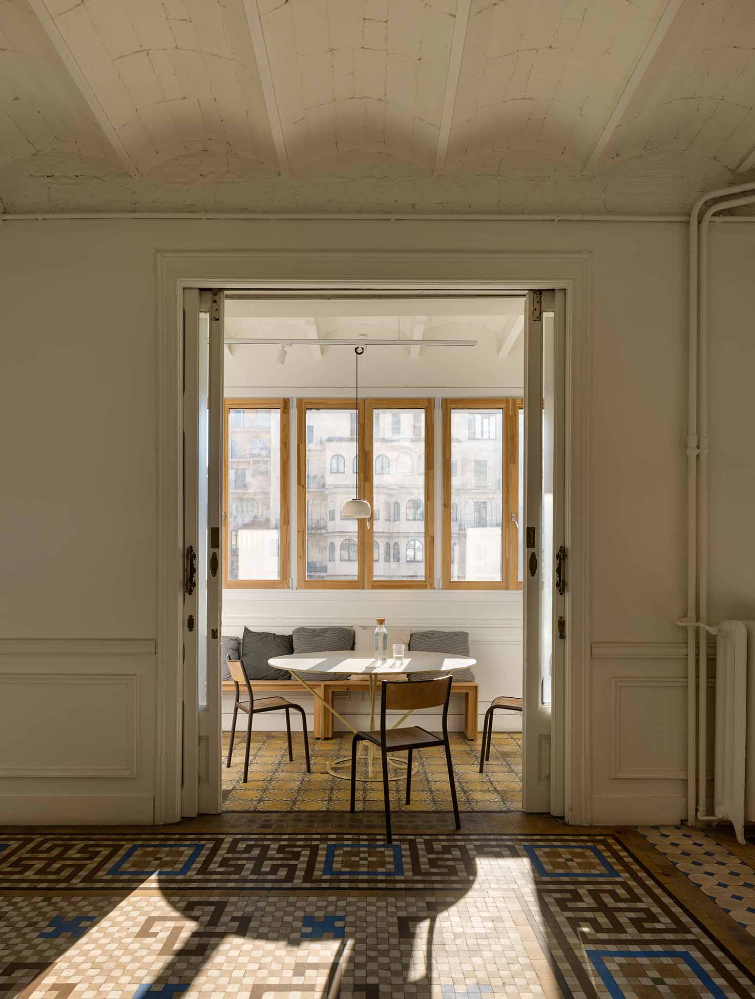
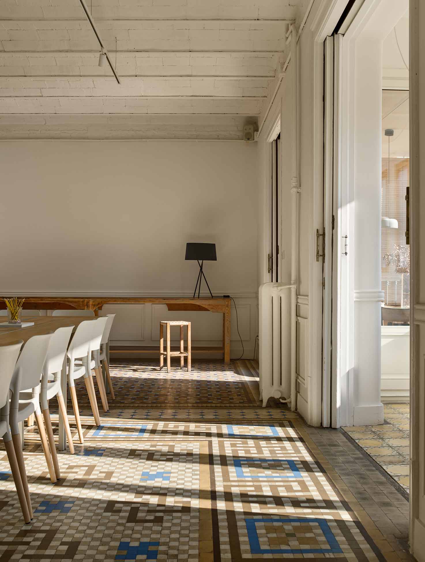
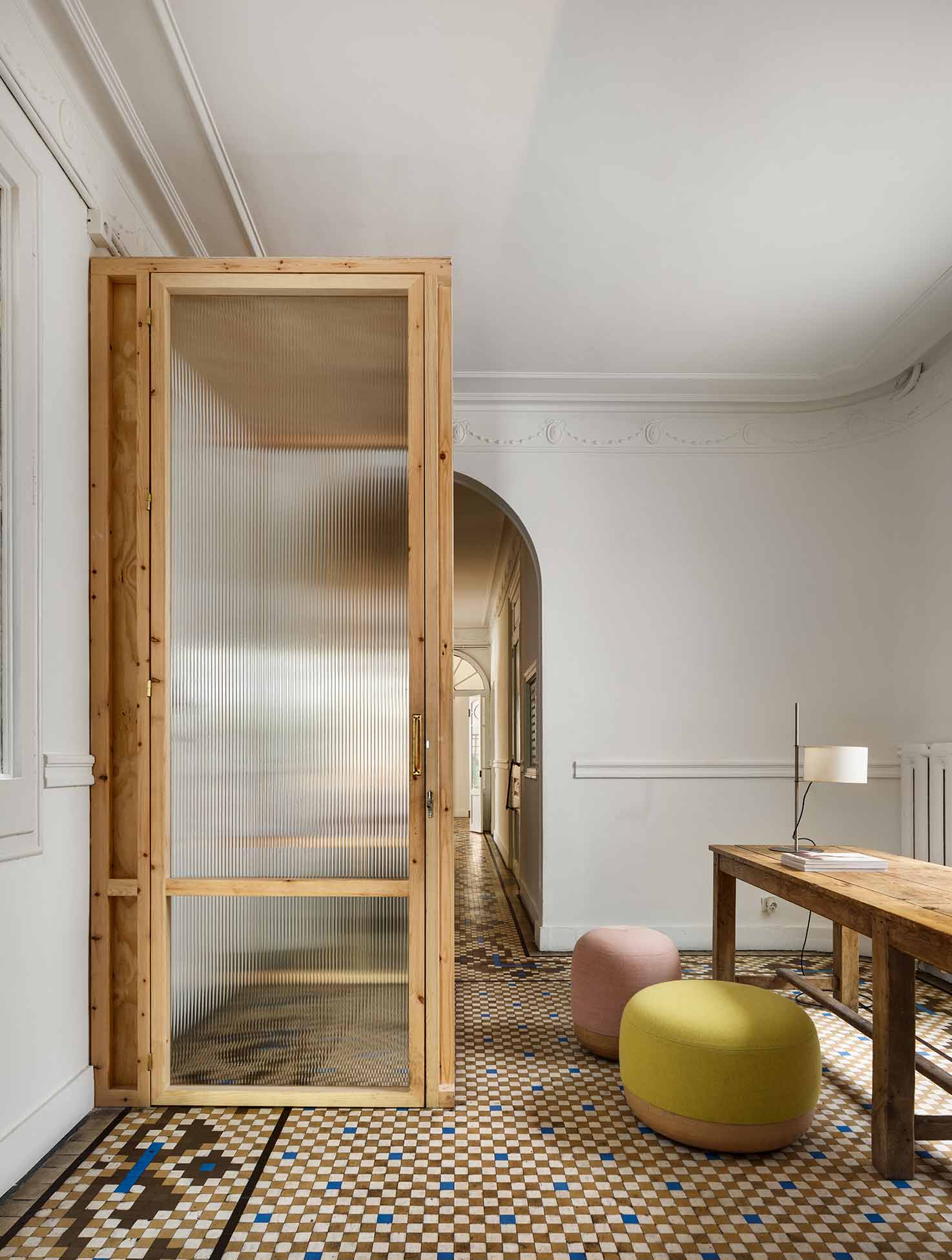
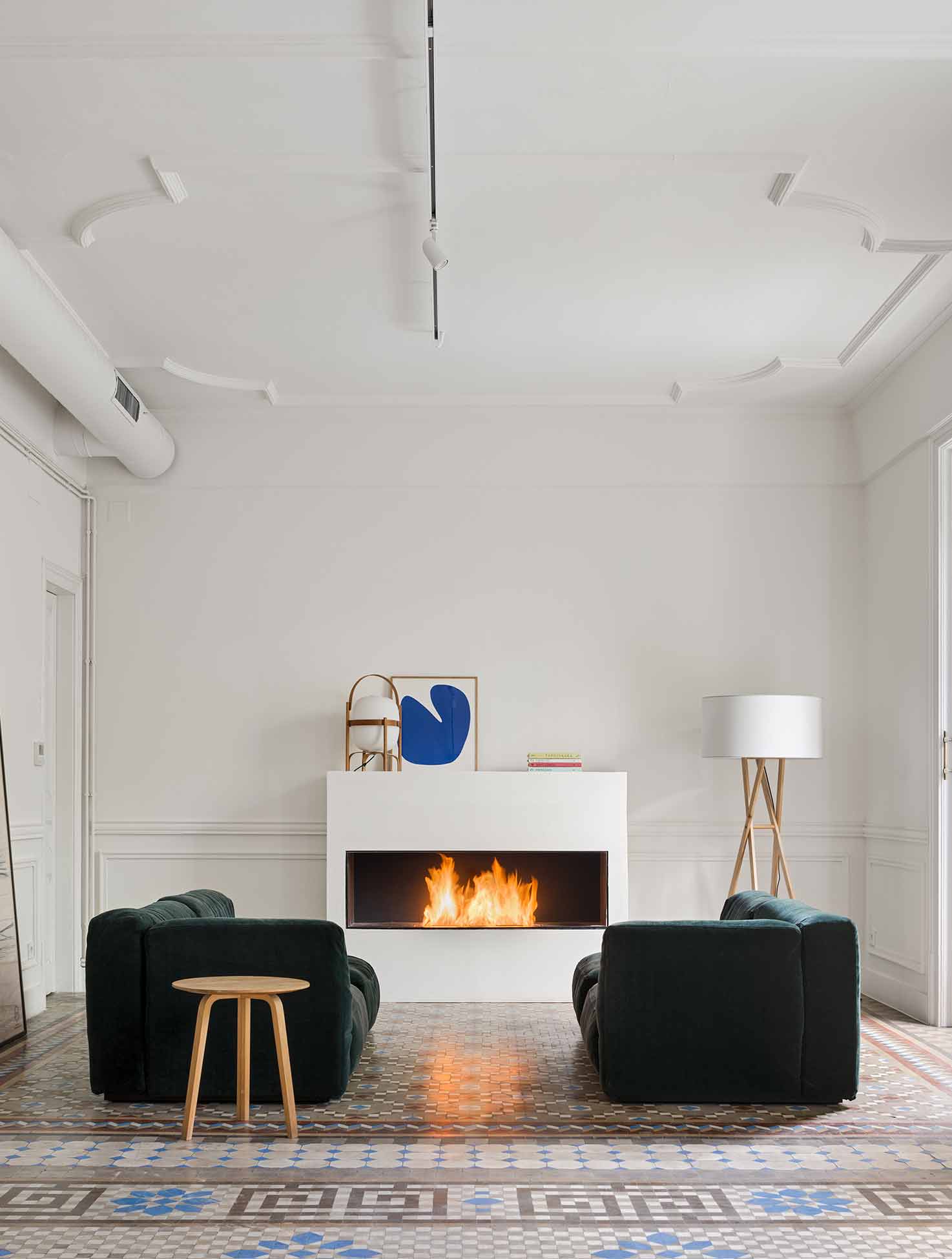
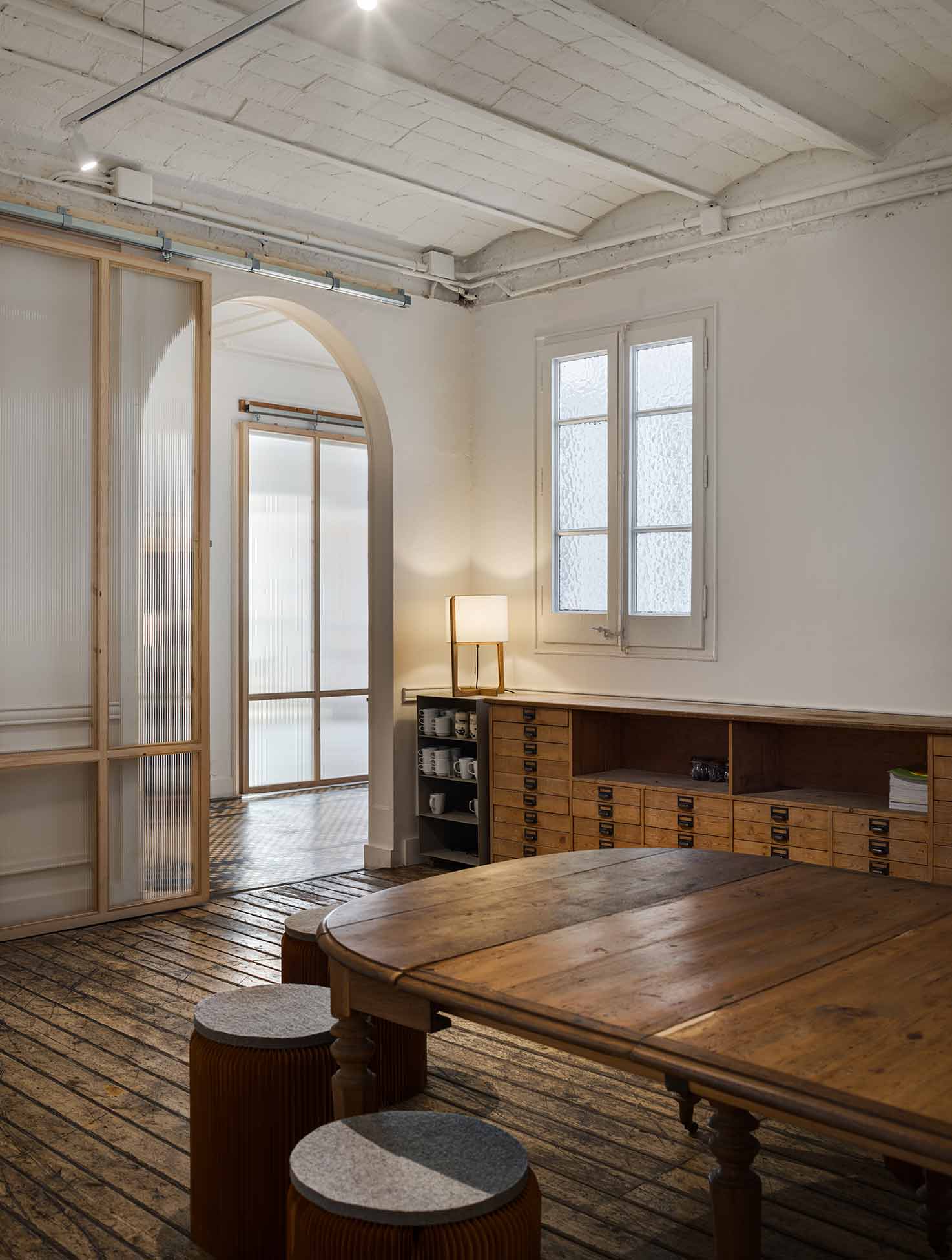
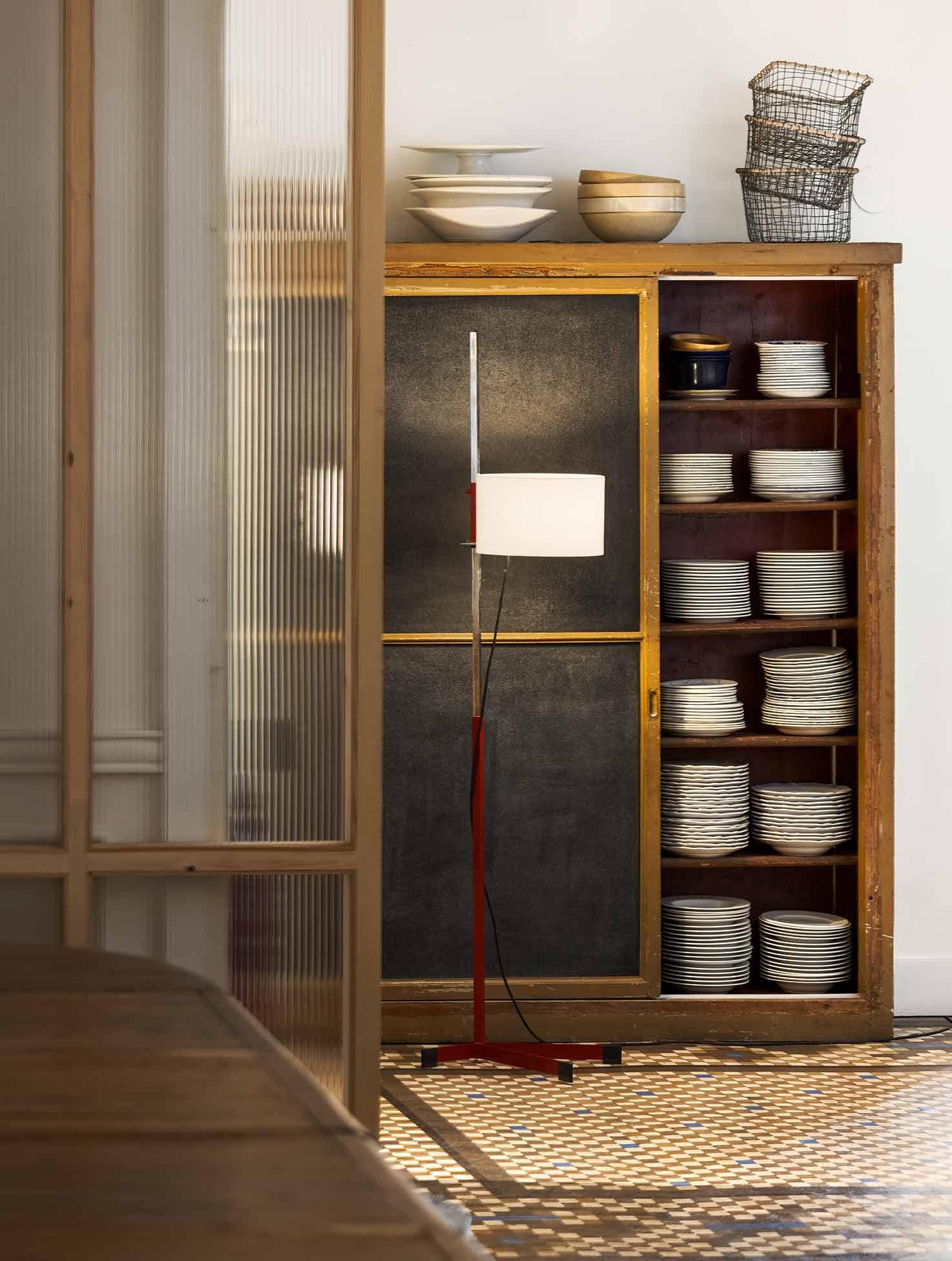
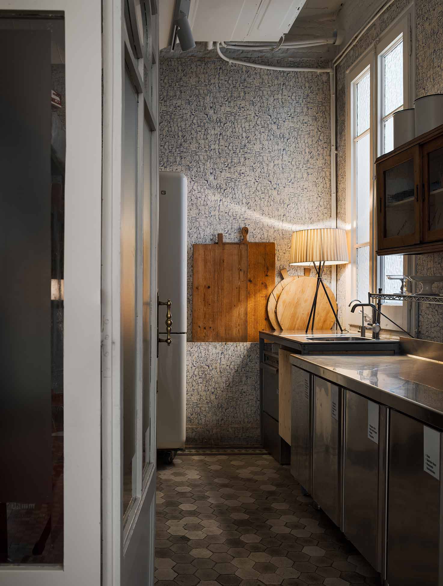
Anna and Emma chose to preserve original elements, such as mouldings, Nolla mosaic floors and carpentry details, to maintain the authenticity and historic character of the house. In addition, they decided to update the rooms by introducing two key materials: pine wood and textured glass. Wood brings warmth and, when left untreated, gives a modern touch to the spaces, standing out against a modernist base. The application of these materials, the common thread of the project, was carried out in the entrance, in several doors separating the rooms, in the washbasin area, the corridor and also in the gallery.
The entrance to Artchimboldi is through a cube designed in untreated pine wood and textured glass, which allows light to enter and at the same time creates a welcoming space. Inspired by the tradition of feng shui, the entrance to a space is especially important because it is the beginning of everything, it gives importance to that initial moment and helps to order the space.
Inside the space, several sliding doors with exposed guides have been installed, always made from wood and textured glass, which allow the work areas to be separated or integrated with a simple movement and make the most of natural light. This intervention sought to improve functionality and provide greater flexibility to the interior spaces, allowing them to be enlarged or reduced according to the needs of the visitors. “Companies need flexibility to meet, divide into groups, move furniture, change the set-up, it needs to be possible to do this naturally,” explains Anna. The separating doors, as well as the access doors to the bathroom and the entrance cube, have a height of about three metres, a slenderness and lightness that has been enhanced by using the thinnest possible wood profile (5 cm).
PHOTOS BY Pol Viladoms
PHOTOS BY Pol Viladoms
PHOTOS BY Pol Viladoms
PHOTOS BY Pol Viladoms
PHOTOS BY Pol Viladoms
PHOTOS BY Pol Viladoms
PHOTOS BY Pol Viladoms
In the gallery, pinewood benches have been installed, which continue the intervention of the rest of the spaces and make it a pleasant space with plenty of light for meetings in small groups. Access to the bathrooms was through a small dark corridor, so it was decided to install two access doors on each side, in pine wood and textured glass, and to connect both bathrooms with a glass partition that allows more light to enter and a better view of the details of the forging.
In addition to the introduction of these wood and glass elements, Emma and Anna wanted to “clean” Artchimboldi of superfluous or insignificant elements, always with the idea of simplifying, going to the essence, creating a harmonious space. In this sense, the ceilings were eliminated to increase the spaciousness and height of the rooms. Lighting guides were installed with spotlights to simplify the lighting, in addition to highlighting the construction system and other elements, such as the heating/air conditioning system. For the latter, a galvanised steel spiral tube painted white was chosen.
In fact, with a few exceptions such as the passageways, which are painted black, white was preferred to brighten up the workspaces. The renovation of this modernist dwelling represents a commitment to the preservation and appreciation of the city’s architectural heritage, while adapting it to the needs of a versatile and multi-purpose space.
Project information
- Architect:Emma Martí Arquitectura
- Location:Spain,
- Project Year:2023
- Photographer:Pol Viladoms
- Categories:Commercial,Historical,Office,Tiles