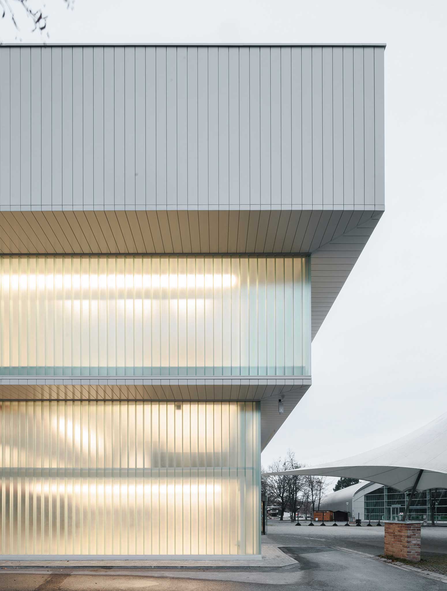
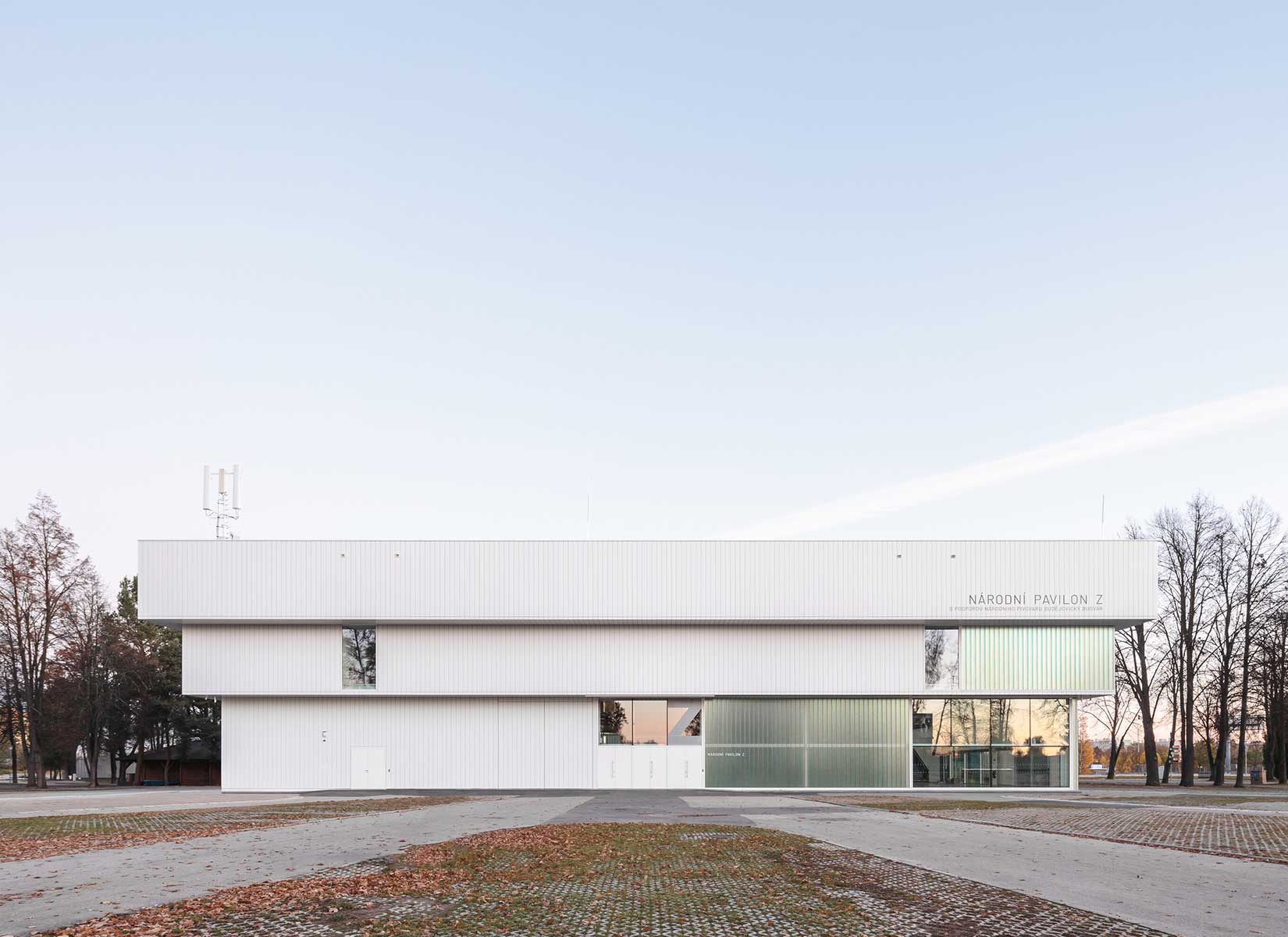
The design of the reconstruction and extension of Pavilion Z is based on the original shape of the building. It consisted of three increasing blocks, where the smallest one is near the ground and the volume increases and gets heavier towards the top. The A8000 studio, however, builds on it seamlessly. The inspiration for the reconstruction was a plant motif and the process of bonsai breeding.
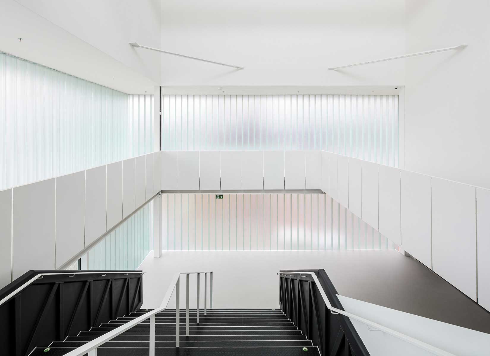
In the same way that a carefully selected portion of the leaves is cut from the plant to achieve a new airy and original look, the architects stripped away the individual period deposits and random layers that were not conducive to the building’s appearance. Parts of the original mass are removed – glazed to give the final effect an airy and elegant appearance. The original pavilion has been stripped to the bone. The exposed steel skeleton is newly admitted and elevated to the initial principle of the interior.
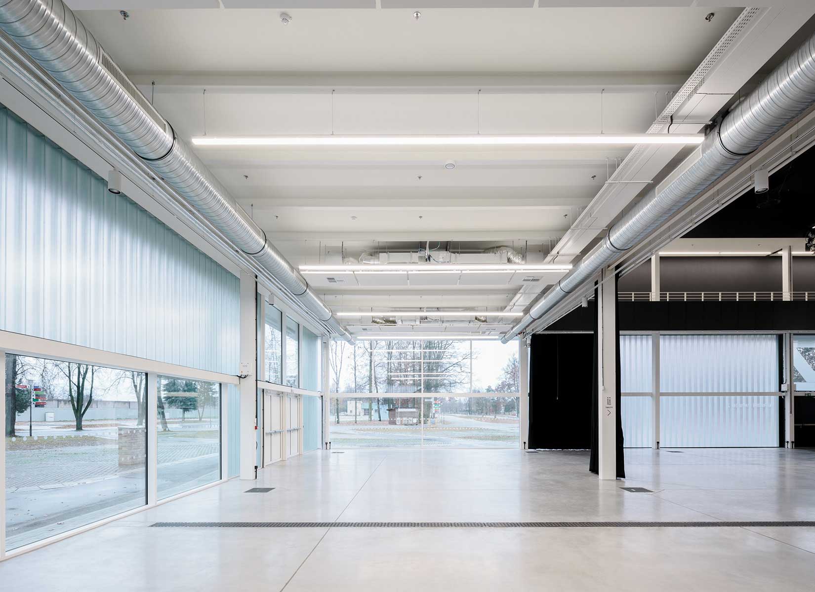
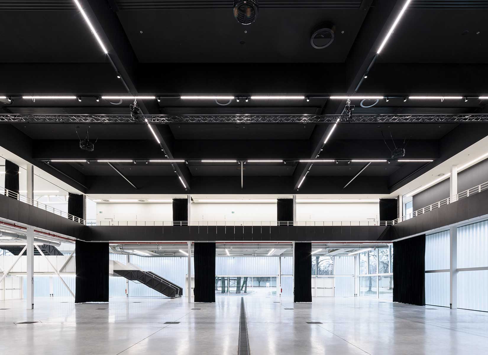
Multifunctionality was also a central theme of the project, which became essential for the revival of the České Budějovice Pavilion Z Exhibition Centre. The basic idea and the investor’s brief was to create a multifunctional and maximally variable space, not a single-purpose hall. The pavilion should be used for various events such as trade fairs, exhibitions, congresses, but also balls and concerts. It can adapt to the various challenges and technical requirements of the organisers. Not only the architectural but also the technical aspect of the project was absolutely crucial. The main hall is designed as an open multifunctional and highly variable space, which can change its layout freely from an exhibition hall to a congress or theatre hall to a ballroom or concert hall.
PHOTOS BY Ondřej Bouška

PHOTOS BY Ondřej Bouška
PHOTOS BY Ondřej Bouška

PHOTOS BY Ondřej Bouška
PHOTOS BY Ondřej Bouška
The renovated pavilion now offers a main hall with a capacity of 850 seats or 1500 standing. Multifunctionality is written into all parts of the project, for example, with the use of minimalist polished concrete floors usually found in logistics centres and production halls. It will accommodate tractors during the agriculture exhibition, but it will not offend even during a festive social event or a concert by the South Bohemian Philharmonic Orchestra. In addition, the entrance hall and the main space flow freely into the upper floor, where we can find two additional halls that can be variably divided and used as event facilities, exhibition spaces or conference halls. The pavilion opens up especially in its eastern part towards the river and the city.
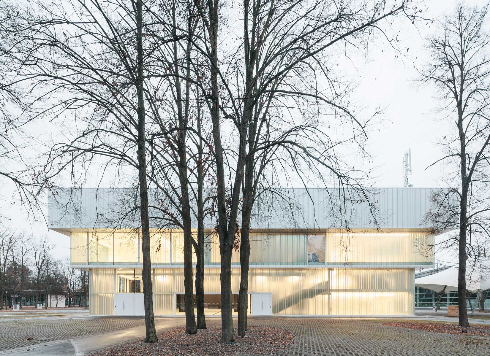
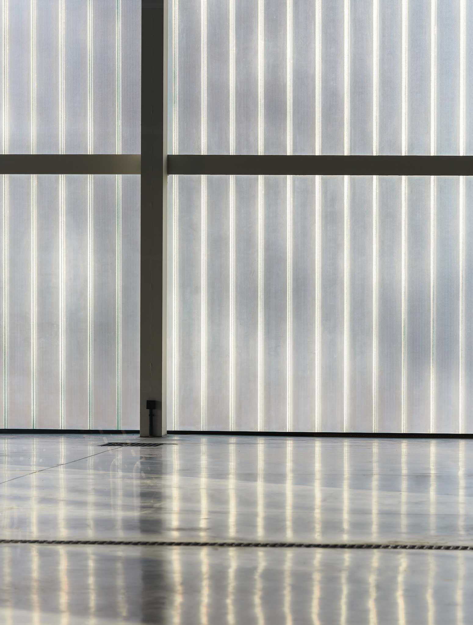
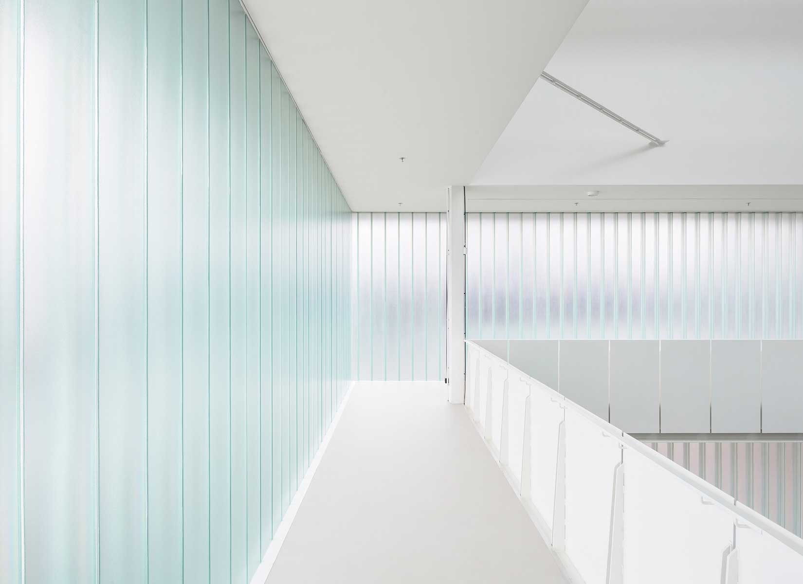
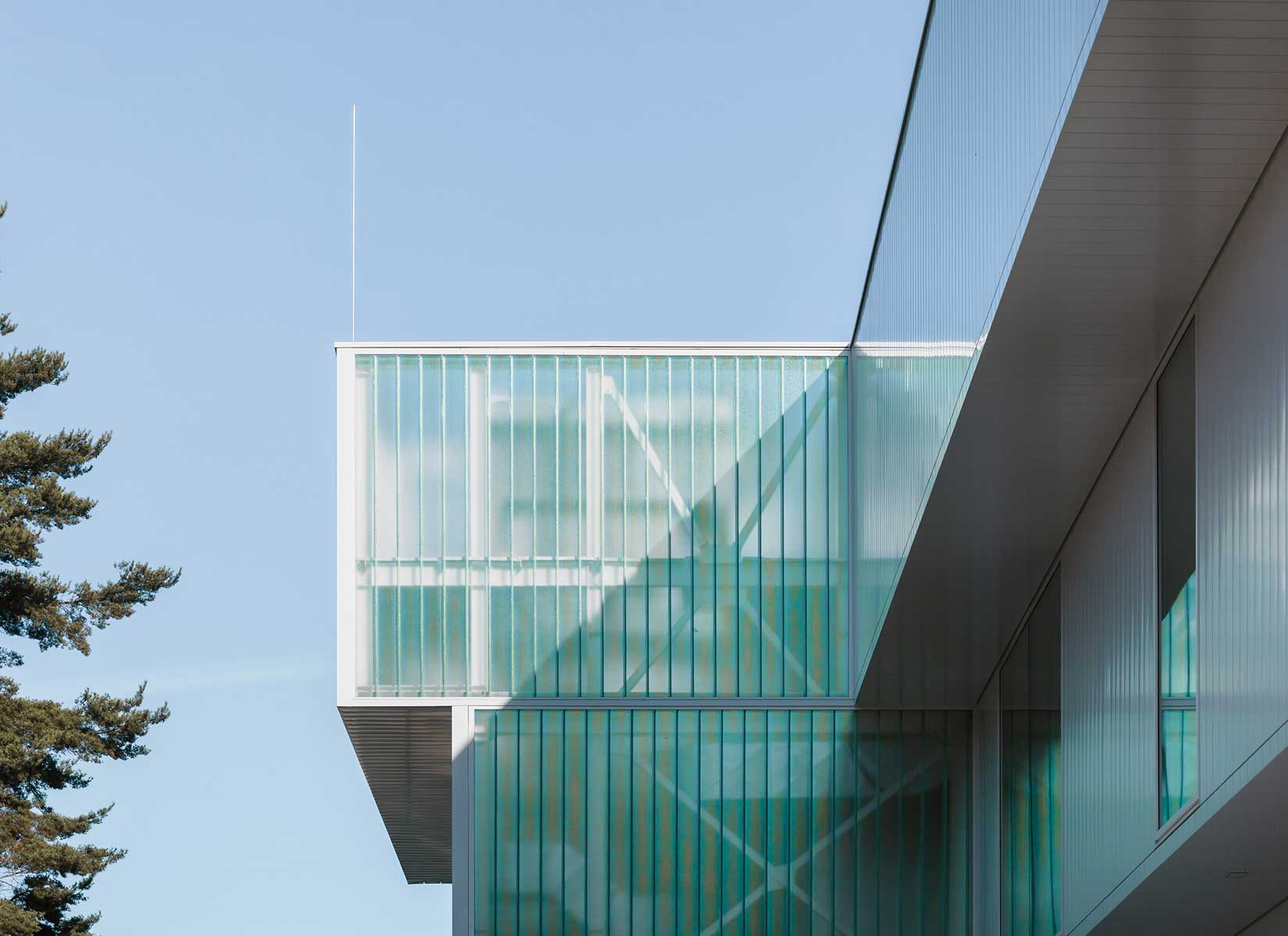
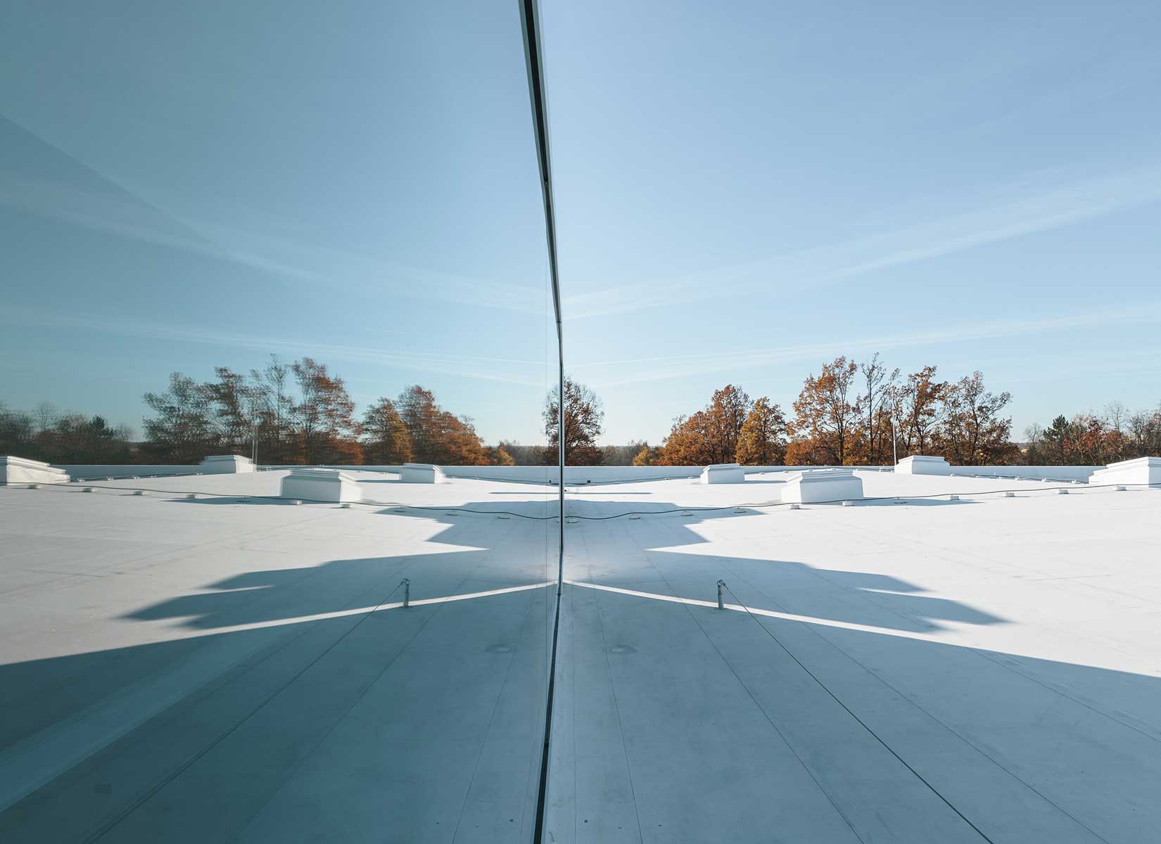
Materially, the external appearance takes two forms – solid and transparent. For the solid form, the material chosen is white metal cassettes and white roofing foil. The transparent form is addressed with glass, either clear structural glazing or the more intimate material of copilite. The use of profiled glass is also a reference to the original architecture. It is complemented by large-format windows that open up the interior space with a contemporary solution. The interior is designed to be open and flexible. In order to create as much space as possible, all the ancillary facilities were concentrated in the outermost wing, leaving the rest of the building free. The pavilion can thus be modified by a system of draperies – curtains from the exhibition or gallery space to the closed concert hall.
PHOTOS BY Ondřej Bouška
PHOTOS BY Ondřej Bouška
PHOTOS BY Ondřej Bouška
PHOTOS BY Ondřej Bouška
PHOTOS BY Ondřej Bouška
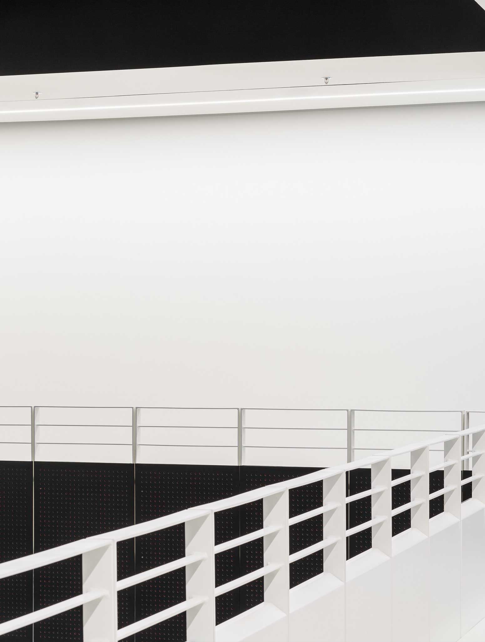
When the curtains are opened, the surrounding greenery flows directly into the interior of the hall, while when they are closed, a perfect blackbox is created. One finds oneself inside and in the green at the same time. A limiting yet beautiful element was the existing structure of the building, where the exposed steel structures were preserved, thus further de-masking the entire space and drawing out its original structure – the soul. This principle also determined the design direction of the interior, where, in contrast to the almost minimalist exterior, a more technicist approach was taken on the edge of high-tech architecture.
Thus, various technical equipment systems, from the massive HVAC ducts to the red piping of the fire system, accompany us through the interior. The atmosphere of the interior is softened by the soft light permeating through the copilite wall, which also shows the outlines of the events of the exterior.
PHOTOS BY Ondřej Bouška
PHOTOS BY Ondřej Bouška

Collaborators:
Construction contractor: OHL ŽS, www.ohla-zs.cz
Technical contractor: ŠTROB & SPOL., www.strob.cz
Statics: STATIKON Solutions, www.statikon.cz
Project information
- Architect:A8000
- Location:Czech Republic,
- Project Year:2021
- Photographer:Ondřej Bouška
- Categories:Pavilion