PHOTOS BY BoysPlayNice
Idea:
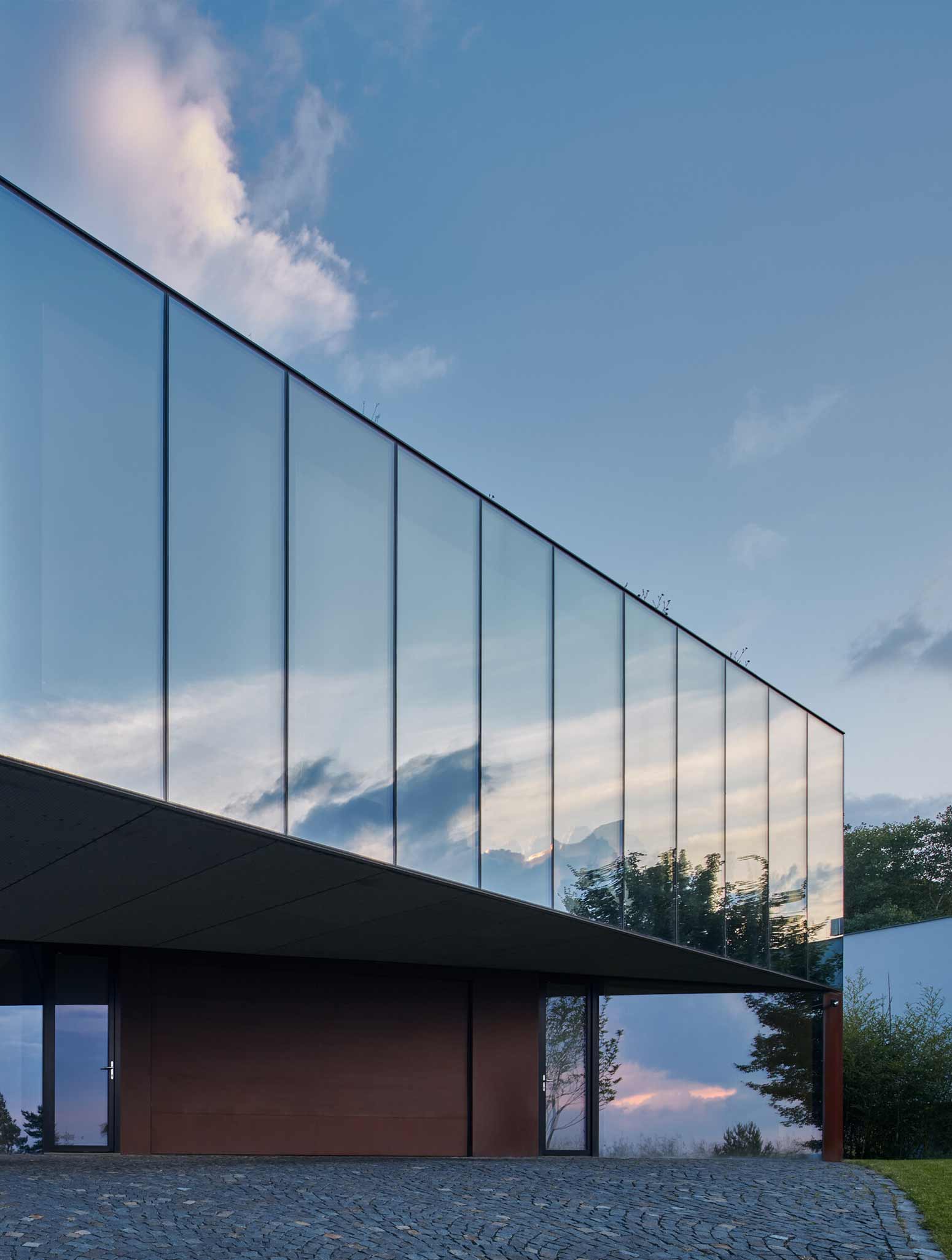
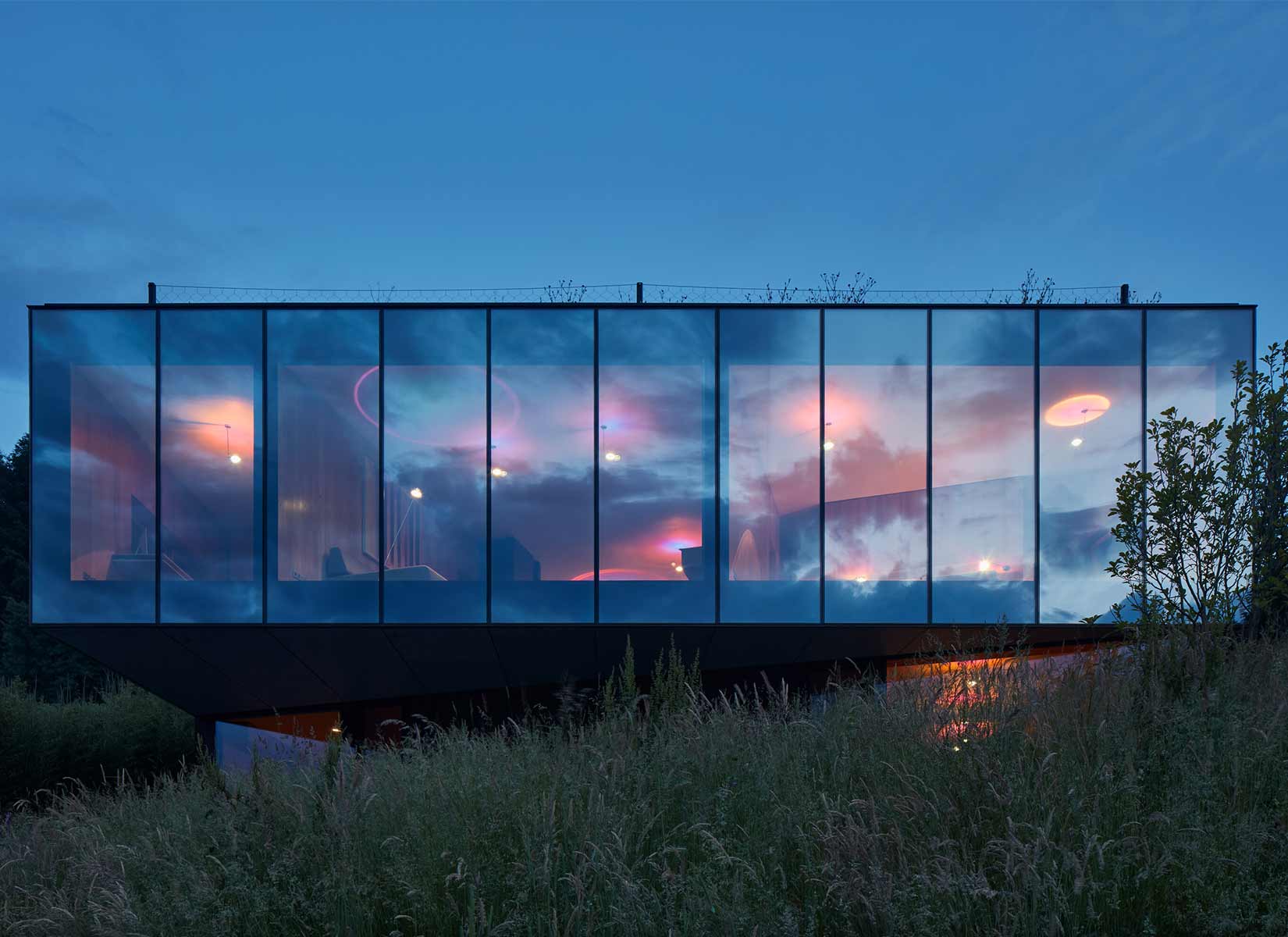
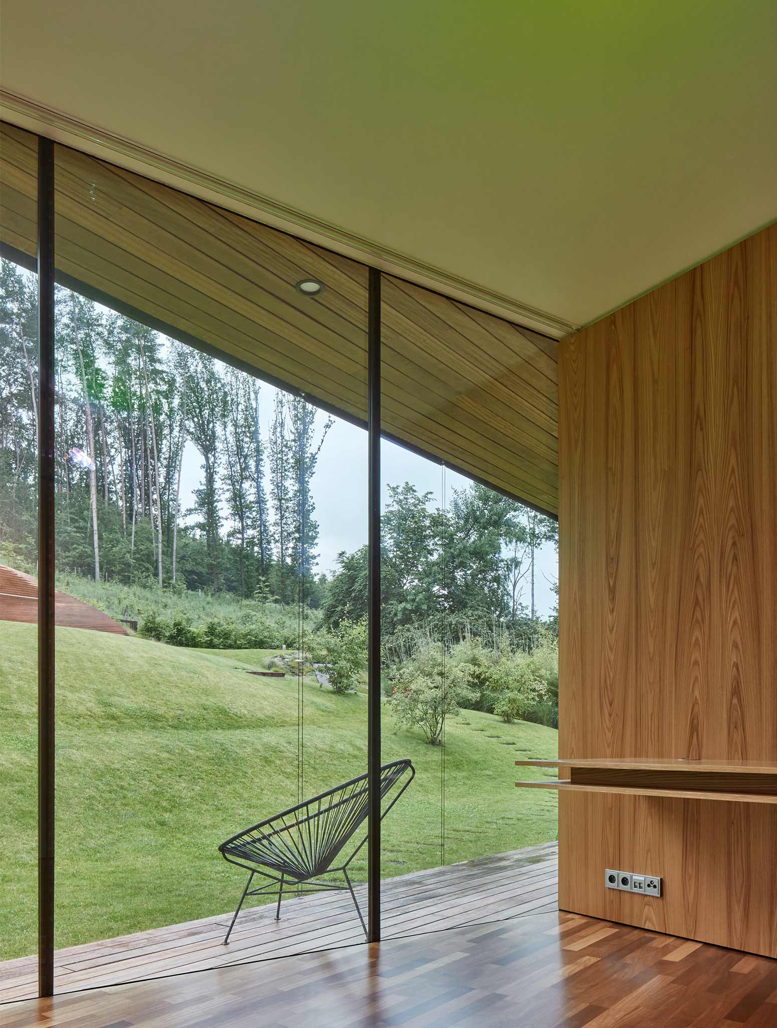
The idea of the house goes beyond its physical form and is built from the inside out on the principle of spatial connection with the environment from which it grows and which it overlooks. The concept is based on the relationship between the house and the city, the house and the garden, and the garden and the city. The relationship scheme is repeated inside the house. The interior communal part flowing through the entire house continues to the exterior and all the separate private parts have their own extroverted relationships. The visual appearance of the house is defined by its inner nature and the permeability of its physical body‘s (non) separation of the interior from the exterior. Privacy is maintained by facade membranes that allow the maximum view from the inside out, but reduces it from the outside in. To set it in the context of the garden and the city, the house uses material mimicry.
Context:
The house is seemingly situated outside the context of Baťa’s urbanism and its constructional and visual principles. However, the perception of Zlín is ubiquitous and defines the event horizon of the entire architectural concept through mutual visual contact. The site is part of a new urban area created by the conversion of the former allotment gardens, divided into six building sites and connected to the existing urban structure by a new road. The locality is connected to the Lazy residential district in the highest part on the slope, under the forest and above the Zlín valley.
The site’s specific feature is its inverse orientation, with the view of the valley towards the north, and the southern part of the site affected by the slope and forest rising above the house. It offers an excellent view of the year-round sunlit valley. The house overlooks a large area of Zlín with typical green residential quarters, with family homes and the valley surrounded by the hills in the background. The typological reference buildings the project emotionally draws on are the distinctive solitary villas situated in environments that offer unique views, such as “villa on a cliff” or “residence above the city”. It is the essential archetype of a house that benefits from the uniqueness of its location. In the topographic conditions of Zlín, the view from the house is analogous to the view of Mediterranean villas or Los Angeles residences.
PHOTOS BY BoysPlayNice
PHOTOS BY BoysPlayNice
PHOTOS BY BoysPlayNice
PHOTOS BY BoysPlayNice
Architectural design:
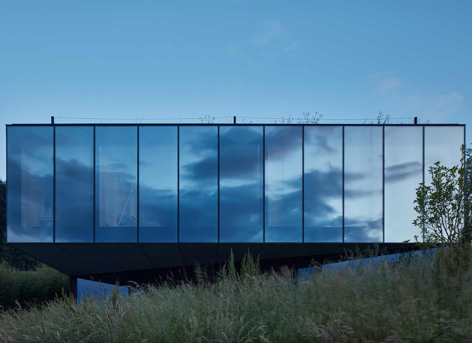
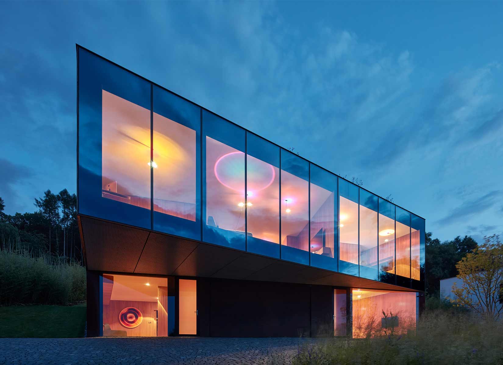
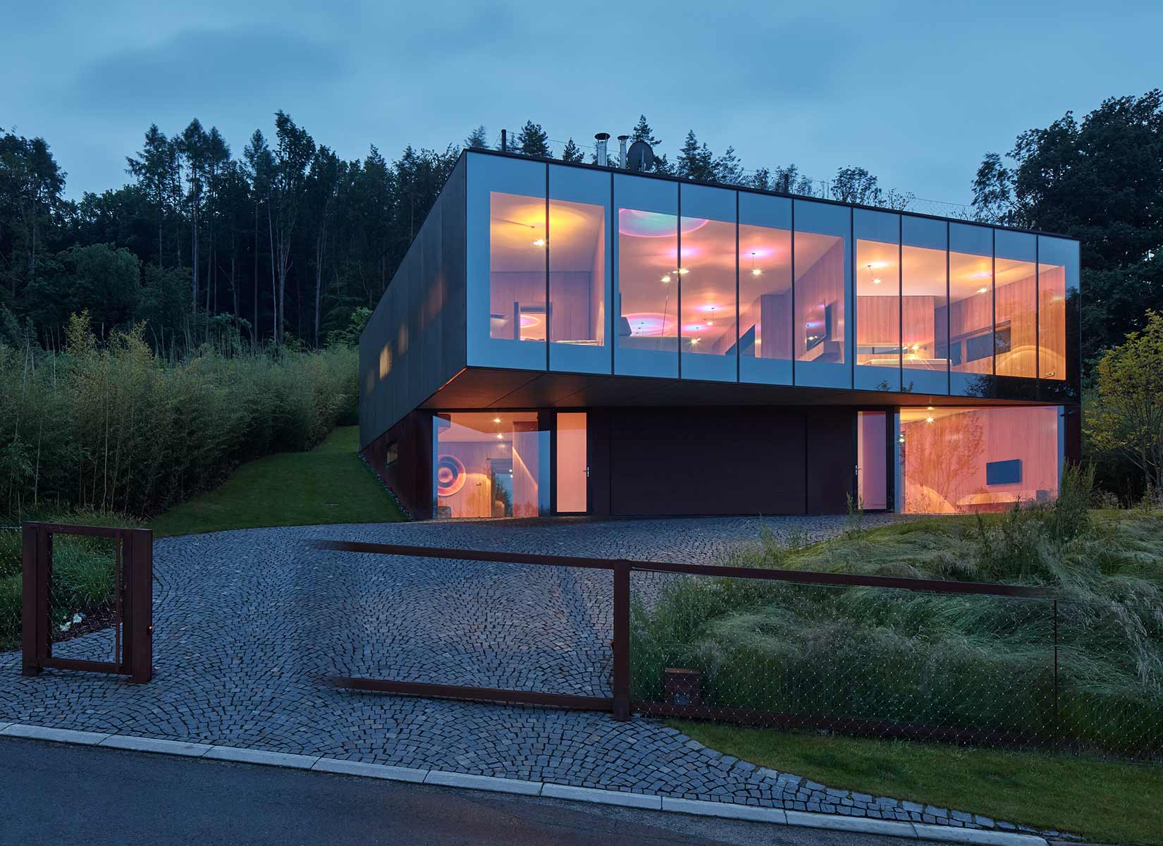
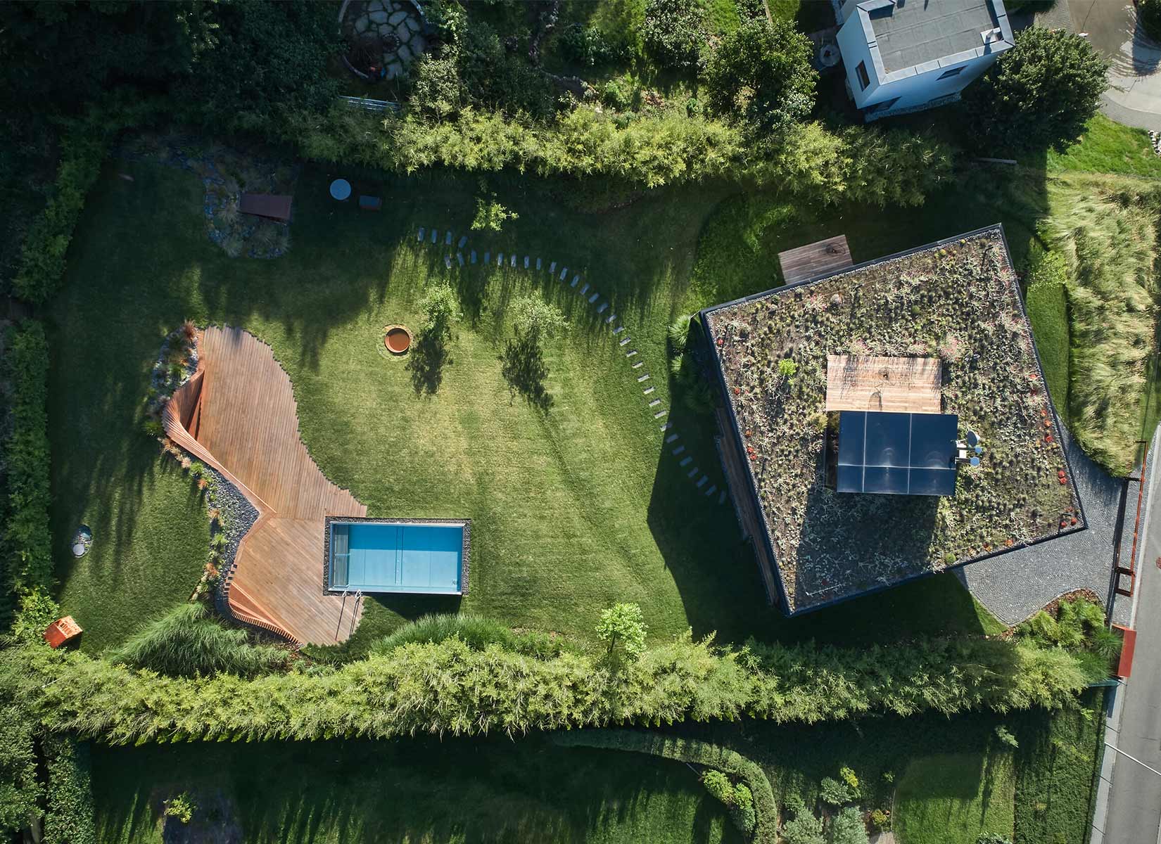
The house is designed as a compact solitaire on a square floor plan, with a slightly rotated layout, where the exterior follows the contour logic of the surrounding houses, while the interior turns towards the valley. The house consists of a lower floor base sunk into the slope and the prism of the main living floor attached to it. This makes it look like a single storey house from the south. The lower floor base is sunk into the ground and its wall with the garage entrance is rotated in a direction perpendicular to the longitudinal axis of the site. The upper floor prism creates a dynamic overhang above the garage entrance. The motif of the layout rotation is repeated with the terrace space cut into the building’s volume. The green roof returns the missing part of the garden cut off by the house’s footprint and has a fully glazed roof studio on it. The main living space is concentrated on the upper floor and can be seen through from the garden to the city. Thanks to the layout rotation, it was possible to arrange the rooms around the perimeter while maintaining privacy and their own views.
The concept of the house allows changes in use corresponding to changing needs. The house is divided into individual parts, each with their own intimate relationship to the garden and the view, allowing a multi-generational arrangement with two separate guest sections with separate access on the entrance floor. The house uses the principle of aircraft camouflage; the main living floor is visually connected to the sky by dematerialization through mirroring and moiré facades and “levitates” on the Corten base sunk into the slope. From above, the green roof with the studio merges with the garden city, dotted with houses. The wine cellar, swimming pool with grotto, access area, fencing with entrance gate and dustbin box grow into the slope and merge with the garden. The garden flows smoothly around the house and creates hidden bays protected from the outside that allow panoramic views of the city. The open concept naturally achieves privacy thanks to the vegetation protecting the boundaries of the site.
Layout:
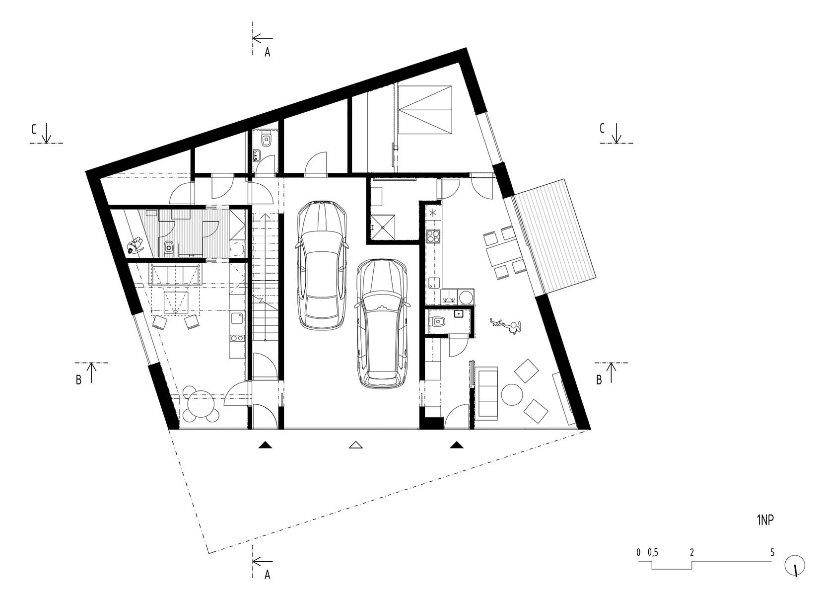
Access to the house is from the street through the gate and the entrance floor with garage, which allows separate access to the main living floor and to the guest apartment. The main living area is on the first floor and is accessible by a single-flight entrance staircase opening a view of the garden. The layout minimizes the need of corridors in favour of smooth living space. The zoning of the quiet and social parts is led from the centre of the layout to the sides. All of the quiet areas are accessible from the central social zone, and the parts for parents and children are separated. The social zone is a space with a kitchen, dining room and living room running through the house, which, thanks to its location, remains protected inside the layout. Around this central part, there are other rooms in corner positions around the perimeter of the layout so that they benefit either from the view of the city or from contact with the garden.
The house is visually permeable (from the inside out) through its north and south facades, while the east and west facades protect the privacy of the house from contact with neighbours and allow the view out and the sun in through the windows covered with stainless steel membrane and blinds. The parent’s zone consists of a bedroom connected by a walk-in wardrobe and a “secret” door to its own bathroom, the children’s zone has two children’s rooms with a bathroom and toilet between them. The layout is complemented by a glazed study with bookshelves connected to the living area and the terrace through a glazed indoor garden and a pantry integrated into the built-in kitchen. The lower floor is concentrated around the two-car garage located in the middle of the floor plan, with both entrances to the house on the sides of the garage. The western part of the floor contains a guest apartment with a separate entrance that can be used for grandparents, visitors or teenagers. The apartment is designed as an open layout, centred on the social part, with kitchen, dining room and living room, and a separate bedroom with its own walk-in wardrobe, bathroom and separate toilet. The apartment has its own terrace with a separate garden.
PHOTOS BY BoysPlayNice
PHOTOS BY BoysPlayNice

PHOTOS BY BoysPlayNice

PHOTOS BY BoysPlayNice
Structure and materials:
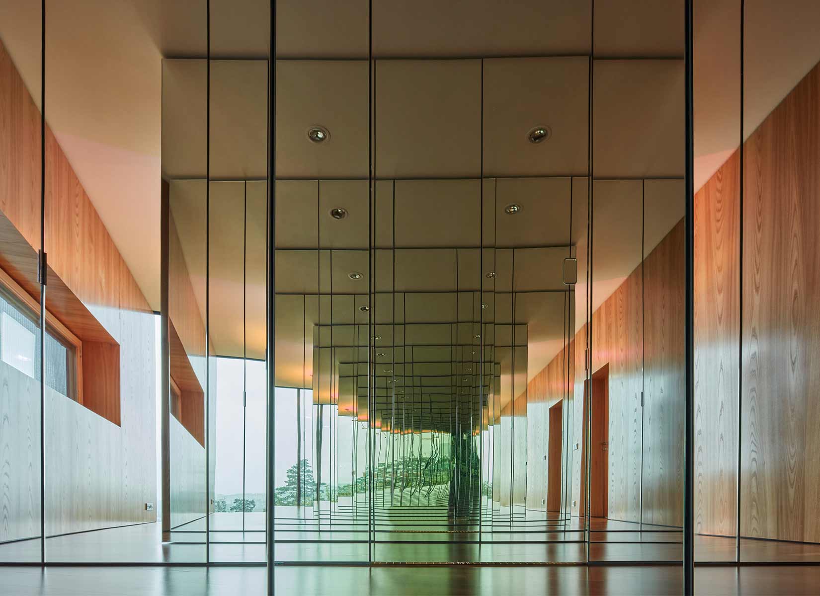
The house uses its load-bearing structure as a skeleton, the insulation as muscles, heating as blood circulation, air conditioning as lungs and trachea, water distribution and sewerage as digestive system, wiring as nervous system and surface layers as skin, protecting the whole body and allowing its surface to breathe. The structure of the house consists of a reinforced concrete monolith insulated with high-performance thermal insulation in a layer corresponding to low-energy or passive buildings, visually faced with materials that naturally support the composition of the house. The volume of the main living floor has a fully structurally glazed north and south facade with large format metallized triple glazing, while the facades facing the neighbours are made of a stainless-steel fabric covering the windows. Its silky shiny surface complements the reflection of the glass and creates a volatile moiré that blends in with the sky when viewed from the access road.
The lower floor, including the garage door, is faced with pre-corroded Corten steel sheets with a distinctive rusty colour, which emotionally connects the house with the garden and materially with the entrance gate and garden elements. The colours and materials used work with the semantic separation of the outside and the inside. The metal exterior contrasts with the wooden interior, consisting of large veneer facing, built-in furniture and solid floors. The dominant material of the walls, doors and built-in furniture is elm veneer facing, in combination with solid Iroko flooring.
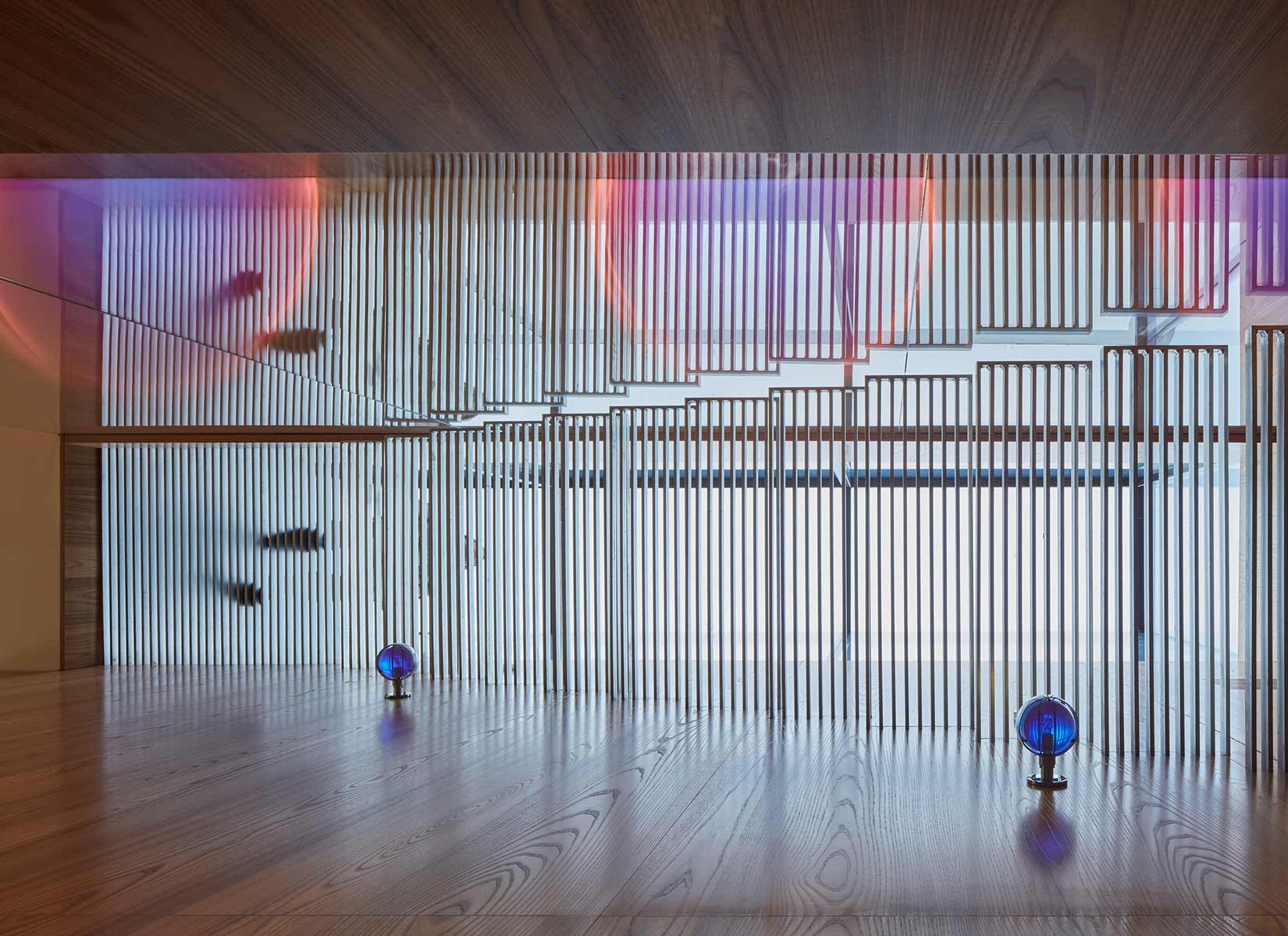
The overall impression is that of a continuous flow of space throughout the interior of the house. This flow culminates in the individual layout epicentres using glazed elements rhythmizing the surface of the walls by the reflection of light, drawing the views from the large windows into the deeper parts of the interior. Bathrooms form the appendices of a flowing interior and the continuous perception is interrupted by entering into their spaces; each bathroom makes a specific impression. Details are subject to the house as a whole and its perceived “detaillessness” and disclosed tectonics of individual elements is suppressed in favour of the natural flow of the interior skin throughout the house. The veneer follows the compactness of the wall surfaces, the sheets are laid so that there is no repetition and seamlessly connect on all edges and parts. The direction of the floor and terrace boards follows the house envelope and subtly draws attention to the tension between the two rectangular systems: the exterior and the interior. The atmosphere of the interior works with variability created by the tension between natural and modulated illumination and its intense changeability over time.
The artificial lighting is designed as an integral (and still autonomous) layer of the interior, based on a combination of direct and indirect light combined with the distinctive materials of the interior. The lights combine reflected “iridescent” light diffused by lenses with two-colour diffusion filters reflected from the ceiling and direct illumination with non-coloured light. The ceilings use a subtle retroreflective effect of pearlescent coat in shades fading from the centre of the layout towards its edges, into the individual bays of the interior. The house offers a multi-layer gradual separation of the interior from the exterior using membranes of curtains, drapes and screens, made of fabrics corresponding to the character of the walls with different light transmittance, from fine translucency to complete blackout.
PHOTOS BY BoysPlayNice

PHOTOS BY BoysPlayNice

PHOTOS BY BoysPlayNice
Garden and exterior parts of the house:
The garden is designed as a smooth carpet. The natural dominant feature is the grotto with swimming pool, creating a covered exterior with a view of the valley. The pool is positioned so that its water level lies above the “level” of the house’s roof, which can be overlooked during swimming and perceived as connected to the garden city in the valley. The curved form of the grotto is composed of gradually rotated massive larch planks joined as formwork for a hidden reinforced concrete shell sunk in the terrain adjoining the grotto, creating a “cave” cut out of the garden hill. The stainless-steel pool uses an edge overflow with a gutter, copying the slope of the adjoining terrain and creating an endless surface effect.
The cover that keeps water temperature when the pool is not in use is hidden under a bench made of stainless-steel rods immersed in the pool. The cellar is an adaptation of the original brick vaulted cellar, a relic of the original allotment colony. It was complemented and equipped with an interior steel waxed shelves for bottles. The cellar’s roof is covered with Irish moss growing through reinforcing slate structure copying its smooth shape. Privacy is maintained by tall bamboo plants and grasses organically connected to the undulating terrain, which is complemented by several solitary woody plants selected with emphasis on their varied appearance during year. A separate thematic layer, which compositionally connects the house with the garden, is the house’s roof with a fully-glazed studio sunk slightly into its surface. When viewed from the studio, the green roof is perceived as its own “infinity” meadow that blends with the remote garden city
Technical design:
The house is designed with an emphasis on connecting its architectural and spatial qualities with the currently available technological principles and achieves the parameters of low-energy to a passive standard. This, together with a reference to the topographical name of the site, led to the name Lazy house. The entire house has controlled ventilation with recuperation combined with underfloor heating connected to a heat pump with two earth boreholes located under the foundation slab of the house and reverse operation used for cooling in summer. Heating and cooling are low-temperature and imperceptible to the touch on the floors. Combined distribution with its own regulation heats the bathroom walls with towel rails and steel posts in the indoor garden.
The exterior air conditioning inlet is led to the space next to the cellar at a non-freezing depth, which enables air temperature treatment even before the actual recuperation. Ventilation distributions are led from the engine room under the garage ceiling and in the floor structures towards the exhaust outlets into the plenum boxes with the distribution through almost invisible slits in the edges where the floors meet the floor-to-ceiling windows. The recirculation works through the inlets in the bathroom ceilings and the slits between the ceiling and veneer panels. The glazed roof studio can be shaded using screen blinds and locally cooled by a unit hidden in the stairs to the terrace. The pool technology with filtration is located inside the house and uses free-flowing water collection from the pool gutters and its subsequent back pumping. The garden is irrigated by the subsurface groundwater and from a drilled well and a reservoir hidden in the space above the grotto. The active lightning conductor is located outside the house at the upper end of the garden behind the grotto, and covers the entire site.
Project information
- Architect:Petr Janda/Brainwork
- Location:Czech Republic,
- Project Year:2020
- Photographer:BoysPlayNice
- Categories:Glass,House,Mirror,Residential,Window