 PHOTOS BY RORY GARDINER
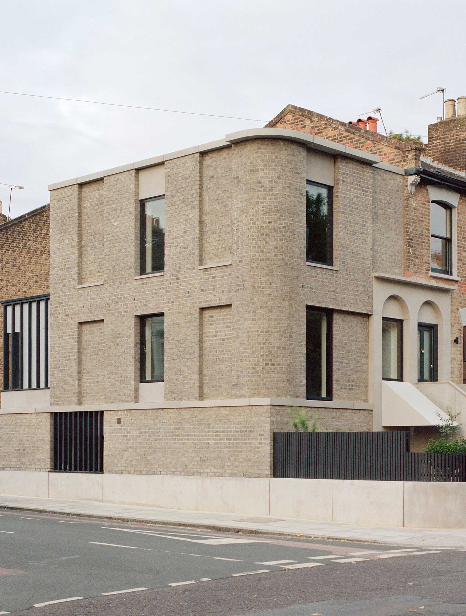
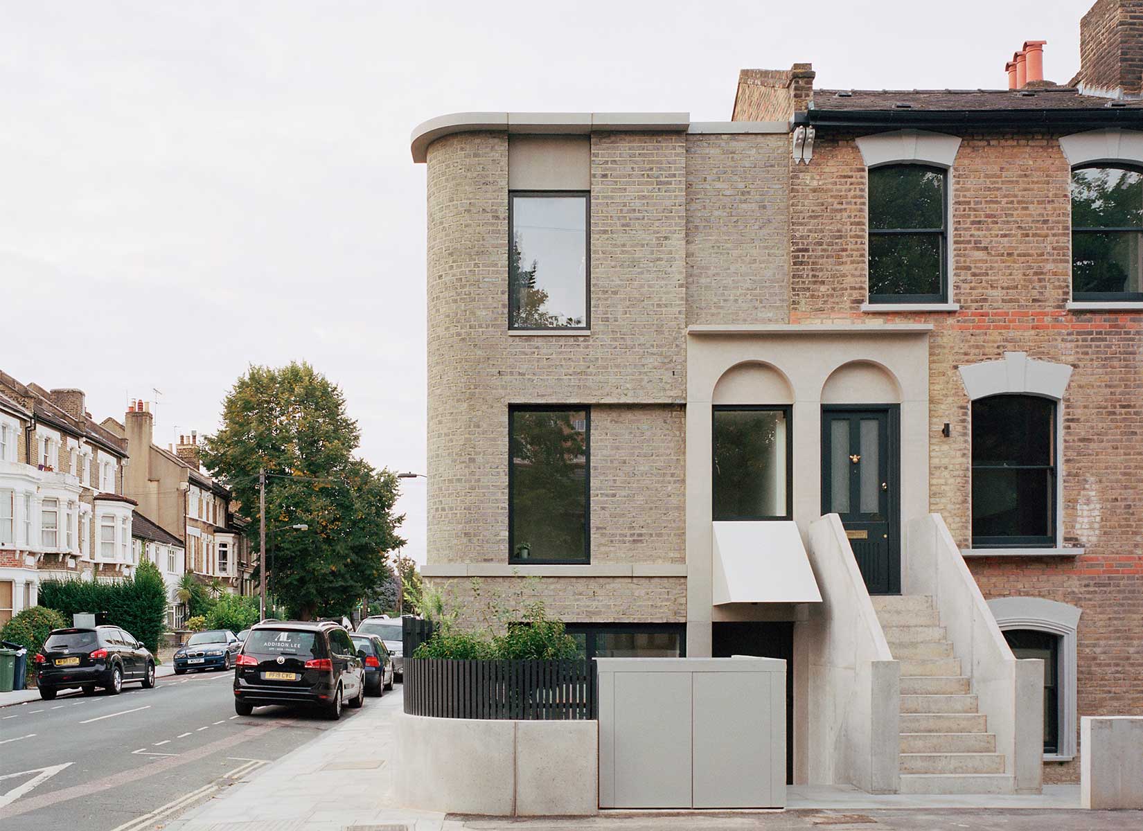
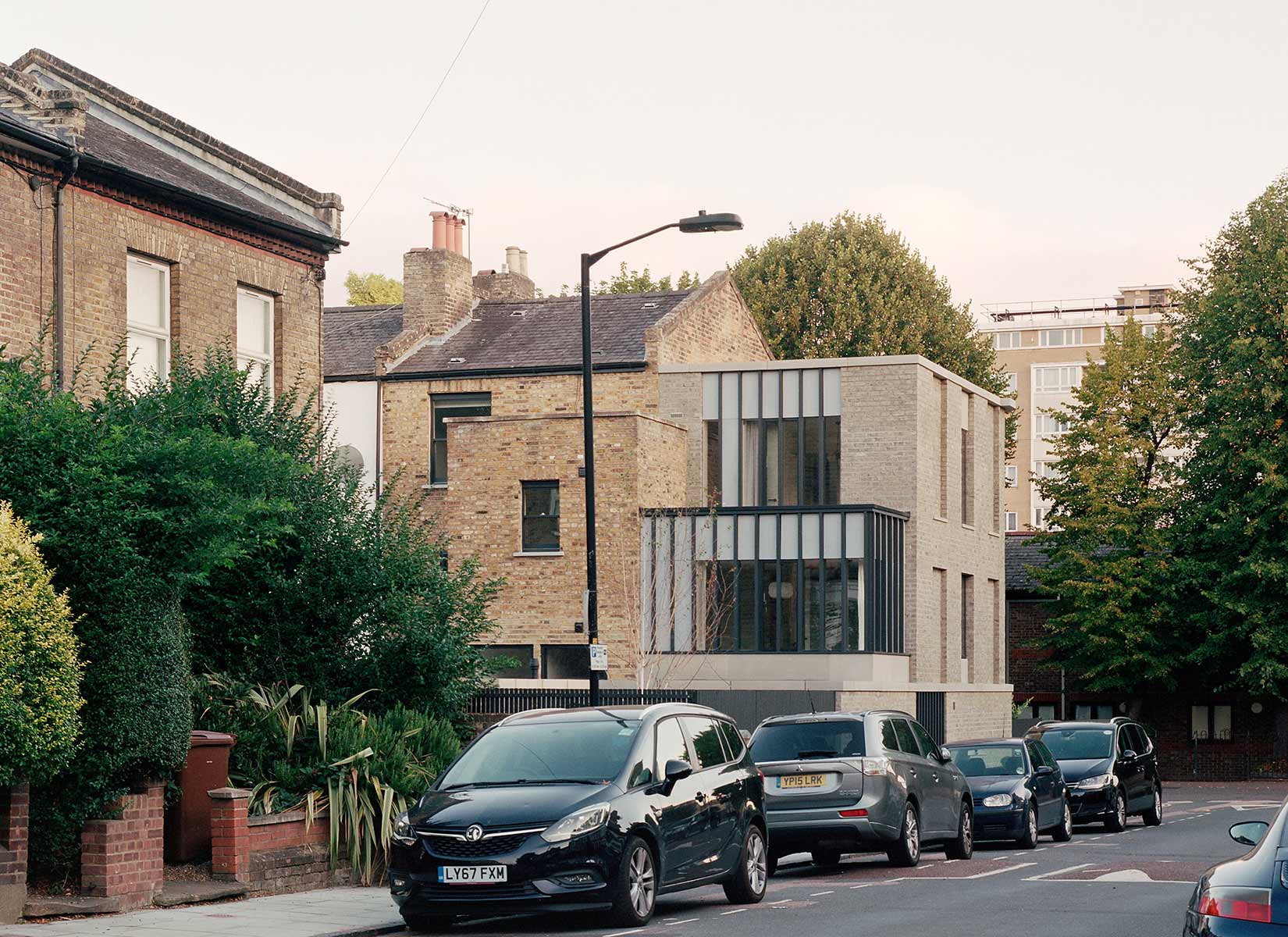
Following the pattern of the existing terrace, this conversion and extension of a Victorian corner plot in South London re-asserts typological elements of the adjacent terrace to repair the existing out-of-pattern arrangement, while lessening any potential impact of stepping out beyond the established building line. As with our design for Red House, it connects with the familiar and established qualities of the surroundings.
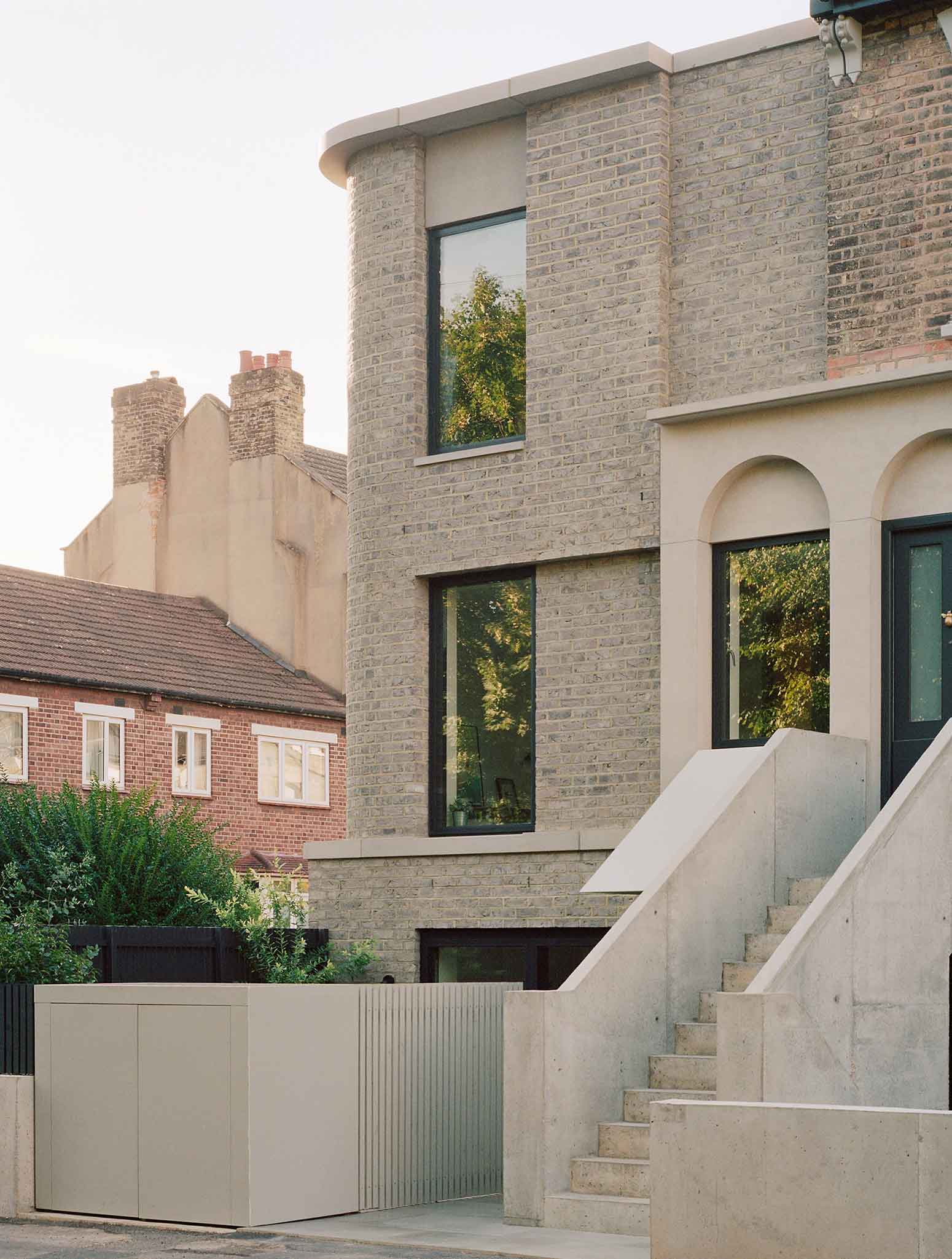
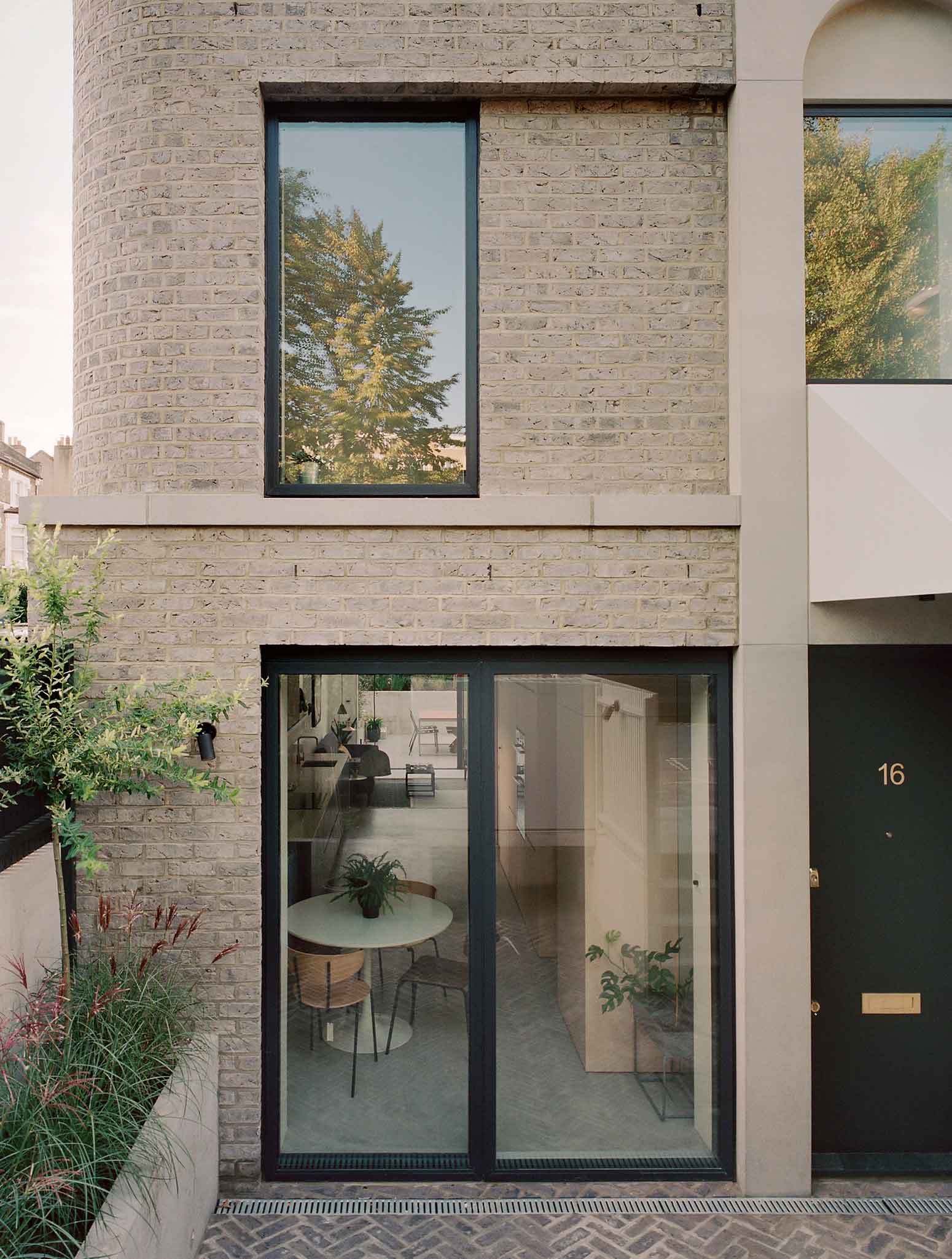
Under careful inspection and through the detailed design, however, it establishes a quiet, subversive distance. The cornice line is continued across the new dwelling but broken and stepped – both associating the two and providing clear articulation. The more sparse version of the elaborated entranceways on the existing terrace appears conventional until you note that the new dwelling is entered at the lower level, the upper ground ‘door’ has become a window, and the canopy sheltering the door beneath appears – out of the corner of the eye – as part of the stair. Each small move reinforces the sense of a quietly subversive building to the casual passer-by.
PHOTOS BY RORY GARDINER
PHOTOS BY RORY GARDINER
 PHOTOS BY RORY GARDINER
 PHOTOS BY RORY GARDINER
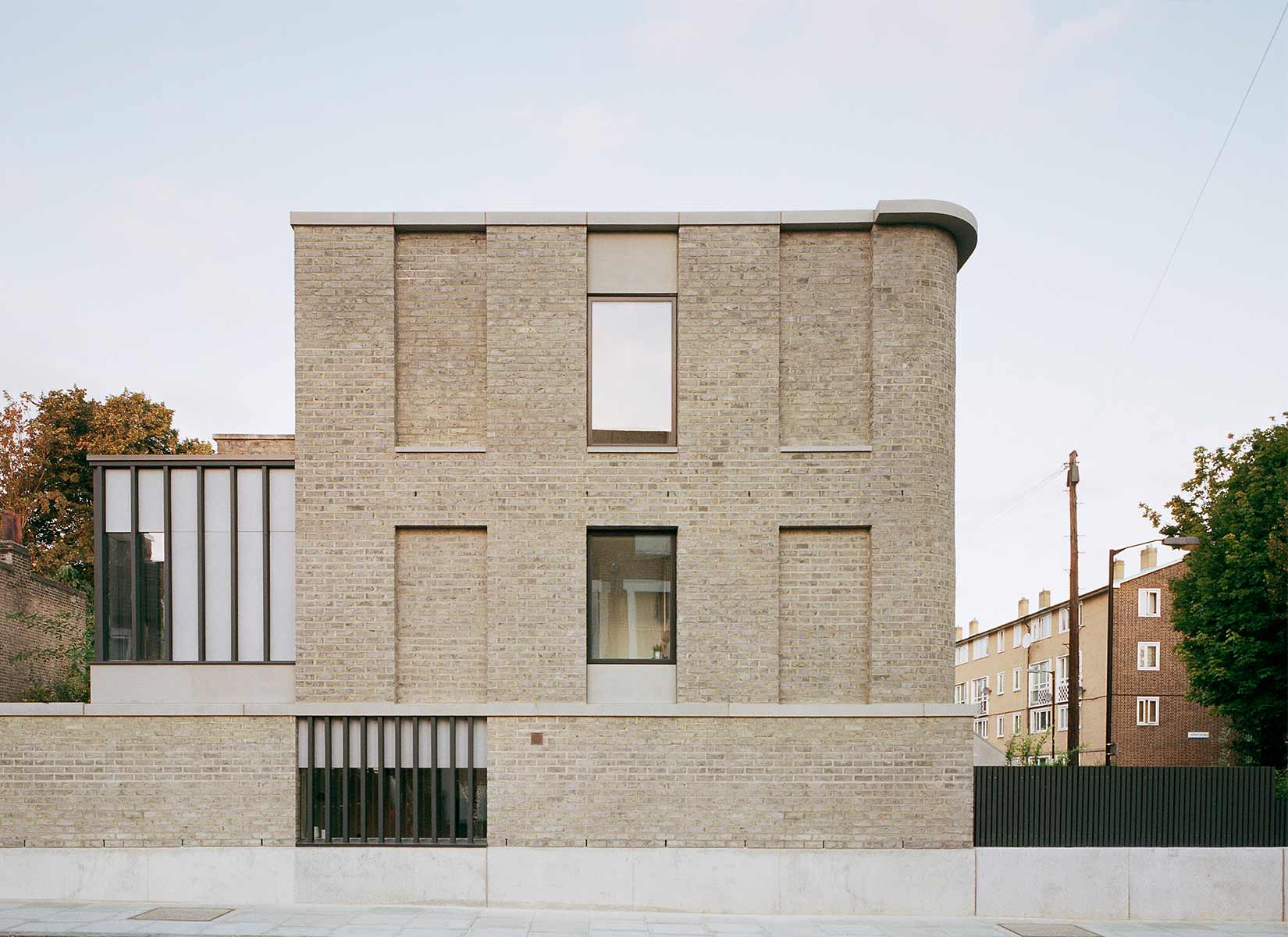
The side elevation is deliberately characterful, as it adjoins a Victorian developer’s ‘show street’ of different house styles. A curved corner allows the house to appear thinner and directly references the old pub across the road, while a playful series of blind and real windows combine to produce a facade that balances the language of both historic and contemporary architecture.
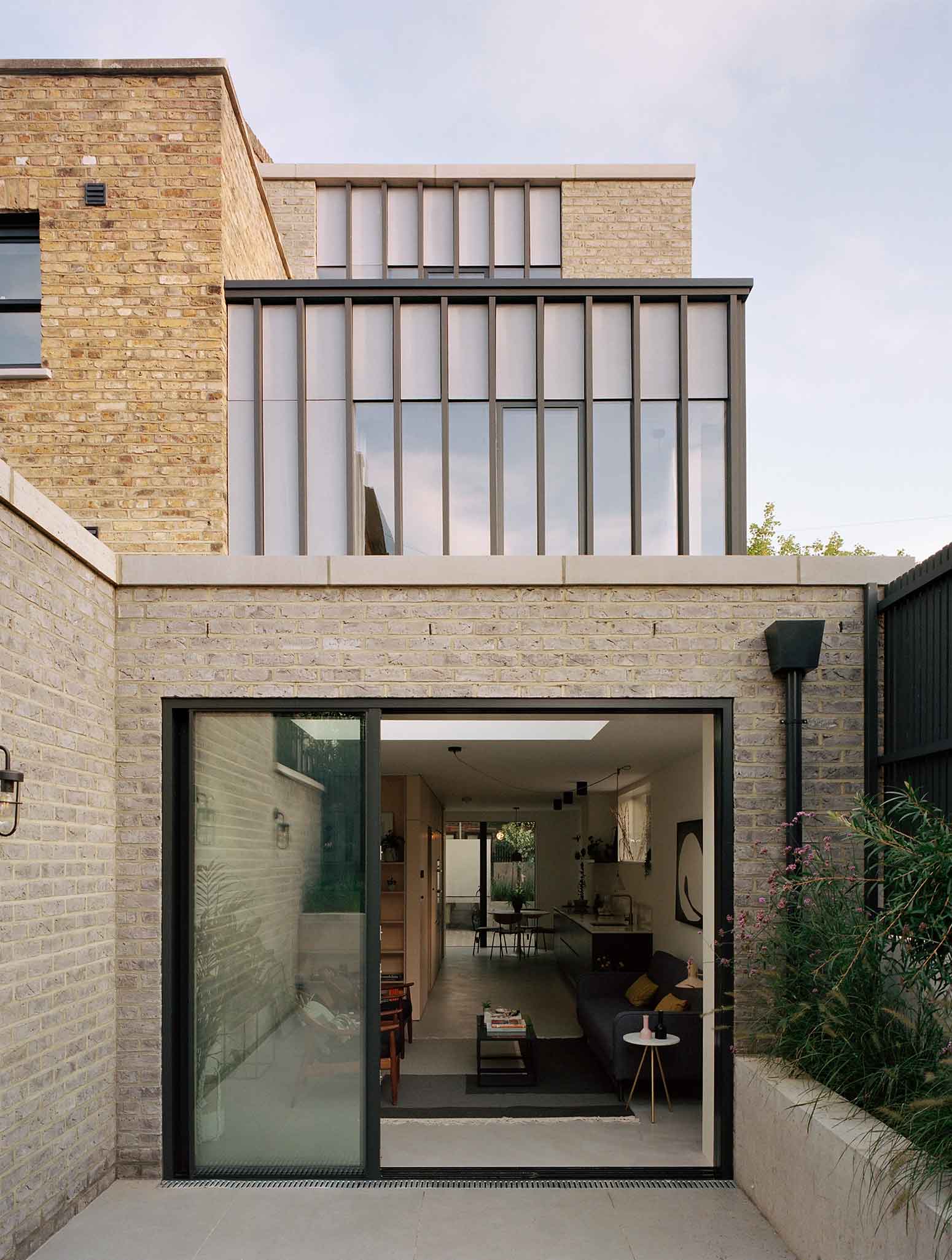
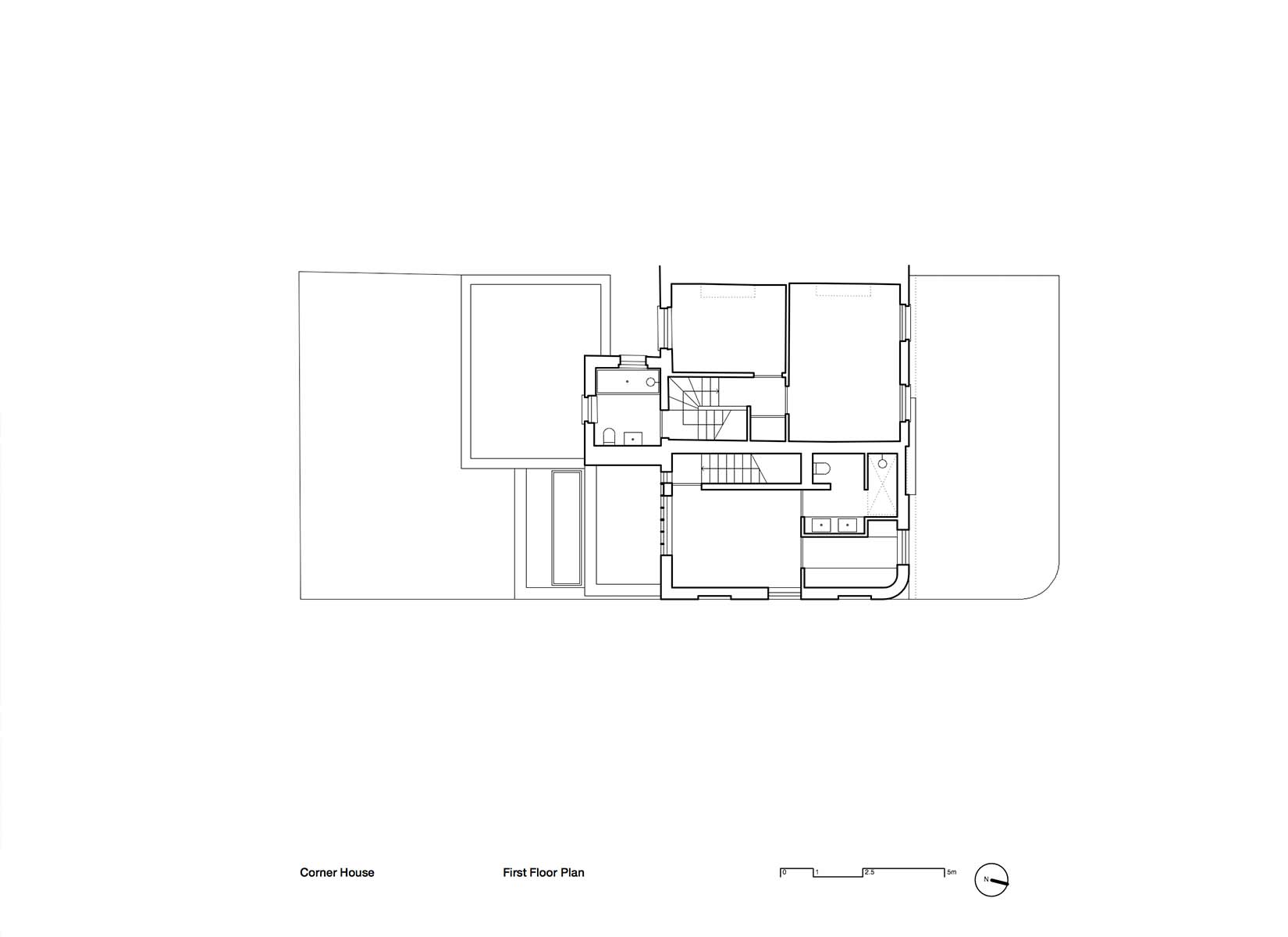
Visible from the side road too is a first floor glazed room, which echoes the elevated conservatories sometimes seen on Georgian and Victorian houses.
 PHOTOS BY RORY GARDINER
 PHOTOS BY RORY GARDINER
 PHOTOS BY RORY GARDINER
Project information
- Architect:31/44 Architects
- Location:United Kingdom,
- Project Year:2019
- Photographer:Rory Gardiner
- Categories:Bricks,House,Residential