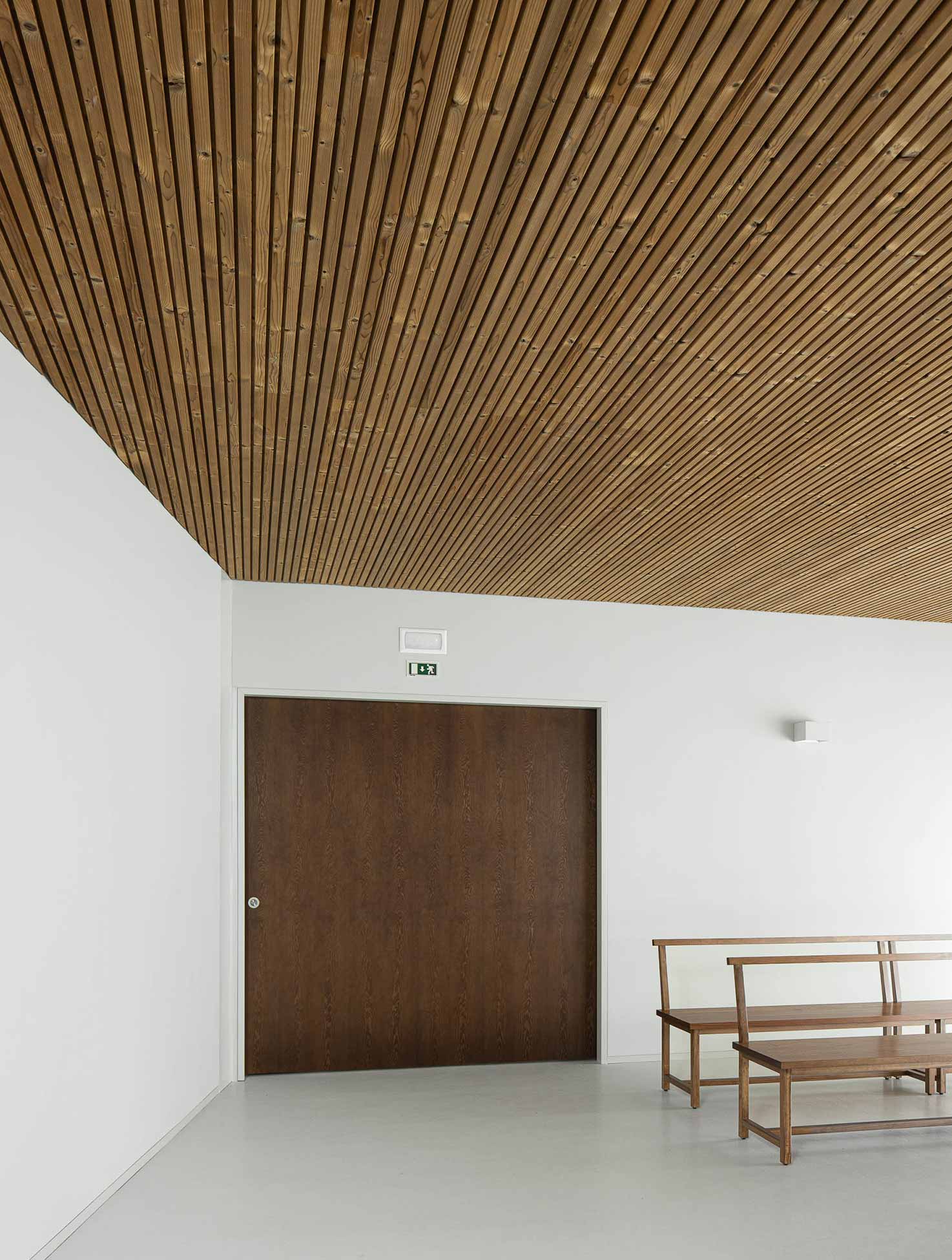
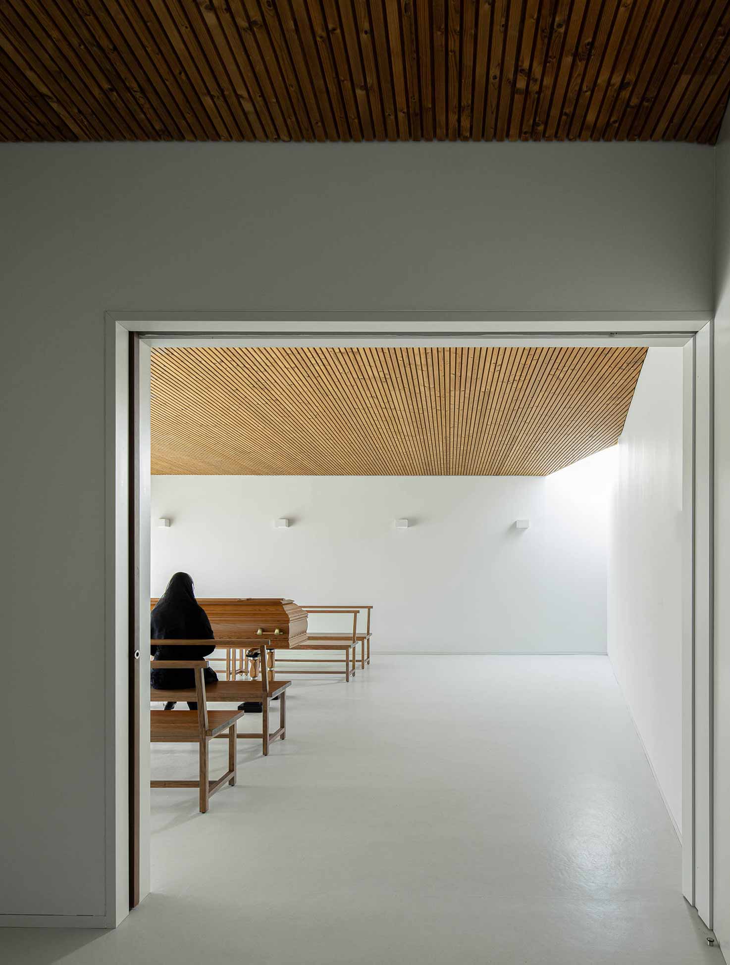
In addition to responding to the need for a wake space, the intervention is intended to provide an opportunity to harmonize and unify the surrounding area and access. The approach is not only to create an independent building with the necessary features to house the planned program, but also to create a silent piece of architecture capable of reorganizing and requalifying the existing space.
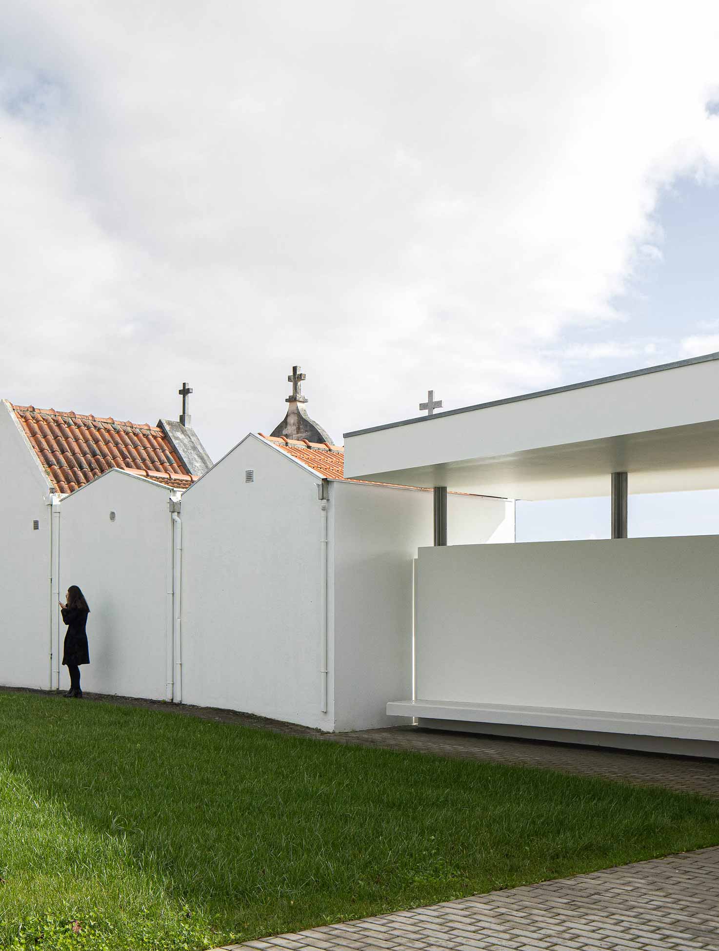
The intervention area is characterized by the disarticulation between spaces and pedestrian accesses, with disharmony between the materials and languages present there, resulting in a disqualified space. On observing the site, several constraints were identified which the proposal considers and seeks to resolve, and which can be summarized in the following points: disqualified entrance; physical pre-existence (boundary of the cemetery, monument/oratory to Our Lady, ancillary buildings (gatehouse, storage and sanitary facilities); disarticulation between the cemetery access and the parish churchyard; entrance front marked by the gables of the tombs; degradation of the public sanitary facilities; lack of technical support areas for the gravedigger; customs, traditions and experiences linked to and established by the community.
PHOTOS BY Ivo Tavares Studio
PHOTOS BY Ivo Tavares Studio
PHOTOS BY Ivo Tavares Studio
PHOTOS BY Ivo Tavares Studio
PHOTOS BY Ivo Tavares Studio
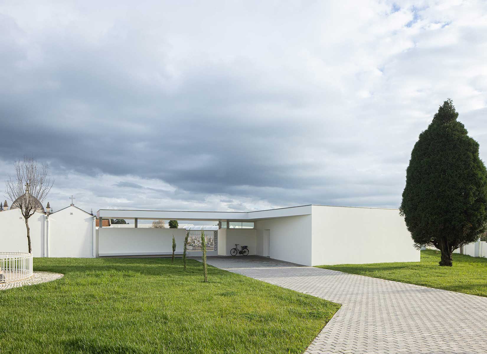
In order to respond both to the initial program proposed by the developer and to the specific needs of the site, it was decided to strategically place the mortuary next to the cemetery entrance. It is proposed that the building be placed next to the main entrance to the cemetery on the west side, so as to create a new element on the cemetery’s street front, drawing attention away from the poorly qualified back façades of the funeral chapels. On the north side, the placement of the mortuary suggests a new alignment that tries to relate the funeral complex (cemetery) to the main churchyard of the parish church, suggesting to the user a common physical and visual relationship. On the south side, inside the cemetery, the layout respects and reinforces the alignment of the common front of the funeral
chapels.
The built volume of the mortuary has a horizontal visor on its roof that stands out from the main volume, articulating and relating the implantation of the mortuary volume with the strong orthogonal alignments present in the internal organization of the cemetery. This flat roof and visor will constitute and qualify the main entrance to the cemetery, providing a covered space, shelter for rainy days and sunny days. On the east side, a fence wall will be built incorporating structural elements of the roof, as well as benches on both the internal and external sides of the cemetery. The proposal calls for a careful and sensitive intervention in relation to the cemetery’s physical and formal circumstances.
In this way, the elements to be built will not physically contact the pre-existence, treating the void as
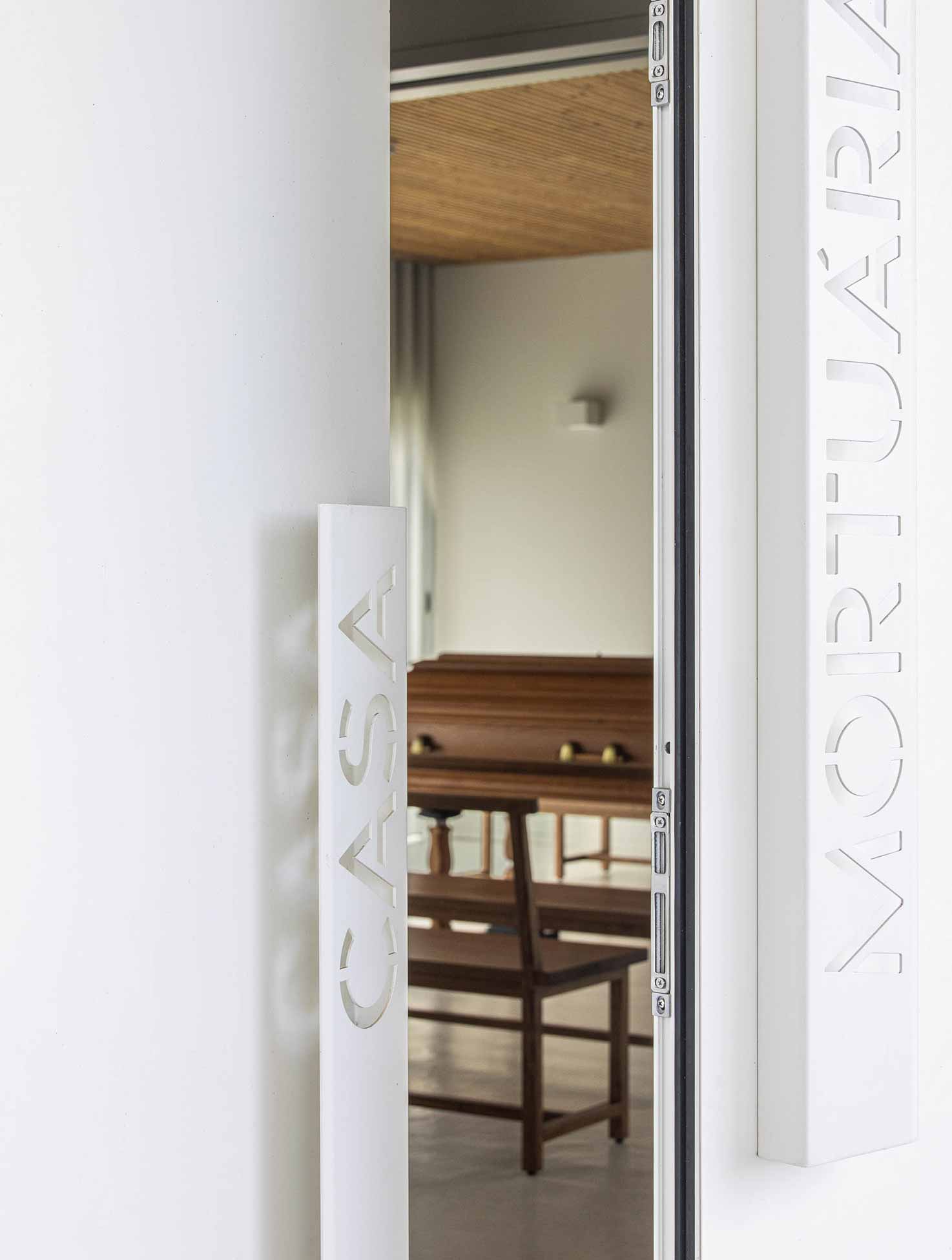
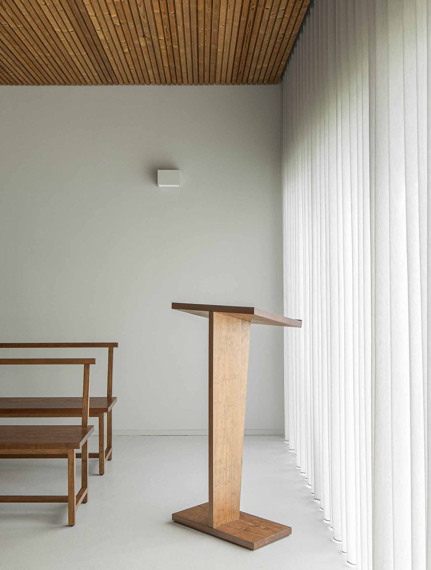
an element of transition between volumes. The materialization of the proposed construction is done intentionally using simple, sober and contemporary design and materials, assuming a minimal architectural language that is distinct from the other funeral constructions that make up the cemetery. It is intended to be a silent, unmarked and discreet intervention, which integrates positively with the building as a whole and does not stand out. The general exterior cladding of the building is a polished concrete grey plaster, close to the color of the sidewalk that makes up the entire complex, as if it were a common stain. The openings will have flat aluminum frames in a dark matt anthracite color.
Collaborators: Rui Vieira, Inês Lopes
Project information
- Architect:Sonia Cruz Arquitectura
- Location:Portugal,
- Project Year:2023
- Photographer:Ivo Tavares Studio
- Categories:Cemetery,Chapel,Door,Religious,Slats,Wood