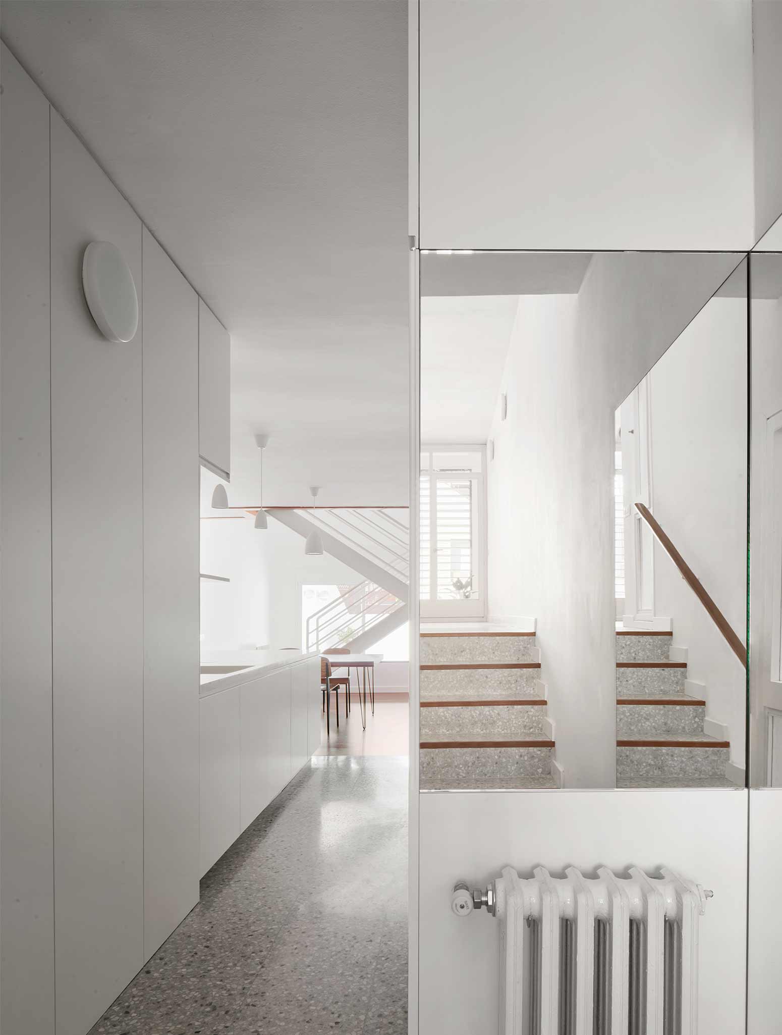
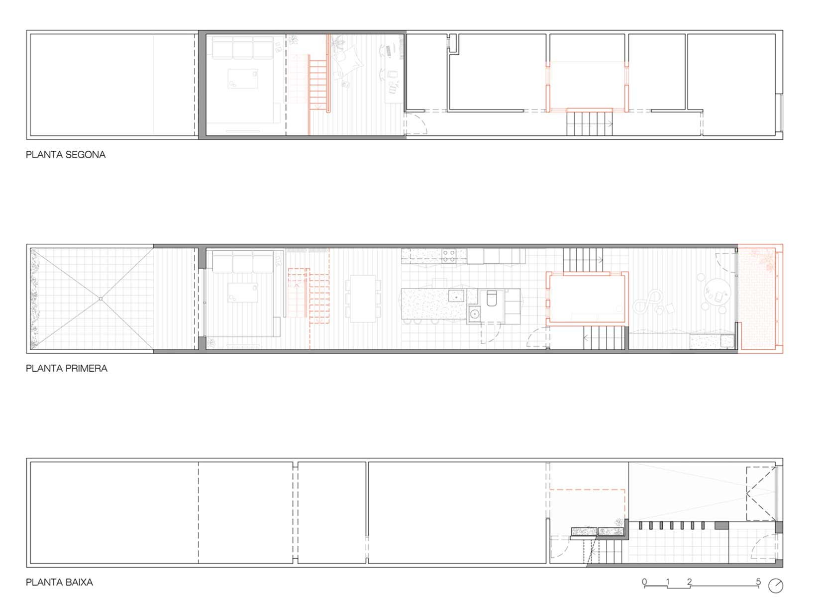
The clients, a couple with two children, bought a row house that was built in the 1970s. It is a rather extravagant construction: the distribution turns its back on the street and opens toward the interior with two courtyards (the rear courtyard and an air shaft). It has interesting details and some good intentions, but, on the whole, it doesn’t really work. The clients would like an open kitchen, and to be able to use the street-facing room for something more than just laundry, while adding more shared space for the family.
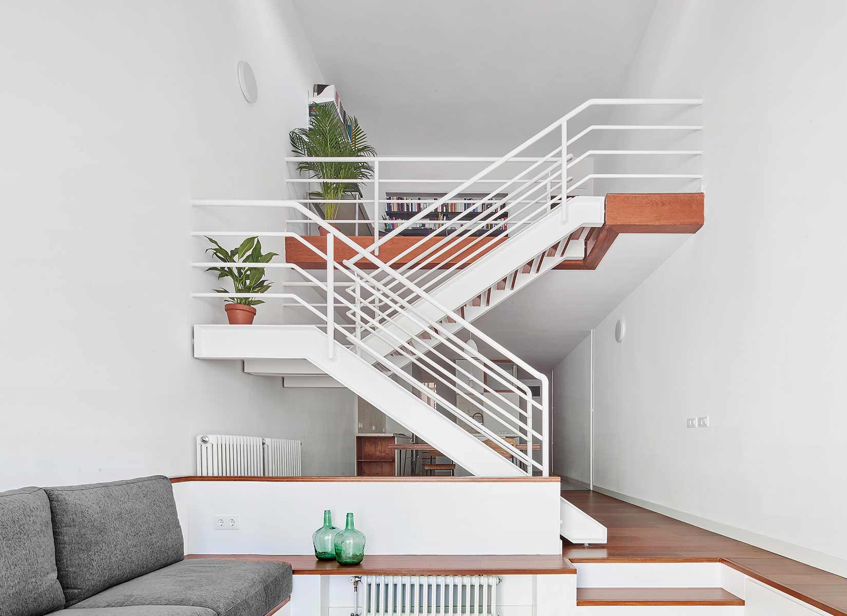
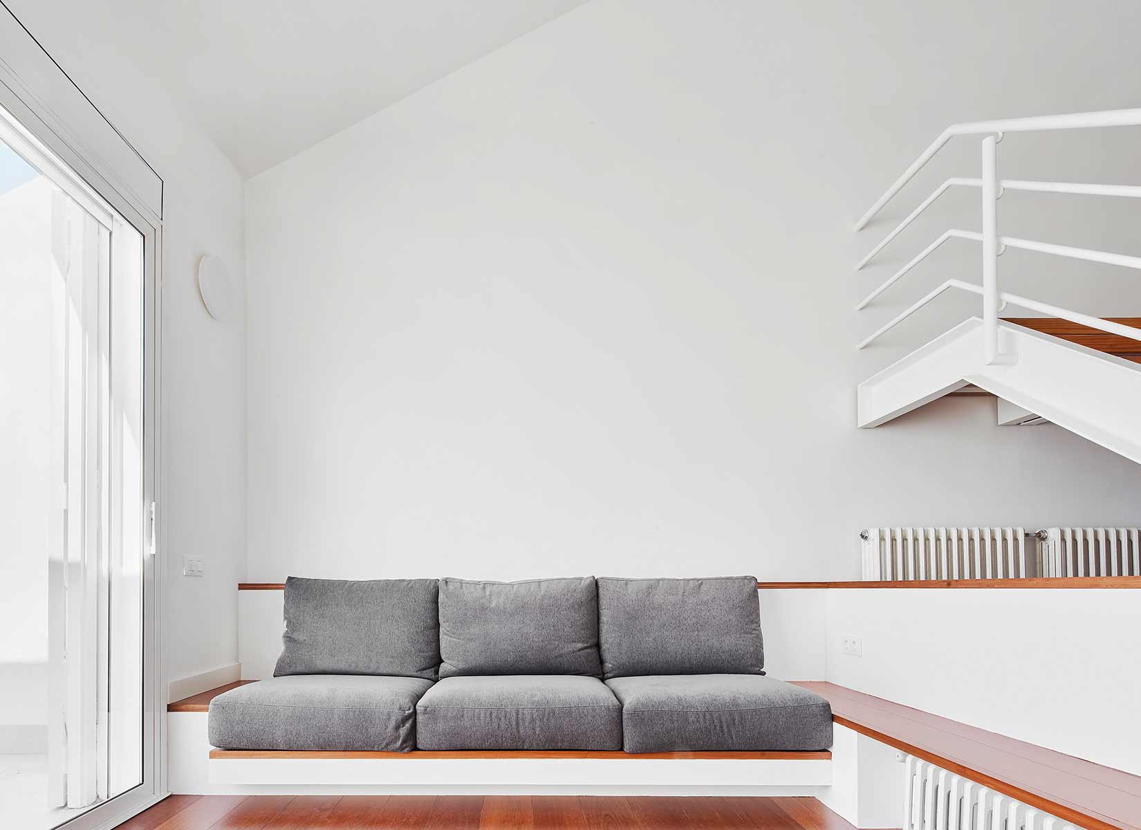
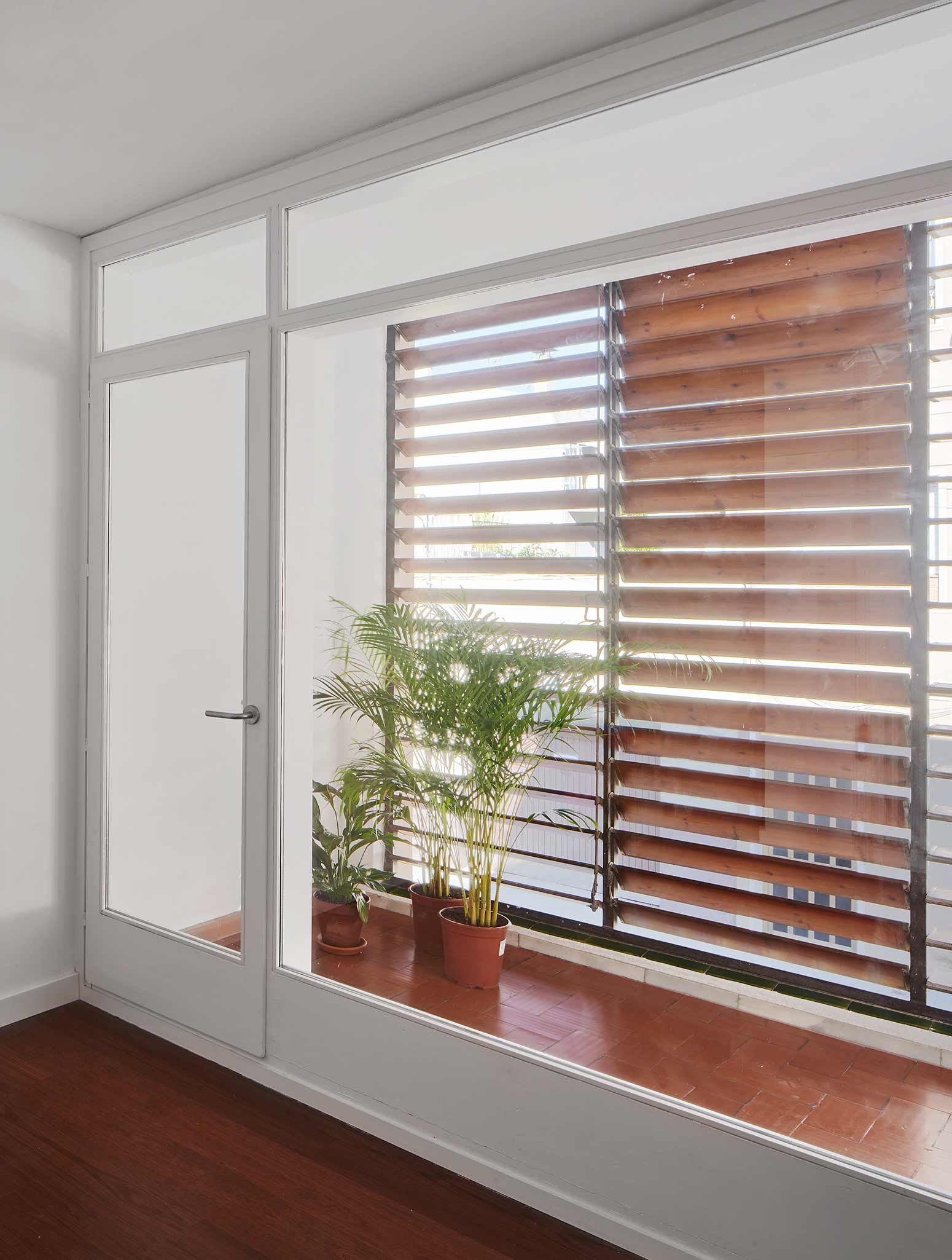
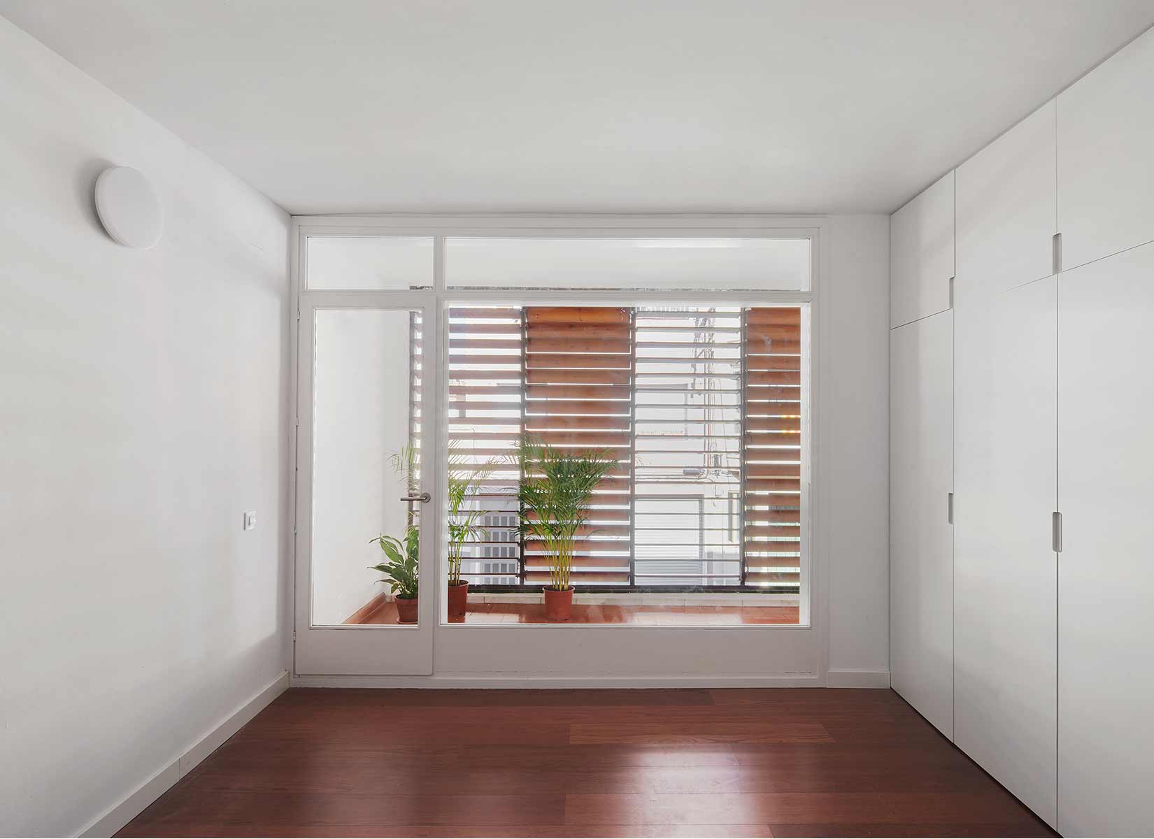
We want to turn the air shaft into something more than a mechanism for ventilation, by transforming it into a skylight. We want the dining room and living room to get the most benefit from the interior courtyard and the high ceilings. We want to make the kitchen into the heart of the house, to make the laundry room double as a playroom and a place to do homework, and make the existing gallery and staircase look better than ever, with a fresh coat of paint. We start with a clean slate, without modifying either the air shaft, the staircase that connects with the second floor (to the bedrooms), or the gallery along the street.
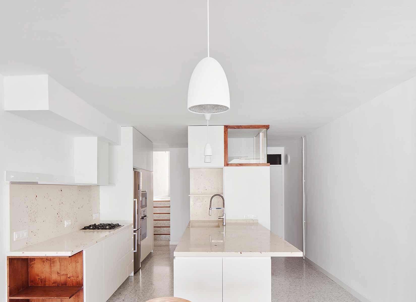
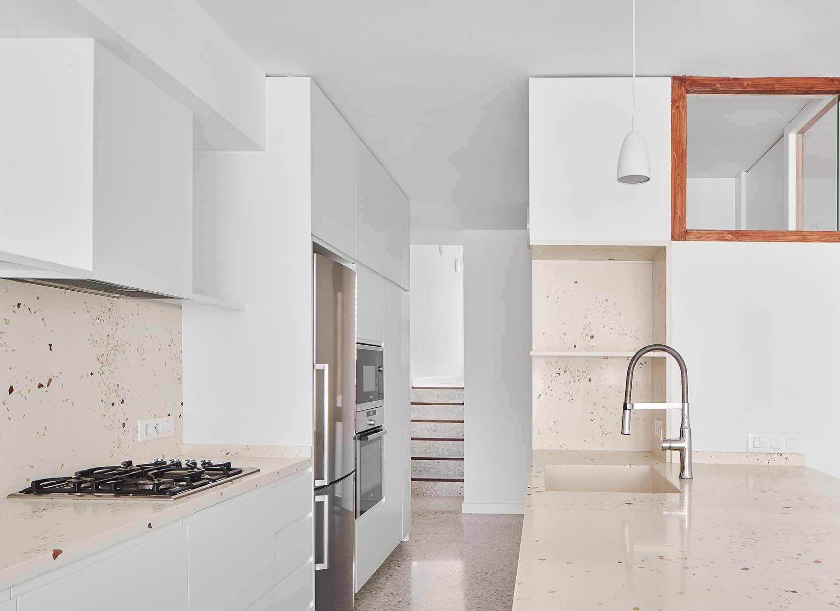
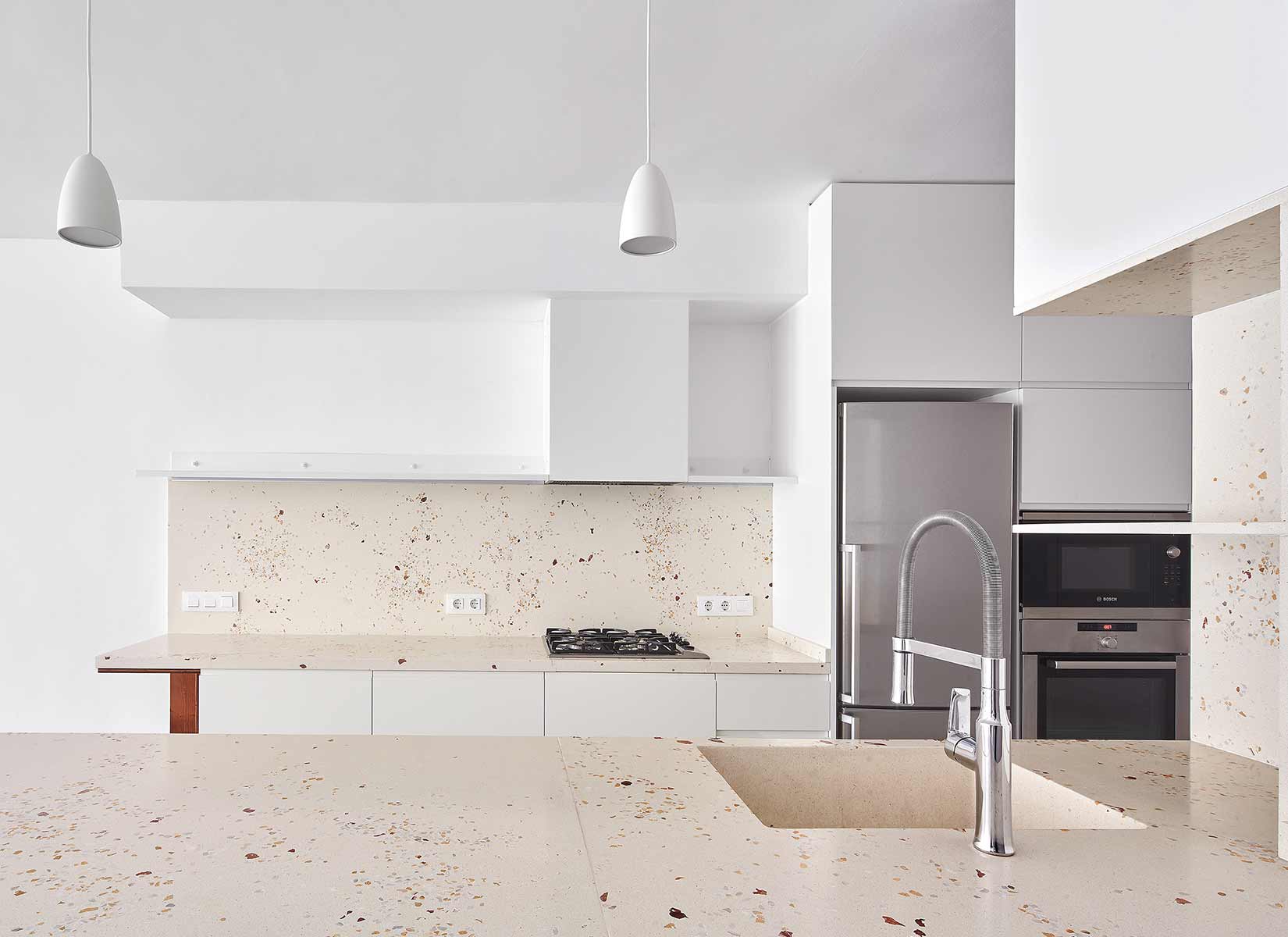
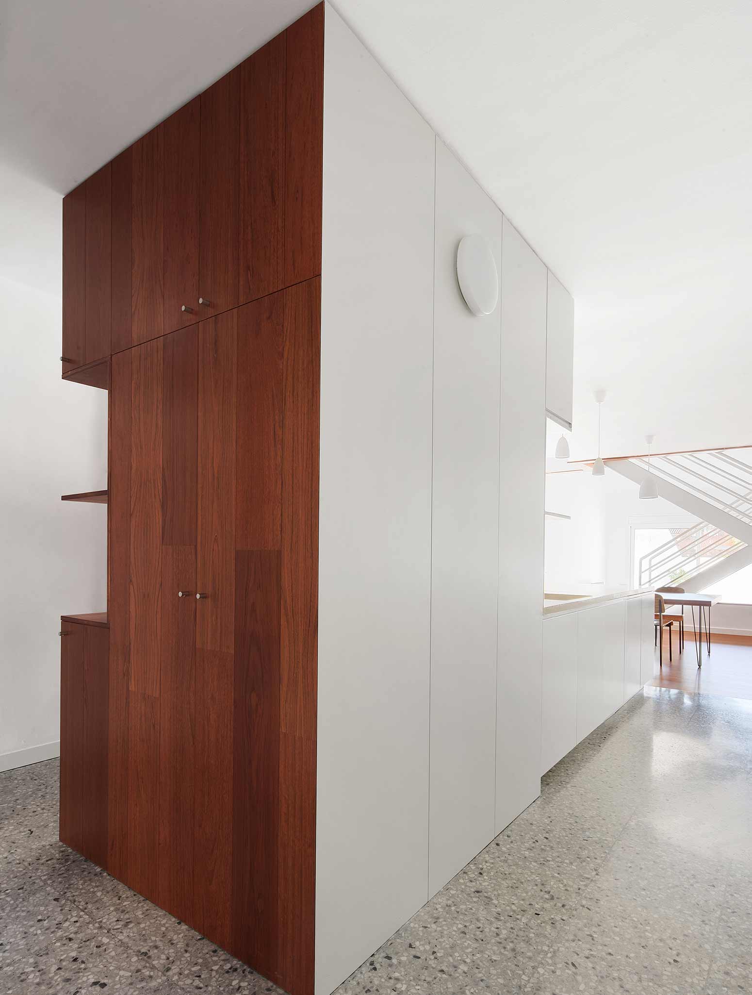
After clearing out the interior partitions, we put in a small central core near the front door with a guest bathroom and a coat closet adjacent to the entrance. The kitchen counter runs up against this enclosure; the counter’s large size means the family can have breakfast there or entertain guests.
PHOTOS BY Jose Hevia
PHOTOS BY Jose Hevia
PHOTOS BY Jose Hevia
PHOTOS BY Jose Hevia
PHOTOS BY Jose Hevia
PHOTOS BY Jose Hevia
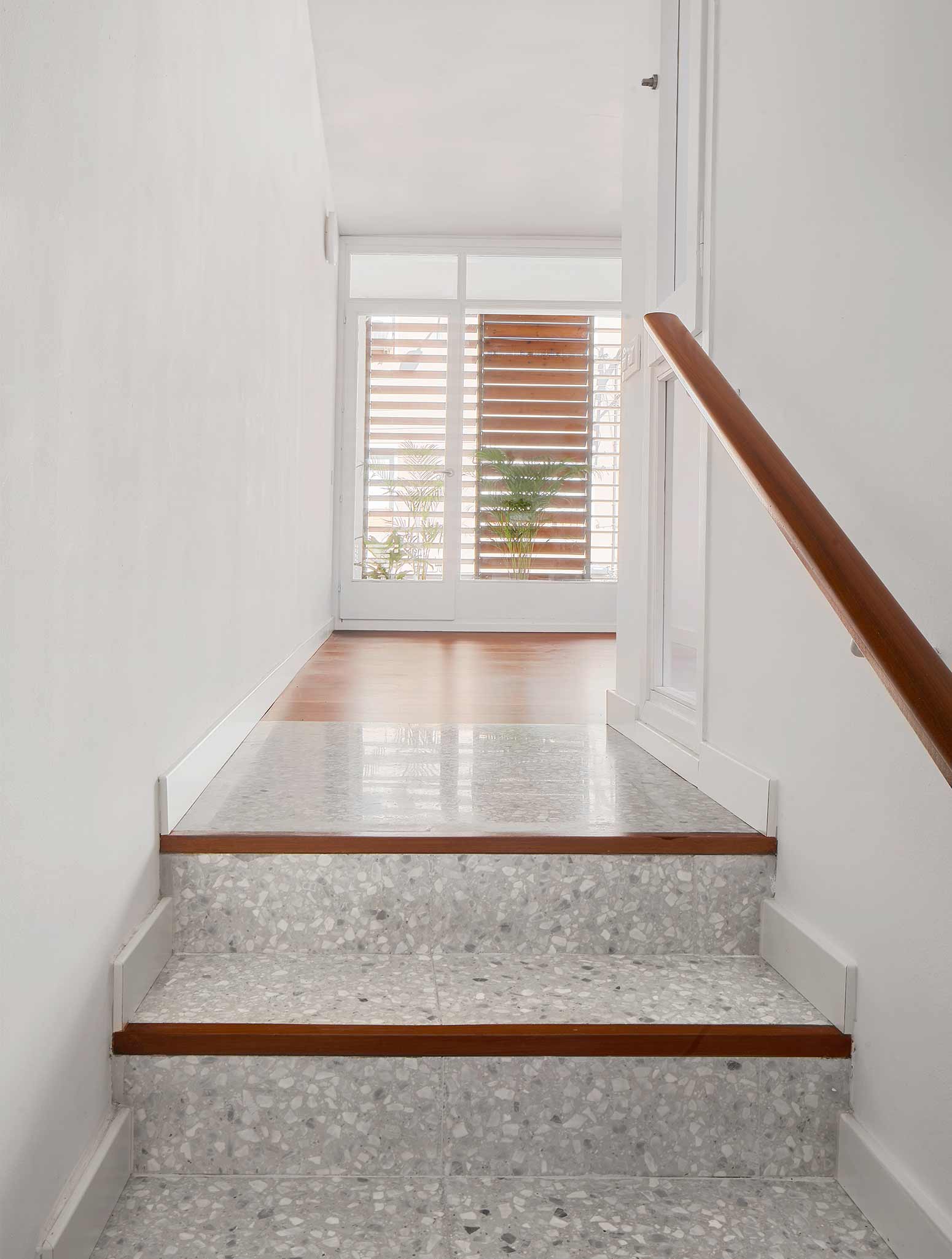
The materials for the new additions are chosen in keeping with the same criteria we used in reimaging the spaces. We maintain the materials we like: the terrazzo, the solid wood stairs, the painted white window frames, the wooden slats on the façade. Everything else can go. We look for a common thread to tie in the new construction with the elements that can be conserved. Wooden flooring, in the same color as the stairs. Terrazzo, similar to what is in the rest of the house but lighter (to create reflections and bring more light into the darker areas of the house). Finally, the new kitchen counter tops and the wall coverings will be cultured marble. This material is added to the palette, since it connects the past with the present and offers a wide variety of finishes. (Our thanks to Ceràmica Huguet for their collaboration.) Looking at the finished work, what makes us happiest is having harmonized the aesthetics and function of the house while keeping that classic 1970s spark.
PHOTOS BY Jose Hevia
PHOTOS BY Jose Hevia
PHOTOS BY Jose Hevia
Collaborators: Llorenç Vallribera, Aleix Gil, Sergi Ballester
Project information
- Architect:Vallribera Noray Arquitectes
- Location:Spain,
- Project Year:2017
- Photographer:Jose Hevia
- Categories:House,Residential,Terrazzo